This site is community-supported. We may earn a commission (at no extra cost) when you buy through our links.
It appears the manufacturer did not list the pigment(s) for this paint.
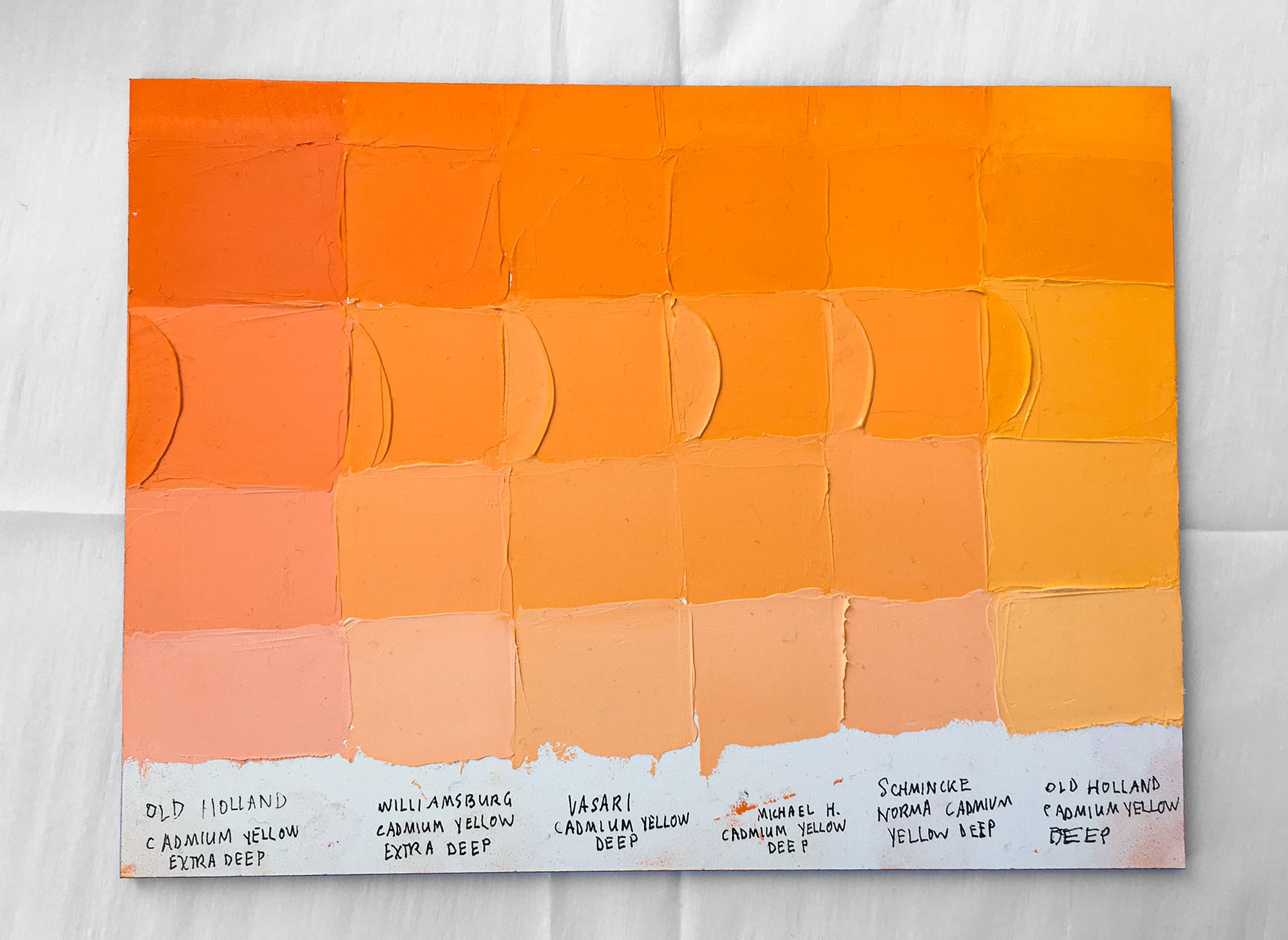
This is a lovely warm pastel brown. Darker in value than French Ochre Havane Extra Pale, this color is around the 5 YR space in Munsell terms. In descriptive English, that means something rosier than linen with a bit of a brown note. This color is somewhat desaturated.
This color is part of the set called The Renaissance Touch of Color. Here is what Vasari says about the set, as their brand statements here may shed more light on this individual color as an opaque pigment blend. “Uniquely formulated from the delicate transparent and semi-transparent natural earth pigments actually used by the Renaissance Masters of painting, this set of eight opaque tints offers subtle notes of light. Useful as whites for delicate changes of value or as neutrals to modify brighter colors for suggestions of space and time.
The eight extra pale colors in the set offer a range of warm or cool, exquisite color, and soft neutral tones.” -Vasari
.png&w=3840&q=75)