An Ancient Palette for Modern Painters
This site is community-supported. We may earn a commission (at no extra cost) when you buy through our links.
The Tetra, an Ancient Limited Palette
A super-limited palette with endless possibilities
Featured Paints
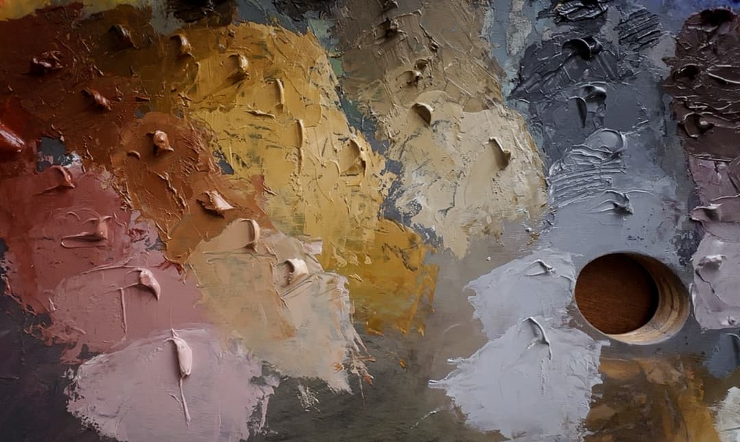
Tetra Palette
The Tetrachromatikon
Powerful Triads (Plus White)
Working in limited palettes holds a special charm. In this case, it is incredible what a range of color can come out of a handful of carefully chosen earth tones.
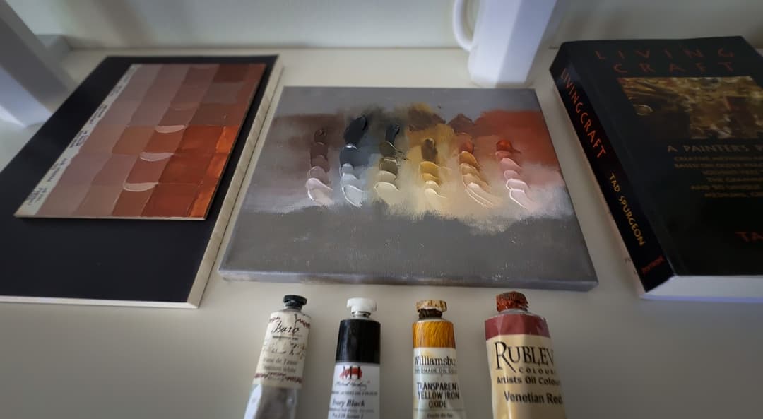
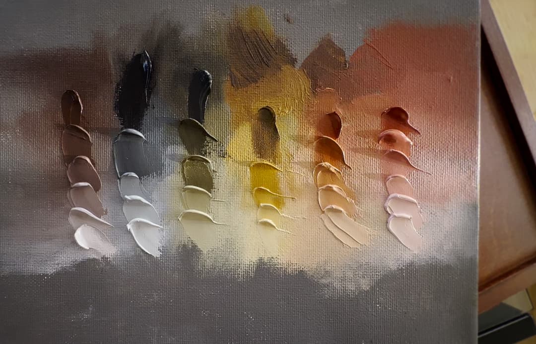
The Tetra, short for Tetrachromatikon, is a take on an ancient palette of red, yellow, black and white. Author and painter Tad Spurgeon highlights this palette in his book, Living Craft. The colors used here are:
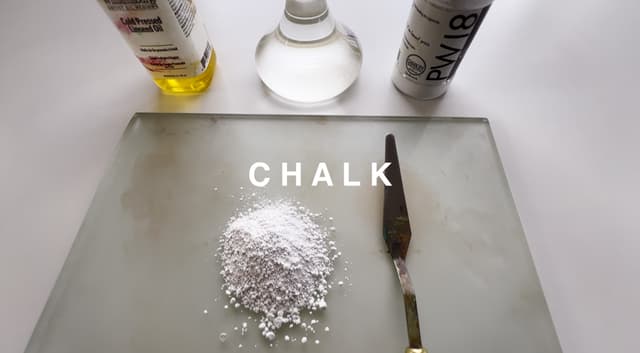
Venetian Red, by Rublev, PR102, Transparent Yellow Oxide PY42, by Williamsburg, and Ivory Black, by Michael Harding, PBk9. For a white paint, Lead White could be used, but we opted to use Titanium White, by Isaro, PW6. To these, one can add a little something extra -- Chalk, shown later in the article, which is also known as calcium carbonate, PW18.
For the Tetra palette, almost any brand will work for each of the color notes. This simple triad plus white is extremely powerful and can mix a wide range of colors for realistic work.
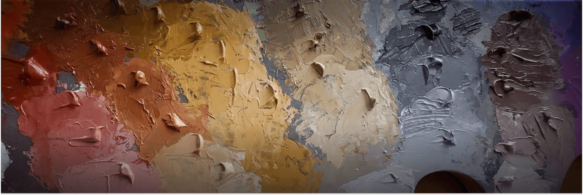
The Tetra, a palette of ancient colors.
Tad Spurgeon is best known for his paint-modifying putty recipes as well as painting mediums. However his section on palettes is fascinating. Here we review just one of them, called the Tetrachromatikon

Initial Palette
Four basic colors: Ivory Black, Venetian Red, Transparent Yellow Oxide (Mars Yellow) and Titanium White. We chose the following paints, but colors from many other brands would work.
The Tetrachromatikon
The big four- color notes
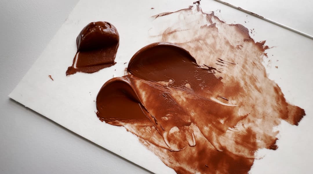
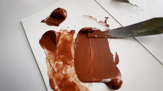
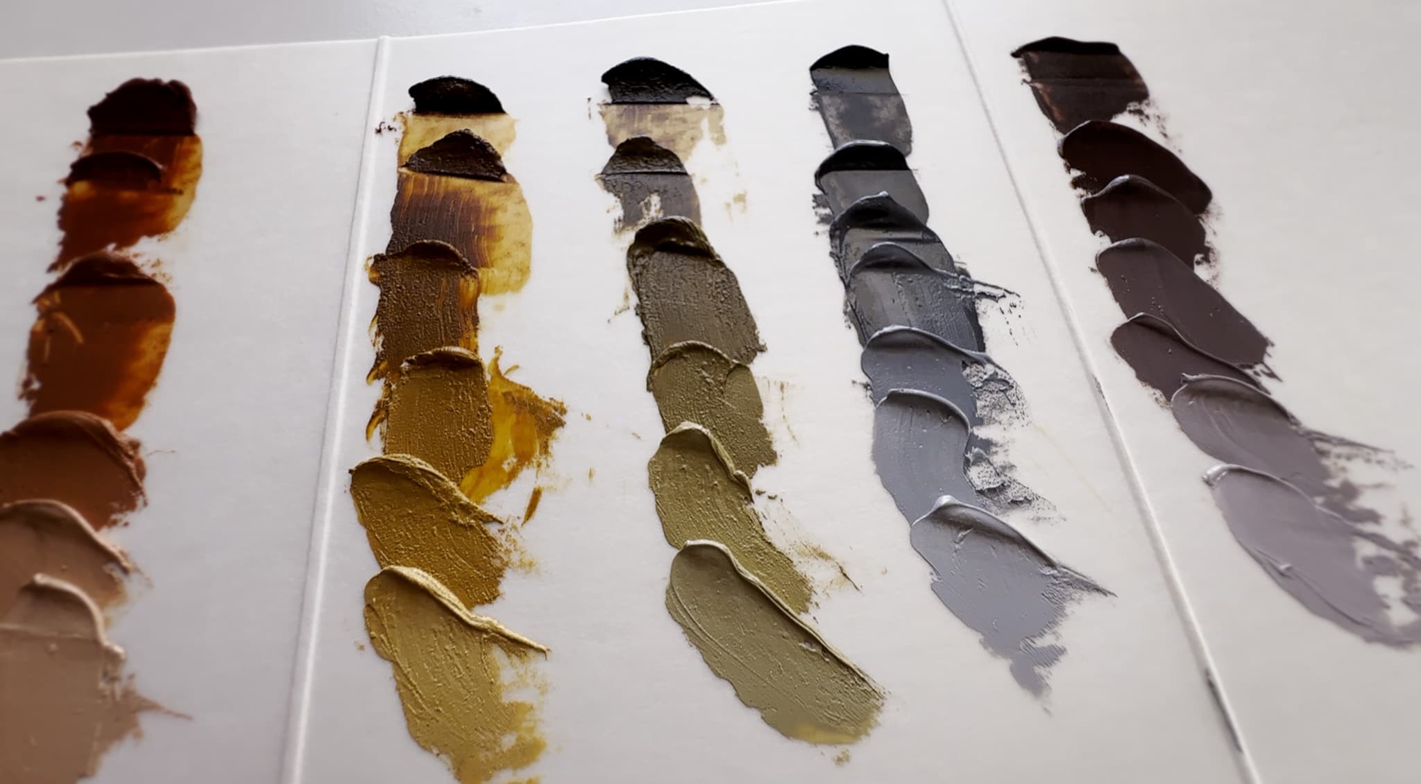
Venetian Red The name Venetian Red (a variety of PR102) can apply to a lot of different shades of natural red earth, and unfortunately the name space is not standardized. Usually Venetian Red is rather opaque, and is a nice warm light red. Some versions are deeper, but we chose one of the more chromatic natural red-orange earths which happened to be by Rublev. In particular, Rublev's paint is quite loose due to lack of additives, and so we had to put it on a paper towel before using it as there is some oil separation. This is not necessarily a bad thing, just something to be aware of. The Rublev has a pronounced red-orange note.
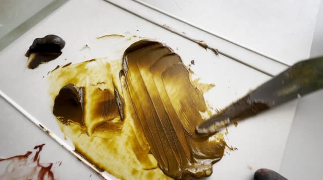
Transparent Yellow Oxide For a more traditional palette, one could use Yellow Ochre, PY43. For the more modern Transparent Yellow Oxide we chose the Williamsburg version. Williamsburg makes several PY42 varieties. This one is deep in masstone and chromatic in tints. It has a finer grain than some of their grittier earths.
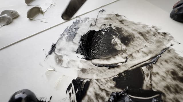
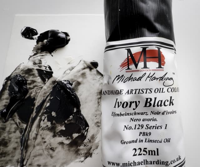
Ivory Black Normally, we would advise some caution when painting with Ivory Black, especially if one is making a layered painting. It can exhibit drying problems and is not really advised for use on the lower layers, and we have heard anecdotal stories of problems when used liberally in masstone. The black in this palette functions a bit like a blue and adds some much-needed coolness. The Ivory Black, PBk9, was by Michael Harding.
Titanium White For our tinting comparisons we usually use Williamsburg, but for this particular palette we chose Isaro's Titanium White. The tube is quite narrow and has its own charm. For a more traditional palette, Lead White could also be used, but of course it is very toxic, so for this we opted for titanium.
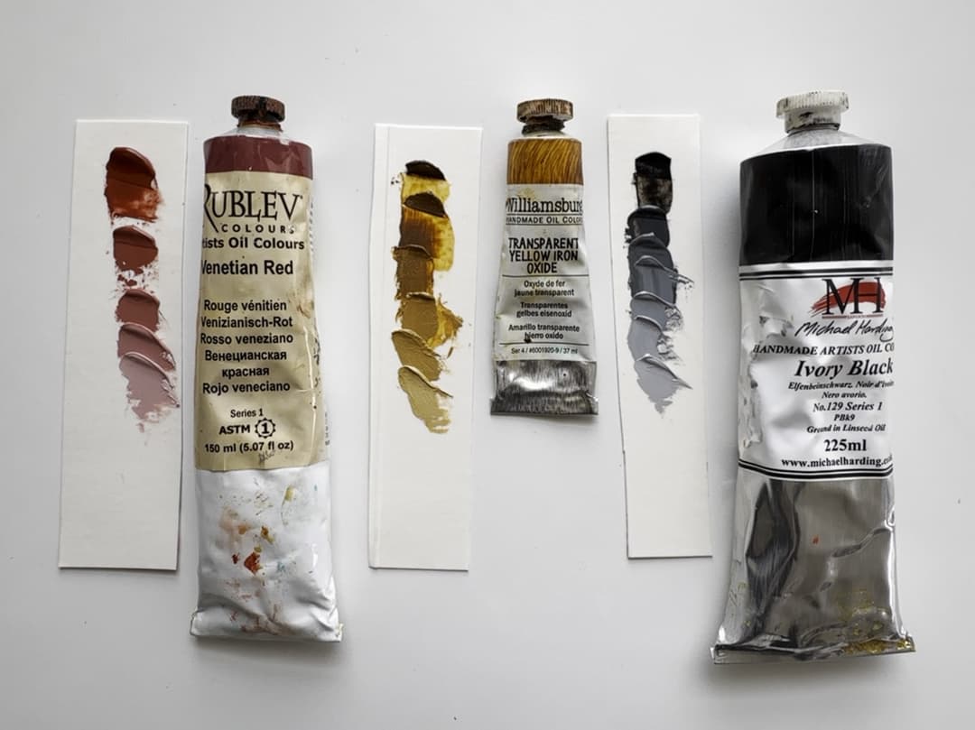
Venetian Red PR102, Transparent Yellow Oxide, PY42, Ivory Black PBk9
A Modern Take on an Ancient Palette
Stark, yet sophisticated
What colors could be more basic than red and yellow earth? Add to that charred bone and you have a secretly robust palette. Moving forward a bit into antiquity, lead white was an early innovation. Debate surrounds whether the four color Tetrachromatikon was as widely used as some people think. Some scholars say maybe green and blue were part of ancient Greek palettes after all, but that goes beyond the scope of this article.
There is something that looks ancient about this handful of colors-- almost stark. However these four colors are capable of a gradient of subtleties.
The ancient four color palette
More considerations for choosing each color note
Updates to time-honored traditions
For this palette, in addition to the descriptions discussed above, we've rounded up some additional choices for colors as many brands would probably work.
In our opinion, it would be nice to have a range of red earths for the red notes and not just one. Spurgeon also suggests modifying the red a bit, see his book for more.
This is a super warm palette. Spurgeon also recommends cooling off and deepening the venetian red a little with just a touch of Mars Red or even a crimson. The Venetian brings some real power in the dull oranges, however its masstone is not super deep, so richer reds would be a challenge unless the crimson note were added. So while this is technically a three color (plus white) palette, he recommends modifying the red into its own blend.
To choose a good basic Venetian Red, we would look for one marked PR102, only because we like the qualities of the native earths for the midtones of portrait work.
For the yellow note, a traditional yellow ochre may give a slightly duller and more semi-opaque midtone treatment for the yellow notes. Genuine Yellow Ochre, PY43, is generally not capable of the depth of Transparent Yellow Oxide, aka Mars Yellow, PY42. In terms of evaluating the palette on the basis of historicity or antiquity, Transparent Yellow Oxide PY42 may not be as far afield as it may seem. A good Mars Yellow may have been close to some of the most prized ochre samples of yesteryear, that is, if someone had a particularly dark, pure, transparent sample of native earth. The particle sizes on modern Mars Yellows varies a lot, so again, using a handful of earths would be nice. Since we only chose one, we picked one that has a fairly fine grind.
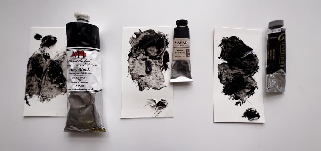
Honestly we had not expected to encounter surprises with Ivory Black. Michael Harding's version siezed up a bit (more on this below) when we added chalk. A good Ivory Black would be one that is a single pigment (e.g., we noticed Rembrandt's is a blend).
For the white pigment, we chose Titanium White. Lead White would give warmer mixes and have a different effect. To choose a good Titanium White, we would recommend avoiding Zinc Oxide (PW4) in the blend, as the percentages of zinc are not usually disclosed by manufacturers.
Some red earth tests, the four-color Tetra Palette, and the book, Living Craft, by Tad Spurgeon
More choices for Transparent Yellow Oxide, PR42
Many different brands of synthetic natural yellow earth would work. Spurgeon recommends a Synthetic Iron Oxide yellow to mix brighter greens, but a yellow ochre could work, too
Alternative Venetian Reds
We favored using a PR102 pigment (some of these Venetian Reds are made from the synthetic pigment, PR101). The Venetian Reds will all vary in colors somewhat, so the color chips are not exactly a reliable guide. Refer to the paintmaker's photos if available. These will also vary in consistency (e.g., Old Holland will be more stiff and Rublev (Natural Pigments) will have more flow)
Ivory Black
Like all varieties of carbon black, this pigment is not a fabulous drier. It is amazing how this black paint can look blue when mixed with Titanium White.
An Elegant Palette
Where the Tetra Shines
What this Super-Strict Palette Can Do
This palette is capable of incredible feats. Many colors for portrait and figure are easily achieved with its range. There is something refined and almost delicate about the tertiary colors built in to this color selection. From emulating gold to mimicking the patina of some aged metal artifact hidden behind the velvet curtain in a museum somewhere, this simple palette could be used to make a masterpiece. The cold grays made with the Ivory Black offer a refreshing cooling note. For paintings that have a regal, old-world dignitiy, this is a great place to start.
What We'd Add to this Four-Color Palette Even the old masters who used a palette like this added a few colors here and there. In many ways this is a proto-Zorn, and even Zorn didn't limit himself to the four color Zorn palette. A brighter red would be helpful (Zorn added this by way of Cadmium Red), and we dearly miss a rich, pleasing blue.
What this Limited Palette Can't Do The word "can't" is probably too strong of a word, as the way a color is surrounded can dramatically change how it appears. Even a mid-chroma color could be made to look bright given a certain context. So, painting feats aside, every palette has its limits. Let's just say that if you're looking for candy-chroma or saturated spectral rainbows, this is not the palette we'd recommend as there are much brighter colors out there.
All that said, in the hands of both those new to painting and experts alike, the Tetra palette can be a lot of fun.

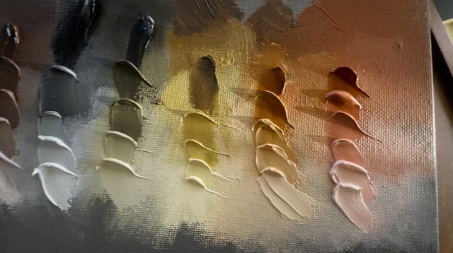
Closeup of the Tetra Palette. None of these paints is actually iridescent, but a person could paint some pretty convincing patina with this lineup
A sophisticated limited palette

Exploring Triads
Meet Proto-Zorn
What came before the Zorn palette? Well probably the Tetrachromatikon. This palette made of earths has a lot in common with Zorn. Earths would have been readily available wherever ochres are found (yellow ochre can be made red by applying high heat, called calcining). Yellow Ochre or Yellow iron oxide can be used as is, and Natural Red Earth or red iron oxide also occurs naturally. The Bone Black would have been achievable as well as Vine Black. In antiquity it is quite possible the red would have received an upgrade in the form of genuine cinnabar, vermilion, or red lead, which are toxic. As oil painting itself is a later development, Chalk seems to have been used at different points throughout the history of easel painting, and chalk is also naturally occuring.
Modern upgrades to our Tetrachromatikon include the Synthetic Yellow Oxide or Mars Yellow for a bit of a chroma boost in the yellow oxide department, as well as Titanium White.
Zorn takes the Tetra a bit further in the reds, with the incredible punchy-yet-lightfast Cadmium Red. Side-by-side the Tetra looks muted and almost reserved compared to Zorn.
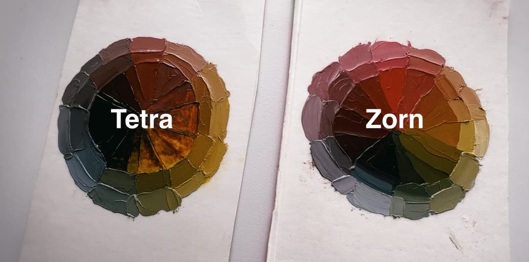
The Tetra Triad (Three colors plus white) uses an earth red rather than the brighter Cadmium Red (PR108) used in a similar limited palette, called the Zorn palette
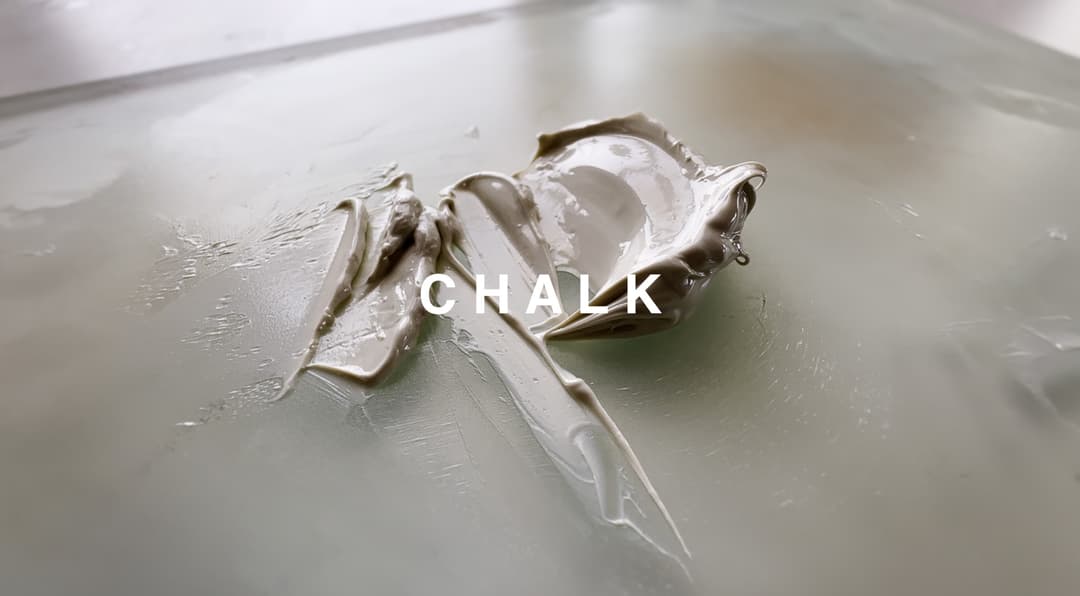
Chalk as a Modifier
One of the actual lost secrets of the Old Masters
Rembrandt added chalk. Need we say more.
Spurgeon goes into great detail about a lot of fascinating modifiers for paints, and in a further section on something he calls the Predimensional Palette, he discusses adding chalk to the basic colors of a limited palette. We felt that addition was appropriate for the Tetrachromatikon palette, as many of the painters from times past may have modified the colors with chalk. So yes, it is technically another pigment (and so maybe our three colors plus white are actually four). However if a person is painting with certain brands of paint, we would argue that chalk is already in that three color palette anyway.
In regard to the many mediums in Spurgeon's book, we like to keep it simple with this old standby- just chalk and linseed oil.
A lot of modern brands may already include chalk as it's a common filler or extender. So here, we are basically making our own extender. Some commercial extenders have a little something extra besides chalk.
Chalk may yellow or show the yellowing more as it's somewhat colorless in oil, so as the paint film ages and the linseed oil yellows, it may show through more. Also as a health and safety note, don't breathe the dust. It's also important not to go too overboard with chalk as far as the percentage added to the paint. However, making one's own chalk putty extender blend is super fun.
A pile of freshly mulled chalk and oil or what some call putty
Chalk in Oil
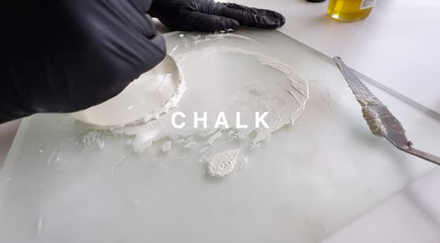
Adding Chalk to Explore New Paint Dimensions with a Limited Palette
Additional chroma, transparency, and different handling
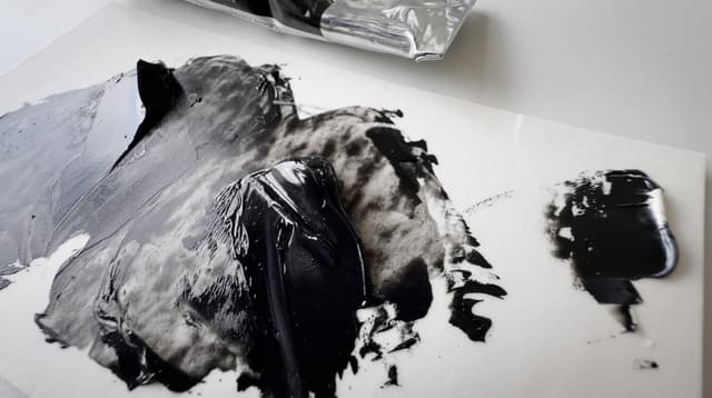
The addition of chalk opened up the palette, and with such an abbreviated palette every little bit of chroma in the gamut helps.
Here we added it 50-50 with the paint, mixed that in, and then added that 50-50 with another daub of chalk to get several dilutions.
It helps to have high quality paints-- especially the earth tones-- so that they can bear being further extended. Many student quality or even middle tier artist quality may be full of chalk already. It becomes clear pretty quickly what has been thickened up or extended.
There is a pleasant filmy quality as well as a luminous transparency to the paint with chalk. If one imagines a time when fewer colors were available, it makes sense that painters explored every avenue-- with chalk, different binding oils, and also combinations of materials to get the most out of their earth palettes.
One very strange thing happened. When we added chalk to the Michael Harding Ivory Black, the paint gummed up. We wondered for a moment if it was the pigment, but the other two Ivory Black paints we tested did not show this behavior.
At first the Michael Harding Ivory Black paint was smooth, but then it became streaky and seized up.
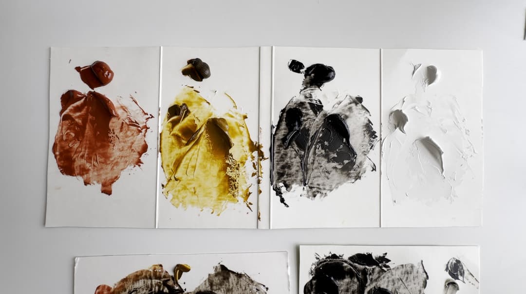
Venetian red with chalk added. Counter-clockwise from the top: Full strength Rublev Venetian Red PR102, Venetian and Chalk 1:1, Venetian and Chalk 1:4
Chalk With the Tetra Palette
It opens up the red and yellow, but there were a few surprises with Michael Harding's Ivory Black
Three Varieties of Ivory Black
For once it's not just about consistency
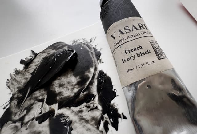
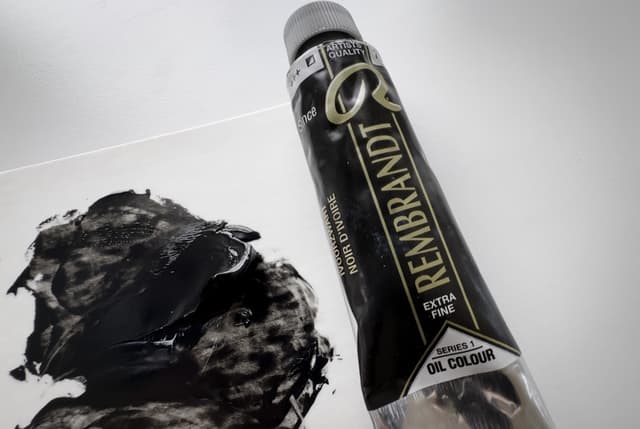
We didn't expect to have to find other varieties of Ivory Black to test for this project. As mentioned earlier, the Michael Harding had an unexpected behavior when mixed with chalk. The Vasari was fine and so was Rembrandt.
Before we added the chalk, the Michael Harding was fine. However, since we wanted to work with the chalk, we had to opt for Vasari or Rembrandt. Both of the latter kept their expected paint consistency after the chalk was added.
As a heads up the Rembrandt is actually a blend with Ultramarine blue.
Ivory Black Options
When we added chalk, the Michael Harding Ivory Black gummed up mysteriously. Here are a few closeups of the Michael Harding, Vasari, and Rembrandt versions. The Vasari and Rembrandt paints did not show the strange behavior.
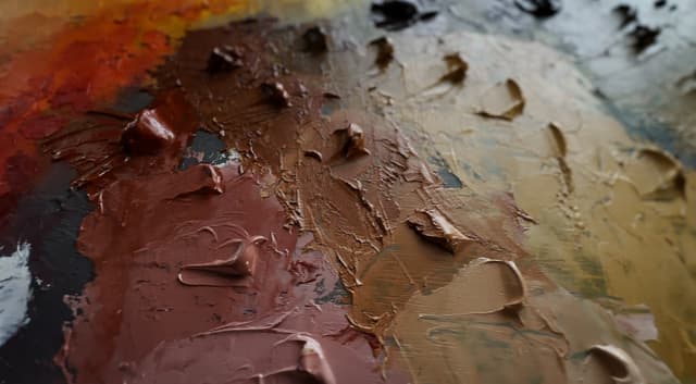
A portrait palette
A few of the mixing targets in the portrait gamut
Beyond the more harsh, elemental colors in the palette, we found portrait strings were well within reach. Hints of crimson may be missing but we decided to leave those out for now as we wanted to explore the most limited version of the palette. This is where a Mars Red or a modern crimson could be added. The purple color beneath the piles of paint is not part of the limited palette, but rather was from another painting session.

Capable of colors for portraits. These more complex mixes involve all the colors in the palette.
The Tetra Palette
A palette where paintings almost paint themselves
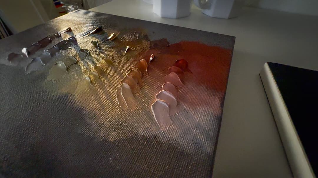
Spurgeon recommends pre-mixing the colors in order to get the most out of this palette. We completely agree. The time it takes to mix the colors takes a significant chunk out of the painting time, and it is very nice to have the strings already lightened and ready for the painting session.
Here we pre-mixed the strings in the Tetra Palette as well as the in-between colors (loosely speaking, the orange, green, and purple). Each of these could be further modified, but it helps to have the colors pre-mixed at least to this stage as a starting point for painting. None of these colors have been mixed with chalk.
Exploring the Gamut
Venetian Red, Mars Yellow, and Ivory Black can cover an interesting range
A Timeless Palette
A combination tested by centuries, and will likely last for many more
Perhaps for many reasons this basic palette has endured through the years. One is the accessibility of the materials, but also their versatility. While some painters prefer to use higher chroma colors, this gamut of four colors covers many mixing targets for realism. Tad Spurgeon graciously made his book free for painters to read here.
Thanks for joining us, and Happy Painting!
P.S. Be sure to sign up for our newsletter to receive the latest articles.
A timeless palette