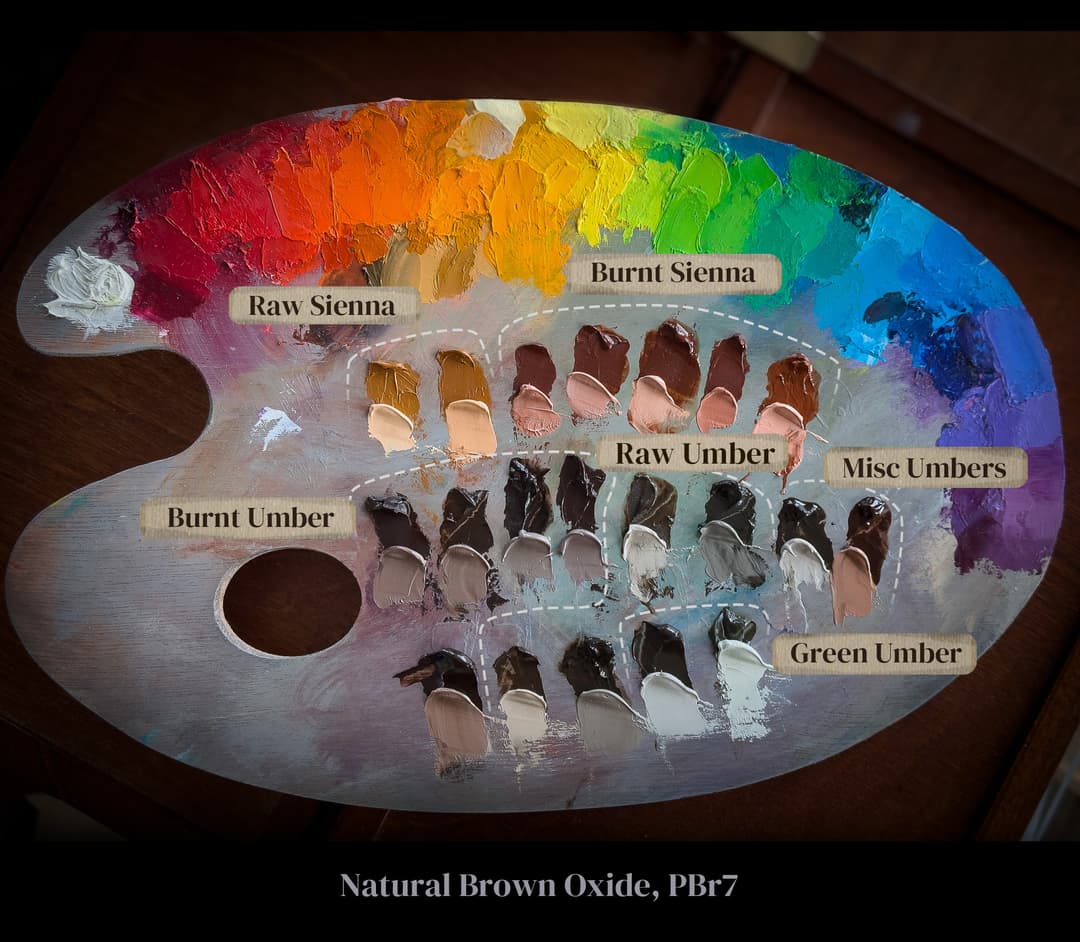
PBr7 Natural Brown Oxide, And a Lost History
From Scarce Raw Siennas to Beautiful Burnt Umbers, Tales of Old Pigments Still Inspire
The Lost Historical Cannon of Color Names
Within the Largest Pigment Code, Color Names Matter
The pigment code PBr7 covers a huge part of the traditional painter's palette. Welcome to the wild domain of one of the most confusing (and the most common) pigment codes in oil paint. To make matters even more interesting, the historical paint names of the past describe genuine earth colors that have become very hard to find.
In the realm of PBr7, the pigment code may not help a painter very much to navigate the terrain. In every other area of the palette it seems the pigment code will be more helpful than it is here. In this land, we are going to have to find different guides-- we will have to turn to old books, and consult sources which seem to have been long-forgotten.
In modern times, we are often told as painters that the famous names given to these earths, such as Burnt Sienna, are arbitrary, and that paintmakers can call them whatever they wish. What they don't say is that there is actually a rich lost history from artists of the past-- a language painters developed to describe the attributes which they expected from their paints.
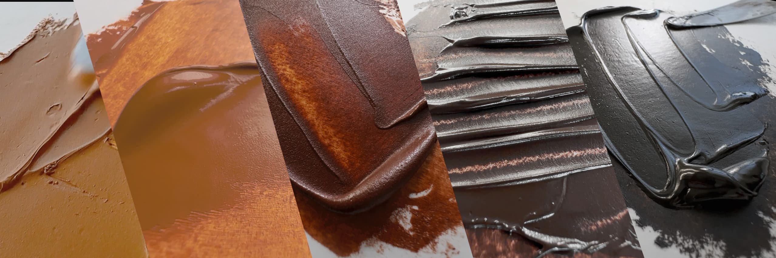
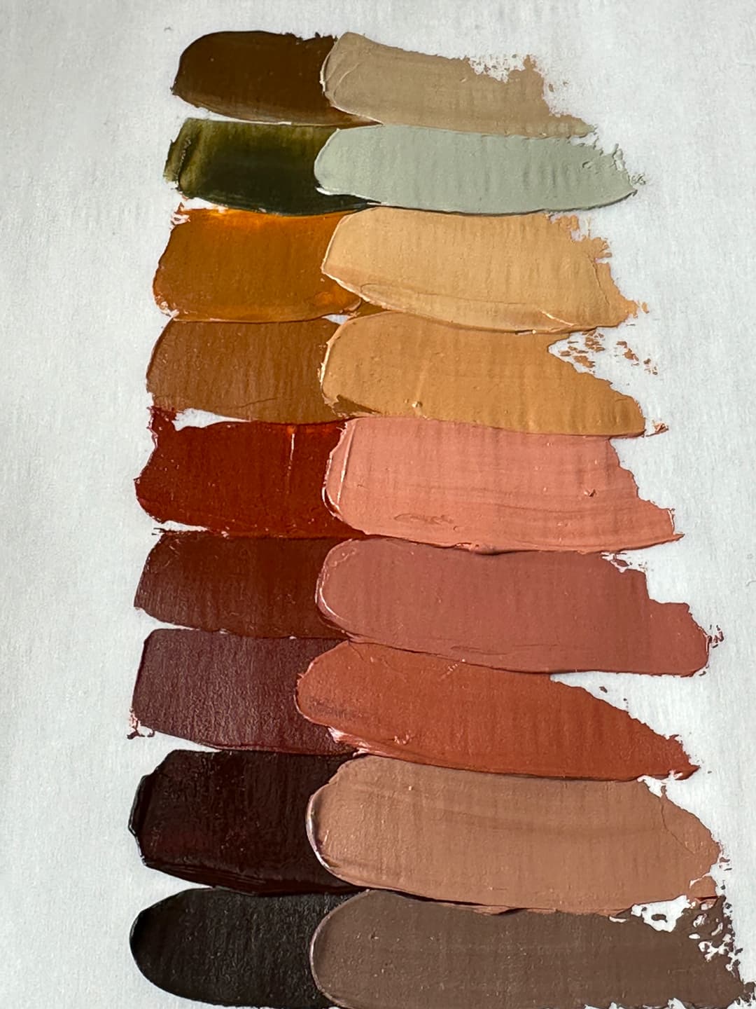
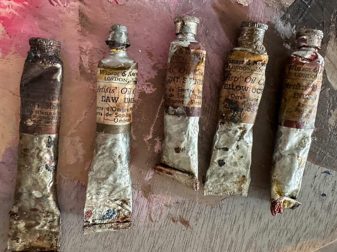
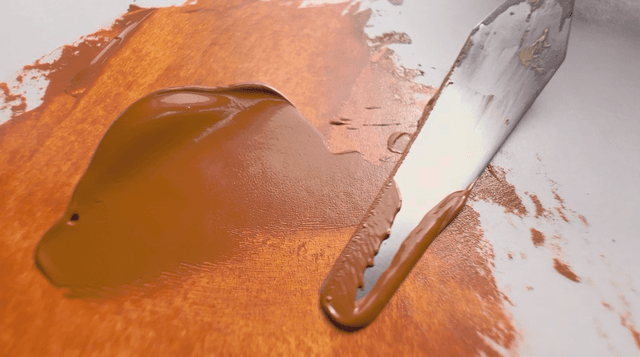
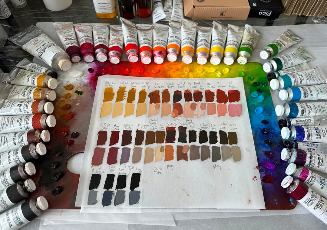
Clockwise from the top, Raw Sienna and Burnt Sienna, Burnt Umber, Raw Umbers, and Green Umbers
Many colors, one pigment code
In many other areas, pigment codes can help to identify materials. However, since PBr7 is such a broad pigment code (for example, a painter may well have a use for more than one PBr7 on their palette), the color names within it take on greater importance. The code PBr7 encompasses earth tones that exhibit a reddish brown, a tepid green, a golden ochre, or a deep chocolate brown umber.
To make matters more complicated, the historical color names used by painters are sometimes shared by multiple pigment codes. For example, some Raw Sienna paints have a pigment code for yellow earth, PY43, while others are PBr7. Similarly, some Burnt Siennas are labeled as red earths, PR102, while others are brown earths, PBr7. When it comes to earth tones, pigment codes don't give artists quite enough information.
The cannon of artist's correspondence
Through the centuries, artists have developed names for brown earths
For centuries, this handful of color names has shaped the handwritten notes and the letters of painters as they discussed their art, and subsequently found their ways into the cannon of books that discuss painting. From instruction manuals to conservation literature, these names do matter. Understanding these names will help us to better evaluate our modern earth tones, for which we are told there are no standards.
For example, the name given by a paint manufacturer may or may not align with the historical cannon. In a world where artists buy paint online, where color swatches on screen are inherently unreliable, and we have fewer in-person art supply stores, it is not a fun surprise to open a tube of Raw Sienna and find out it is a rather dark, cool middle brown ochre instead of a warm, semi-transparent orangey light brown.
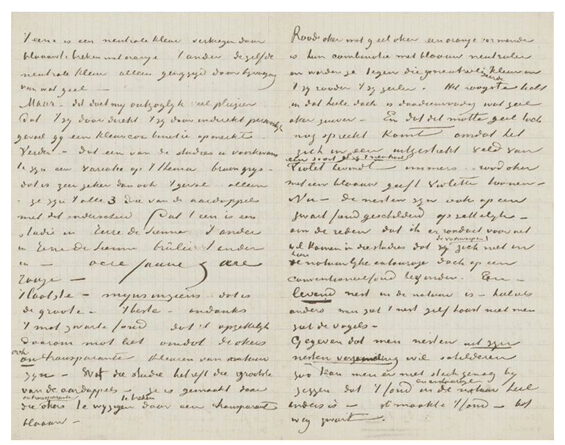
A letter from Vincent van Gogh references Sienna, Burnt Sienna, Yellow Ochre and Red Ochre. From letter to Theo van Gogh, Nuenen, on or about Tuesday, 20 October 1885.
A Gamut of Earthtones Within a Single Pigment Code
Color names take on greater importance within PBr7
Most of the time, a pigment code gives artists a lot of good information about their paints. Unfortunately, PBr7 is the most common pigment code for single-pigment paints and it also gives us the least color information.
When we think of PBr7, we usually envision brown earths, but the color can spin out to yellow, to green, to red, or even to violet from there. Granted these are brownish reds, greens, yellows, and violets, but for a painter purchasing colors the category is too broad to be helpful.
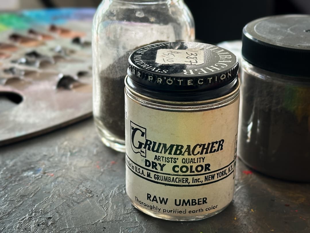
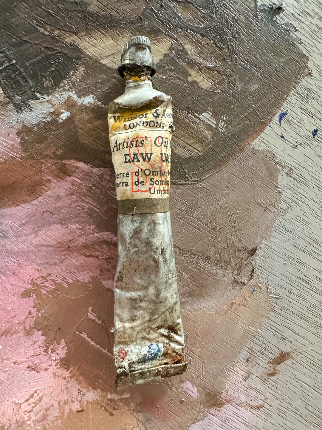
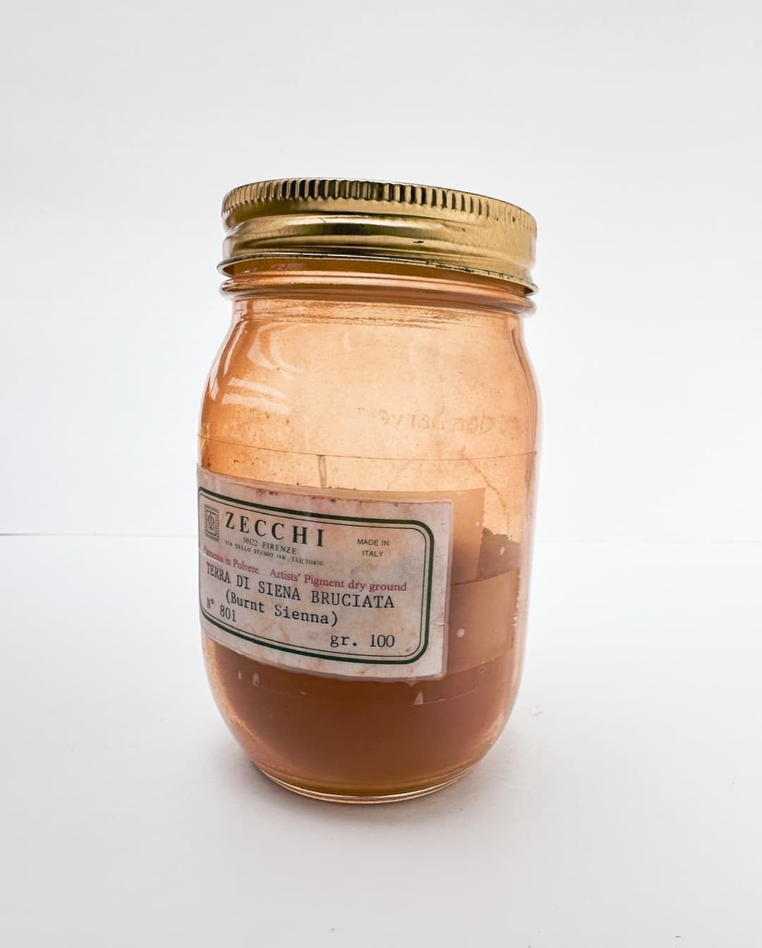
PBr7 is one of the pigment codes that does not give a person a lot of color information, besides the general tendency of earths toward a middle chroma. It's possible to find a few relatively cooler browns and even a stray green or two. Natural Brown Iron Oxide, PBr7, has several well-established sub-variants. Some of the more frequently occurring names are Umbers and Siennas. Umbers tend to be darker brown while Siennas at least start out a little bit lighter. Raw Sienna and Raw Umber can be burnt or calcined to make Burnt Sienna and Burnt Umber, which tend to be warmer than the raw colors. The names often add a place of origin such as French, Italian or Cyprus, though unfortunately that is not a guarantee that the earth tone came from that locale.
Related pigment codes are PR101 and PR102 for red earth (synthetic and natural), PY42 and PY43 for yellow earth, and PG23 for green earth.
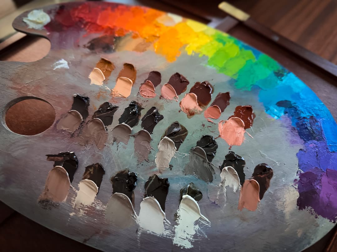
All of these paints have the pigment code PBr7.
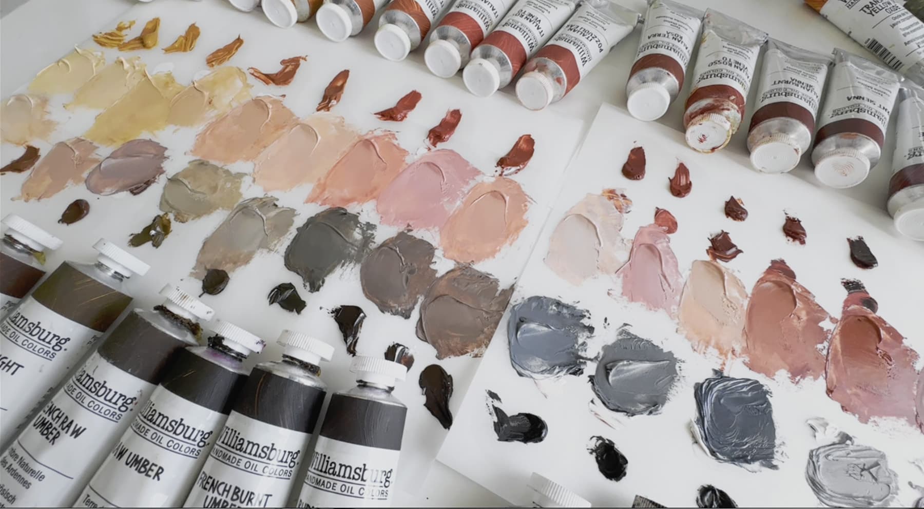
Umber Tones and Undertones
Warmer Burnt Umbers and Cooler Raw Umbers
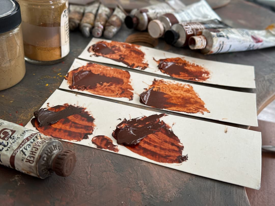
All of the paints swatched here share the pigment code PBr7. To the left are three Burnt Umbers, to the Right, three Raw Umbers.
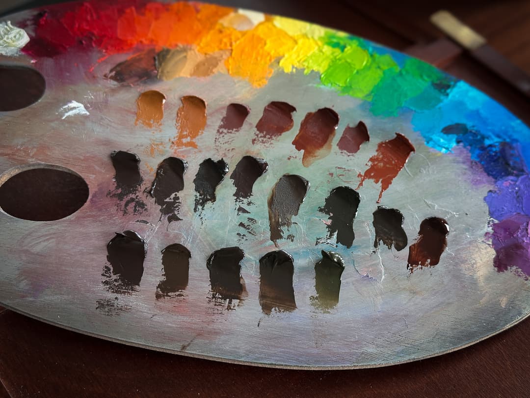
As a refresher on the panel layout, from top to bottom, the topmost row contains the colors thinned with Rublev Oleogel to mimic a glaze. The next row is each paint at full strength, and following that, there are rows of each color tinted out with varying amounts of Titanium White in three steps. The steps are not meant to show tinting strength but rather to reveal the undertone at similar lightness values. The tinting strength comparison where paints are matched 1:1 with white is in the curved swatch in row 3.
Even with a similar masstone, some PBr7s show different behaviors when mixed with white. Some veer toward brown, some toward red, some toward a neutral.
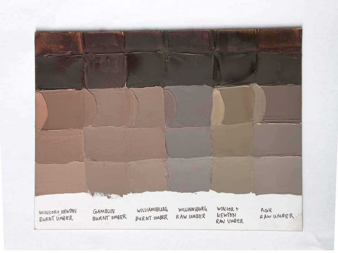
All these colors are made with PBr7. Despite similar brown masstones they reveal different colors when tinted
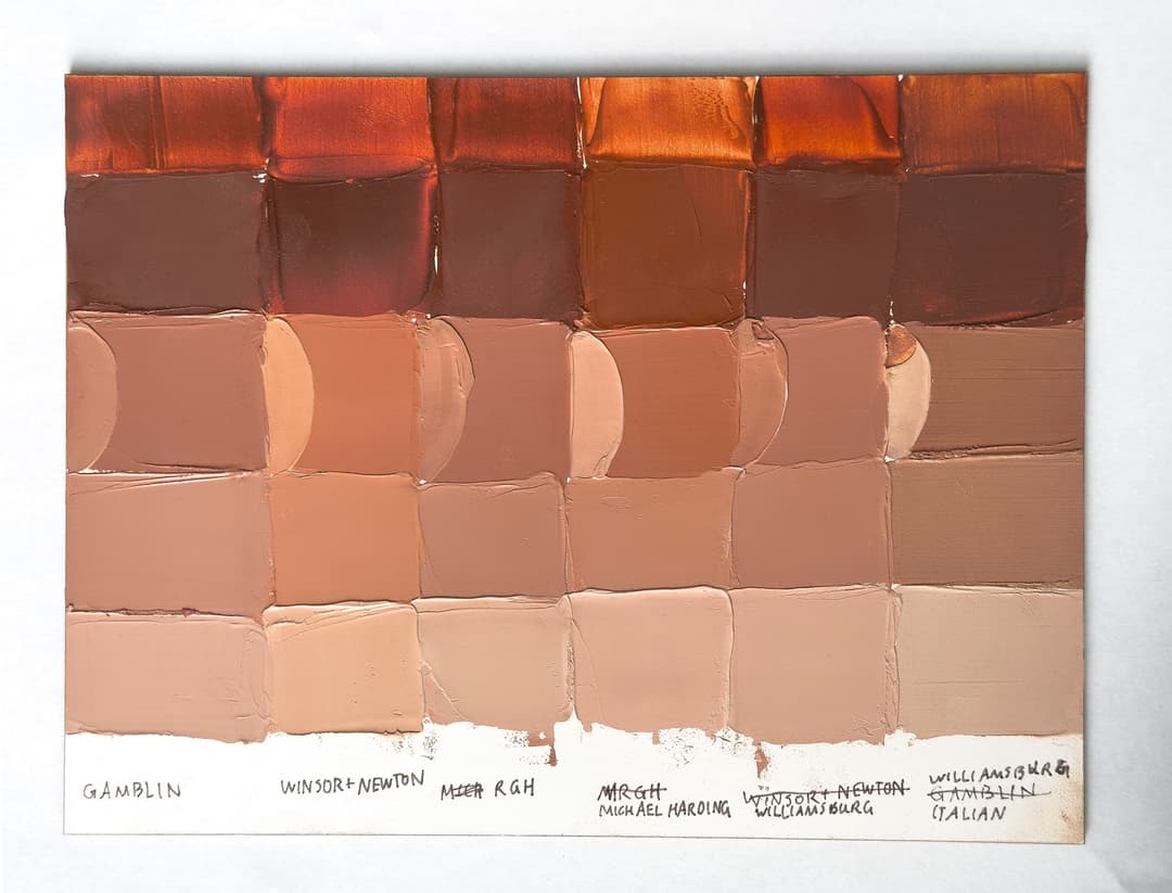
Overview of Famous PBr7 Paints and their Patterns
Some of the names of famous Brown Iron Oxide Paints
Raw Sienna: tends to be a warm gold color or a yellow-brown that has a bit of an orange note when mixed. It's often a bit oranger or deeper than Yellow Ochre. Raw Sienna is named for the earth color which was mined in or near Siena, Italy, and the genuine earth tone has some native transparency. This color is sometimes listed under the pigment codes for yellow earth (PY42 or PY43). Natural impurities may contribute quite a bit to the desirability of genuine Raw Sienna, as they make the pigment semi-transparent. The warm note makes it a useful color in portraiture.
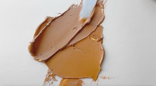
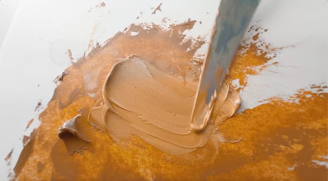
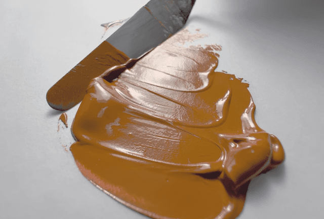
Burnt Sienna: A deep red brown that is one of the quintessential artist's colors. From flesh tones to landscape to abstracts, this radiant warm brown is everywhere. If brown could be a gemtone, that's what we think of with some of the best Burnt Siennas. The same paint name is also found among the red earths (PR101 and PR102). Burnt Sienna is a warm middle brown which often shows rosiness in tints--a brown and a red at the same time. Burnt Siennas range from transparent to semi-opaque, however it is also possible to find opaque versions. Natural versions (PR102) are often named French or Italian depending on their origin and may have a larger variety of particle sizes. Burnt Sienna is made of calcining or heating Raw Sienna hence the name "Burnt". It has a medium to fast drying time, though not as fast as the umbers. Older authors praise its beauty, prize the deep mahogany versions, and mention that it is not chalky in mixtures. It's ideally transparent or semi-transparent.
Burnt Umber tends to be a dark chocolatey brown that is warmer than Raw Umber. It is made by heating various earths or calcining them, which yields a deeper and redder tone. Some burnt umbers have a bit of transparency (semi-opaque) while it is also common to find opaque ones. The umbers sometimes have problems with a phenomenon called sinking-in. (More on this in the section on Burnt Umber). This is a pigment that tends to require a lot of oil but is also a very fast drier, possibly due to Manganese. We noticed a comment in The Artist's Handbook by Pip Seymour where the author wrote, "Because it darkens appreciably in oil use carefully". More on this below.
Raw Umber tends to be a cooler dark brown that may even have a very faint green leaning to it depending on the variety. For example, some Italian Green Umbers are raw umbers that are especially cool. The transparency varies. Among the green umbers some semi-transparency (as well as low tinting strength) is common, but other Raw Umbers may be opaque.
Raw umbers can vary from pale browns, tepid greens, or deep rich browns with a cool note. While we wish the earth tones would be single pigments, sometimes Turkey Umber has a note of added green (we've seen a few with PG7 mixed into it).
Raw Umber requires a high amount of oil, and can also be associated with "sinking-in" in oil painting (similar to Burnt Umber, mentioned above), so it is helpful to understand the causes and plan one's painting accordingly.
Umbers often contain manganese. Please see Monona Rossol's work for information about health hazards associated with manganese. This metal speeds drying, so despite high oil content, umbers are among the very fast driers. Some of the natural varieties have a degree of transparency.
Other names include Cassel Earth, Italian Earth/Italian Umber, and Brown Ochre.
The Banished Burnt Umbers
Notes on Modern Burnt Umber
Burnt umber is a pigment that is associated with something painters call "sinking in" where a section of the painting goes matte after drying. The trouble is that this matte area may persist even after coating the painting with varnish. A full discussion of sinking in goes beyond this article, but Natural Pigments has some good resources on how to prevent it. Pigment choice is not the only factor, substrate absorbency appears to be related. However, Burnt Umber has long been known to be a pigment that can exacerbate the problem. Some of the other PBr7 variants may also be involved to a less-intense degree.
From sinking in to darkening, rumblings of problems with burnt umber emerge in professional painting circles from time to time. Author Virgil Elliott in his book, Traditional Oil Painting discusses the issues on p.127, and removed Burnt Umber from his palette.
For more on these concerns see also Is Burnt Umber Evil for an additional citation from conservation on Caravaggio. So, clearly these problems are not related only to modern burnt umbers.
Impish Burnt Umber. Some oil painters have gone so far as to wonder if this pigment should be called evil.
Beautiful Earth Tones of the Past
From Burnt Umber to Raw Sienna, things used to be different
We have been amazed to read the descriptions of the earth tones from past centuries. Our inquiry into this so far has shown that there is some merit to the claim that older earth tones used to be different, and that perhaps due to expense, perhaps due to scarcity, or maybe having to do with the synthetic iron oxide market, things have changed.
The cannon of literature from the past helps inform us as to what was expected from the earth tones available at the time. We will examine each pigment in turn, beginning with Burnt Umber. It seems that back then there was a variety available which was olive with a tinge of violet in tints.
Burnt Umber is a single-pigment earth tone, and the best versions were burnt Cyprus Umber or Turkey Umber. An author from over a hundred years ago writes, "It runs from light reddish brown to a violet brown, its tone depending upon the nature of the raw material it is calcined from. The roasting or calcination...imparts a warmer tone, deeper color and more translucency to the pigment."
In general, Burnt Umber would ideally have a very similar composition to Cyprus Raw Umber (described below), from which it should ideally be made. "Burnt Turkey umber with a reddish brown tone makes a stronger stainer, but the pigment with a neutral tone that leans, when ...in oil, to the olive with a tinge of the violet and produces when used with white a tint that has a suspicion of lavender-gray with its drab effect, is far preferable to the almost terra cotta brown tint produced by some of the reddish toned burnt umbers."
Older earth tones were actually different from most of what is on the market today
Burnt Umber - PBr7
Some of the modern Burnt Umbers available today which are marked PBr7
PBr7 - Some Modern Burnt Umbers
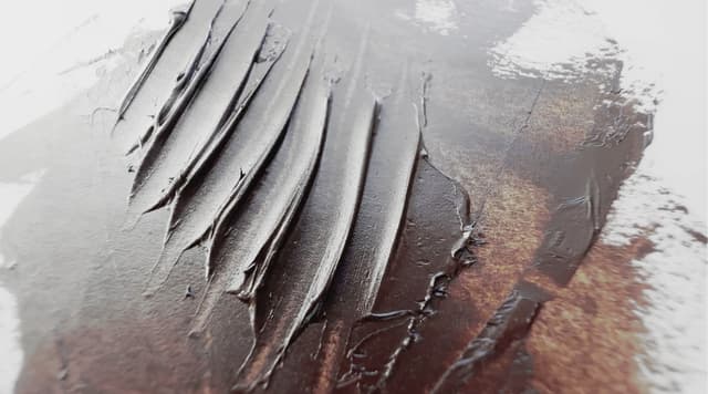
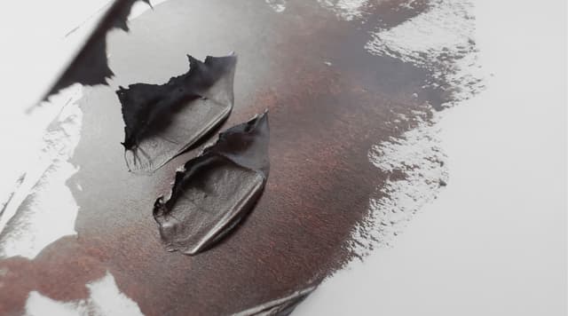
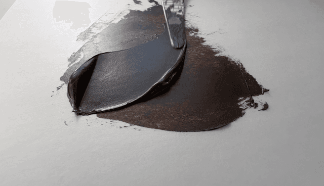
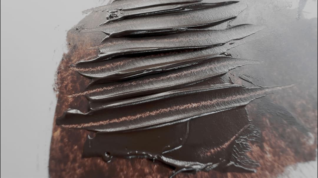
Depending on how the paint is formulated by the paintmaker, some PBr7s will have more impasto ability than others. Some have a smooth impasto, while others are a bit softer, more ragged, and almost tear.
Raw Umbers
Notes on Modern Raw Umbers
Raw Umber can range across shades of brown, and for the ideal descriptions we'll look to the past, which are discussed below. However for modern descriptions, which are not currently guided by ideals, we can start by saying that it should be a single pigment earth tone. Raw Umber tends to be a bit cooler than Burnt Umber, and some versions have less of a red and more of a neutral undertone, which can make them seem almost green in comparison.
Like Burnt Umber, Raw Umber can be a useful pigment for lowering the lightness of mixes. However, Raw Umber can also be a problem when it comes to oil paints sinking in. Similar mitigation strategies are used such as tackling substrate absorbency, minimizing the use of solvents, and avoiding the use of Raw Umber in masstone in large passages.
Ideal Antique Raw Umbers
From Cyprus, Olive-hued, Semi-Transparent, Warm and Finely Ground
In 1913, Charles Uebele wrote that, "The best undoubtedly comes from the island of Cyprus." He went on to say, "The best quality of Cyprus raw umber has a peculiar greenish cast, which we usually term olive, and its color is due to ferric oxide of iron and quite a large percentage of dioxide of manganese, to which latter is also due its good drying quality when ground in linseed oil. Some specimens have a somewhat dull reddish or yellowish cast. These, however, produce a poor tint with white. The olive toned raw umber, makes a much warmer tint and is especially favored by artists..."
When compared with the best sample of American Raw Umber available at the time for analysis, he said, "This specimen of American raw umber ...in oil had a yellowish brown tone, as against the olive of the Cyprus umber and lacked the semi-transparency of the latter, as well as its richness. Had a dull appearance in comparison, that a practical painter would describe as having "no life." In testing the staining power or strength for staining white, the Cyprus specimen gave a strong, warm, brownish tint with a tinge of green, while the American umber produced with the same white a weak, cold stone gray." For some artists that neutrality may be a boon in mixes, but the Cyprus umbers clearly had a different quality. He gave detailed notes on the chemical composition of each specimen. Later, he goes on to say, "For artists' tube color only the very warmest olive toned raw Turkey umber should be selected and ground very fine..."
Raw Umber
Different paint consistencies for PBr7 Raw Umber
Raw Umber - PBr7
Some of the modern Raw Umbers
Modern Burnt Sienna
An art history staple, and a consistently beloved color through the ages
Burnt Sienna tends to be a bit more transparent than Raw Sienna, from which it is made. We loved the description of this pigment as "fiery" by Mayer, as there is something gorgeous about Burnt Sienna in glazes.
Old texts praised Burnt Sienna as one of the most important artists' pigments. Since it was made from heating or calcining Raw Sienna, a good quality Raw Sienna would be the starting place. Since there is some natural transparency to Raw Sienna, the calcined version becomes even more transparent.
We found authors mention several qualities that make a good Burnt Sienna. The darkest mahogany colored grades were most prized, which had an orange undertone in transparent glazes. It should make peachy-pink tints when mixed with white. The depth and clarity of this color made it excellent for dark blends.
Best Burnt Siennas from the Past
Brilliant, Deep Red, Finely ground
Another antique source mentions that "the brighter and redder toned siennas are much preferred and command the higher price." In 1913, Charles Ubele wrote, "The brightness of tone does not depend entirely upon the temperature and length of time used in calcining, but to a greater extent upon the quality of the natural earth. The so-called red fire burnt siennas, so highly valued for their brilliancy of tone and richness of tint, that were imported years ago from Italian sources, are hardly met with now, excepting in rare instances, due, it is said, to the mines being exhausted, which may be partly true, but it is also a matter of fact that the average manufacturer will not pay the price asked, when the consumers themselves look more for tinting strength, than for transparency and brilliancy of tone."
Ubele also mentions the importance of the absolute freedom from grit in the selection of pigment for Burnt Sienna: "As mentioned in the case of raw sienna for artists' tubes, only the old time standard of material should be selected in burnt sienna as well and the more brilliant the overtone of the pigment, the more favorably the color will be received by the user. In grinding burnt sienna for the artist, extreme care for obtaining the highest degree of fineness and absence of all grit must be exercised..."
Even midcentury Burnt Sienna from the 60s was different than the offerings on the market today. The paint swatches in the foreground are midcentury versions, which are darker and have more of a cherry note, while all four modern versions we tried had the yellow note and were not as deep in masstone.
Modern Burnt Siennas
Modern Burnt Sienna Comparison
Burnt Sienna can sometimes have alternately more of an orange or more of a red undertone. The leaning of the particular paint shows up in glazes (top row), or in tints (rows 3-5).
The parenthesis-shaped swatches on the panel show the relative tinting strength 1:1 with Titanium White, and there is not a whole lot of variation between paintmakers. As an inexpensive pigment, tinting strength is less of an area of concern for Burnt Sienna-- rather we'd be looking for depth in masstone and clarity in glazes.
A good Burnt Sienna should be only a single earth pigment, not a blend of synthetic organic colors.
Most modern Burnt Siennas are PBr7. The paints here are PBr7 with the exception of one. The Williamsburg regular Burnt Sienna is a PR101, which is second from the right.
Burnt Sienna
It is not clear which if any of the types of modern Burnt Sienna possess the qualities of the older pigments which were so highly praised. Many brown pigments are useful even if they are not what the older painters knew to be the ideal Burnt Sienna
Modern Raw Sienna
The famous Terre di Siena or Raw Sienna is a yellow-orange-brown color interesting pigment which is not always well-enough differentiated from Yellow Ochre in some modern paint lines. In fact, while some brands have a nearly indistinguishable Yellow Ochre and Raw Sienna, we have also noticed a wide range of colors that are sold as "Raw Sienna" across paint brands.
Old painter's books from the past speak of a Raw Sienna pigment that is both deeper and more delicate than Yellow Ochre. This pigment had native transparency due to impurities in the clay from which it is mined. It is also a bit warmer than a Yellow Ochre, and may have an orangey note.
Raw Sienna should be less opaque than Yellow Ochre. An older text mentions that it contains Iron and Manganese, while in a newer version of the same book, the manganese note was dropped.
An interesting note from a paintmaker's perspective is that Raw Sienna doesn't really require any additives or stabilizers to form a lovely paint.
Many Raw Siennas are PBr7, but some are also PY43.
Some Raw Siennas are made from earths that get categorized as yellow iron oxides (PY42 and PY43)
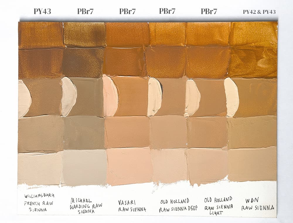
Finest Raw Siennas from the Past
More transparent, Deeper, and Warmer than Yellow Ochre
One of the antique sources mentions, "a yellow pigment with a more or less brownish red tinge in the solid and a more or less yellowish undertone. It differs from the best French yellow ocher by having a much deeper color, more than twice the tinting power..." That source has some specifics on how it differed in composition with less silica and more iron, along with a bit of manganese which also affected the color.
Raw Sienna Paints
Raw Sienna
These are listed as PBr7 Raw Siennas, however there are Raw Siennas in the PY43s as well
More PBr7s
Color names outside of the main four classifications
Several other names are found with some frequency among PBr7 paints.
Cassel Earth (Hue) or Van Dyke Brown (Hue). Names and pigment codes can get a bit fuzzy here, but it seems that the Van Dyke Brown labeled as PBr7 is probably a kind of umber that looks like Van Dyke brown. NBr8 is the pigment code for Van Dyke Brown (also sometimes called Cologne Earth or Cassel Earth, which may be a particular variety). Genuine Van Dyke Brown NBr8 contains lignites, and has some amount of vegetable matter (e.g. peat or decayed organic matter) which causes it to fade somewhat over time. We associate genuine Cassel Earth/ Van Dyke Brown with nearly neutral mixes with white. The genuine NBr8 we've tried was fairly gritty.
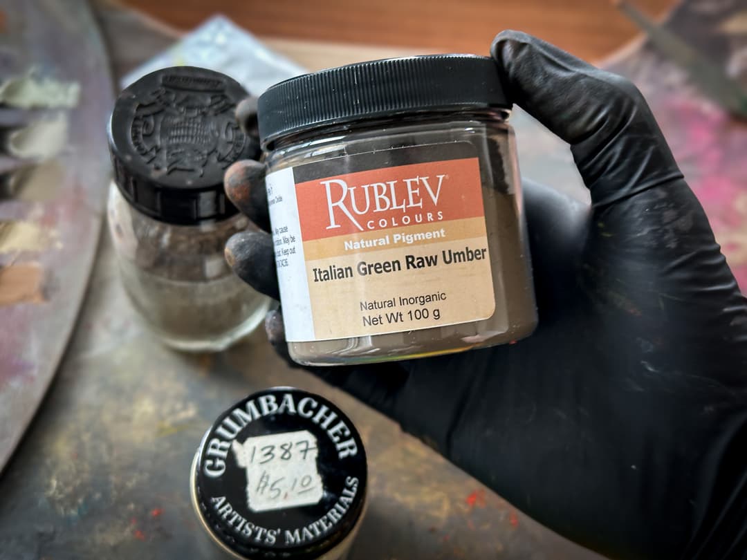
Green Umber or Raw Umber Cool. It's fairly common to find Raw Umbers that have a green leaning or a bias away from the warm oranges and reds. Natural Bohemian Green Earth, Italian Green Umber, Turkey Umber, or Cyprus Umber Green are some of the names associated with a cooler (or even more neutral) umber. Other green earths may be found under pigment codes PG23, Green Earth, or even under PY43, which is for the Yellow Earths.
Red Earth Old Holland, Vasari, and Williamsburg all offer a Red Earth paint that is PBr7. Other paint names include Cyprus Umber Red, Red Brown Vayk, and Sardinian Red Earth. For more red earths, check out pigment codes PR102 and PR101.
Brown Ochre and Brown Ochre Light Includes the Brown Umbers, and Italian Brown Ochres. We'd tend to associate them with more opacity but that's not always a given.
Green Umber pigment
Single-Pigment Van Dyck Browns PBr7
Sometimes this color is found as a blend. Here it's offered as a single pigment PBr7. It is unlikely that any of these are genuine Cassel Earth, as it has a different pigment code, NBr8.
Green Umbers
PBr7 has a wide color range. Sometimes greenish umbers have multiple pigments, however these are single-pigment PBr7s
Red Earths- PBr7
More red earths can be found under PR101 and PR102
Brown Ochre PBr7s
Other ochres show the wide variety within this pigment group from yellow earths to orange to violet.
Transparency and Drying Times
Transparency can vary quite a bit between the sub-variants of this pigment. Each of the traditional names has a bit of an unofficial cannon to it, though there are no formal rules about naming, so one Burnt Sienna may vary quite a bit from another Burnt Sienna by another paintmaker. In terms of transparency, Raw Umber and Raw Sienna are usually semi-transparent. Burnt Sienna is also fairly transparent, while some of the brown ochres can be quite opaque.
In oils, the drying time for PBr7 pigments ranges from fast to average. Some of the Umbers dry very quickly naturally (1-2 days) due to their natural manganese content, as manganese is a natural drier. To a lesser extent, iron is a bit of a drier as well. For other PBr7s, a dry time of 2-7 days is fairly typical. In oil paints, PBr7 tends to form good and somewhat flexible oil paint films. More on its lightfastness and toxicity can be found below.
Excellent Lightfastness
Natural Brown Iron Oxide, has excellent lightfastness-- generally thought to be among the most lightfast.
There was a really interesting quirk that turned up in Golden’s Lightfastness Testing in oils. We don't have a lot of information but one Raw Umber revealed a slight sensitivity to Flake White in linseed oil, though this may be particular to that exact pigment source.
In general PBr7 performed at the expected ASTM I. There are many forms and colors within PBr7 and we would expect them to perform at ASTM I as well.
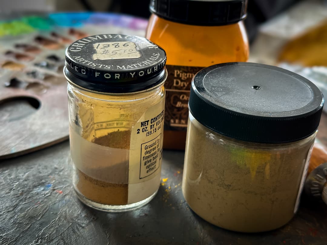
Natural Earth Tone Scarcity
While natural earth itself is not scarce, it seems that the commercial sources for it as a pigment with some consistency batch-to-batch are getting harder to find. Rumors have been going for years that it is getting harder for paintmakers to acquire reliable sources for natural earth tones, probably in part due to the control afforded by synthetic processes for most iron oxide pigments. Golden/Williamsburg recently announced the discontinuation of several natural earth colors. We happen to love natural earths precisely for their hard-to-emulate little quirks as well as the way that natural impurities soften the look of a color.
Discontinuations have rocked the paint industry lately and unfortunately the earth tones were affected. These changes as well as their context are discussed here. While these are yellow earths and not brown earths, we were so sad to learn that in the Williamsburg line, both Yellow Ochre and Raw Sienna were changing. A specific kind of red earth, a PR102 variety, was discontinued in 2024, and this triggered a discontinuation of Williamsburg's Spanish Earth and Red Ochre paints. According to the comments section on the article linked above, their specialty earths-- the French and Italian colors, which do contain some PBr7s-- may only last through 2025, so we are awaiting more information to see how long they will be available.
Something we loved about Williamsburg's natural earth tones is that they have a wide range of particle sizes. The individual character of each pigment was a lovely addition to the palette.
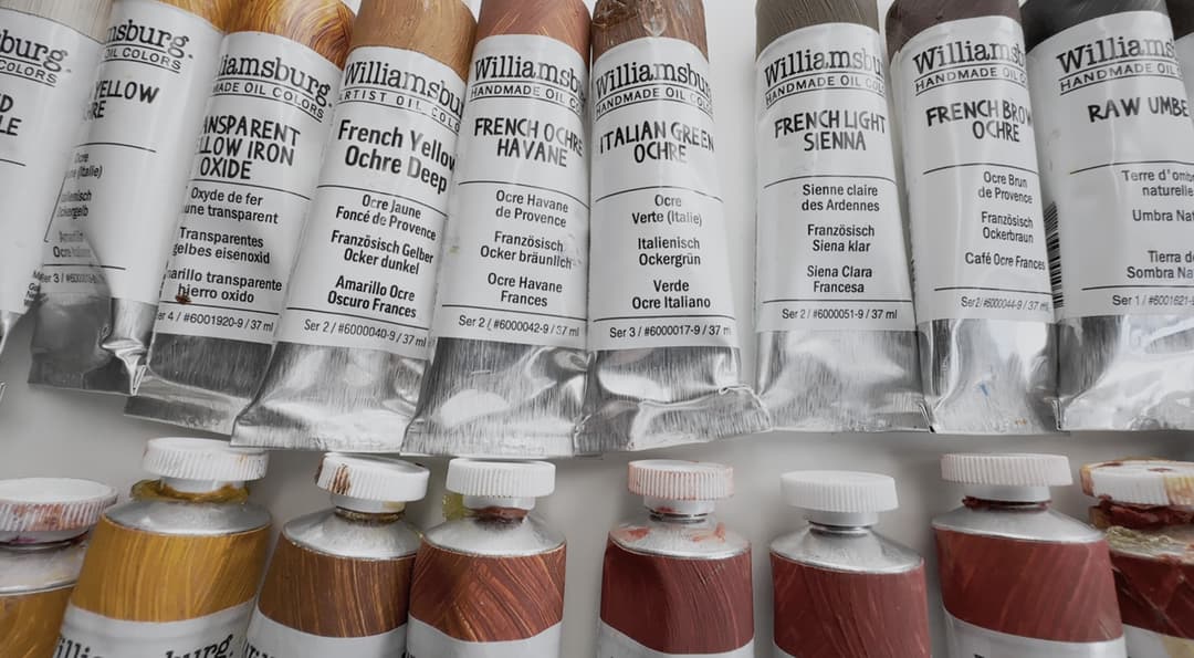
Several of the Williamsburg Earth Tones
Williamsburg Earth Tones
Pigment codes PR101, PR102, PY43, PY42, PBr6, and Pbk11 offer more to explore
Paints called French Earths
Rich in history, modern versions of these ochres sometimes have a bit more grit, though that is not always the case. French earths can be found under other pigment codes as well. Unfortunately the name French does not necessarily mean the pigment is from France.
Paints called Italian Earths
Some of the stars of art history, these earth tones are world-famous. They can be found under other pigment codes for earths as well.
Cyprus Earth Tones- PBr7
Some of our favorite umbers are from Cyprus.
Particle Sizes
May have a large range
Earth tones vary a lot in particle size. We've seen a few comments in old books on paint manufacturing that grittiness was not a desirable trait. Many modern paintmakers will spin grittyness as a positive feature and praise the "larger particle size" however we hear from a lot of painters that they do not like grit. So to each their own.
Years ago we attended a Williamsburg demo at an art supply store where they showed the varying levels of grittyness in their paints. We wish more brands would publish information about their particle sizes as well as charts to organize their colors. Williamsburg's chart may be found here. We actually wish they would add another level of categorization, as many of their natural earths (Italian, French) do have some audible grit to them.
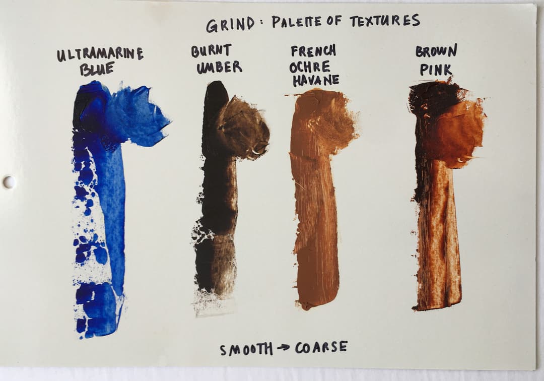
Levels of grittyness
Oil Requirements for PBr7
Every pigment, when made into oils, has a different oil requirement, which is an under-recognized facet of paintmaking. So when a paintmaker says they have "highly pigmented" paints, that is only relative to the pigment under discussion. Some pigments are very oily, and other pigments in the same color group are not as oily.
The oil requirements of a given pigment may be helpful to know if a person is painting in layers. For example, there are a few pigments, such as Burnt Umber, which one may wish to avoid using in an underpainting.
In oils, different Natural Brown Iron Oxide pigment samples within a pigment code may have different oil absorption amounts, but several categories of this pigment require quite a bit of oil to be made into a paint.
For some reason, this information can be rather hard to find. In his 1970 book, Mayer assigned a score to different paints for their oil content by volume. This seems to be missing from the 1991 edition. Even with the caveat that the volume is a range, there may be some helpful patterns to know when planning a painting, especially if a paint is inherently very oily. Natural Brown Iron Oxides vary considerably depending on the pigment sub-type, and this pigment code in particular has some cautions regarding high oil content. Speaking in generalities, here are some of the main types of PBr7 listed from lower to higher oil content by volume.
By volume, Raw Umber is a paint that tends to requires a lot of oil. A chart by Williamsburg shows a comparison. Mayer also categorizes it as high oil volume with a score of 103, and there is general agreement that it requires a lot of oil.
For Raw Sienna, Mayer assigns a high oil volume with a score of 118.
Burnt Sienna can vary from medium to very high as well, and has a broad range. So it's hard to say exactly, but in general it is oily. Mayer assigns a score of 129, which is higher than raw earths but lower than Burnt Umber.
Burnt Umber is very high for oil with a Mayer score of 136 (among the highest of the PBr7s).
Though it may sound confusing at first, oil content by volume is totally different than oil requirements by weight. It is more common to find figures listed by weight, which are more geared to the concerns of paintmakers instead of painters. For painters, volume ratios may be more helpful, even though that information can be hard to find. For figures by weight, refer to the entry for PBr7 in the Pigment Notebook for more details.
Wide variety in earth tones
Notes on Toxicity
Generally thought to be in the category of lesser concern, however may contain impurities. The Artist's Guide to Health and Safety has more information about health issues associated with pigments containing Iron and Manganese, and if there are other impurities the relevant sections need to be consulted. Please consult the proper health and safety experts, manufacturers SDS sheets and third party research. Monona Rossol's updated work can be found through her site. PBr7 may also contain manganese, and precautions are needed to handle its toxicity especially as a dry pigment. There may be other impurities that are not necessarily tested for as well. As with all pigments, do not breathe dust. Treat all pigments and paints with studio safety protocols.
More Earths to Explore
PBr7 Shares Borders with Other Pigment Codes
The lands between PBr7 and its adjacent pigment codes feel more like a gradient and less like a hard line.
For yellow earths, visit PY42 and PY43. For red earths, check out PR101 and PR102. For synthetic browns, refer to PBr6.
Happy Painting!
Resources
An abbreviated bibilography
PBr7 pigment data from David G. Myers, The Color of Art Pigment Database, Artiscreation.com
Elliott, Virgil. Traditional Oil Painting, Echo Point Books & Media, LLC, 2019
Spurgeon, Tad. Living Craft: A Painter's Process. Mt. Airy, Philadelphia, PA: Zoetrope, 2018. Newer version available here
Information about PBr7 from Bruce MacEvoy, Handprint Guide to Watercolors
Ambrose, Trevor (2023, September 24). ASTM Lightfastness Testing for Oil Paints. Just Paint, Golden Artist Colors
Mayer, Ralph. The Artist's Handbook of Materials and Techniques, 5th ed. New York, NY, Penguin Group, 1991
Uebele, Charles L.. Paint making and color grinding; a practical treatise for paint manufacturers and factory managers, including comprehensive information regarding factory arrangement; pigments; vehicles and thinners; liquid and cold water paints as well as practical working formulas and recipes. New York, The Painters magazine, 1913. Internet Archive.