Are all phthalo greens the same? Do you really need this green color of oil paint? And is there actually a difference between premium brands?
All this and more.

Rich with Mystery and Mystique, The Best Phthalo Blue Greens Do Yield Some Surprises
Are all phthalo greens the same? Do you really need this green color of oil paint? And is there actually a difference between premium brands?
All this and more.
Phthalo Greens Come in Two Color Categories
When it comes to phthalos, there are two: this one, PG7, aka Phthalo Green Blue Shade, which is the blue-green shade, and the more leaf green hue named PG36.
This shimmering deep blue-green shade unleashes a chromatic range of beryl and aquamarine in glazes or in tints with titanium white.
As already mentioned, the single pigment paints for the two phthalo greens are called Phthalo Green Yellow Shade - PG36 and Phthalo Green Blue Shade - PG7. Both of them are helpful for hitting different colors of the rainbow at their highest chromas.
They are also useful in complementary color mixing. These colors will pull back Cadmium Reds (PR108), various magentas, and whole lot of other crimsons. They do this so well that they are often ingredients in chromatic black mixtures. For the sake of thoroughness, even though PG36 isn't the focus of this article, it is the phthalo green of choice in Gamblin's Chromatic Black.
And it should go without saying that these are ingredients in a huge array of convenience greens. A quick look through the convenience greens where this pigment appears will reveal just how broadly it's used in mixes. Though of course their presence of PG7 your paintbox is by no means mandatory, with this green at your fingertips you can expand you palette's gamut.

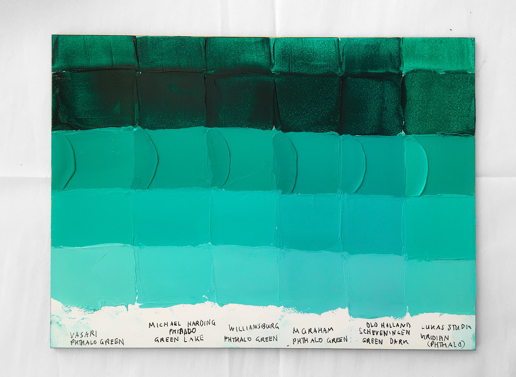
Phthalo Green PG7 paint comparisons by a variety of paintmakers. All of these Phthalo Greens come from brands, except for the one on the right, which shows a student brand Phthalo Green.
With the pigment name PG7, this green leans bluer. Discover single-pigment versions of this paint
Transparent, Chromatic, Popular
In this article we're talking about Phthalo Green Blue Shade, known by the pigment PG7. The blue-green phthalo green pigment is a necessary addition to many teal mixes as well as forest greens, as well as some sap greens. It’s worth exploring the many dimensions and uses for this color.
Naturally transparent and highly chromatic, Phthalo Green blue shade is a palette staple which is found widely in both premium and student brands.
There was a time when we used to paint without either one of the phthalo greens, and for certain palettes the single-pigment greens are not strictly necessary. However, this green-- Phthalo Green Blue Shade--is a useful color on an oil painter's palette for many reasons, not least of which is hitting the highest chroma mixes for blue greens and teals.
In this article we're talking about Phthalo Green Blue Shade, known by the pigment PG7. The blue-green phthalo green pigment is a necessary addition to many teal mixes as well as forest greens, as well as some sap greens.

A Handful of Premium Phthalo Green Blue Shades from Premium Paintmakers and One Student Brand
Five Premium Brands and One Student Brand of Phthalo Green, PG7
Premium Brand Surprises
We were totally surprised to see differences among premium brands, as we initially thought there would not be much variety in this color when it came to oil paints. The highest tinting strength was found in M Graham Phthalo Green. Among premium brands there were differences in hue.
Since PG7 is one pigment where a person might not find enormous differences between student and premium brands (or so the oil painter’s lore goes) we included a student brand. The other reason for this is that sometimes painters say they even prefer the student brand. We were shocked to see that the student brand did not have the same depth of value, nor did it have the same hue. More testing is needed to see if this was just true of the Lukas Studio version or if there are broader patterns to be found here which would apply to other student brands as well. The Lukas Studio Viridian (Phthalo) was lighter in masstone, lighter when mixed Oleogel, and more emerald (yellower as opposed to bluer) in tints. Here we will say warmer to mean closer to yellow and cooler to mean closer to blue. None of these paints get as warm as the other Phthalo Green Yellow Shade, PG36. On a similar note, none of the phthalo greens tested here got anywhere near as blue as a as Phthalo Turquoise or anywhere close to a full blue like Phthalo Blue PB15:3.

Phthalo Green Blue shade across brands. The student brand, Lukas Studio, is on the left and has less depth in masstone
Depending on Place and Date of Manufacture, Phthalos May Have Toxicity Issues
Just a two second public service announcement while we're here. We're no toxicology experts (we're artists) so we always remind you that we don't make notes on all the toxicities there are to keep track of, but this one is a weird one that took us by surprise. Now is as good a time as any to mention it. Older phthalos (pre 1980s) were manufactured differently and can have toxins called PCBs. They can also be in modern ones depending on where the pigment was made, and you'll have to ask the brand about that. Look it up, check it out, research it. One time we got really into this and wrote manufacturers, because phthalos can still contain these if they are manufactured in places that don't have regulations, like China. So here's just a heads up on that. That applies to all the phthalo colors, not just this kind of green.

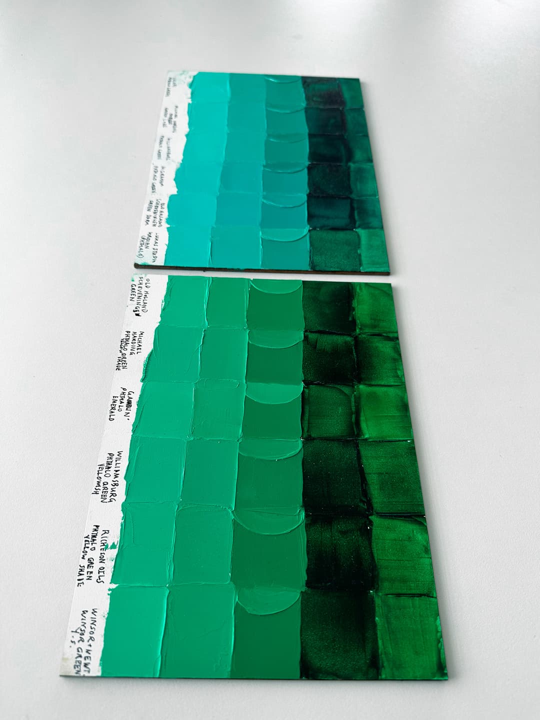
A closeup showing the glazes made with various Phthalo Greens across brands. The student brand, Lukas, is in the foreground.
The PG7s on the Panel That Were Bluest
Ok, so with the caveat that these all of these are basically the same color of dark green, we were totally surprised to see that there was indeed a little bit of hue variation among premium brands.
This pigment is thought to be fairly uniform in color appearance, and while this is sort of true, differences emerged. The Vasari Phthalo Green, Michael Harding Phthalo Green Lake and Williamsburg Phthalo Green were all greener toward yellow (as well as the Lukas Studio), while the M Graham Phthalo Green and the Old Holland Scheveningen Green Dark were definitely more blue leaning. This could be useful if mixing high chroma teals or if a bluer version of PG7 is desired.
Interestingly there was also a bit of variation in chroma, though this could have been a function of high pigmentation. The Williamsburg Phthalo Green initially looked lower chroma, however it’s hard to say if that is really the case. The Vasari Phthalo Green seemed the highest in chroma among the warmer shades. The biggest difference besides the hue shift is the working consistency of the paint.

A closeup of phthalo greens in premium and mid-tier brands starting with Vasari. Includes Michael Harding, Williamsburg, M Graham.
On the panel, these were the two that leaned a bit blue in color
Of the paints on the panel, these were the greener blue-greens
Some Phthalo Greens PG7 Tinted Greener/Warmer
To compare these paints we tinted them out with Williamsburg Titanium White. The semi-circle regions show what the paint looked like when tinted 1:1 with white. The samples were prepared on Ampersand Gessobord panel, and the glazes were made with a bit of Rublev Oleogel.
The Vasari Phthalo Green, Michael Harding Phthalo Green Lake and Williamsburg Phthalo Green are similar at a glance as warmer versions of this pigment. The M Graham Phthalo Green and the Old Holland Scheveningen Green Dark were bluer greens.
The M Graham is the strongest tinter and is made of walnut oil. We tested a student brand as well (Lukas) since some painters use student brands in this pigment. The student brand, Lukas studio, as not quite as deep in value and was also the least blue-leaning.

Subtle differences in tinting temperature. These are extremely difficult to photograph, however these show the blueness or greenness of the samples
Munsell Hue Pages for PG7 and PG36 Varieties
The blue green versions of Phthalo Green Blue Shade in oil paint tend to be around 2.5BG while the yellower versions of Phthalo Green Yellow Shade tend to be closer to 5G.

The difference between phthalo green blue shade PG7 (our featured panel) and phthalo green yellow shade, PG36
These colors differed a little bit in hue with M Graham and Old Holland Scheveningen Green Dark as showing up a bit more blue. The M Graham was a powerful tinter. The Lukas Studio was a different overall color in masstone and when spread thinly.
Phthalo Green, PG7. There were subtle differences in hue along with difference in consistency.
Discover single-pigment phthalo green paints across brands
