
Williamsburg Oil Paint Review
With a Stunning Rainbow of Single-Pigment Paints, this Paintmaker Has Led the Way in Oil Paint Testing
Featured Paints
Do you need a truly neutral grey? Is your favorite color going to fade? And are Williamsburg's earths actually gritty?
All this and more!
Williamsburg Paint Review
Soft-impasto, highly-pigmented paint with a variety of consistencies, plus world-class research
A Rainbow of Single-Pigment Colors
Neutral Greys, Linseed and Safflower Versions, and Earth Tones Galore
In addition to having a wide range of high-tinting single-pigment colors, Williamsburg actually does what we feel every paint company should do-- which is test their paints. Williamsburg, which is owned by Golden, has been leading the way for years in oil paint research and most recently brought the painting world some groundbreaking news in terms of lightfastness testing. Golden has been instrumental in the development of a new lightfastness standard (in concert with several other paint companies, such as Natural Pigments). They make their paint in upstate New York, USA.
In this article we'll take a look at the consistencies of these paints, the huge amount of single-pigment colors they offer, the Safflower line, the Neutral Greys-- and what it takes to mix your own!-- as well as their earths. Then we'll take a look at some highlights from each color family. We'll also take a look at their formulation changes as well as their incredibly valuable research on zinc white and also on lightfastness.
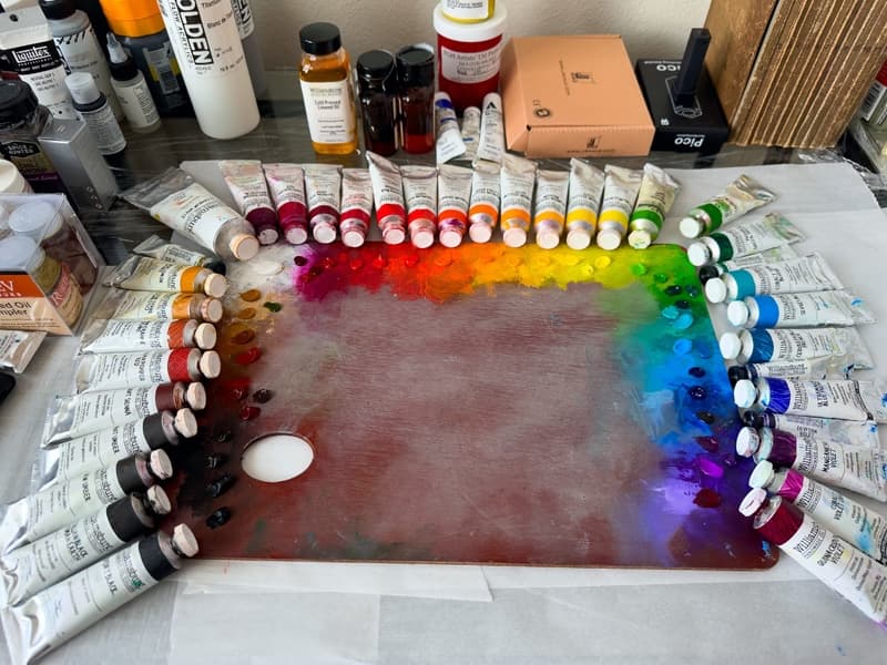
Williamsburg, as Golden's oil paint brand, deserves special mention for its dedication to testing.
Working with Williamsburg in Large Quantities
Standout chroma and some viscosity revelations
While many of these colors were longstanding staples of my palette, in 2020-2021 I got to know a few of their colors in a different capacity thorough working with them in large quantities. I undertook a massive color mixing project which involved matching and tubing over 1000 mixtures in order to study a historical color theory. Though I had been painting with Williamsburg in realistic work for a long time, I got to know the paint differently through this project. There were a few standout high chromas in the Williamsburg cadmium yellows. Working with the paint sans oil or medium I noticed just how stiff the Permanent Alizarin Crimson could be as well as a few other colors. This is something I would likely have not noticed on the palette, because their colors respond so well to a minuscule drop of oil. Overall I appreciated how pigment-rich these colors can be.
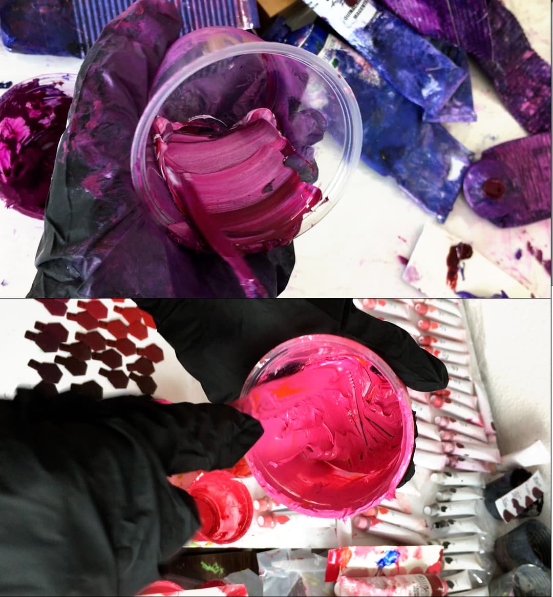
Stills from a large color-mixing project I undertook in 2020-2021. Williamsburg paints had first-class chroma. A few had a stiff impasto consistency (the kind that is intentional) as I was not adding oil nor medium. Williamsburg colors vary in consistency depending on the pigment. All of the colors felt richly tinting.
Groundbreaking Information from Golden on Mixing Whites
White paint vareity may affect lightfastness
This is just quick mention about Golden's recent testing. For context, I serve on the ASTM subcommittee for artist materials (all opinions here are my own), which is currently revising its standards for lightfastness testing. The current understanding of most artists and educators is in fact outdated- what I mean by "current" refers to the older lightfastness understanding from 40 years ago, which is the basis for many manufacturer's ratings. If you look on a tube, for example, you may see some rating for lightfastness which derive from the older testing methods. Since the tables were established, many things have changed- the way the pigments are manufactured has affected the lightfastness of some of them, and also these ratings can vary from manufacturer to manufacturer or (I have even heard) from batch to batch with some particularly problematic pigments. Not all pigments are equally affected.
Also, a new understanding has emerged that has to do with the choice of mixing whites. The particular white blend prescribed by the older test method contained zinc, and the precise blend of ingredients seems to have affected the lightfastness ratings. It turns out each tube of paint is a world unto itself and needs to be tested by the manufacturer, at least in my opinion, as undisclosed fillers and additives may also sometimes affect it's precise lightfastness performance (research on this is preliminary and not yet fully known). So far, at the time of this writing, the only manufacturer to my knowledge who has tested all or of most of their paint line is Williamsburg. (Natural Pigments / Rublev has also published testing on two of their colors).
Golden recently released a cutting-edge study on oil paints and choice of mixing whites. It turns out lightfastness is more complicated than was once thought, and it will give painters and conservationists much to consider. In short, the choice of mixing white matters for some pigments! Testing one's own paints may be especially important if some of your favorite pigments show unexpected behavior based on Golden's research. More on this below.
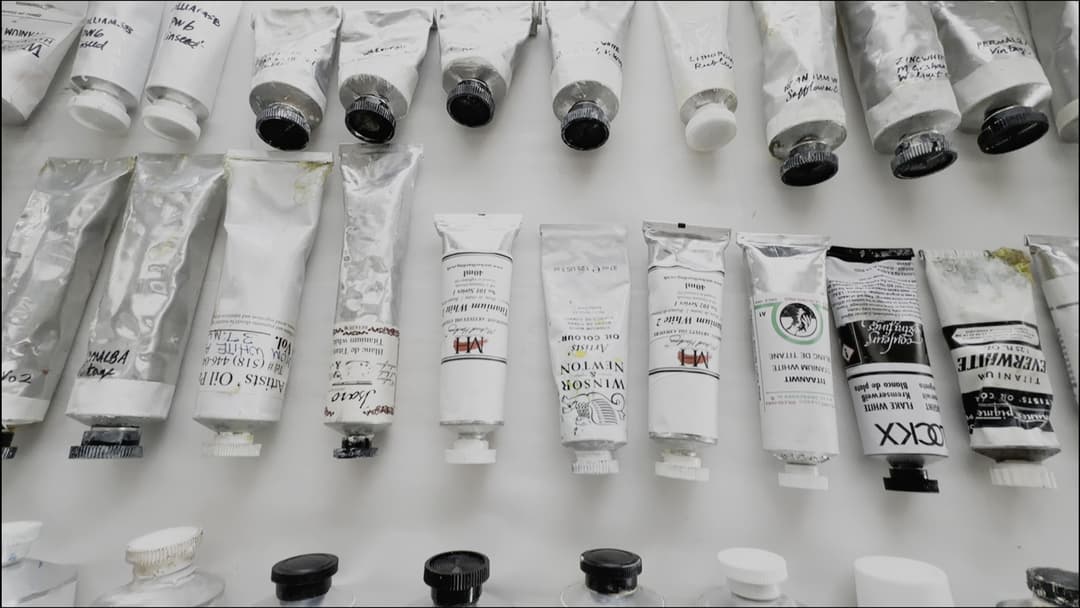
The choice of mixing white (pigment and also possibly binding oil) may affect the lightfastness of other paints. See Golden's research for more.
Highly Pigmented, Workable Impasto
Variety is the rule but many paints are fairly soft and workable
Every brand has a character to their paints, and with Williamsburg there is a lot of variety. However, despite the wide range of consistencies (letting each pigment shine through) overall when we think of this brand, many paints have a certain kind of soft impasto-- but not in every color. Speaking of impasto, Williamsburg has some tips on best practices to share when working with oils in impasto. Back to consistency, when making generalizations, bear in mind we haven't tried every single color, but we have worked with a lot of them. In general terms only, their colors (for example, Cadmiums) were less stiff than many Gamblin colors, while still having an impasto quality. It's hard to describe impasto, but this will tend to pull off into a peak in many (but not all) colors.
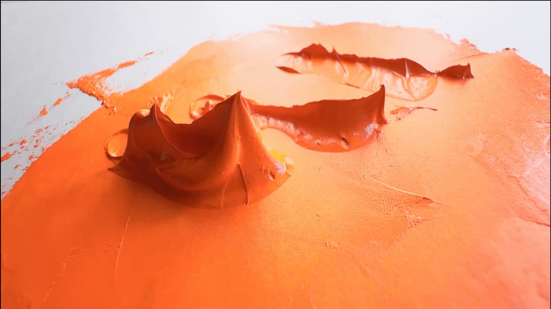
Dollops of Williamsburg's Cadmium Orange create soft, sculpted peaks when pulled up with the palette knife
Multiple Working Consistencies
Different experiences from Color to Color
Some people prefer homogeneity in their paints, and each paintmaker decides how much they want to formulate the paint toward that goal. With Williamsburg we noticed a great variety from pigment to pigment, which we find enjoyable, but that is not everyone's preference. We tend to appreciate the diversity in consistencies that can be found in some of the areas of the Williamsburg line. They also have a huge range of fineness to coarseness and even have a handy chart found here to help artists find the right paint. While many paints tend toward the soft impasto, like the cadmiums, there are some which are quite ropey, such as this French Ultramarine in Safflower Oil.
A consistency we noticed a lot was a soft, workable impasto. Speaking in generalities only we found it to be more workable than a few other impasto brands-- and it was amazing how we could draw the paint into ribbons. Also there was a bit of a tendency for soft points to form, even when moving the paint to and fro with a palette knife.
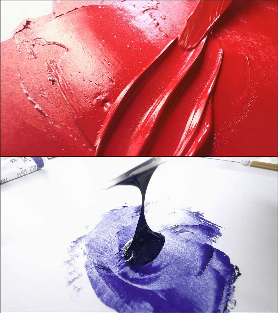
Variety in working properties. Williamsburg Cadmium Red Medium's workable, sculptural consistency contrasts with the ropey SF Ultramarine Blue French in Safflower oil.
A Soft Impasto
From peaks to ribbons
In every brand the white paints are important as they get mixed into the other colors. Williamsburg's Titanium White in Linseed Oil has body, and an almost roundness to the way it coheres to itself. This is our mixing white that we use on the Paint List. The Sevres Blue, which contains Titanium White was also fairly willing to stretch into ribbons. These are easy-to-work-with paints that are highly pigmented.
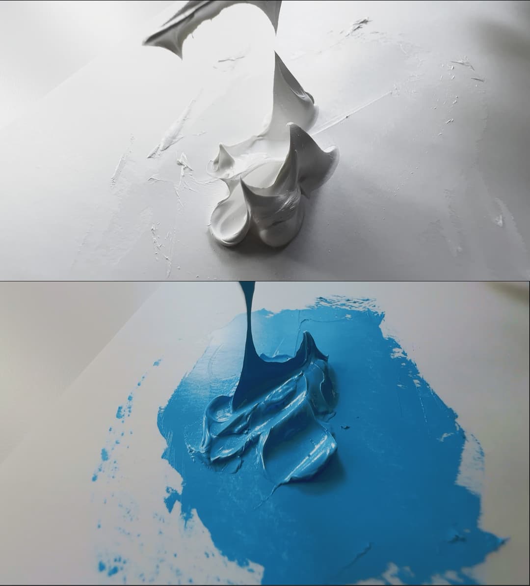
Several colors show hints of a longer paint behavior, such as Sevres Blue, while still having a sculptural quality. The Williamsburg Titanium White in linseed oil almost looks like frosting (but don't eat it).
A Short Impasto
Some colors have a compact crispness
Some Williamsburg colors have a short, rather compact impasto, in contrast to the colors which are both impasto and ropey. This short impasto is what we'd tend to expect from Dioxazine Violet as well as the Phthalos. It is amazing how much variety can be found within the Williamsburg line. While the soft impasto and a bit of ropeyness is more common, we wanted to prepare you for some stiffer colors, too. PR177 (not shown here) is also a very stiff paint.
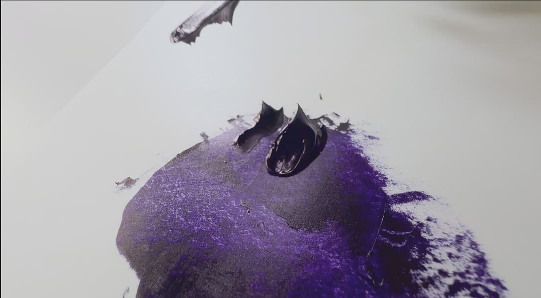
Dioxazine Violet forms shorter, pointy peaks with a crisp edge
Generously Pigmented, Easy to Thin with Oil
A versatile paint
The impasto quality is easily melted with a tiny drop of oil, and we mean tiny! (See the video above). With other brands that have the impasto quality, it sometimes feels like some impasto paints major on the sculptural quality which can take some effort to overcome. Williamsburg colors tend to be very easy to modify, which makes them versatile. It is easy to thin this paint with oil. It's highly pigmented, so the resulting consistency is satisfying for a variety of applications including realistic work.
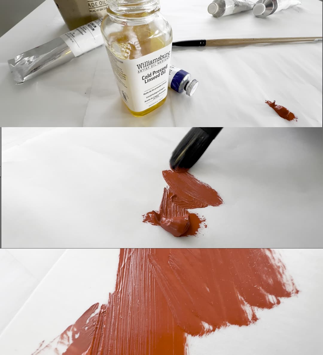
The tiniest drop of oil transforms an impasto paint into a highly-pigmented, easy to spread color which still holds a brushmark
Varied Textures, Even in Quinacridones
A Few Consistency Surprises
A couple of paint brands have fairly consistent treatments of the modern pigments like Quinacridones, Dioxazines, and Phthalos. This is a place where Williamsburg diverges from the pack now and then, and we found a surprising texture to their Quinacridone Magenta. It feels fairly rare to find nay visible texture in a Quinacridone Magenta, and it also had a pleasant way that it almost tore when pulled up by a palette knife. This color also was the coolest-hued/purplest-leaning Quinacridone Magenta we've tested.
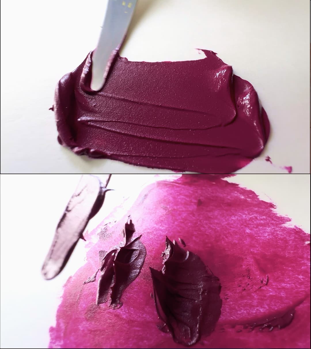
A very slight texture can be seen in the paint here, which is actually quite pleasant to work with. The way this paint tears when pulled up by the palette knife is craggy but soft-- it differs a bit from Dioxazine Violet.
Potent Single Pigment Colors
A Marvelous Array of High-Quality Paints
When we take a look at a manufacturer, for example when looking through their brochure of colors or searching Williamsburg on the Paint List, certain things stand out. With Williamsburg, it's the large range of single-pigment colors. There are a few other highlights, such as the Safflower Color series, the Neutrals, and the wide selection of natural earths, but it is really the dedication to making a huge diversity of single-pigment paints that first won us over with this paintmaker.
Where many brands will just have one variety of cobalt teal, Williamsburg has two. And that's not even counting the cobalt turquoises and the genuine ceruleans. They also have a broad range of genuine cadmiums and the other inorganic colors we'd hope to see (such as two cobalt violets-- though PV49, which they used in their Cobalt Violet Light, is sadly disappearing from the wider pigment world). We also like to see genuine manganese violet as well as a good viridian, which they have. Some of their colors, like PY150, are hard to find in other brands.
In addition to the full palette of regular colors, some interesting colors include Carl's Crimson, PR187, Perylene Crimson, PR179, Green Gold, PY129, the dynamic Nickel Azo Yellow, and the recently (sadly!) extinct Cobalt Violet Light PV49 and the now-lost Ultramarine Pink.
They also have a huge range of natural earths. In addition to these, they also have a range of interesting and hard-to-find single-pigment greys, including French Ardoise Grey, PBk19.
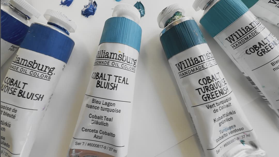
No two cobalts feel exactly alike. It looks to us like this paintmaker celebrates the nuance of color by giving each one its moment. These allow you to fine-tune certain palettes. They have not one but two cobalt teals, and two cobalt turquoises in addition to their genuine ceruleans and cobalt blues.
Interesting Single-Pigment Colors from Williamsburg
A heads up, a few of these colors were recently discontinued so they may be in short supply or even unavailable (see below). A few of these colors are earths that may be gritty.
Safflower Oil Color Line
Paints that give you the power to choose
In 2014, Williamsburg welcomed a whole new series of colors in Safflower oil.
The Williamsburg Safflower range of colors are a selection of duplicate colors from their regular linseed oil line, which have been made in safflower oil instead of linseed oil, so you can choose which binder you'd like to use. There were a handful of colors where they identified that safflower oil had an advantage, which is why there are not safflower versions of everything. The safflower line gives serious artists the power to select their binding oil for colors that may benefit from being made in safflower. (Safflower oil also has drawbacks, so it's helpful to know where the benefits will outweigh the potential issues that safflower oil can bring). Many other blends will just add safflower oil to their linseed oil paints, and we appreciate that Williamsburg separates the two. Linseed oil is associated with stronger paint films, and may be better to use in lower layers of the painting. Williamsburg also published some best practices for when to use safflower oil-- if at all-- mostly it is recommended to only use safflower-based paints thinly and and in the uppermost layer of the painting.
It's fairly common for a paint line to have a Linseed Oil and a Safflower Oil version of their Titanium White. Williamsburg offers both of these, as well as a handful of other colors. The two colors handle differently, with the Linseed Oil Version having more heft to it, while the Safflower Oil is light and fluffy with less of a crisp impasto. A discussion of the full range of Williamsburg Whites can be found here at Just Paint.
Browse the Williamsburg Safflower Colors on Paint List Please note some of the safflower colors were discontinued due to zinc white's removal from their line, and several others were affected by the 2023 pigment discontinuations that recently rocked the industry (more information on that below).
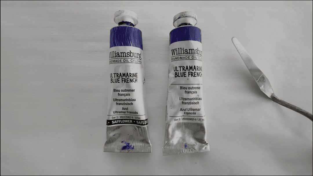
Two versions of the same paint-- one in Linseed Oil, the other in Safflower Oil
Safflower Oil Colors
Oils have different different working properties. These were the colors Williamsburg added to their line in Safflower Oil, which are the same colors as a few from their Linseed oil line.
The Truly Neutral Greys
These Munsell neutrals arose from the needs of painters
These greys arose from the needs of realistic painters. Once upon a time, the Rational Painting Forum expressed their wish for truly neutral greys which were calibrated to Munsell. It is surprising how difficult it can be to mix a truly neutral grey (more on this below). If one mixes black with white the result is too cool-- not truly neutral, and one needs warmer pigments to help steer the mix toward neutrality. Williamsburg answered the call to make carefully-balanced color blends that are actually neutral. Please note as an aside that the tubes shown here do not come pre-painted around the top. We do that to our tubes because it helps to find the right grey quickly. These are a colors we use a lot.
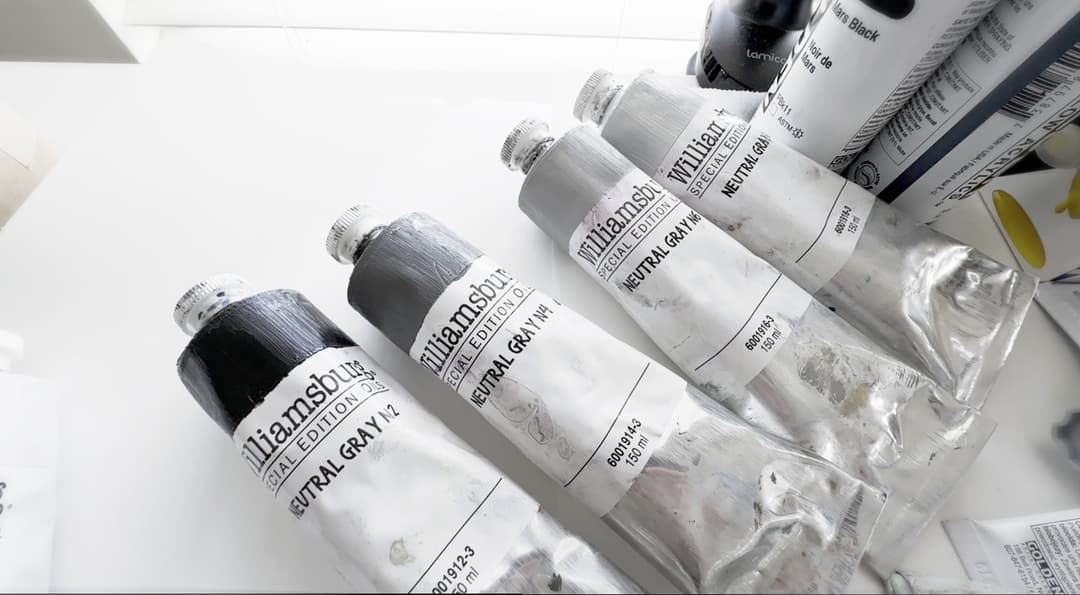
Carefully color-balanced blends hit Munsell N2, N4, N6 and N8 and make the core of the grey scale
High-performance Colors to Match Munsell
With these four colors (plus white and black) it's easy to create a perfect 20-step grey scale
These greys have been put through their paces! They are exceptionally useful for underpaintings and for judging values. The greys, which come in four steps-- N2, N4, N6 and N8, correlate to those values in a Munsell Grey scale. If using a grey scale is part of your work, these colors in oil are excellent (they also make them in acrylic --they actually offer more steps of the value scale premade in acrylic, which are very handy). The Neutral Greys can be used to quickly mix a 20-step grey scale of colors.
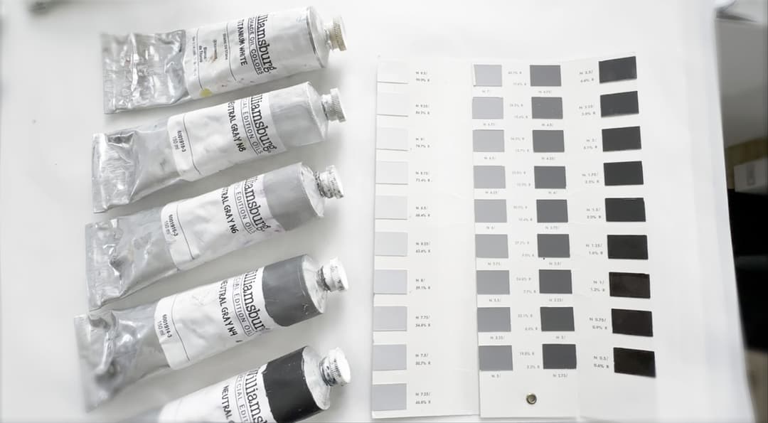
There's something enchanting about balanced greys. Here are the Williamsburg Munsell neutrals with a vintage Munsell greyscale set
Williamsburg Munsell Neutrals in Oils
Color-calibrated greys that are perfectly neutral
True Neutrals are... Invaluable
Painter's Notes
Each of these greys vary a bit in consistency due to the differences in their pigment content. N8, which is the lightest, is useful for establishing the value of the sky in landscape as well as for spacious vistas in more abstracted work. It is useful to have N8 on hand for bracketing mixes for value 9, which can be somewhat hard to judge, and Williamsburg published an article on how to mix it quickly, which is appreciated. Value N6 is a helpful way to pin down the midtones, which can be difficult to sort out, and value N4 establishes the low middle of the the scale. N4 is capable of a pretty detailed impasto. Both N4 and N2 dry fairly quickly. N2 is ropey and glossy when wet. Similar to N8 but on the other end of the spectrum, N2 is helpful for establishing value differences in the darks.
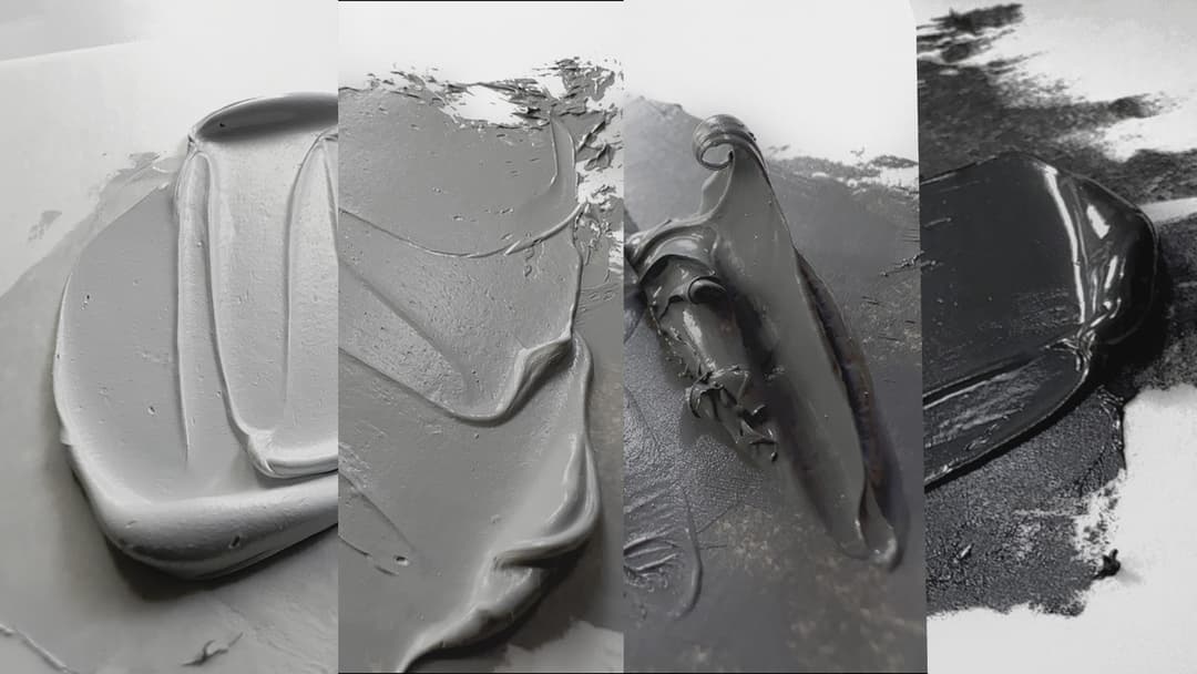
The Munsell Neutral Greys differ a bit in consistency. The glory of these greys is the exacting nature of their masstone color
The Task of Making One's Own True Neutrals
It takes a balancing act
It actually takes a handful of pigments to mix true neutrals in oil paint and there are many combinations which would yield satisfactory results. It's incredibly surprising how much work it is to make a series of balanced, color-calibrated neutral greys-- we know because we have done it a few times. The mixing curves for various pigments with white will send the mix spiraling off gracefully toward warm or cool, and so small additions of other pigments are needed at every step of the way in order to balance the mixes. Here are just a few colors I grabbed at random (many different earth tones would do) which can be used for neutral mixes. Just about any burnt umber, yellow ochre, raw umber, and black pigment with white (as well as other pigments, too) can be used in the balancing act to get the neutrals right. Here, for example, the Rublev and Michael Harding Raw Umbers were quite similar when mixed with Williamsburg Titanium White.
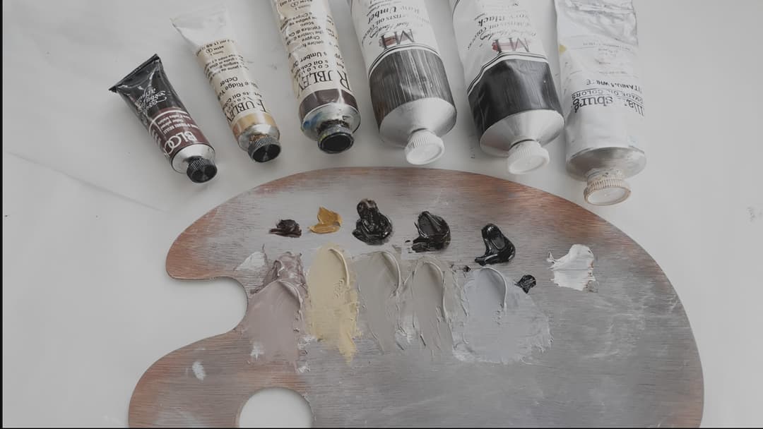
It takes a couple of colors to get pure grey. Here is a randomly-selected grouping of earths (plus black and white) in an off-the-cuff mixing session to create a neutral grey look-alike. Not all of the paints were needed- Michael Harding's Raw Umber and this particular Umber from Rublev created similar mixtures. There are many possible combinations.
Mixing and tubing Munsell Greys by Hand
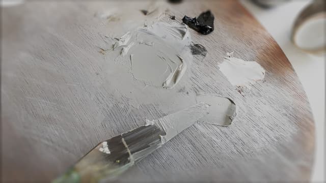
The process for mixing true neutrals gives one an appreciation for them. A variety of pigments were used to mix true grey (on the palette knife) held up against a Munsell Grey from Williamsburg. The task of tubing a quantity of balanced grey adds yet another level of work.
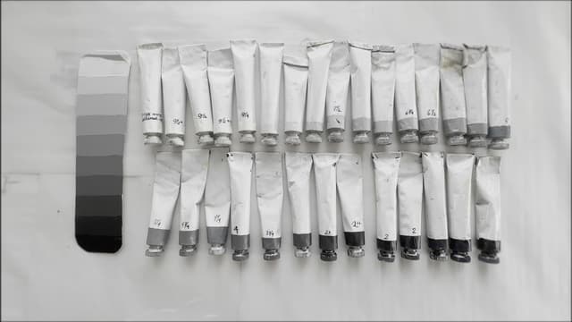
Ideas for pigments one could use to mix and tube true neutrals by hand
Here are a few of the paints that could be used to mix one's own neutrals. There are many ways to mix true neutrals. Many different brands and varieties of earth tones (or other colors) could be used. Earth tones are an easier way to get there and are often one of the less expensive routes. Multiple brands are provided as these are offered for inspiration.
The Task of Tubing One's Own Neutral Greys
Weighing out whether to mix one's own
Ok, in terms of benefits and drawbacks there are a couple each way. I have done the work to mix and tube Munsell greys before purchasing the set from Williamsburg and have since gone through several sets of the large tubes. The project is a valuable exercise that I would wholeheartedly recommend. After doing this exercise several times though, I prefer to buy the Williamsburg greys because the work is already done, and even if I tube them myself, I have to buy the ingredient paints. I may as well buy the paint already blended up as it is a huge timesaver. The only drawback to buying them premixed that I can think of is that some painters may prefer lead over titanium or alternatively may not like the choice of the black pigment (PBk6), and may prefer to use Mars instead. In that case tubing one's own does give more control over the mix. It is also worth mentioning that if one is doing one's own mixes, the Williamsburg Italian Black Roman Earth is an earth tone that gets a person closer to neutrality than most other black pigments.
A sample image of what it can look like to mix and tube one's own neutral greys. I've done the tubing process twice (once from scratch and another time with the WB greys as starting points for 2,4,6, and 8).
Williamsburg Earths
This might actually be the Secret of the Old Masters
The Williamsburg Earth series contains some rare specialty earths that are very difficult to find in other brands. Williamsburg carries the solid old-standby colors which form the core earth lineup of the palette. We've long favored their Yellow Ochre Domestic as a daily driver, which has only a very faint bit of grit. However when we tried their Lemon Ochres we had visions of Renaissance Manuscripts- if you don't mind grit, try the similar but related Italian Lemon Ochre and Italian Yellow Ochre. The French and Italian earths are gorgeous but gritty natural earth colors. You can find a brief description of many of their earth tones on Just Paint.
The French and Italian series of Williamsburg paints are what we'd identify as specialty colors. Not everyone likes gritty earths, however, it's worth mentioning that this is perhaps actually one of the secrets of the Old Masters. The Old Masters would have been well acquainted with every kind of pigment particle size and how and where to use them to their greatest effect.
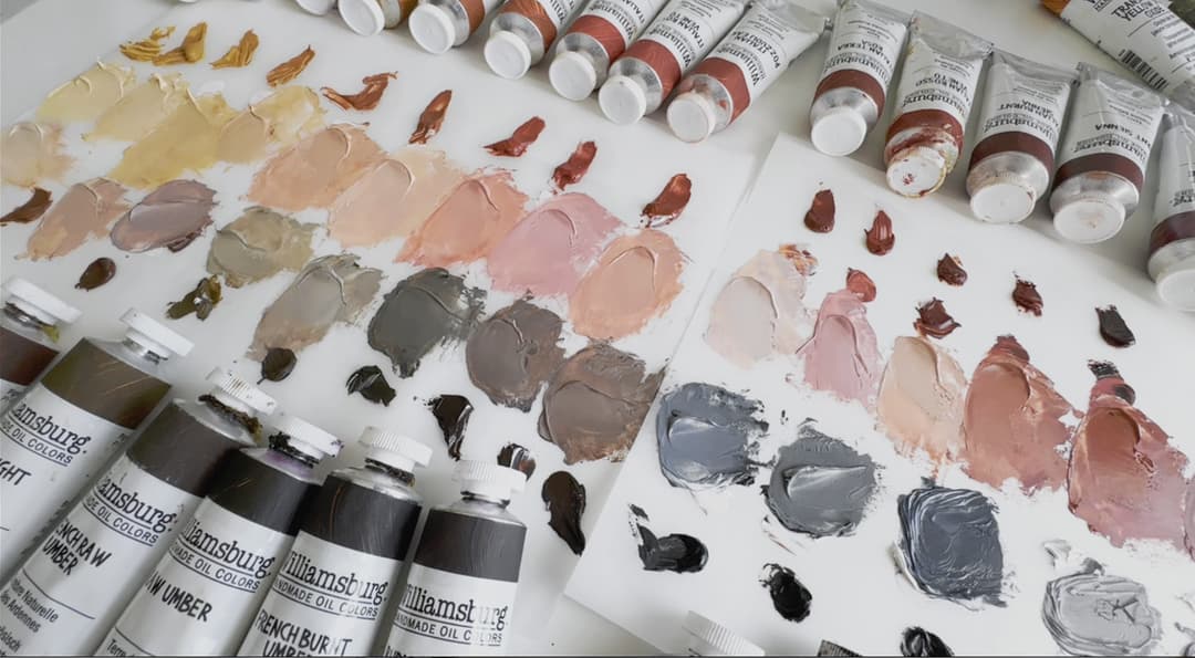
For realistic painters there's so much one can do with these colors, from gold to terra-cotta-red to pink to black with a lot of colors in between like greeny browns and deep plums. These seem most well-suited to those who are open to painting with a variety of textures
A Mini Primer on Earths
Some patterns can be found in these three paints
We may do a deep dive on the Williamsburg earths, because there is more to say than we can cover in one article. In general, as long-time painters know well, there is a ton of variety within each pigment group (e.g. PY43 and PY42, the codes for yellow iron oxides).
Three Colors that Typify some Patterns Within Earths
As with most things in life, there are too many exceptions to make generalizations so one would do well to avoid hard and fast rules. Rather they are cloudy amorphous rules that still might be helpful. So instead of making a rule let's look at three paints. All are hydrated ferric oxide (iron oxide), one is synthetic and two are naturally derived (which can still have a little synthetic in them it turns out).
These three paints have totally different properties. The Transparent Yellow Iron Oxide is what is shown on the palette knife tip, and comes out of the tube at a very low lightness. However, when spread thinly, as it is on the paint tube, it is vibrant and has high chroma. The Yellow Ochre Domestic is a bit more opaque and mid-valued, with a totally different masstone appearance than the synthetic Transparent Yellow Iron Oxide. Yellow Ochre Domestic has a good tinting strength for a yellow ochre and a slightly different hue than Transparent Yellow Iron Oxide when mixed with white, as well as the faintest touch of grit. The Italian Lemon Ochre is a stunning natural earth with noticeable grit, a soft feel when worked with the palette knife, and a large particle size. It is a gentle tinter but has quite high chroma in masstone. It is also in the middle zone for lightness.
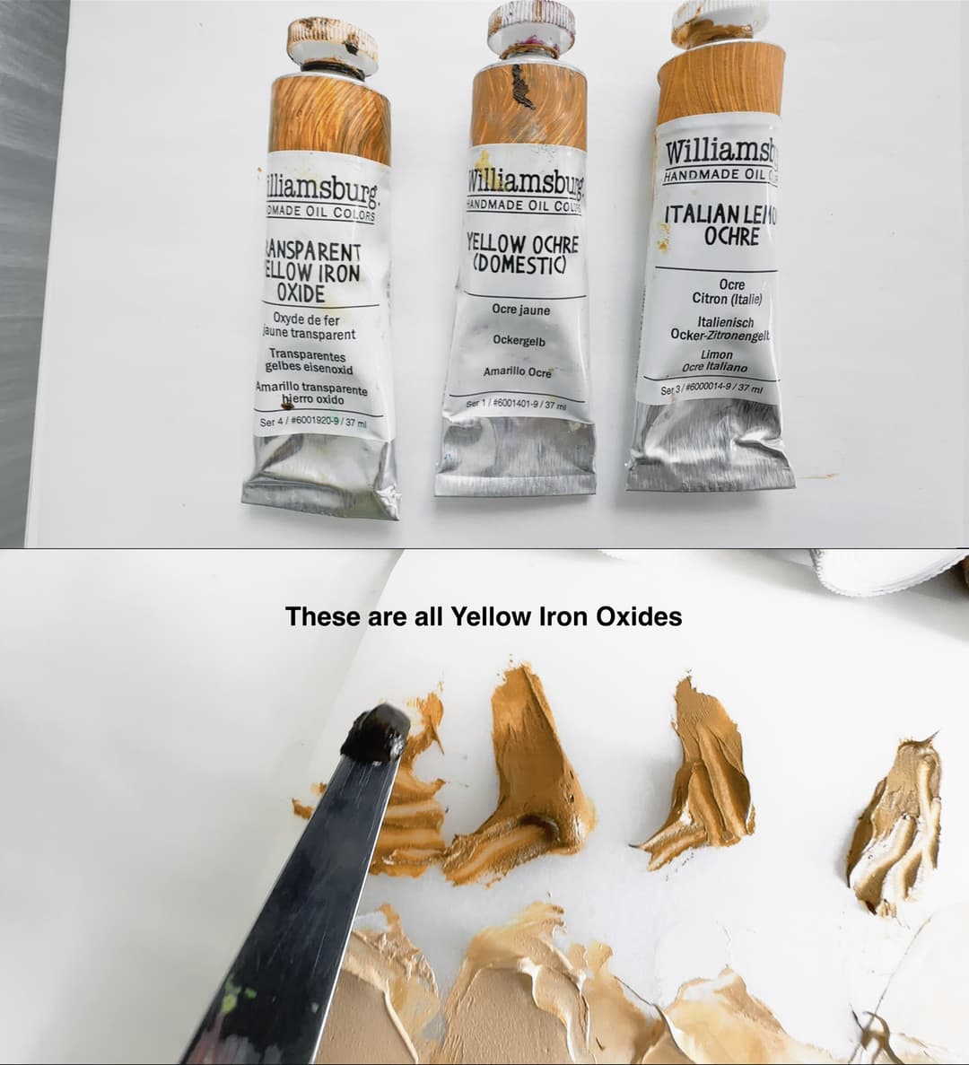
Three tubes of Williamsburg Paints: Transparent Yellow Iron Oxide, Yellow Ochre Domestic, and Italian Lemon Ochre. In the bottom image the Transparent Yellow Iron Oxide is on the tip of the palette knife. Several varieties of natural yellow ochre are seen next to it.
Colors Listed as Coarse
These are some of the coarsest colors in the Williamsburg line. Some of them have related paints made of the same pigments ground more finely. Some of the colors, such as Van Dyke Brown, have been reformulated since the chart was published. These coarse paints have interesting working properties.
Are the Williamsburg Earths Gritty?
Three Levels of Grittyness- Maybe Four or Five
The safe answer to the question "Are the Williamsburg Earths gritty?" would probably be a yes, but that is a subjective matter. Williamsburg has a handy chart of their textures here, however we think of their line with another column inserted between Medium and Coarse. Having painted with a few of the other medium colors like Alizarin Crimson or Sap Green, we see why they would be in the medium category, however a bit of grit can be heard under a palette knife with the French and Italian earths. We absolutely love these colors, and would classify them as grittier than the Alizarin. The sap green contains some PY43.
A trio of red-brown earths show the range of grit you might find within the Williamsburg earth tones. There is actually one category more gritty than this-- which only encompasses a handful of colors with large particle sizes. The top picture in the trio shows the grit that is typical for the French and Italian earth colors. The middle is the regular Burnt Sienna. The bottom picture is a super smooth red earth, which is actually the same pigment as one of their coarse colors (not shown here). The fine grained Transparent Red Oxide is almost glossy it's so smooth. The Transparent Red Oxide is actually the same pigment as their Brown Pink, which is the coarse/extra-gritty version of the same pigment (not shown here). More about Williamsburg Transparent Red Oxide can be found here.
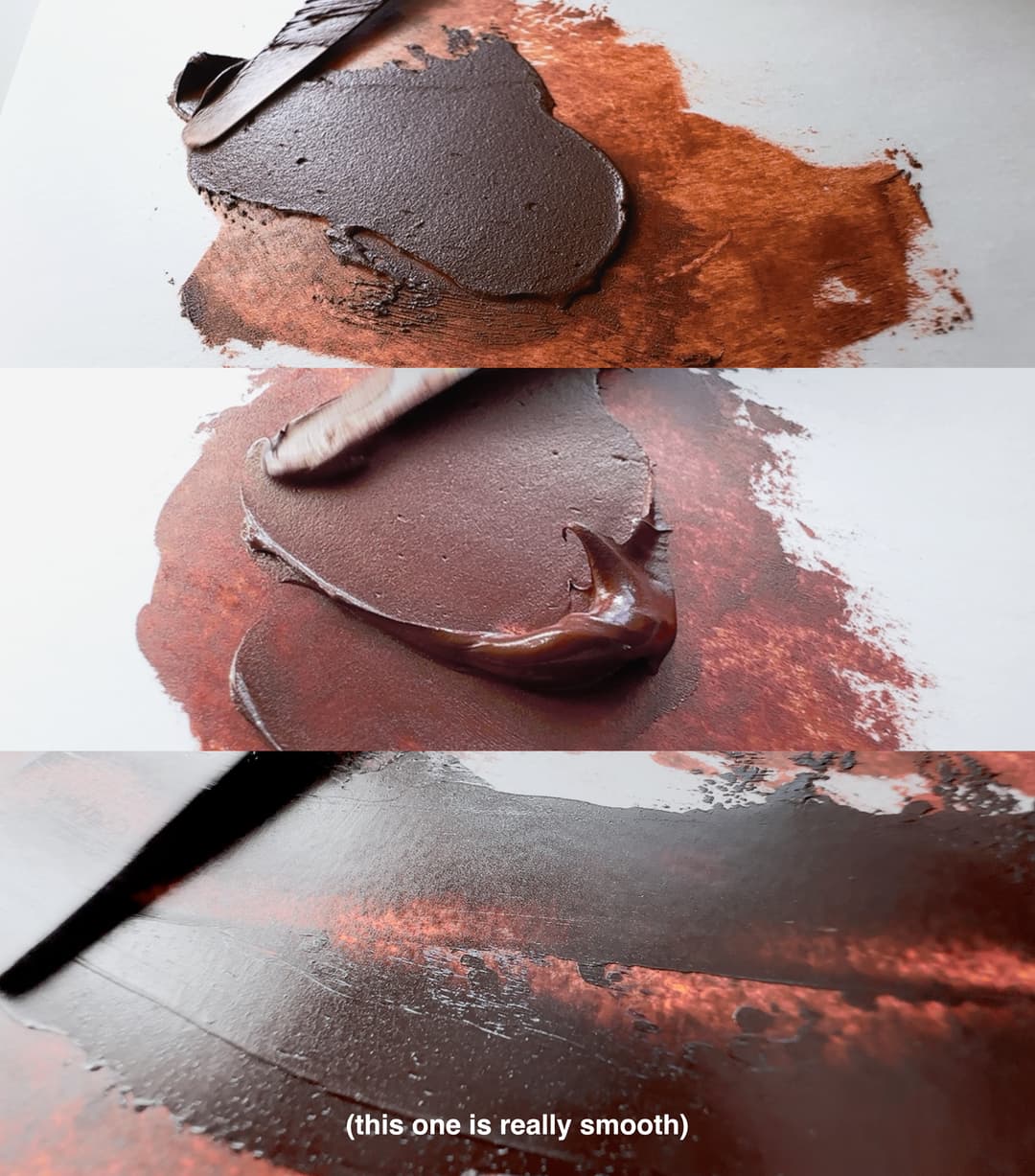
Three levels of grit. The Italian Burnt Sienna has visible texture, the regular Burnt Sienna is smoother but still has a hint of texture, while Transparent Brown Oxide is quite smooth
Williamsburg French Earths
The ones we tested were in the boxed set, however not all of these are in the boxed set, so some exceptions to the generalizations may apply.
French and Italian Earths- Gritty and Pretty
We love these textured earth tones with colors that can be hard to find
Williamsburg classifies the French and Italian earths as medium in terms of their scale from smooth to coarse. However we would describe these as gritty, purely because we get a lot of questions and feedback from painters who are sensitive to having texture in their paints, and these have texture! Personally, we love these specialty earths as they are fantastically varied and represent hard-to-find pigments. There are a few notable high chroma callouts as well as some mysterious greenish ochres and other off-the-beaten-path colors like green earths.
A Williamsburg video on the French and Italian Earths, plus two more videos focusing on each set individually: French Earth Set which shows various tints and their opacity, and the Italian Earth Set.
Earth tones in some ways have it tough when compared to the appeal of high chroma colors. However we'd wager that the Old Masters would have been well acquainted with every earthtone in every particle size possible.
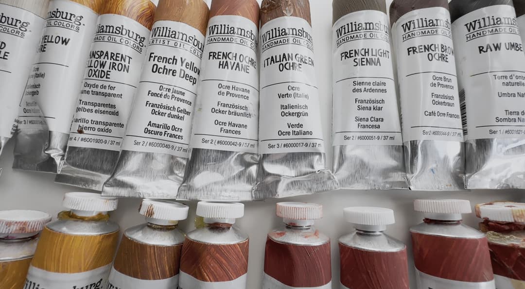
A fun array of earths with hues that look like peanut butter, cedar, dark terra cotta and brown
Williamsburg Italian Earths
We especially enjoyed the Italian Reds. Not all of these come in their boxed set, which are the ones we tested for this article.
Exploring the Williamsburg Paint Range
A Magnificent Rainbow Powered by Research
This is a palette of Williamsburg colors we enjoy though we would add to it several more ceruleans, cobalt violet deep, and a few more of those gritty red earths if we were doing a "best of" list. It was tough to choose amongst the earths as there are many interesting colors which don't fit on a standard palette.
Also, Golden just released a virtual paint mixer program to help in creating mixes that is just for Williamsburg.
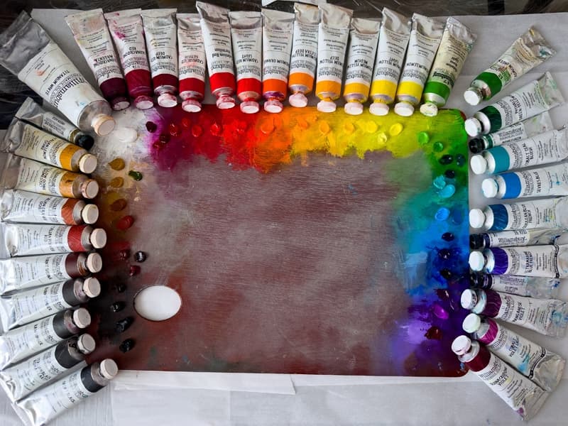
There were too many favorites to fit around one palette
Williamsburg Cadmium Reds
Stellar reds with hue variety, high chroma, a soft impasto and excellent pigment load. For the cadmium red purple and cadmium purple see the magenta section.
Cadmium Reds-Chromatic Powerhouses
A hearty array of reliably bright reds
Williamsburg also offers a variety of other red pigments, some of which are hard to find in other brands. We especially enjoy their Cadmium Red Light, and have heard that a lot of people use the slightly more red-leaning Cadmium Vermillion. We also love their Cadmium Red Medium. Williamsburg doesn't stop there though. They make an extra deep Cadmium Red Deep and go beyond this to the Red-Purple territory (more on those below in the magenta section). All of their cadmium reds have been excellent.
More reds from Williamsburg
A fun range of reds. A few are LFII so be mindful of that, but many have great lightfastness. It's hard to say where red ends and magenta begins sometimes so check out the magenta section, too. For red earths see the earth section below.
Cadmium Orange and Cadmium Yellow Extra Deep
Two colors we won't do without
We have a special place in our hearts for this cadmium orange, and really don't know why. Maybe it was a long-ago halloween decoration or a printed picture of a pumpkin that had this particular color of orange. Also we decided to include the extra deep cadmium yellow in this section- that is a truly excellent color that we quickly fell in love with as well.
Cadmium Orange and Cadmium Yellow Extra Deep
We knew we loved the Cadmium Orange but the Yellow Extra Deep was a surprise
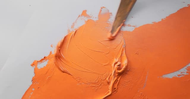
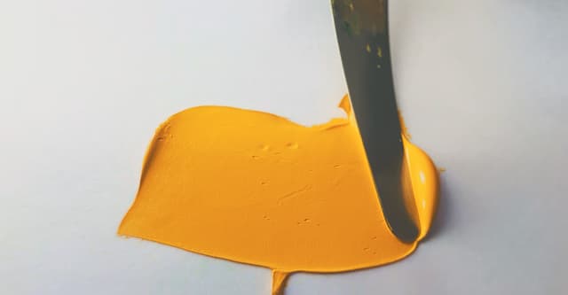
Cadmium Orange and Cadmium Yellow Extra Deep
For some reason it's hard to find super high chroma colors in the region where the yellow extra deep finds a place. All of their cadmiums are excellent, but in comparison with other brands, their warm cadmium yellows sometimes have an extra advantage.
More oranges from Williamsburg
Notes on the other oranges
Williamsburg offers other oranges as well. Some of these are not lightfast though such as the Alizarin Orange, so just a heads up there. Those were historical colors from the days of its founder, Carl Plansky, that they opted to keep (more on this later). They discovered some quirks to Pyrrole Orange through their rigorous testing (more on that later, too).
Widening the range of oranges
For some reasons colors named Permanent almost never are, though this color at Williamsburg has a layered history. They actually reformulated it to make it more lightfast than it was (more on this later). For orange earths see below.
Cadmium Yellows
Palette staples for saturation, sometimes beating out other brands
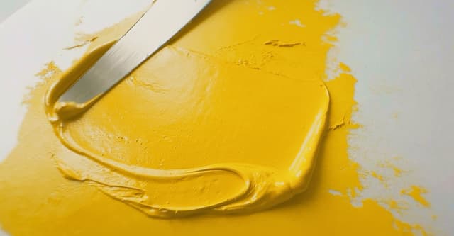
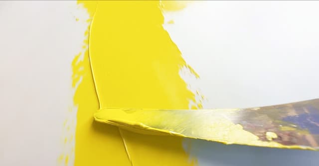
The Williamsburg Cadmium Yellows are some of our favorite areas of this paint line. All of them are outstanding choices for their areas of the spectrum. If you like the soft impasto texture these are outstanding. The cadmium yellow mediums, deeps, and extra deeps are an area where Williamsburg really shines. The lighter cadmiums are outstanding, too-- we consider all of them go-to colors (we paint with several brands in the cadmiums and find it helpful to have a lot of colors in this area). Their Cadmium Yellow Mediums and Deeps have actually become some of our top favorites through comparison with some other brands.
Terrific Cadmium Yellows
Some of the deeps and mediums actually outshine other brands.
Painter's Lore
Notes on the texture of their cadmiums over time
Painter lore has it that back in the old days, Williamsburg had cadmiums with a larger particle size. In regard to their current cadmiums, we did not find them to be noticeably different from other high quality cadmiums in this respect. The Williamsburg cadmiums are staples on our palettes.
Other Yellows
Nickel and Nickel Azo- Just to name a few
Nickel Azo Yellow, PY150 is a fascinating color which changes in hue more than would be expected with the addition of titanium white. (As an aside, every color seems to change in hue with Titanium White, so this is a matter of degree- and in regards to Nickel Azo Yellow, that degree happens to be a lot of fun). It's nice to see some rarer colors represented as single pigment in the Williamsburg line. We also adore the pale Nickel Yellow, PY53 for its role in muted, chromatic neutrals, and have found it to be enough of a staple of the palette that we hid a dollop of it on the palette overview above near the cadmium yellows.
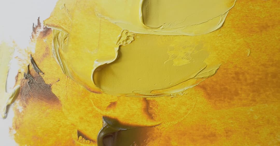
Nickel Azo Yellow, PY150 (not to be confused with Nickel Yellow, PY53). This is Nickel Azo yellow mixed with increasing quantities of white. This remarkable color unleashes its glory in tints.
More Yellows from which to choose
Williamsburg has some neat yellows. They also did groundbreaking research that revealed that PY83 transparent (e.g. the Indian Yellow) had issues no one seemed to be realizing (more on this below). The Alizarin Yellow is not lightfast, but is kept for other reasons-see the section on lightfastness testing for more.
Convenience Greens
From yellow to green, here are some higher chroma colors
We really enjoyed Williamsburg cadmium greens. They come in two shades of lime which we'd say are more like lime proper and lime peel. They lend themselves to foliage due to the warmth and ever so slight desaturation. If you're looking for punch, try the Permanent Green, however its lightfastness ratings were a bit interesting so be sure to check out their new breakthrough research.
Some higher chroma convenience greens between yellow and green
They have lovely cadmium greens. Check out their research though on the Permanent Green - it had some interesting/unexpected lightfastness
Phthalo Greens
Two core palette colors and essential green ingredients
Williamsburg carries both phthalo greens, which we love to see in a paint brand. The addition of PG36, the yellow shade of phthalo, gives an additional little chroma boost to the brightest yellow-green mixes.
Enchanting Phthalo Greens
The blue shade and the yellow shade have different mixing capabilities
Other single-pigment greens
Mysterious greens that hold a few palette secrets
Williamsburg has a huge array of single-pigment greens. These are worth checking out. We've come to cherish some of these distinguished but less flashy pigments.
More Single-Pigment Greens
We saved green earths for later in the article, but here are some cool single-pigment greens
More convenience greens
Some highly useful blends
While we're fans of single-pigment colors, there are a few true conveniences to be had in life, and a few of them can be found in the green department. Williamsburg has a lovely range of convenience colors, including a handful of excellent Cadmium Greens, like this -- see above. We also enjoyed their Courbet Green, not shown here. However Courbet Green contains PY65 which is not our favorite these days. They also make a good Sap Green that does have a more textured feel. It does contain PY129 so maybe watch those mixing whites.
Something to pay attention to in the convenience blends is the addition of earths. Since Williamsburg has a gamut of textures as well as colors, the earth pigments that are used as ingredients can have a bit of tooth to them, like the Olive Green, which is classified as coarse. We really enjoy the subtle texture to their Sap Green as well as some of the other colors like Courbet Green, which is a very useful blend.
Convenience Greens from Williamsburg
We especially enjoy the Courbet green and the Sap, which has a bit of texture
Luxurious Ceruleans
Regal ceruleans in plain-white tubes
One of the paints we look to in judging a paint brand's quality is in the ceruleans. This tends to be an expensive "off the beaten path" color that can sort of be approximated in surface color via a mix with a phthalo, that is, you can mix something like the masstone of this color. However a hue will not emulate cerulean's mixing properties, nor its feel as a paint. We know of painters who avoid phthalo blue in blends because it doesn't work for their mixing process, and we can see why. Instead of phthalo blends, they will seek out genuine cerulean because it mixes with other colors differently than phthalo blue. This is an interesting concept. So genuine cerulean flies under the radar a bit, and whether a brand makes an excellent cerulean can be a bit of a tell for the rest of the colors.
In Williamsburg's case the cerulean is excellent, and highly pigmented. They also go all-out and make a whole range of ceruleans and cobalts.
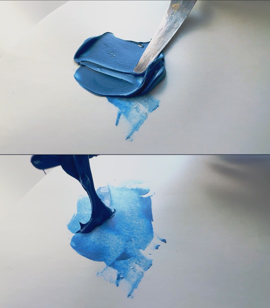
All ceruleans have a working quality that is identifiible as different from other pigments. We like it for the way it mixes different from other pigments than phthalo.
An range of exquisite ceruleans and cobalts
We love these unsung heroes of realistic painting palettes
Phthalos and Ultramarines
And their zinc-free blends! Not every brand removed zinc
Phthalos and Ultramarines- the blue powerhouses of the palette. We also enjoy their extra-indigo Ultramarine Blue French.
Our favorite part of the convenience blends is that they don't have zinc. Of course Titanium-Zinc white is a blend with zinc, but that is very obvious and it's in the name. Their Sevres Blue is a nice zinc free titanium-phthalo blend which we find useful on the palette. More often than not we're cutting phthalo blue with white anyway, so it's nice to have this to reach for. This is a pleasant addition to a plein air palette (if you use phthalo blue for realism, that is, instead of cerulean. We like both).
A few other convenience blends we enjoy are the Ultramarine Blue French, which is a little extra violet due to the PV15. The new research they did on PV15 made us a little reticent about it but we still love it. It's nice to have an extra purpled PB29 red shade, so that is an inspired blend. The Turquoise is useful if one wants to avoid cobalts, and has an interesting history. We like having both cobalts and the phthalo blend for different reasons.
Phthalos, Ultramarines, and their blends
With Zinc-free King's blue and Sevres blue
More blues from Williamsburg
YIn Mn, Prussian, Indanthrone
There are a few more blues, including the elusive YInMn. We've worked with this color from Williamsburg and it's beautiful. The unconfirmed rumor is that it has a high pigment load compared to a few other YInMn offerings, and we can say for sure that it was a joy to work with. They offer it periodically through the Williamsburg store.
In regard to Prussian Blue, we appreciated the lightfastness research Williamsburg did on this color.
More Blues to be found
From elusive and exotic to tried and true, there's a blue for everyone
Williamsburg violets
Striking Deep Violets to Electric Hot Purples
It does the heart good to see this many violets in one place. There aren't too many violet pigments in the world.
We're sad to see the pigment for cobalt violet light go- this was due to shake-ups in the wider pigment industry (see below). This is one of our favorite electric violets in safflower oil, though a touch of the high voltage look is lost when it dries. So far, all of the mineral violets we've tried of theirs were exceptional in chroma and quality.
Williamsburg Violets and Magentas
Opulent colors from royal purple to luminous magentas
Earth color groupings
Yellows, Oranges, Reds, and more
We've talked a lot about earths already, so textures aside, let's look at some estimates of their groupings. We have not tried every single one, so this is imperfect, but here are some rough groupings of their earth categories.
Yellow Earths
It's hard to say where yellow earths cross into orange earths. Here are a few yellowish ones.
Orange Earths
Lately we've come to love orange ochres
These colors are a loose category, however we are kindof obsessed with orange earths and so let's see where this grouping takes us.
Raw Siennas
A handful of raw siennas and orange earths (includes some blends)
Red earths
From Venetian to Mars
Red earths vary so much by value as well as hue. Williamsburg has some inspiring, high chroma red earths with some grit like the Pozzuoli Red and the Rosso Veneto. They also have some red earths that reach deep depths.
Red Earths, part 1 (Natural)
There are a lot of red earths and red-brown earths. These are not perfectly grouped, however many of these will be the more natural gritty earths
Red Earths, part 2 (Synthetic)
A wide variety of particle sizes and hues
Some of the synthetic earths have a gritty particle size, and some have a fine smoothness. It just depends on the color.
Red Earths with synthetic Red Iron Oxide
These vary widely and include some of their coarsest colors as well as some very finely-grained smooth ones. We also added Red Umber here - a PBr7, since it's named Red.
Brown Earths
A large category
These colors have a lot of variety, so it feels weird to group them all together. Each one has its own characteristics.
Burnt Siennas, Burnt Umbers, and Burnt Umbers
A group of brown earths. The Burnt Siennas tend toward rosiness in general
Raw Umbers and other earths
Tending toward depth and coolness
Raw earths tend not to have been heated or calcinated. These colors (this seems to be the rule with earths) have a lot of variation.
Raw Umbers
Raw umbers and several blends. Turkey Umber has been strangely useful.
Black and Grey Earths
Hard to find in other brands
Williamsburg has some fascinating grey earths that are hard to find in other brands, such as French Ardoise Grey or Graphite Grey. The Ardoise does have some grit to it. The Italian Roman Black earth is famous for making slightly more neutral mixes with white than other black pigments. Also the pigment for Graphite Grey is another difficult-to-find color anywhere else.
Black and Grey Earths
Fascinating and underrated
Green Earths
Williamsburg's Green Earths are Stunners
These hard-to-find colors are exceptional in the Williamsburg line. Only one other paint maker that comes to mind has anything similar.
Green Earths
From soothing fern green to a cool almost blue-green, these mysterious colors do have some grit
Interesting earth colors
Hard to categorize, these are some of our favorites
These fascinating ochres are some of the most useful colors.
More Earths
We can't get enough of the off-beat earth tones that are less typical.
The less gritty colors among the Williamsburg Earths
Some of the Williamsburg colors are rated Very Fine
Not all the color have a grit to them. While we haven't tested every one of them, on the chart Williamsburg released way back when they listed a handful of their earth colors in the finest category. What's interesting is that while these do tend to be synthetic earths, their coarsest colors often tend to include synthetic earths as well. It's fun to try both.
Williamsburg earths that are more smooth
These colors are listed by Williamsburg as being in their smoothest or Very Fine category. We also found the Transparent Iron Oxides to be smoother though they are not on the chart.
Zinc White and Williamsburg
Their now-famous photos (check their article) cracked the case
Way back in 2010, when Golden had acquired Williamsburg after the passing of Carl Plansky, Golden embarked on crucial testing that would change the course of oil painting history. Over the last century, there had been a lot of use of zinc white in painting. However, word was brewing in conservation circles that zinc white was linked to some problems. Painters held out hope that perhaps all the paints they'd been using weren't so bad, while online forums roiled and boiled over zinc white. There is still controversy over zinc white, as some paintings made with it seem to look fine, while others delaminated or cracked terribly.
Back in the day, George O'Hanlon of Natural Pigments was one of the early voices who alerted the painting community about what was being published in conservator circles and raised awareness regarding the hidden perils of using zinc white. Papers like the famous one by Marion Mecklenburg were circulated. As early as 2010, Williamsburg reduced the amount of zinc white in their oil paints while they simultaneously embarked on pivotal research that would help to clarify the issues for painters going forward.
Zinc white has different particle sizes, and these can be seen on this re-tubed version of vintage Bellini. (We unfortunately had to part with the original tube due to smoke damage from a wildfire, but we were able to save the vintage paint).
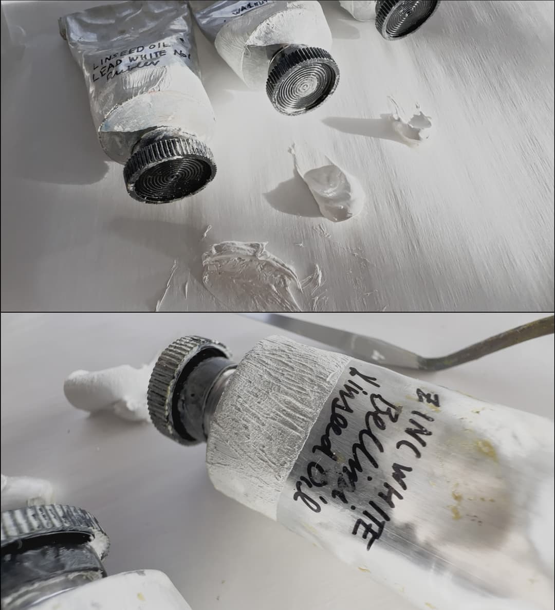
Zinc white, which was secretly destroying (some but not all) paintings
Williamsburg White Paints
Titanium in linseed and safflower as well as lead white (Flake) and the rarer-to-find Lithopone. Check out Williamsburg's new research on mixing whites
Williamsburg's Famous Photos
Compelling and candid research
Williamsburg's tests showed now-famous photos that illustrated the way that zinc caused early embrittlement of paint films. While this is not evident on every single painting that was ever painted with zinc white (as there are many variables involved in paint film formation), the evidence was clear enough for the Williamsburg specialists and for many in the painting community. What is interesting about zinc is that in some cases it does seem to have a mildly positive effect on lightfastness, so this will likely be a topic of ongoing research, and it was one that Williamsburg explored in 2023. The relevant article on zinc white from 2018 can be found at Just Paint, and includes a list of colors which were reformulated in order to remove zinc white. They made several of their whites harder to use casually and limited them to larger tubes, while other colors such as Silver White were discontinued entirely.
Resources from Golden's Just Paint publication: 2018 "Zinc Oxide: Warnings, Cautions, and Best Practices" the Now-Famous Zinc White tests from Golden 2018 "Zinc Oxide – Reviewing the Research" Similar article on Zinc White Exploring Stress/Strain 2021 Update on Zinc- Search for the Dividing Line Explores New Questions in Zinc Research 2023 "ASTM Lightfastness Testing for Oil Paints" - Information on Zinc and Lightfastness.
Golden's Zinc Oxide: FAQ.
Golden/Williamsburg Lightfastness Testing
An illuminating article that will change oil paint history
In 2018, Sarah Sands from Golden Artist Colors (which owns Williamsburg Oils) presented lightfastness information at the Munsell Centennial Convention on some surprises in lightfastness testing. You can still view the notes from the presentation at: Not So Fast, courtesy of the ICC. Tests on PY3 and PY73 were giving unexpected results. This discovery lead to so much more.
In the years leading up to 2023, Golden performed hundreds and hundreds of lightfastness tests sorting out how their paints behaved in various mixing whites. This new information, which was published in 2023 revealed that lightfastness varies with choice of mixing white: a huge revelation that was unknown to the art world. You can find this treasure-trove of research here.
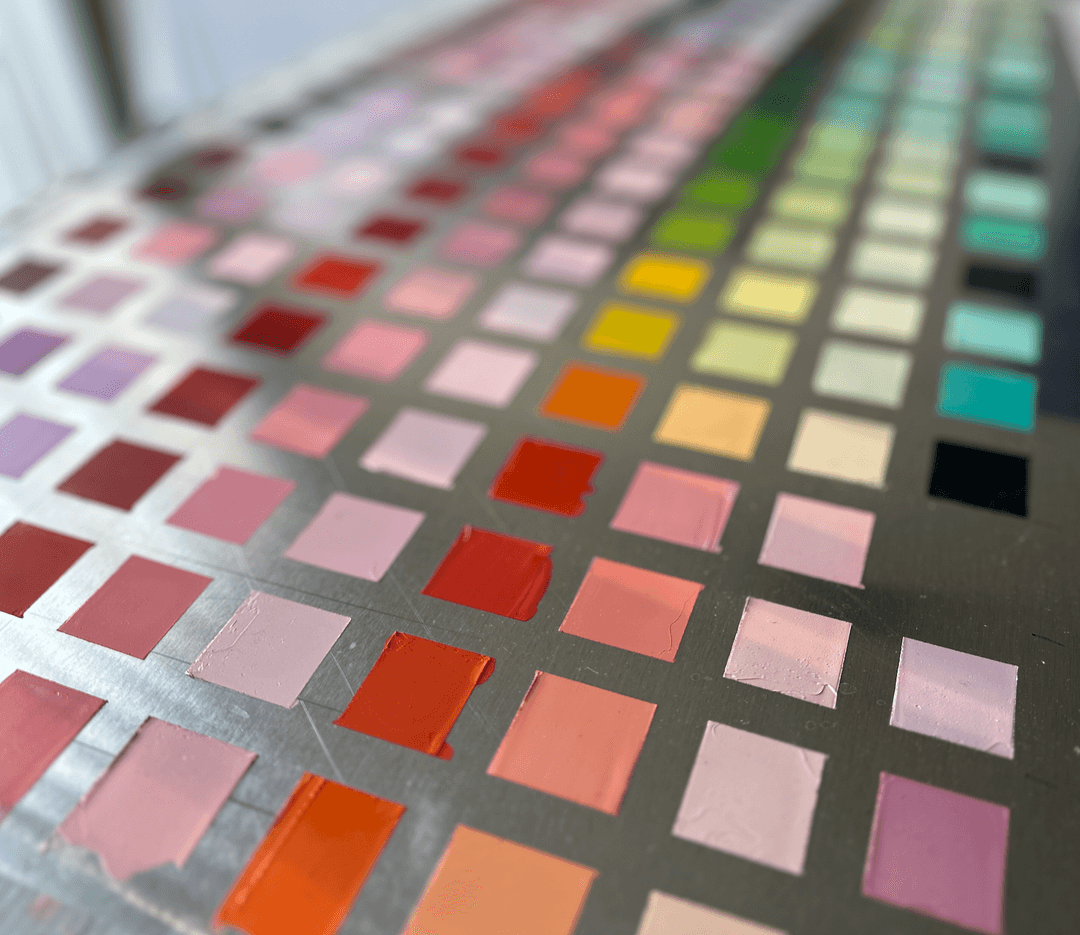
Lightfastness mixtures on aluminum sheeting. Mixes were made with a lab scale at several ratios. The swatches were made to be big enough for a spectrophotometer.
Someday we will do a deeper dive on this, but for now we wanted to provide a few preliminary notes.
Lightfastness testing for studio-purposes doesn't have to be difficult or even expensive, and this is in part-- thanks to Golden (see below). They provided some simple ratios by weight that can be done with a digital scale. One of the revelations from the emerging testing is that each paint is a system unto itself, and it is unknown how various undisclosed binders and additives might affect the lightfastness from brand to brand (source: preliminary research from Natural Pigments). Unfortunately this means there may be some differences for each brand's paint system, which we will not know until they are tested.
The formal ASTM lightfastness tests are a bit demanding and we want them to be that way, but for artists, there is absolutely nothing stopping you from sampling your paints with white, putting them in a window, and seeing what happens! The window glass is a bit important for measuring exposure due to some details about UVB. Information on how to do your own lightfastness tests can be found in Mark Gottsegen's Painter's Handbook - available at Amazon and available to read online here at archive.org for free with a login. Sometime we'll do an exploration of how to combine what is in Gottsegen's book with the newer methods for making tests with mixing white, but this resource and the ones mentioned below can get a person started.
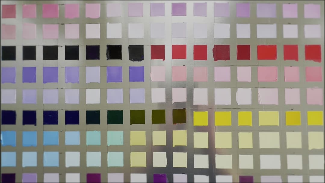
A sample of in-studio lightfastness testing on aluminum panel
The Pyranometer in Your Paint Box
A good use for genuine Alizarin Crimson
So in the simplest terms, you can paint a swatch of a color, or a color tinted with your mixing white of choice, and put it up in your window (be sure to keep a separate swatch out of direct sunlight) and put a date on it. You can absoutely compare these by eye later and see how they do. From there you can always add more sophistication to your testing methods. Paint testers use equipment to measure how much light a paint has received, such as a pyranometer, or the less high-tech Blue Wool Scale to measure light exposure. However you might have something already which can be used and it might be in the back of your paintbox.
Bruce MacEvoy describes a method for watercolor lightfastness testing that can be adapted to oils. Basically you can use Alizarin Crimson genuine (PR83) to gauge how much light your paints have received. This color fades a little worse (by some accounts) in watercolor, however when doing lightfastness tests it's nice to see that it's "working" by judging the fade happening with Alizarin. So Bruce's comments would have to be transposed a bit for oil-- for example the dilution ratios, but you can read about his methods here.
For oils we are not usually dealing with dilution exactly, but rather mixing with white. The age-old question of how much white to use and how to keep it consistent from color-to-color is another layer of sophistication discussed below.
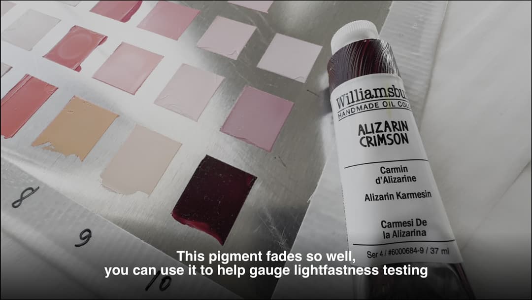
Genuine Alizarin Crimson (PR83) can be mixed with white to help gauge sun exposure for informal lightfastness testing. It doesn't fade as fast as it does in watercolor, but it does fade.
More on Doing Your Own Lightfastness Testing
Brief notes on the Mixing Ladder, compliments of Golden's in-depth research team
There is a piece of the formal testing method that is admittedly difficult to achieve for most studio painters-- but Golden's research has made this much more achievable than it would be otherwise.
For context, the formal procedure is to make a mixture of 40% reflectance at the wavelength of maximum absorbtion. Golden helped out painters everywhere by A) figuring out the weight percentage for tints for each pigment of theirs in order to reach the 40% (see the bottom of the article here Golden's Lightfastness Research) and B) suggesting a series of ratios that can be used to make a whole range of tints to show lightfastness. Some pigments are super highly tinting (like Phthalo) and only a drop will tint the mix, while others require a lot of paint to reach a similar level of tinted paint. The so-called mixing ladder describes a series of ratios that will work for almost all pigments, one of the higher ratios with white will work for the weaker tinters and one of the lower ratios with white will work with the stronger tinters.
The Williamsburg Titanium White Ladder
So by referencing the Golden research, you can consult both their table for the 40% mixes-- which will get you close-ish even without a spectrophotometer, as well as make the series of mixing ratios to give you a broad idea of what a pigment will do at different ratios. The weight ratios will vary a bit by brand but Williamsburg's mixes will help get a person close. If a person desires to achieve true precision in the 40% reflectace measurement, these tables will save immeasurable time if they desire to do so. In Golden's Lightfastness Research they discuss these ratios in a section, see "Williamsburg Titanium White Ladder" for details.
In short, they mention, "Each color was mixed with Williamsburg Titanium White in a ratio of 1.00g color to 10.00g white (9.1% color by weight)....As often as possible, a fixed set of concentrations were used to compose the remaining rungs in the tint ladder: concentrations of 0.1, 0.4, 4.8, and 28.6% were the most common." For most of us in studio that handful of ratios and that level of precision is ample, and will reveal what is happening at varying levels of tinting.
Some classes of pigments are expected to do very well in lightfastness tests, and so a person can check for problematic pigments in Golden's work or other sources and prioritize the testing for pigments which are known to vary from brand to brand.
Secrets of the Paint List
From the Great Book of Color
Many years ago, we began compiling sources on pigments and color, and amassed these into the Great Book of Color. Some of the sources are now lost. We won't focus on the Great Book of Color here but we are going to share a Paint List secret. We stumbled upon this while making the hundreds of color comparisons we make over here while working on every corner of the spectrum. One day we mixed some Williamsburg white with a bit of Oleogel and it reminded us of something.
The Great Book of Color
Williamsburg + Oleogel = ?
Secrets of the Paint List
Well, the answer is Vasari, it seems. It's not perfect-- Vasari is a bit more stringy than the Williamsburg white, and there's a slight hue difference. In terms of texture though, we'd be quite hard pressed to tell the difference.
We have not tested this in every color. The Williamsburg Titanium White in Linseed has a roundness to it that not all Williamsburg colors share, so we expect it will vary according to the starting consistency of the Williamsburg color. Also please note this will not apply to grittier colors (like the French or Italian Earths) because Vasari colors tend to be very smooth with small particle sizes, and no amount of Oleogel will change the particle size. Also take it easy with the Oleogel-- too much of it can cause problems with drying.
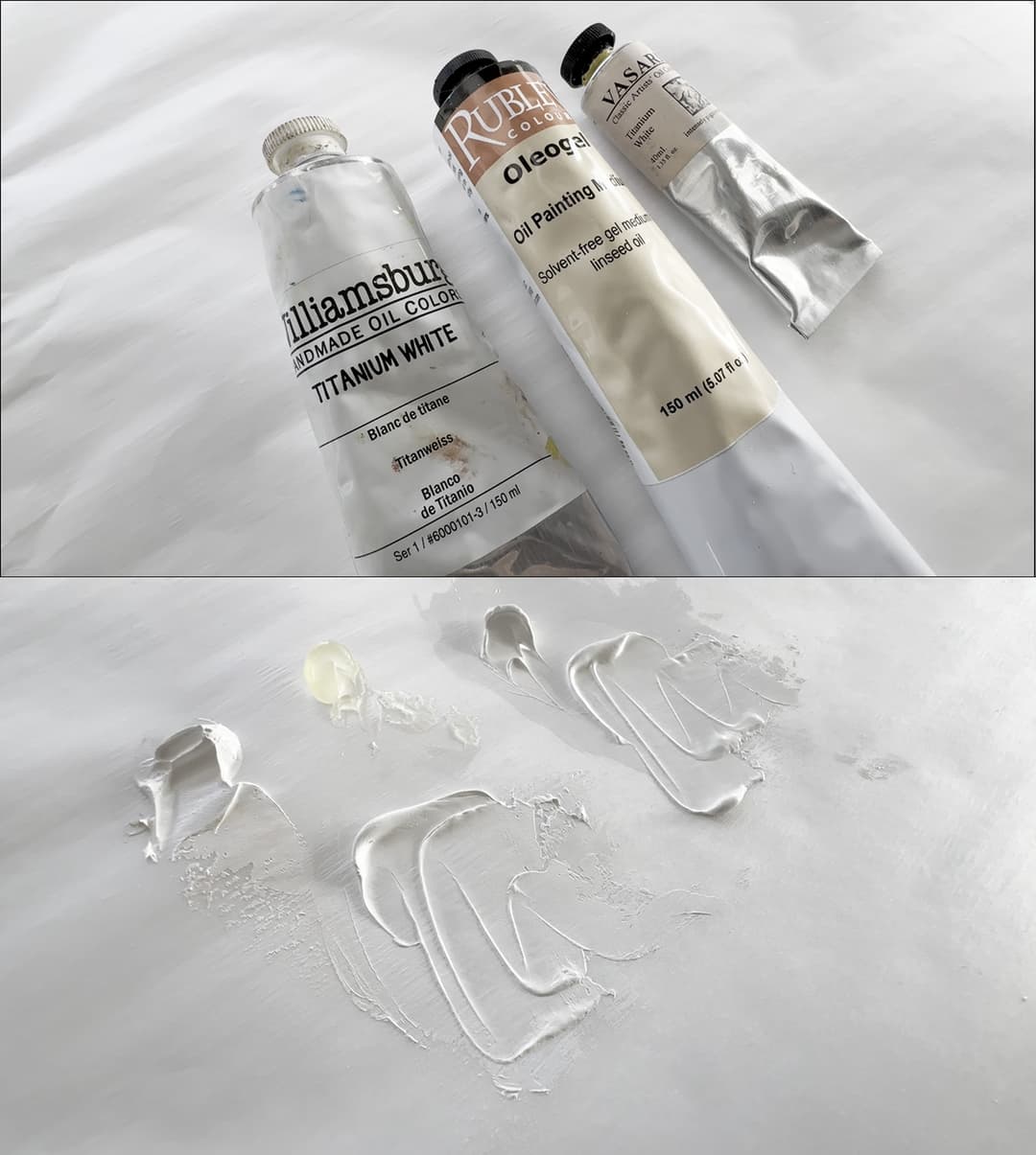
Williamsburg Titanium White, Rublev Oleogel, and Vasari Titanium White. The mixed paint on the left is Williamsburg plus Oleogel, the paint pile on the right is just Vasari Titanium White (nothing mixed in).
Reformulations- Zinc Based
A handful of reformulations surrounding zinc
Here are a few colors that were reformulated due to zinc white. One of many reasons we formed the Paint List is to create a resource for artists when one of their go-to colors has changed due to a reformulation or discontinuation. So in the interest of history, here is what we have ascertained from the Williamsburg materials:
Blends that contained Zinc Oxide, 2010-11: Brilliant Yellow Pale, Canton Rose, Jaune Brilliant, King's Blue, Montserrat Orange, Naples Yellow, Naples Yellow Reddish, Persian Rose, Provence Violet Bluish, Provence Violet Reddish, Sevres Blue, Turquoise, Zinc Buff (replaced by Titan Buff around 2018), and Zinc-Buff Yellow. The white colors were Silver-White, Titanium-Zinc, and Zinc White.
Colors that were reformulated around 2018: Persian Rose, Naples Yellow, Titan Buff (formerly Zinc Buff), Brilliant Yellow Pale, Naples Yellow Reddish, Jaune Brilliant, Canton Rose, Montserrat Orange, Provence Violet Reddish, Provence Violet Bluish, King's Blue, Severs Blue, and Turquoise.
Colors that were discontinued around 2018 include Zinc Buff Yellow, Silver White, SF Titanium Zinc White (safflower), and SF Silver White (safflower).
Sources: Zinc Oxide Reviewing the Research and Zinc Oxide: Warnings, Cautions, and Best Practices.
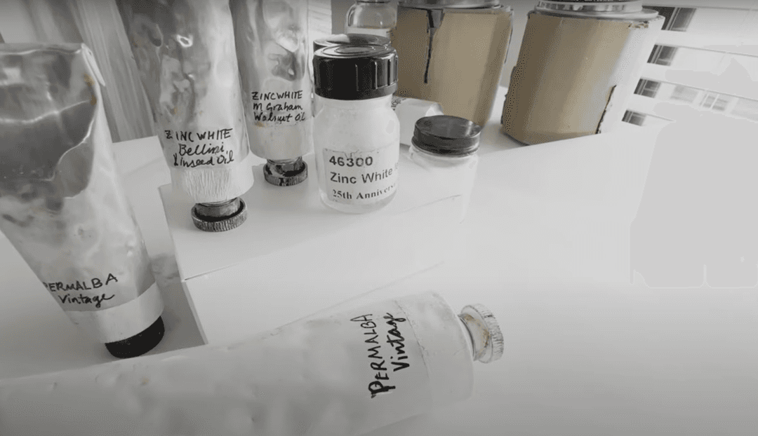
Zinc white was taken out of the Williamsburg blends
Lightfastness-Related Reformulations
A wave of lightfastness-related updates
Some changes came to the Williamsburg line due to lightfastness. Colors that were reformulated include: Permanent Orange, Persian Rose and Montserrat Orange (which also underwent some zinc-related changes also), Olive Green, and Sap Green. We will be curious to see if any further lightfastness-related changes are in store as some of these colors in the newer forms contain pigments which are a bit reactive in certain mixing whites, such as PR112.
Find out about the older formulations and their 2015 changes, along with pictures at Just Paint.
Even a general idea of how a paint performs can be ascertained by informal lightfastness testing. The test methods Williamsburg uses (not shown here) are rigorous.
The Curious Case of the Alizarin Yellow Blends
More eye-opening research from Williamsburg on PY83
One thing to watch out for in a paint line which is so closely connected to lightfastness are the two historical blends, which only have a lightfastness rating of Fair (or not good). By "historical," I mean the pre-Golden times, and these colors in their non-lightfast forms had their own dedicated following. A full discussion of this fascinating tale can be found in Beauty and the Best: Wrestling with Changes at Williamsburg. We can appreciate why they opted to keep these colors intact and include the lightfastness warnings- this is just a heads up for painters who are new to the brand.
Heads up on Lightfastness in PY83s
Also, in the midst of the lightfastness assessments of their convenience mixtures, Golden discovered an important difference from the ASTM tables concerning PY83. Some opaque forms of PY83 are very lightfast, and others-- like the transparent version-- have only fair or poor lightfastness. However, the transparent (not-so-lightfast) form is a rather unique color, which led to a quandry. The Alizarin Yellow and Alizarin Orange both contain the transparent form of PY83. Golden opted to remove it from a group of colors that could be adequately reformulated, such as the Permanent Orange of the old days, however this was not the case for the these two. As an aside, the names are kindof confusing, and we did a double-take. Neither of their current formulations contain Alizarin Crimson PR83-- which one would have assumed to be the cause of only Fair lightfastness as well as the genesis of the name. Rather both contain the yellow pigment PY83. We appreciate that Golden tested their paints, reformulated some, kept others, and also brought the PY83 issue to light.
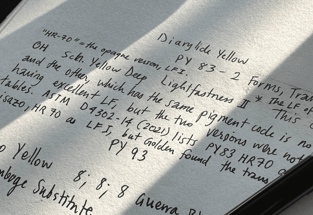
Shining light on the curious case of PY83. The ASTM does not currently distinguish between the two forms. According to Golden, the opaque form is LFI, the transparent one is LFIII
Discontinuations in the Wider Pigment World
It's so hard to say goodbye
In the scheme of things, artists' needs are rather niche in the wider pigment industry. Automobiles, mulch, and other manufacturing industries order massive amounts of pigments and dictate much of the demand. Discontinuations of Quinacridones for instance have a lot to do with demand in other industries.
Golden has done a great job of keeping artists in the loop about the changes that have been happening and have also had some videos with their staff who explain the situation- linked below.
Some paints that have been reformulated due to pigment availability include: Quinacridone Gold Brown (now discontinued) and Van Dyke Brown.
Paints that have been Discontinued due to pigment availability include: Cobalt Violet Light, SF Cobalt Violet Light (safflower) Cobalt Yellow, French Cassel Earth - more info here, French Noir Indien, Mars Orange Deep, Naples Reddish, Quinacridone Gold Brown, Permanent Yellow Green, Italian Green Ochre, Cobalt Green Pale (see this for more- also this color may have come back in some form), and a few of the zinc oxide paints- see above.
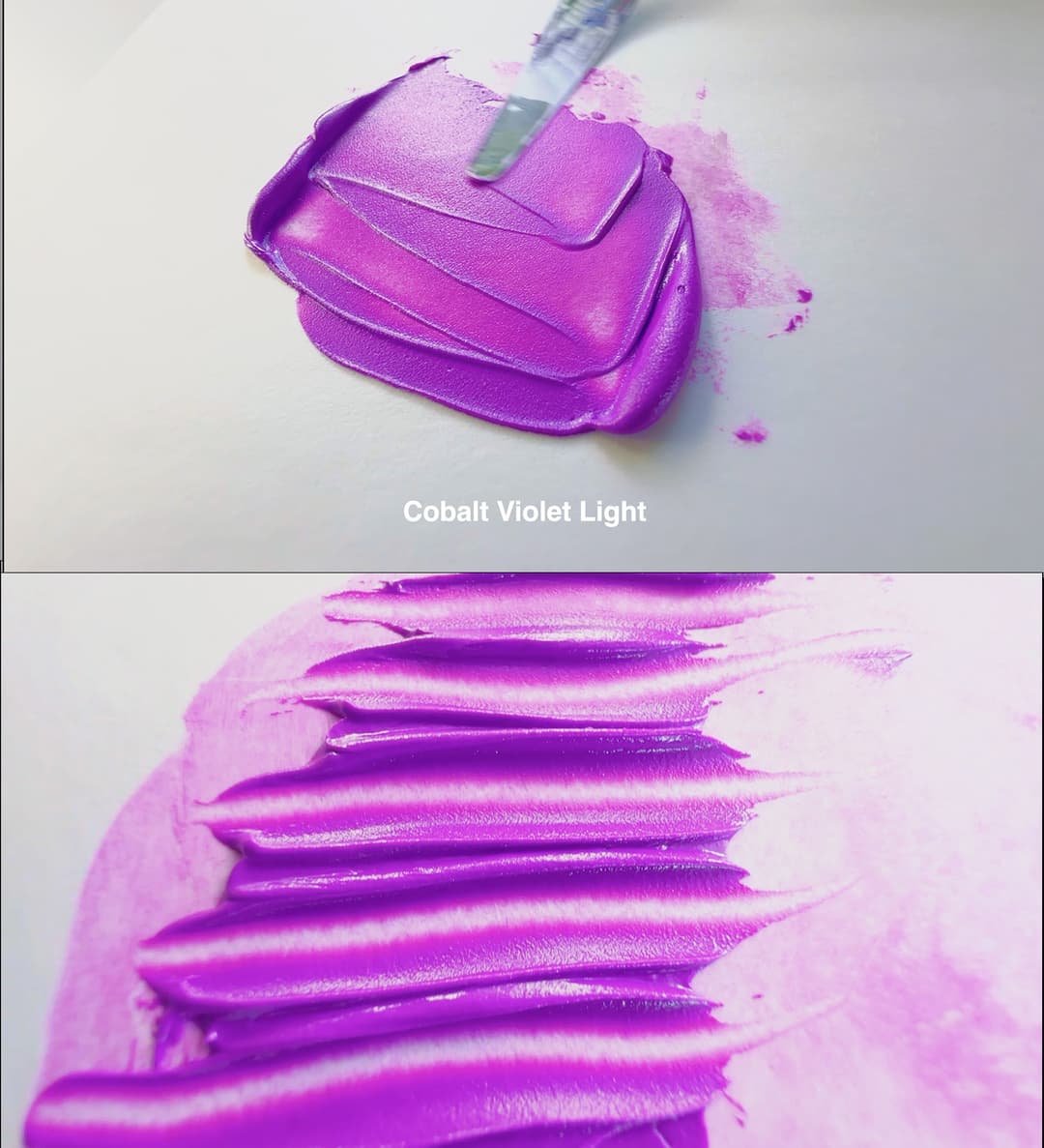
There were a lot of pigment losses in the world throughout 2020-2023, and one of them was a favorite of ours. It's hard to find any color that is even sort of lightfast at this area of the spectrum. We're sad to see SF Cobalt Violet Light in Safflower Oil go. This seemingly self-illuminating purple is one we'll truly miss.
Golden Kept Artists in the Loop
If you can't tell by now we love this company
Some of the pigments that have been retired are the earth used in Van Dyke Brown- a Cassel earth, genuine Cobalt Yellow PY40, the particular Cobalt Violet Light PV49, several specific specific earth tones. Genuine Alizarin Crimson, PR83, which despite its lack of lightfastness has been a historical artist pigment, was lost. A special variety of Ultramarine Pink, PV15, was recently lost as well as a handful of Quinacridones. P048 has been on the way out for a long time but recent discontinuations took out PR206 and PR207. More information on the recent changes can be found in our article on limited-availability pigments. Golden kept artists up to date with their 2023 Product discontinuations update.
Here are a few videos Golden released about discontinued pigments: A 2021 presentation giving background on pigment categories and information about what happens behind the scenes in the pigment industry that causes pigments to be unavailable. This presentation has a few notes on lightfastness testing for example with Hansa yellows, the transparent PY83, and the PG50 change-ups.
2023 Discontinuations due to changes in the pigment industry. This affected quite a few colors from Alizarin Crimson PR83, to a special Ultramarine Pink, PV15, to the beloved Cobalt Violet Light, PV49.
Golden kept the art world informed about the great pigment shakeup of 2020. We are going to miss several unique Williamsburg colors such as Quinacridone Gold Brown, Ultramarine Pink, and Cobalt Violet Light.
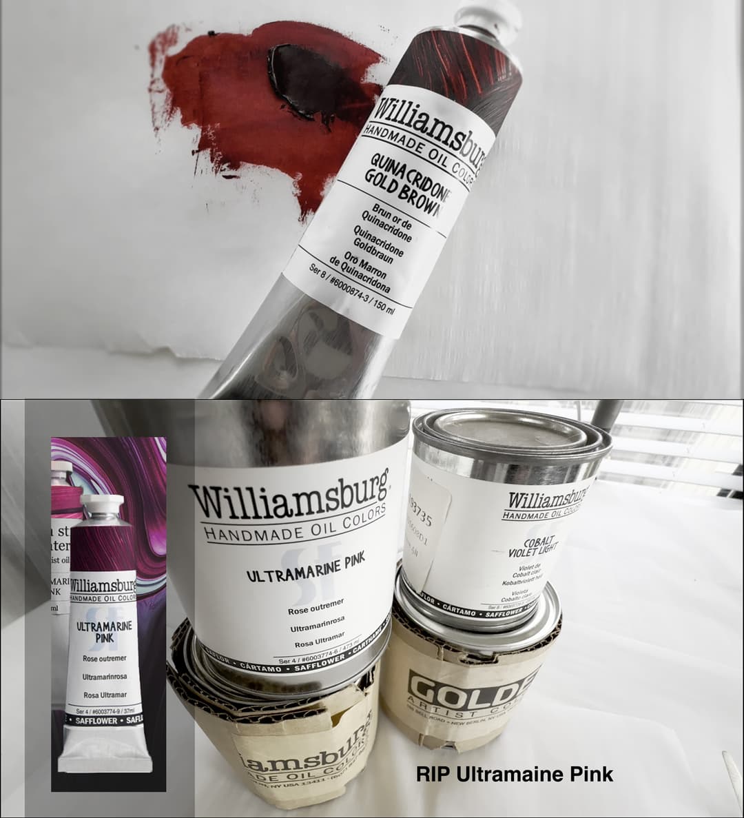
Several beloved paints that were affected by the great pigment shakeup: Ultramarine Pink PV15 and Quinacridone Gold Brown
Discontinued Paints
Several stunning colors were lost including our pyranometer, Alizarin Crimson
More to discover
There's always so much more
As always there are more things to talk about than one article can cover. Williamsburg has a lot to discover. For example, we didn't even cover their Chromatic Darks or which colors are Vegan, both of which you can check out. And, we didn't cover them here but Williamsburg also has a series of interference colors.
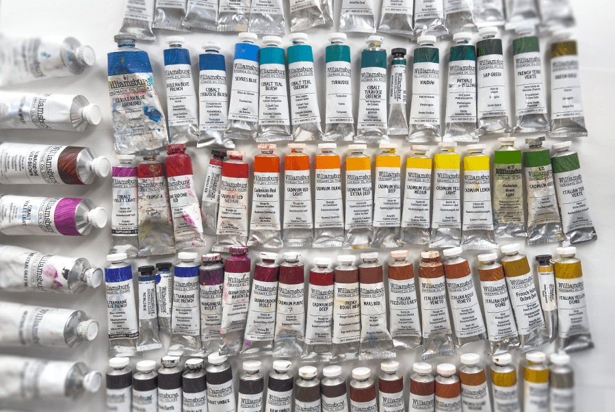
Explore Williamsburg colors
What We Recommend
Exceptional Single-Pigment Colors, Perfectly Neutral Greys, and World-Class Research
Williamsburg paints are highly recommended-- as paintmakers they have shown not just a commitment to research but a love of it. The research from Williamsburg is leading the world of oil paints. We love that Golden acted swiftly in researching zinc and have now reshaped our understanding of lightfastness.
If an artist is sensitive to grit, we recommend checking out Williamsburg's chart on textures, so you can stay in the smoother colors. If you like variety, Williamsburg has it. These colors tend toward a soft impasto and are very highly pigmented.
We love that Williamsburg has a wide range of single-pigment colors and that they disclose their pigments-- they go further and do lightfastness testing on pigments that have not even been included in the ASTM. Their cadmiums are stellar and their range of genuine cobalts and ceruleans it hard to match.
We paint with many Williamsburg colors and many of them are staples of our palettes.

A palette of Williamsburg Colors
Williamsburg Paints
Some Williamsburg paints we enjoy
Explore the Williamsburg Line on the Paint List
Discover more colors in the Williamsburg line
More Resources
Articles, Videos and More
More resources:
Golden's new Virtual Paint Mixer for Williamsburg Oils
__
Recent Lightfastness Testing and Mixing Whites:
Sarah Sands' presentation which explained the need for the testing. Slides can be found here
The Golden 2023 Paper on Lightfastness from Just Paint
Another brand who has been involved in mixing white research is Natural Pigments. Here's their article on lightfastness and mixing whites
We recommend checking out Natural Pigments' video presentation on lightfastness and mixing whites as well.
More about Lightfastness testing at Golden:
-- Video with general information on lightfastness testing from Golden Acrylics. About halfway through they discuss the new research. More Golden resources on Lightfastness
More articles on lightfastness testing from Just Paint, not related to mixing whites. 2017 Lightfastness Overview.2016 Understanding Delta E
--
Discontinuations:
Golden's 2021 presentation giving background on pigment categories and information about what happens behind the scenes in the pigment industry that causes pigments to be unavailable with a few notes on lightfastness testing for example with Hansa yellows, the transparent PY83, and the PG50 changeups
We recommend checking out Golden's 2023 presentation for information on the recent discontinuations due to changes in the pigment industry.
Golden Product Discontinuations 2023
--
Neutral Greys:
The Value of Painting with Neutral Grays
Golden's Video showing the Neutral Greys.
-- Earth Colors
Just Paint's notes on Earth Colors
French and Italian Earth Colors Video from Golden
Golden's Live Mixing Video with the French Earth Set: Shows various tints and their opacity. And their video showing the Italian Earth Set.
Just Paint Article with Chart with the Palette of Textures (smoothness vs. grittyness).
-- Zinc White:
Removal of Zinc White
2018 Zinc Oxide: Warnings, Cautions, and Best Practices 2018 Zinc Oxide Reviewing the Research 2018 Zinc Oxide Reviewing the Research 2021 Update on Zinc White- Search for the Dividing Line
A brief video announcing the changes that Williamsburg made to their line.
-- Other Interesting Williamsburg Resources
Williamsburg White Paints: Just Paint Article Williamsburg Video
Williamsburg oil content by volume
Article on Oils over Acrylics"
Explore the Williamsburg Line on the Paint List
Discover more colors in the Williamsburg line
