
Gamblin Artist Oils Review
Thick Impasto Paint and a White Paint for Every Occasion. Is Gamblin the Right Paint for You?
Featured Paints
Do you really need all of the Gamblin White Paints? What is Torrit Grey? And Will Gamblin be the best paint for your next painting?
All this and more!
Gamblin Review Video
An overview of Gamblin Artist's Oils (their Professional Line)
Gamblin's Artist Grade Oils at a Glance
Impasto-feeling Oil Paints
We recently had a vote of which of three brands people wanted to hear about, and we made this brand review just for you.
On a late afternoon in summer, we were working on a large color-mixing project and had a fresh can of Gamblin Titanium White. It was here we first began to notice the wide differences in handling between paint brands that we would normally modify on the palette with oils and mediums. When working with the paint and just the paint, a person gets to know a brand in a whole new way. So we're talking about paint as it comes just out of the tube.
Every paint brand has a vibe, and for Gamblin, we think of impasto!
Gamblin oil paint is made in the USA in Oregon. They make a student line (1980 Oils) and a professional line, the Gamblin Artists' Oils. This article is about their professional line.
They have a fairly large line of paints and there are even a few extra Gamblin colors that are only available through their online Factory Store, such as their Equality Orange. Fun fact, at the factory store you can also find deals on imperfect paint tubes.
One of the things we look at with brands is their ratio of single pigment colors to convenience mixes. Gamblin has about a ratio of two to three for single pigments compared to blends. This is a little better than average among brands but still in the middle range with a decent amount of single pigments.
Also, Gamblin recently updated their label design. A different label may or may not mean the same paint-- see the section at the end for known formulation changes that have happened recently.
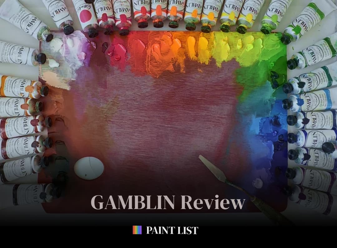
Are Gamblin Oil Paints Right for Your Palette?
Gamblin Stand-Out Colors
Here are just a few standout colors from the Gamblin Line. We're not sure how Gamblin formulates their paints so we can't speak to their archival properties, but these colors were fun to use paints that tended toward sculptural applications. For many of them we made specific videos to show how they handle.
Exploring Brands Through Color Wheels
Paints that lend themselves to impasto textures
What can you get with a basic palette of colors? One of the things we're really interested in at the Paint List is hue and color gamut. However we're also paying attention to texture and the painting experience.
To make comparisons between brands we painted a series of high chroma color wheels with different paint lines. While we've used these pigments a lot on the palette, to limit oneself to a single brand can help in making general comments. Sometimes a brand will have a couple of standout colors, however we're looking for general patterns across colors to make comments on consistency and other variables.
For Gamblin the main takeaway was the texture.
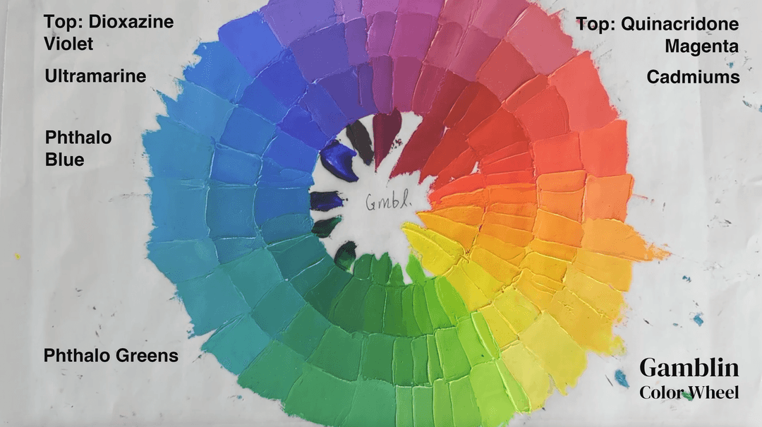
Color Wheel Using Only Gamblin Colors
Paints from the Color Wheel
We used the range of cadmiums, as well as basic colors such as Phthalos, Ultramarine, and Quinacridone Magenta to explore the higher chroma colors that might be used on the palette.
Color Wheel Takeaways
An almost sculptural quality
Gamblin tends to make a very impasto-feeling paint. Usually we'd dilute this on the palette with mediums or oils, however we did not do this here. In order to make comparisons across brands we used the paint right out of the tube.
We found there were differences (within the Gamblin paints) in the variety of impasto feeling from color to color.
To standardize the way we made these color wheels we chose the same high-chroma classic pigments for each brand. The process of painting a color wheel using only one brand gives a sense of the working consistency in general.
For this color wheel we used Cadmium Red Deep, Cadmium Red Medium, Cadmium Red Light, Cadmium Orange Deep, Cadmium Orange, Cadmium Yellow Deep, Cadmium Yellow Medium, Cadmium Yellow Light, Cadmium Lemon, Phthalo Emerald, Phthalo Green, Phthalo Blue, Ultramarine Blue, Dioxazine Violet, Quinacridone Magenta, and Titanium White.
The main takeaway for Gamblin was the thickness. The colors were pretty bright, the cadmiums had a good range, and we liked that there were two phthalo greens so that we could get those extra lime notes with PG36.
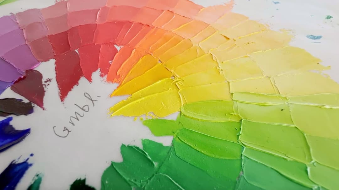
A closeup of the Gamblin color wheel to show texture. Note where the palette knife pulled up the edges of each stroke
Working with Large Quantities
A different angle on paint consistency
Overall, Gamblin oil paints tend to be impasto paints right out of the tube. Yes, we know most painters modify them with about 100 mediums and oils (we used to do this too, and have since changed up our painting practices). So no, we will not be covering mediums (like Gamblin neo-meglip or their solvent free gel or any of those other interesting inventions-- not even Gamsol). We got to know paints on a different scale when making our own convenience blends for a color theory project.
We first began to notice Gamblin's paint texture when we used large quantities of Gamblin paint.
We were working with Gamblin Phthalo Green and began to notice a gel-like texture to this color. The Gamblin Titanium White is also fairly thick.
On the Paint List, we tend to link to smaller tubes. However, if you want to purchase large cans, you can browse all sizes of Gamblin paints at Blick.
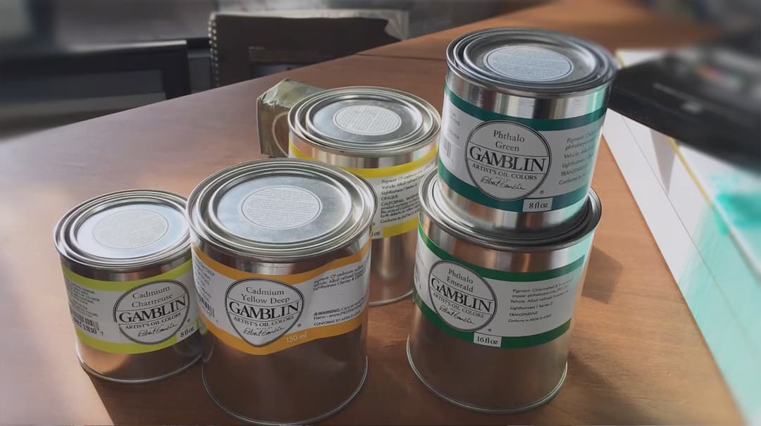
Some of the Gamblin Colors We Used for the Color Mixing Project
Gamblin Textures while Paint Mixing
It turns out this paint is thick
The more gel-like impasto colors include Phthalo Green PG7 and Phthalo Emerald PG36 and many others. Overall this texture was not our favorite, but phthalos are somewhat forgiving when it comes to additives as they need to be diluted for most applications.
There are also some paints with a somewhat gritty, clay-like impasto feel and which differed from the a gel-like impasto. Gamblin has different impasto varieties depending on the color. And then there are a few colors with a totally different feel yet.
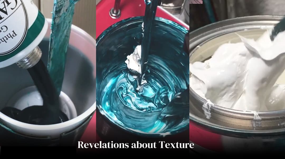
Photos from our massive color-mixing project. Gamblin Phthalo Green and a can of their Titanium White
More than One Kind of Impasto
Different kinds of textures within Gamblin colors
The clay-like impasto feeling reminds one a bit of calcium carbonate (though we don't know if they add chalk or how they formulate things). This thick impasto is found in some of their inorganic colors such as cadmium red deep, cadmium yellow light, and genuine cerulean.
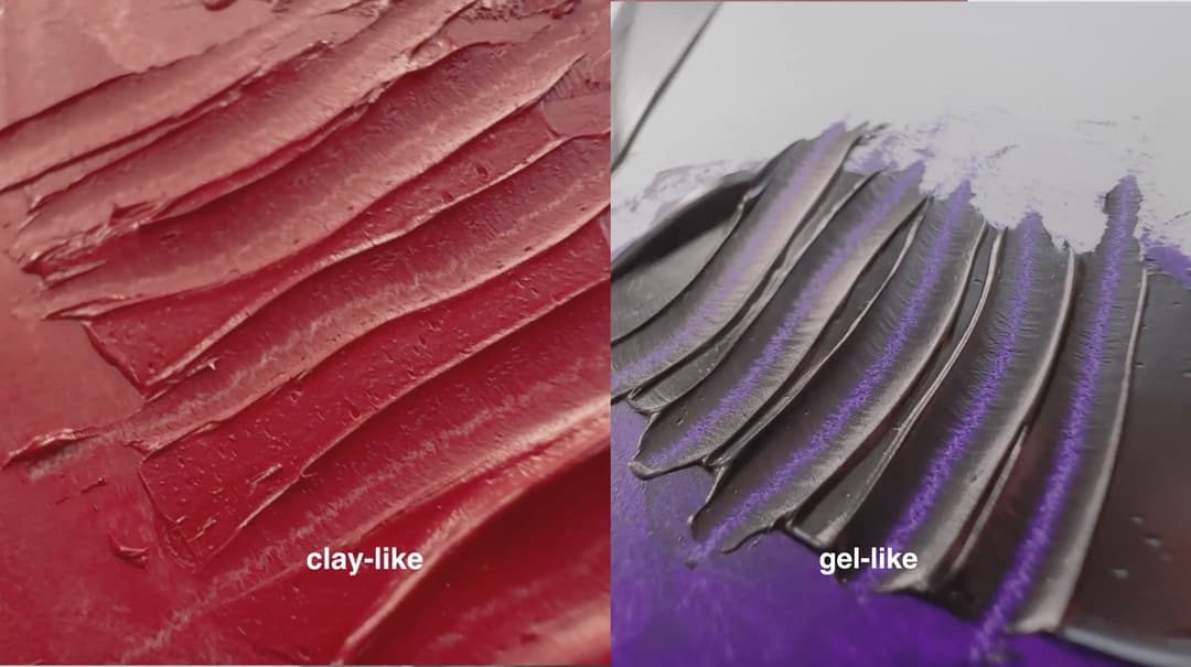
Alternate textures among the Gamblin Artist Oils. Some of the impasto-leaning colors have a clay-like feel, while others feel more like a sculptable gel.
Gamblin Textures
Paint right out of the tube (without additional mediums). Interestingly though, not every color in their line is equally stiff. There are a few that are more flowing (Cadmium Yellow Lemon for one!)
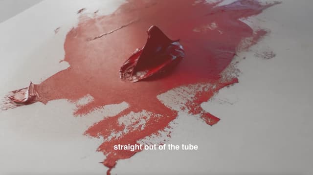
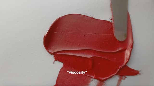
Gamblin Cadmiums- Some High Chroma Paints
The Gamblin Cadmiums Differed in Texture and Handling
Gamblin is known for high-chroma cadmiums, and we love the bright colors. The cadmium yellow medium and deep had some moments where they were less high chroma, however overall we'd say Gamblin has some great cadmiums.
Some of them have a consistency when scraped thinly that reminded us of calcium carbonate or chalk. We don't know if they have chalk in them, but when thinned the film was reminiscent of that feeling. These are very impasto paints!
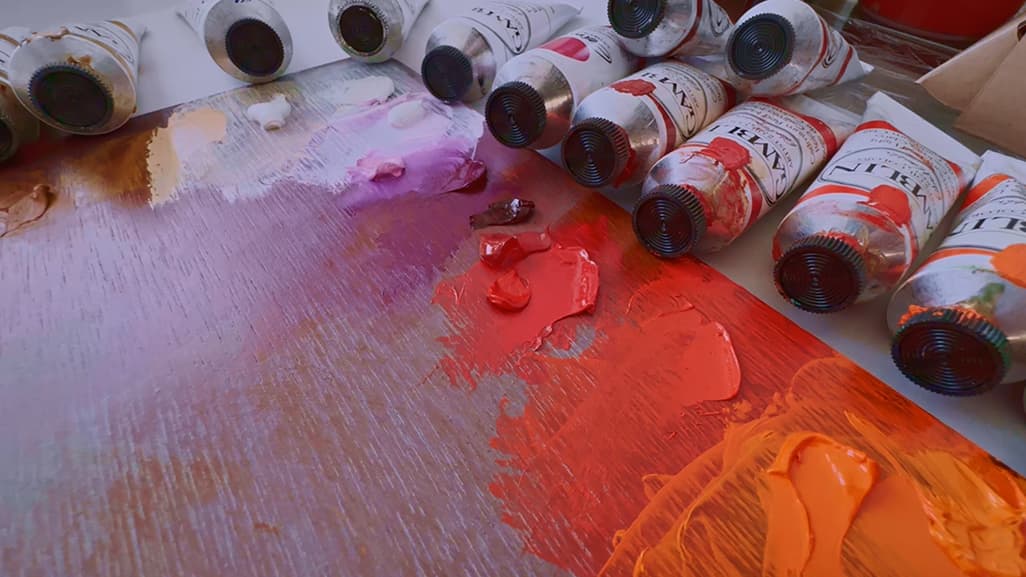
A view of some cadmium reds on the palette
Gamblin Cadmiums
Some high chroma choices and a mix of impasto colors. Not all are impasto though, some are more melting.
Gamblin Consistency Variety- Cadmium Edition
Some are stringy, some are stiff
Some Gamblin cadmium colors differed in consistency. Gamblin Cadmium Orange was a much softer paint - note the thinner string and falling peaks on the left- than Cadmium Yellow Light on the right.
The consistency varied among the cadmium colors. A few cadmiums such as Cadmium Lemon were not nearly as impasto as the others. Cadmium Red Medium and Cadmium Red Light were less intensely impasto than Cadmium Red Deep. It is worth noting that these paints dry quite matte (speaking of an unvarnished state).
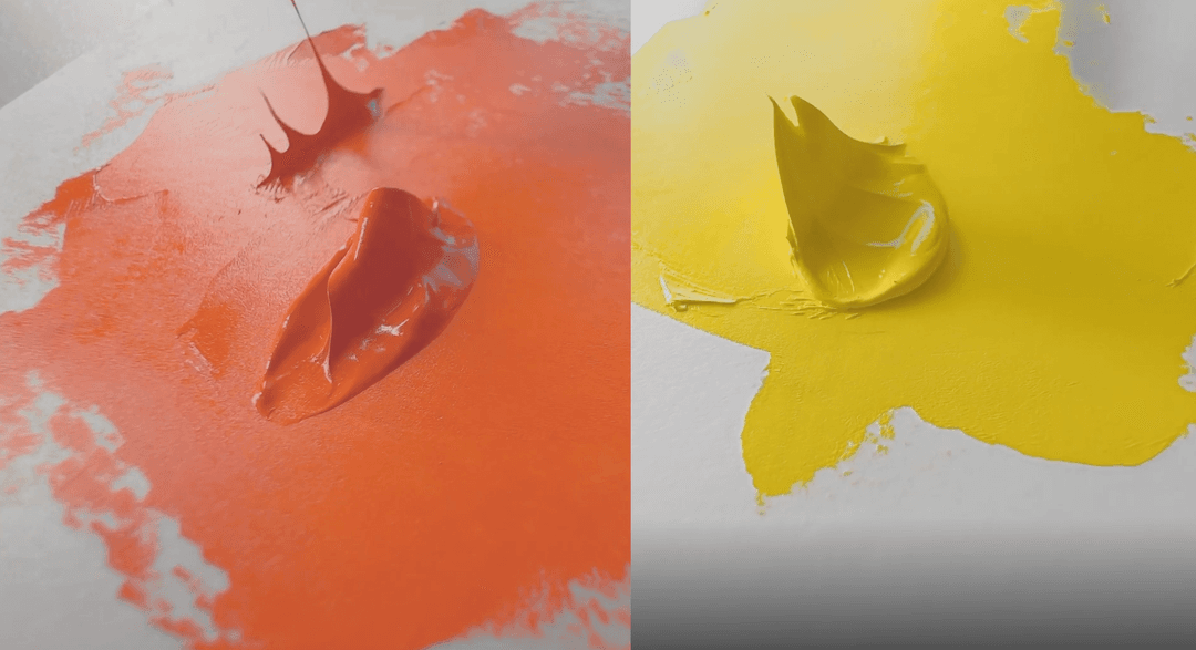
Variety of consistencies within the cadmiums
Gamblin Cadmium Colors
These colors vary in consistency, ranging from stiff impasto to very workable
Gamblin Cadmium Red Deep
This is one of the stiffest cadmium colors by Gamblin. Here's a video, and a bit more about Gamblin Cadmium Red Deep.
Gamblin Cadmium Red Medium
This color has nowhere near as intense of an impasto as Cadmium Red Deep. The video displays a bit more. Find more about Gamblin Cadmium Red Medium.
Gamblin Cadmium Red Light
This color has a bit of heft and really high chroma. Here is the video. Find out more about Gamblin Cadmium Red Light.
Gamblin Cadmium Orange Deep
Gamblin has two cadmium oranges and this is the redder of the two. Here's a link to the video for Cadmium Orange Deep. Find out more about Cadmium Orange Deep.
Gamblin Cadmium Orange
This is the yellower of the two cadmium oranges. Here is a video. More information on Cadmium Orange.
Gamblin Cadmium Yellow Deep
It may be a bit of an optical illusion but if you're looking for the brightest high chroma cadmium yellow deep, this may or may not fit the bill. There was a moment in our color mixing project when we needed a different one by Williamsburg. This color has high chroma for the exact hue it happens to be. The consistency of the color is stiff and impasto. Video here. Find out more about Cadmium Yellow Deep.
Gamblin Cadmium Yellow Medium
This color is pretty bright and adds a nice note of chroma at that particular hue. Like most of the Gamblin Cadmiums it has low viscosity. More information about Cadmium Yellow Medium.
Gamblin Cadmium Yellow Light
This is one of the stiffer Gamblin Cadmium Yellows. The chroma is high and bright. Video here. More information about Cadmium Yellow Light.
Gamblin Cadmium Lemon
This is one of the less impasto Gamblin cadmiums. This color is definitely a cadmium yellow lemon however it has a surprising warmth when used in mixes. There is also a lightening effect almost like adding white. In masstone it's high chroma. Video here. Find out more about Cadmium Lemon.
Gamblin Convenience Greens
As with all convenience greens, some of these colors vary in lightfastness. Better lightfastness will likely be found in the cadmium colors (as opposed to something like Permanent Green). The Gamblin Cadmium Green is slightly desaturated.
Gamblin Cadmium Chartreuse
We love the specific hue of this ultra chromatic beautiful near-yellow. The paint is fairly thick. Video here. Find out more about Cadmium Chartreuse.
Gamblin Cadmium Green
This cadmium green is ever so slightly less high chroma than a spectral green, however it is made with genuine viridian, which is a useful color in realistic painting. We also love that it has a lightfast (genuine cadmium) yellow. Video here. Find out more about Cadmium Green
Gamblin Permanent Green Light
This is a high chroma leaf green. It's a little yellower in hue than some Permanent Green Lights, and has a nice bright chroma. Details from Paint List on Permanent Green Light.
Other Standard Single-Pigment Colors
Fairly common pigments which are found on many palettes
The Gamblin line offers the usual palette staples. Everyone has a different idea of a core color for the palette, but these are some of the ingredients for high chroma color blends.
Phthalo Emerald PG36
Something nice about the Gamblin line is that they offer a PG36. Not every brand offers two phthalo greens, and both are needed for the highest chroma palette. This is a phthalo green that leans more toward yellow. This can be nice ingredient in mixing green blends. Several other brands offer this pigment in their paint line as well (you can find out who does on the Paint List here). Video here. Find out more about Phthalo Emerald.
Gamblin Phthalo Green PG7
The Gamblin Phthalo colors have a sort of gel-like quality that only really became super noticeable when working with large quantities of these colors. Video of this specific here. Also, you can see a little clip of a larger quantity of this color being poured out in our brand review video. It is almost slick. Find out more about Gamblin Phthalo Green.
Gamblin Phthalo Blue
This is a slightly warm variety of Phthalo Blue (though that is totally relative to other phthalos). This is pigment PB15:2. In the past, this color was made with PB15:1. Video here. Find out more about Phthalo Blue.
Ultramarine Blue
This was a nice deep variety of Ultramarine with good tinting strength. Video here. Find out more about ultramarine blue.
Gamblin Dioxazine Violet
Gamblin's Dioxazine Violet was similar to ones we tested in other brands. There was an almost-imperceptible warmth to this color in masstone but it was so small that it would likely not be noticeable in practice. Find out more about Dioxazine Violet.
Gamblin Quinacridone Magenta
Video here. Find out more about Quinacridone Magenta.
Common Palette Colors from Gamblin
Popular cooler-hued 'ingredient' colors that often form the core of the palette
The Gamblin Titanium Whites
Three Interesting Formulations
Gamblin has a large range of white paints in addition to their standard Titanium White. These include Quick Dry White, Zinc White, Titanium Zinc White, Radiant White, and Flake White Replacement. In addition they have a few white blends with colors to make Cool White and Warm White. However we took a look at just three of these made with the same pigment to see how they differed.
Gamblin White Paint Exploration
Regular Titanium White, Flake White Replacement (also Titanium), and Radiant White (also Titanium) in this Mini-Review
Gamblin Radiant White
Totally different working consistency than Gamblin's Titanium White
Radiant White is super fluffy- almost a shock for a Gamblin color because the consistency was a departure from their normal impasto consistency. This paint was almost like whipped cream! (Don't eat it!)
Painter lore had it that this paint is one of the brightest whites. We didn't take a look at that (perhaps a future review would be in order) because we were focused here on its handling qualities. It does contain safflower oil so that may be important to some painters.
Radiant White is a strong tinter, with a fluffy consistency. Find out more about Radiant White.
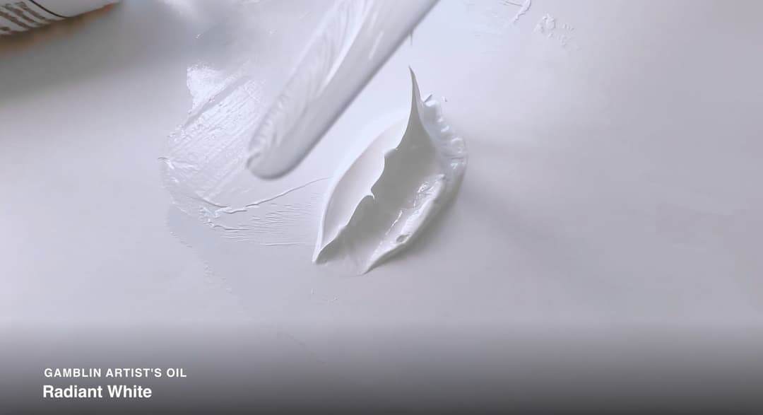
Gamblin Radiant White
Gamblin Flake White Replacement
Another Variety of Titanium White from Gamblin
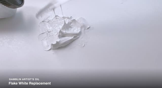
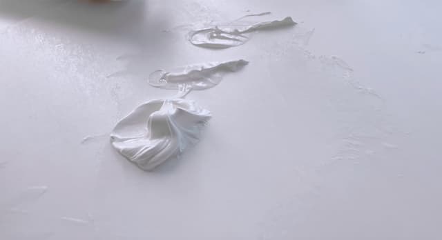
This color was also a departure from the normal Gamblin consistency. As an attempt to replace Flake White, this actually has some good things going for it.
Nothing can replace genuine lead white because of the film strength that lead white imparts, however this paint did a pretty good job at gesturing to some of lead white's qualities. Flake White Replacement is still at heart a titanium white.
The paint was lacquer-like and thick, overall it was a bit warmer than regular Titanium, it tended to flatten when swirled with the palette knife, and also became a bit stringy.
The main benefit to painters would probably be that it is less of a strong tinter than the regular Gamblin Titanium White.
For painters where lead white is unavailable (or for those who do not want lead's toxicity) this is an interesting alternative to try.
Find out more about Flake White Replacement.
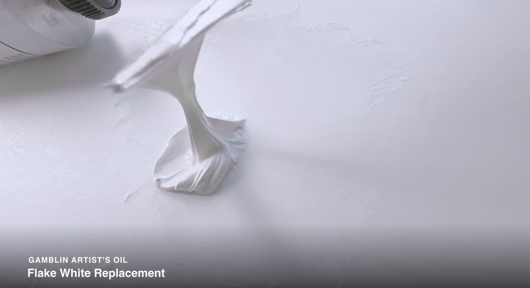
Flake White Replacement
Gamblin Flake White Replacement
The working properties of this color differ substantially from Gamblin Titanium White
Gamblin's (Regular) Titanium White
Gamblin's signature color
A paint line's standard Titanium is an important color since it is mixed in with most other colors on the palette. The Gamblin Titanium is a very crisp titanium which is very slightly cooler in temperature than the Williamsburg Titanium White which we use as a standard color on the Paint List.
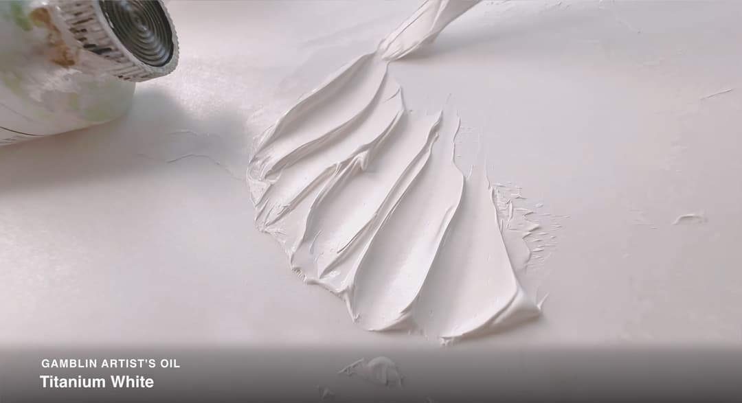
The consistency is both impasto and very smooth-- there is almost something resin like about the paint, but it has a lot of heft to it. This color typifies Gamblin's impasto quality. Find out more about Titanium White.
Gamblin Titanium White
Which White (if Any) Suits Your Practice?
One Pigment, Three Properties
The three Gamblin PW6 colors: Radiant White, Flake White Replacement, and Titanium White.
In general, Gamblin's Radiant White is a super light and fluffy safflower oil paint which tints mixtures powerfully.
Gamblin's classic Titanium White has a crisp, sculptable impasto. The texture is polished in comparison to some other titanium white paints we've tried.
Finally, Flake White Replacement (which, we feel would be better named Flake White Hue) cannot replace the chemical nor the structural elements of Flake White which lend to genuine Flake White's permanence. We do not know what else is in it (in addition to the stand oil) nor can we say how it may change over time. However for a Titanium White it is amazing how they were able to emulate some of the Flake White feel.
.png&w=1080&q=75)
Gamblin's Radiant White, Titanium White, and Flake White Replacement (a hue)
Gamblin White Paints
Whipped-feeling Safflower oil, Polished Pointy Impasto, or Flake White Feel
Gamblin's Radiant Colors
Radiant White's Feel is Found in the Radiant Colors
In a sense their convenience blend whites Cool White and Warm White could be said to be just the beginning because they also have the series of Radiant Colors, which are also pastels/white convenience blends, just with a touch more color than the tinted whites. We've tried several of the radiant colors. Here is a listing of the colors and a few notes about them.
Gamblin Radiant Magenta
A pink that's cooler than what we'd call a bubblegum pink, Radiant Magenta is a PV19 and titanium white blend.
Gamblin Radiant Violet
A handy mix to have on the palette. Find out more about Radiant Violet
Notes on Gamblin's Radiant Blends
Some pigment notes on the Radiant Colors
Radiant Magenta a PV19 and titanium white blend.
Radiant Red This is an interesting one with PR149 as a colorant.
Radiant Orange can only be found sometimes at the Gamblin Factory store. Of it, they say, "If you’ve ever wished for a Radiant Orange, this is it." But they don't seem to list the pigments, at least at the time of this writing.
Radiant Yellow contains PY83 and titanium white. Not to be confused with Radiant Lemon!
Radiant Lemon Might want to lightfastness check this one, as it has PY3 (lightfastness can vary by brand).
Radiant Green like all convenience greens, check that yellow (PY3) for lightfastness. This also contains PG36.
Radiant Turquoise which blends phthalo blue and phthalo green together with white.
Radiant Blue a sort of King's blue, which combines ultramarine and white.
Radiant Violet which is made of PV23 Dioxazine Violet, so do your LF tests for this one, since it has long been rumored that PV23 can vary from supplier to supplier.
Sometimes it's just great to have these colors on the palette.
Similar colors which are not technically in the radiant line of colors include Naples Orange and Naples Yellow. More information from Gamblin about their Radiant colors can be found here.
Gamblin Radiant Colors
Pastel convenience mixes
Gamblin Earth Tones
Once again a variety of impasto textures
There was a wide textural variety in the way that Gamblin's earth tones handled. Two of our favorites were Yellow Ochre and Burnt Sienna. We don't know what's in them that causes the way to handle with such a bounce to them, but it's a lot of fun to move those colors with a palette knife.
Raw Sienna and Burnt Umber were more stiff.
Gamblin Burnt Umber
This is a stiff paint! If you're looking for an impasto umber, this might be one to try. Video here and more information.
Gamblin Raw Sienna
This is a somewhat clay-like impasto and a stiffer earth. Video here and more information
Gamblin Yellow Ochre
Like the Burnt Sienna, this paint probably has some sort of additive that give it is amazing handling. This is a fun paint to use. More information here
Featured Gamblin Earths
Gamblin's version of some of the more popular palette colors
Additional Gamblin Earths
Beyond the Basics
Gamblin has a handful of additional earths and earth-blends including red earths. They also have several interesting convenience colors, such as Brown Pink which includes a PR149.
More Gamblin Earth Colors
A few more of Gamblin's take on classic earth colors, plus a few interesting blends
Gamblin Reclaimed Earth Colors
Specialty Earth Series
More information about these oil paints can be found on the Gamblin website. This is an interesting project. While we love the project we do want to let people know (just for awareness) that there were some issues early on with one of the colors that needed to be recalled. This was mentioned on the Gamblin site as recently as 2022/2023. Some tubes had exploded and the recall notice is no longer on the website. We would advise treating all fine materials with caution and a healthy respect even if made from iron oxide, and these are no exception.
More information can be found from Gamblin on their Reclaimed Earths series.
Gamblin Reclaimed Earth Colors
Specialty Earths from Gamblin (please note these are available as a set)
Gamblin Black Paints
The Usual Standbys and a Few Surprises
Gamblin offers an array of black paints including a convenience mixture.
Gamblin Chromatic Black
This convenience color has totally different working properties than Mars Black. Explore more about Chromatic Black
Gamblin Mars Black
A color with more opacity than Chromatic Black. Explore Gamblin's Mars Black
Black Paints from Gamblin
Gamblin offers a variety of black paints
Tinting Strength in Featured Gamblin Colors
A Few Colors to Consider
The tinting strength in Gamblin colors was decent. We'll be featuring more Gamblin paints in cross-brand reviews so you can see direct comparisons for specific colors. Certain brands have higher tinting strength than Gamblin, however the coloration in the cadmiums was moderate to decent.
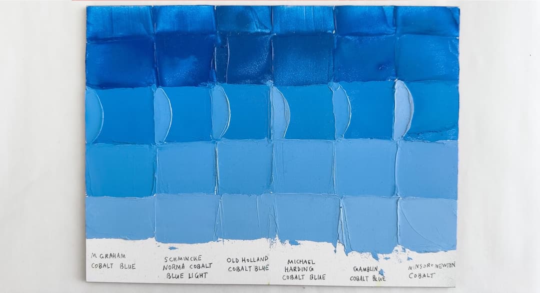
Their cobalt blue had good tinting strength, and we noticed a higher than average tinting strength in their Ultramarine.
Gamblin's Cobalt Blue is an interesting color. We liked the consistency of the cobalt a bit more than the cerulean. The cobalt also did well as far as tinting strength. The consistency is a little bit plastic feeling, however if you like the Gamblin consistency this could be a good choice.
Comparison of Cobalt Colors
Tinting Strength in Cadmiums
More Tinting Comparisons
In some colors the tinting strength was ok. Some of the Gamblin cadmiums shine for chroma and less so for highest tinting strength. However they are quite bright.
In this particular comparison of mid-tier brands, Gamblin's Cadmium Red Medium appeared to have comparable tinting strength to Winsor and Newton's Cadmium Reds.
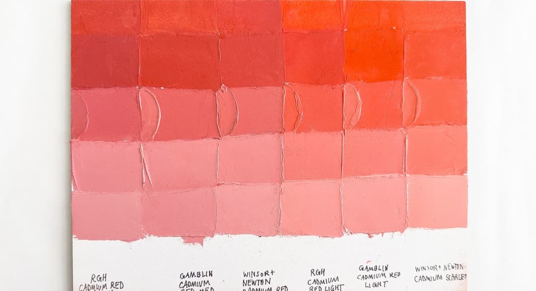
Tinting strength comparisons for Gamblin Cadmium Reds
Gamblin Cadmiums and Cobalt
Paints discussed for tinting comparisons
Lightfastness Issues
New information on lightfastness
As always, we recommend doing your own lightfastness tests. A couple of colors to look out for could be those which contain PY3, PV23, PR112, and possibly even PY74. Prussian Blue PB27 was also revealed to have some unexpected lightfastness testing results.
In general: the lightfastness of colors may need revision depending on which white paints are used with that color. New tests for lightfastness are being developed by the ASTM which take into account the ways in which different white paints interact with pigments. There have also been changes in pigment manufacture over the years which could impact the lightfastness of a couple of colors. For this reason, we always recommend doing some lightfastness tests.
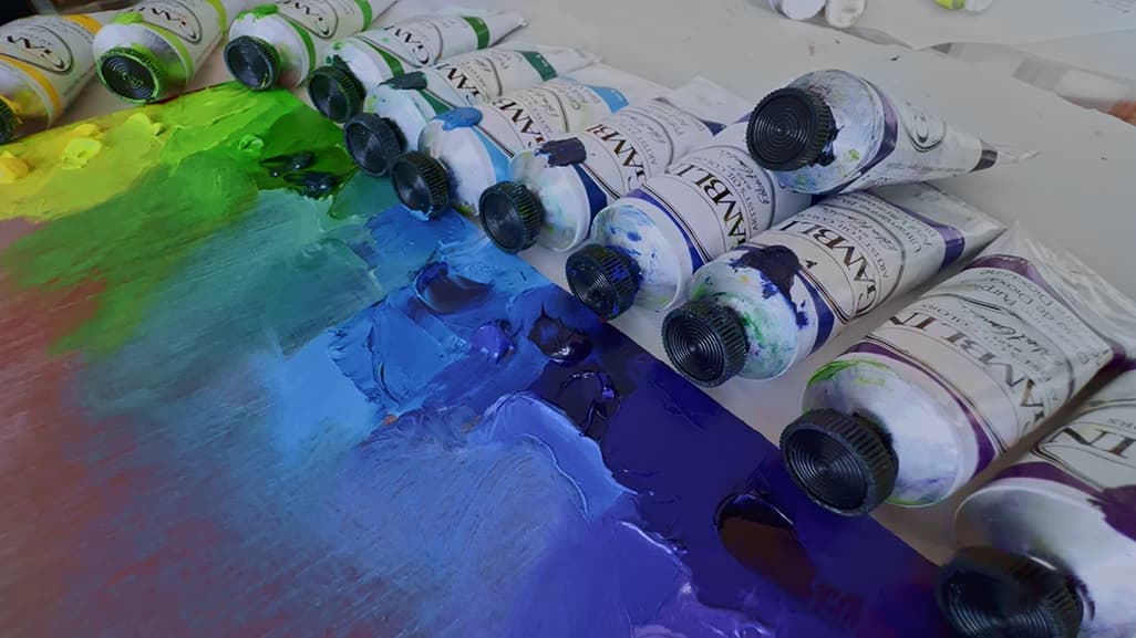
Standard palette colors from Gamblin
Formulation Changes
Shake-ups in the Pigment Industry and Formulation Changes at Gamblin
There have been a handful of formulation changes we've heard about in recent years relating to Gamblin.
Gamblin Indanthrone Blue
This color is still made with PB60 but the color will be different. This shows the older color. Explore Gamblin Indanthrone Blue.
Indanthrone Blue
A slightly different hue in store for the future
Here are a few formulation changes we've heard about. Gamblin recently changed their Indanthrone Blue.
Video here. More information about Indanthrone Blue can be found here.
Jackson’s Blog compares changes in Gamblin’s Alizarin Crimson and Gamblin Indanthrone Blue Paints and they have nice pictures of the old version and the new formulation side by side.
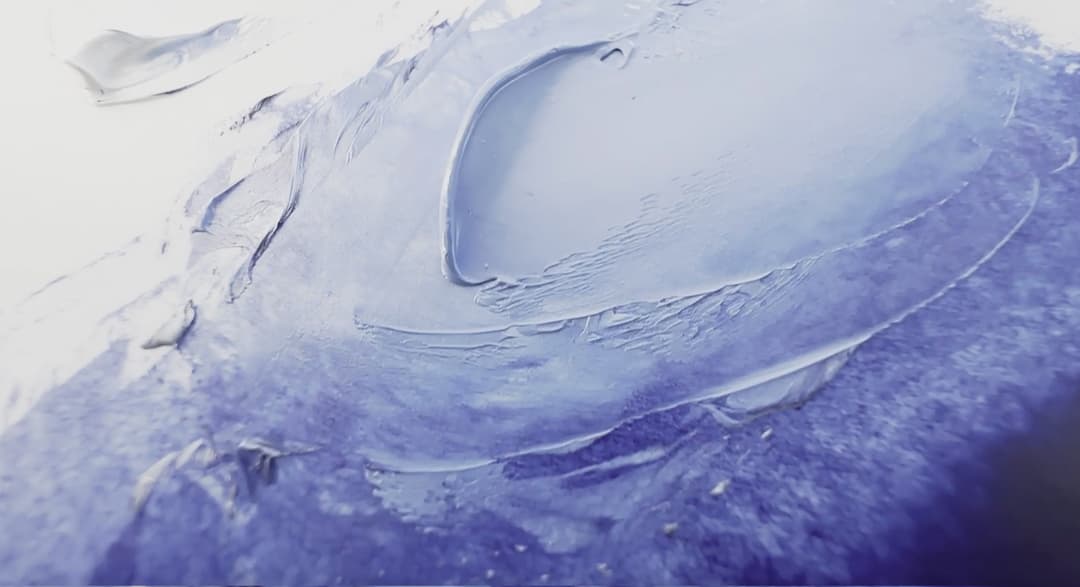
Beautiful deep blues from the previous formulation of Indanthrone
Gamblin (Genuine) Alizarin Crimson
Video here. More information on Gamblin's genuine Alizarin Crimson PR83.
Gamblin Genuine Alizarin Crimson
Wider shakeups in the pigment industry
Changes are also possibly coming to Gamblin's genuine Alizarin Crimson, PR83. This is due to wider changes in the pigment industry, not due to Gamblin specifically. This color (PR83) has been beloved by artists, however its lightfastness is not good-- it is LFIII. Due to the changes, in late 2023 Gamblin announced that they would no longer be selling genuine Alizarin in can form, though it is still available at the time of this writing in tubes.
While Alizarin Crimson is still available in their Artist professional line, it has already been removed from the Gamblin 1980s oils and has been replaced with PR177.
Available while supplies last (please bear in mind we cannot guarantee the formulation, please check with the retailer to be sure their website reflects the most current information).
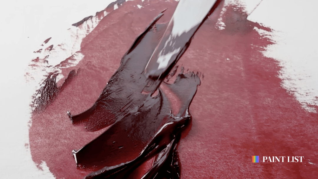
Gamblin Alizarin Crimson
More formulation changes
Whether due to pigment-world shakeups or other factors, a few paints have changed
Gamblin may have also changed the pigment for Cerulean Blue as some sources said PB36, and yet a recently purchased tube of ours was PB35. A few more formulation changes include mixes for Olive Green, Terre Verte, and VanDyke Brown.
Paints with Formulation Changes
A handful of paints with formulation changes, including a few blends
What We Recommend
Impasto paint right out of the tube
Gamblin's professional line is the choice of many fine artists that we know personally, and we've painted with Gamblin in years past. It's a paint that comes ready-made if you are looking for an off-the-shelf impasto solution. Our only caveat comes along with not knowing how the paint is formulated as well as the need for mediums to modify it if you're painting in thinner layers. Since we don't know the binders, additives, and specific ingredients, for the highest requirements of archival work, those elements would need to be known so that their effects could be taken into account. For thinner painting a person may need to modify most Gamblin colors. If a person is modifying using mediums, this can add chemical complexity to the paint films.
One of the things Gamblin seems to be aiming for is impasto working qualities even at rather warm ambient temperatures. If this kind of paint consistency is important to you, Gamblin could be a paint to try.
We like that Gamblin has a decent range of single-pigment colors and that they disclose their pigments. Their cadmiums are bright and they offer genuine cobalts and ceruleans. We appreciate the Radiant color line of convenience colors since most colors on the palette end up mixed with titanium white anyway, these pastel blends save time mixing.
Happy painting!
More Resources:
Paint List video on Gamblin White Paints
Discover the line of Gamblin Artist Oil colors on Paint List
Videos of individual Gamblin Colors
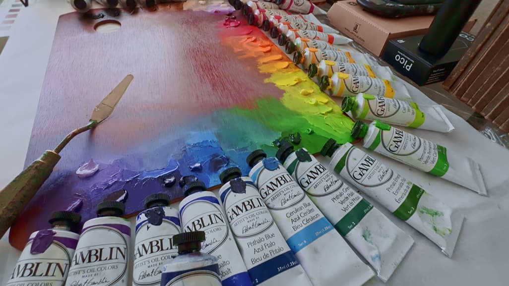
A palette of Gamblin Paints
A Handful of Gamblin Artist Oil Colors
From cadmiums to earth tones
Browse the whole range of Gamblin Artist's Oils on Paint List
Discover new Gamblin paints
