Ultramarine Blue Oil Paint Comparison
From A Word Meaning Over the Sea, these Deep Blue Beauties are an Old-World Painter's Dream Come True
Featured Paints
A Modern Take On An Ancient Pigment
What is the difference between Ultramarine Blue and Ultramarine Blue French? Is it worth it to buy Ultramarine from a premium brand? And was it really worth more than gold? All this and more.
This is an oil paint comparison article where we gathered a handful of premium ultramarine paints in the studio. There is also another article. focusing on the pigment itself and how it behaves in oil painting.
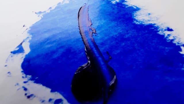
Literally translated over the sea, these blues are just as deep. Synthetic Ultramarine Blue is the modern version of the historical Lapis Lazuli. When we think about what we are grateful for, the invention of artificial ultramarine makes our list.
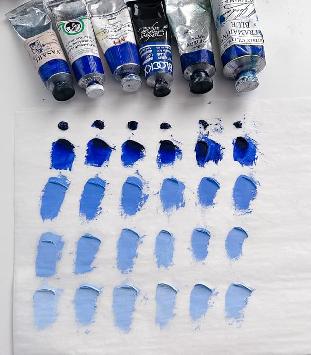
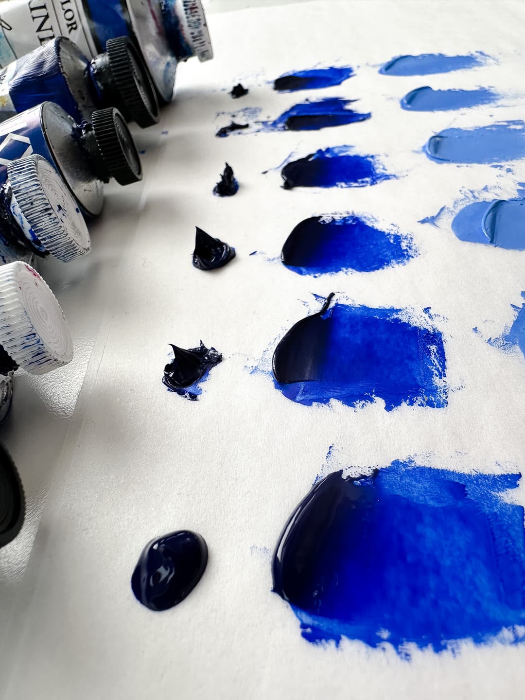
Modern Ultramarine Blue is identified as pigment code PB29, and to learn more about the pigment, you can also check out our article. Here we take a look at a handful of paints out on the market that are made of this important pigment, such as Blockx, Old Holland, Michael Harding, Vasari, Rublev, and M Graham. For this comparison we just happened to pick these paint colors-- there are many good ultramarines available to painters. The best advice we've heard is to get lots of advice from different sources, so this article is not meant to be definitive. Here we'll explore some of the various handling qualities of these paints, as well as explore their tinting strength and different binding oils.

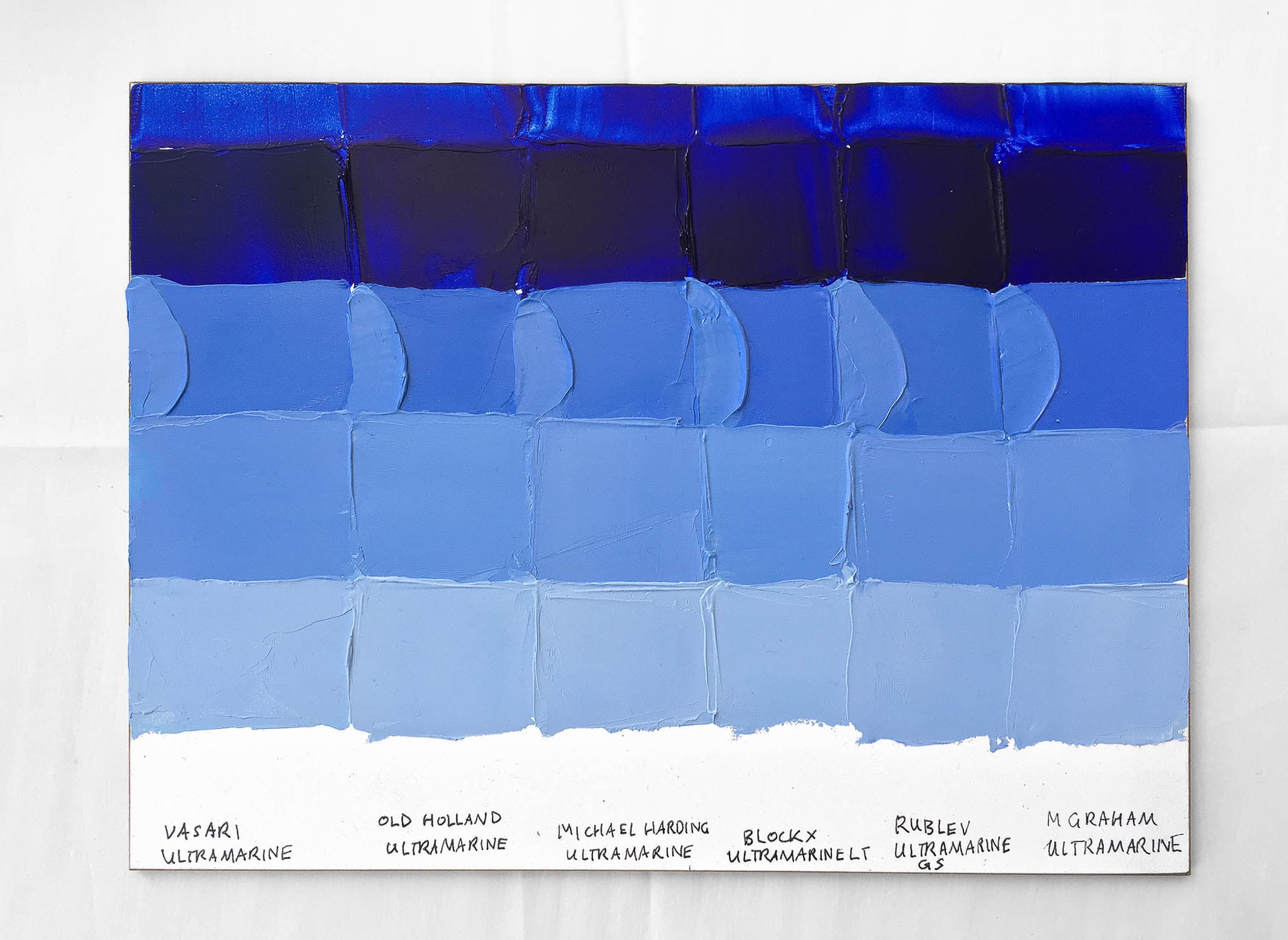
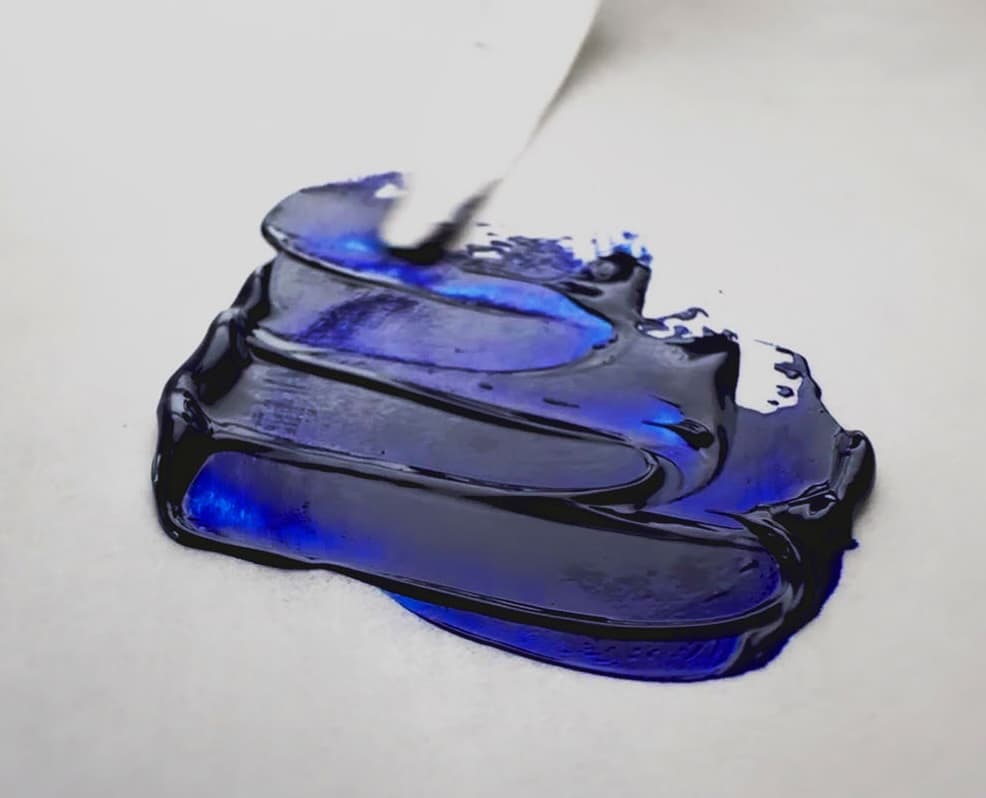
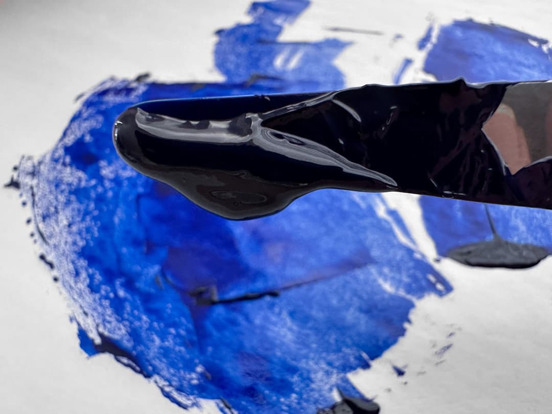
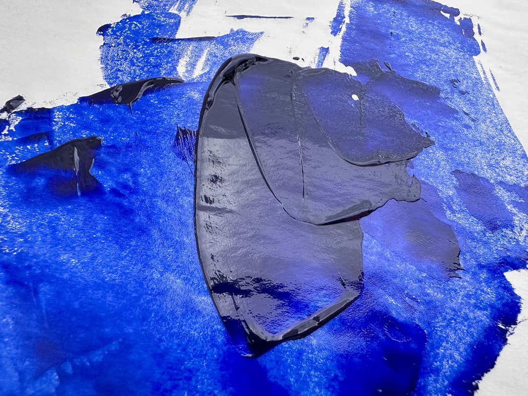
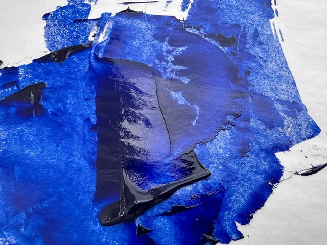
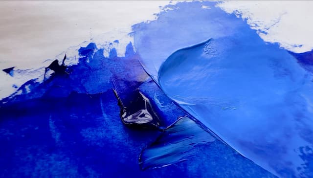
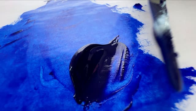
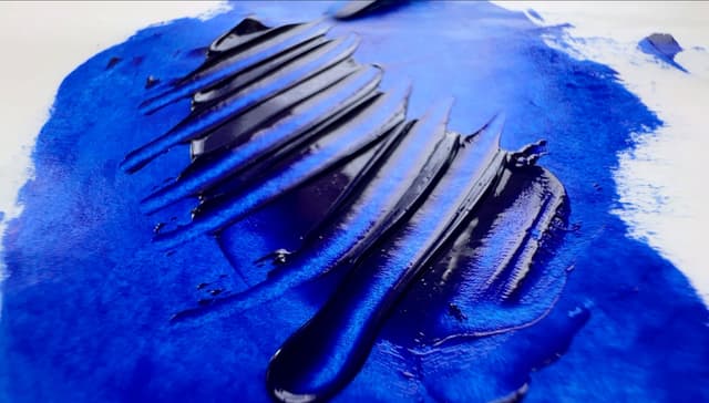
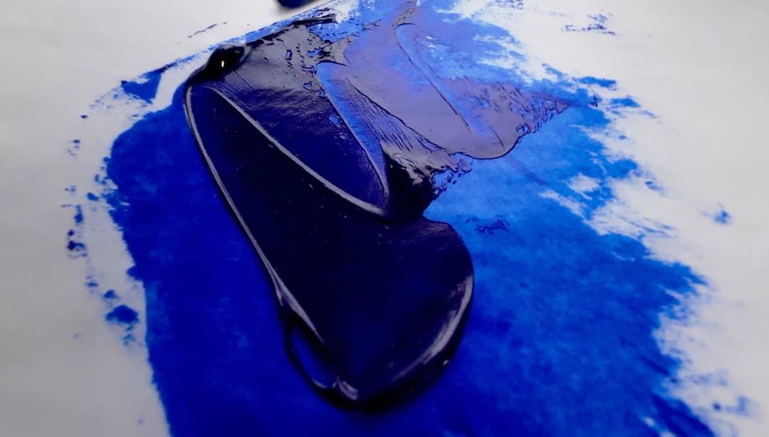
A comparison of Ultramarine Blue oil paints made of single-pigment PB29. Among ultramarine paints, some are more royal blue like these, and some have an additional indigo-violet note (not shown here). The paints here are all what we'd call regular Ultramarine Blue, which is a deep royal blue
Ultramarine Overview
Modern Ultramarine Blue
Once As Precious, or maybe More Precious, Than Gold This lustrous royal blue is without parallel, and it outshines all but the most refined versions of its semi-precious-gem predecessor (Genuine Lapis). A full explanation of the layered history of Lapis Lazuli is a topic for another day, but it is said to have been more costly than gold. Natural Ultramarine pigment was so valuable that artists would (allegedly) go through the work of straining it out of the cleaning water and their brushes. Let's just suffice to say that in modern times have at our fingertips a deep blue that artists in other eras would have greatly desired to have on their palettes.
Modern Ultramarine Blue Now a painter's staple color, this pigment comes in two shades, which can be searched for on Paint List. Unfortunately the names are bit confusing. At one time, French Ultramarine Blue referred to just the synthetic pigment. Now, in some brands it means a more indigo-violet version, but that's not always the case (more on that below). In terms of pigment codes, Natural Lapis Lazuli, Regular Synthetic Ultramarine, and the more violet-leaning Ultramarine Blue Deep, all share the same pigment code, PB29. Natural Lapis Lazuli will tend to be well-marked by a paintmaker, but the synthetic ultramarines can be harder to sort out using the paint name alone. Since the names can vary a bit, it's not a sure-fire guide to the undertones of the color one will find in the tube.
Even so, one can search for Ultramarine Blue colors made of PB29 on Paint List, which are sometimes also labeled Ultramarine Light, and the slightly purpler Ultramarine Blue Deep, also known as Ultramarine Blue French. As with most things in the paint world, the names are generalizations and there are sometimes exceptions.

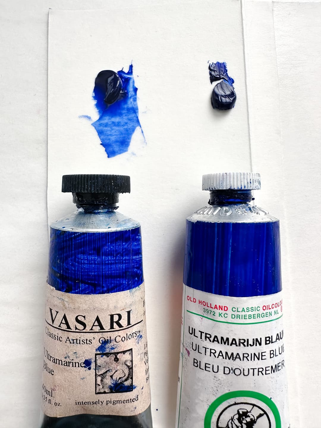
Michael Harding Ultramarine Blue, PB29
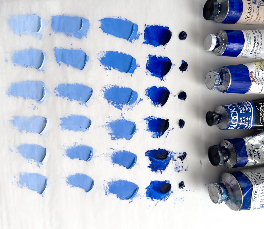
Ultramarine Blue Tinting Test
The premium paints all had high tinting strength
For this particular comparison, we chose a handful of paints that all happened to have very high tinting strength, so the tinting comparison doesn't show the dramatic differences that are sometimes noticed between something like student vs professional lines (the student lines are not shown here).
The tinting strength across the paints here was very high. Old Holland and Rublev had a very slight advantage. A variation was noted in Vasari and Blockx as seeming to have a bit less intense tinting strength, however all of the colors shown here were strong tinters.
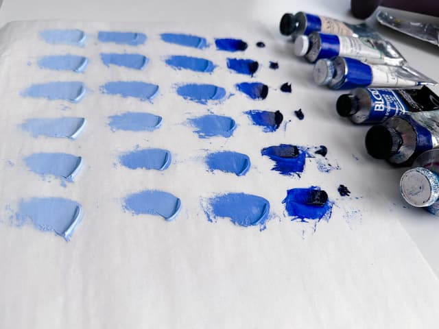
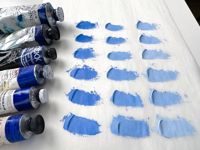
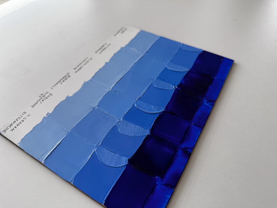
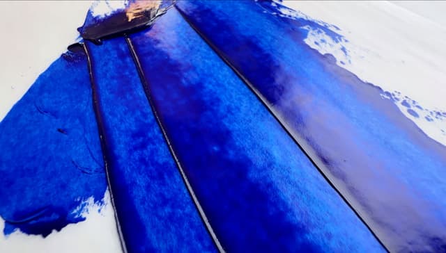
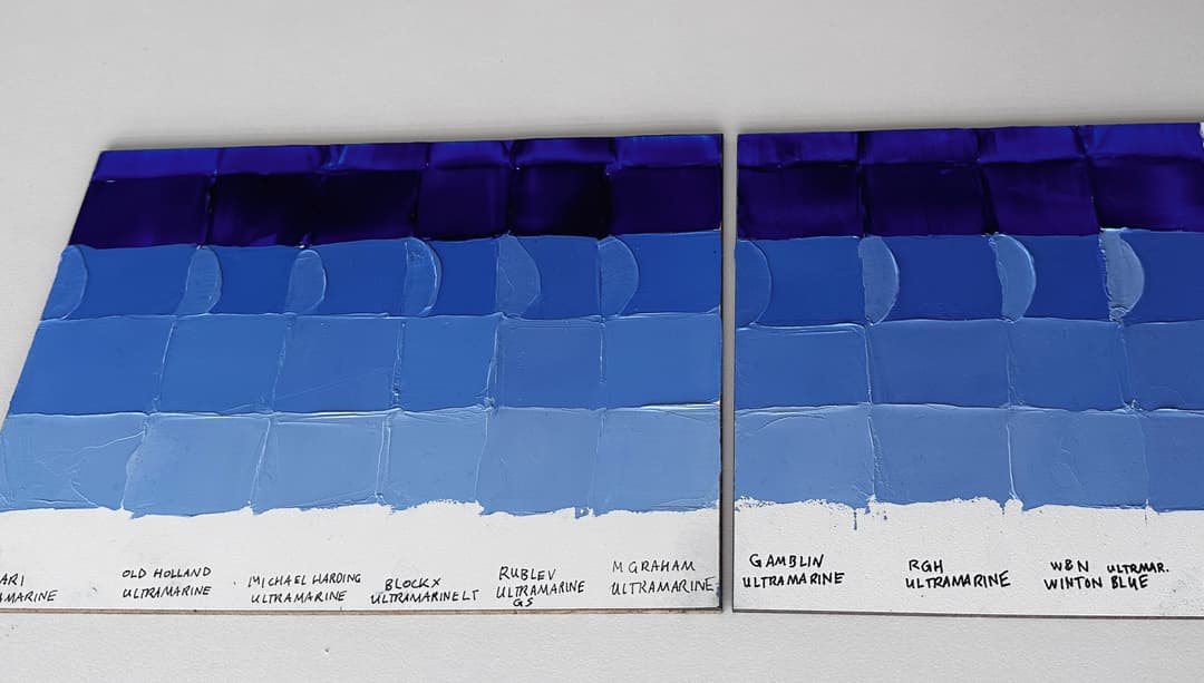
Ultramarine Blue Paints by Vasari, Old Holland, Michael Harding, Blockx, Rublev, and M Graham. These paints are bound in a variety of binding oils. The first line of pastel tints are tinted approximately 1:1 with Williamsburg Titanium White in Linseed Oil, PW6.
Featured Ultramarine Blues
All the paints featured on this panel are the regular deep middle-blue (i.e. the less-purple) variety of ultramarine blue, made of PB29
Ultramarine Comparison
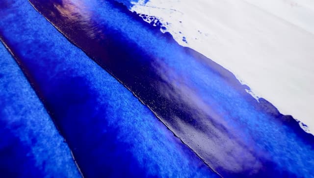
The ultramarines shown here are a bright royal blue, and all the colors we swatched here were fairly similar once they dried. To be clear we have not individually assessed the lightfastness of these paint colors, but rather this panel is focused on exploring the tinting strength and undertones. The tints are made with Williamsburg Titanium White.
The semi-circle areas show the paint mixed 1:1 with white to show tinting strength, whereas the rest of the squares contain different amounts of white to explore the undertone. The glazes at the top were made with a bit of Rublev Oleogel. A more detailed tour through the panel is discussed below.
Oil paint brand comparisons for Ultramarine Blue included
Michael Harding Ultramarine Blue
Blockx French Ultramarine Blue Light
Rublev Ultramarine Green Shade
Each paint is described in greater detail below. In terms of pigment they are listed as single-pigment PB29. Here are some general observations:
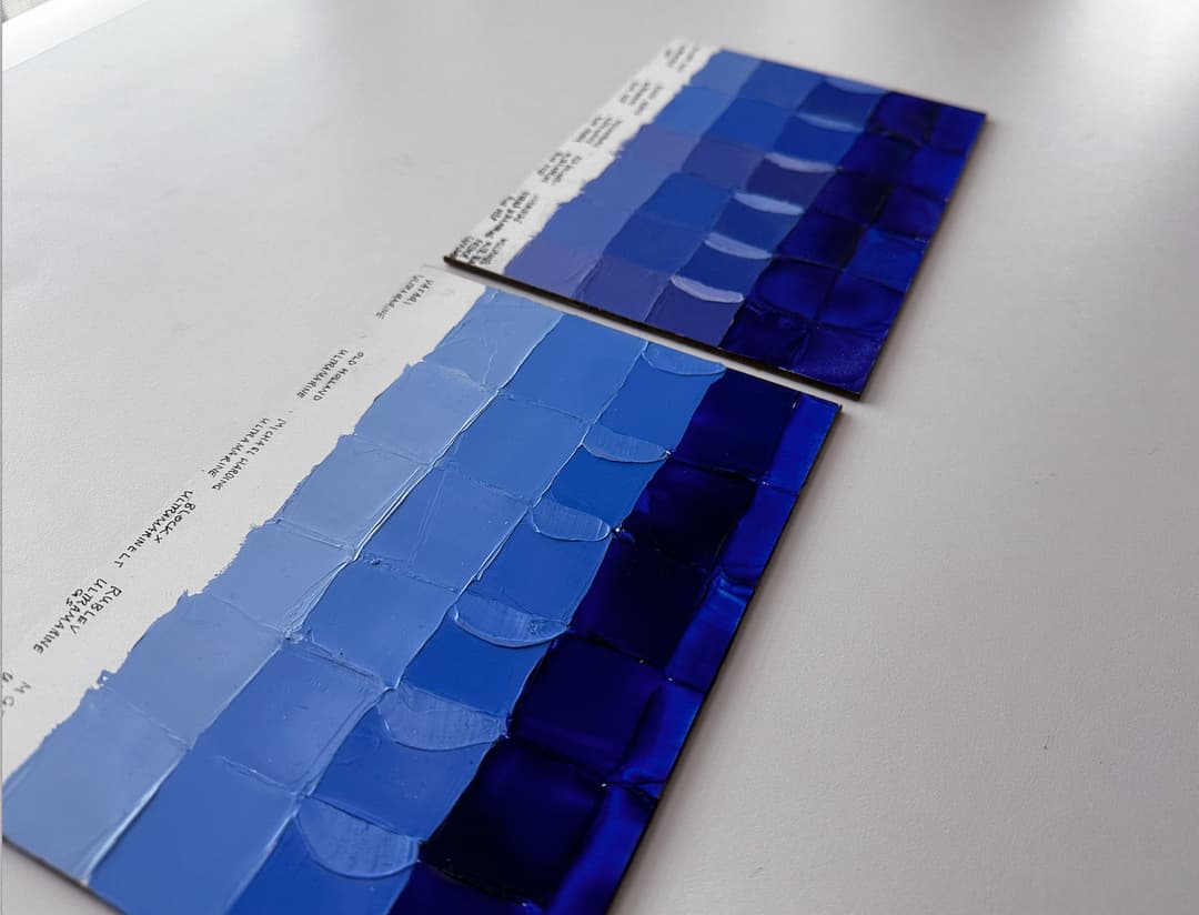
Color Variation Ultramarine comes in a variety of blues, and the shades of ultramarine chosen by these paintmakers were quite similar. Of the shades shown here, Rublev was a tiny bit warmer (indigo) in tints, however that was almost imperceptible.
Depth of Value All of the paints were sufficiently deep. One thing we could see was when the paint was wet, the Rublev was extra deep when applied opaquely, with close seconds of Old Holland and Michael Harding. After a few years of drying, all of the linseed versions appeared similarly deep.
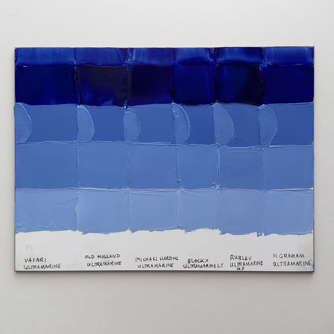
Panel of Ultramarine Blue PB29 oil paint comparisons exploring undertone and hue. The top row is a glaze made with a bit of Rublev Oleogel. The second row is masstone spread with a palette knife. The third row contains semi-circles to show the tinting strength 1 to 1 with Williamsburg Titanium White. The squares in rows 3-5 use varying amounts of white to explore the undertone and emulate how the paint might perform in practice, as well as what the hue is capable of achieving by adding more white. Ultramarine paints from left to right are by Vasari, Old Holland, Michal Harding, Blockx, Rublev, and M Graham.
Tinting Strength In general the tinting strength of all of these colors was similar. In our tinting test, which is approximately 1:1, Old Holland was a bit stronger than some of the others and Rublev was quite strong as well. Interestingly, on our panel, Vasari and Blockx looked pretty strong in the tinting swatch, too. All of these paints have high tinting strength.
Richness of Chroma Both Vasari and M Graham had a great quality— a rich matte deep blue that were richly chromatic at a very slightly higher value. This held true after several years of drying. These two paints were in non-linseed binders.
Summary All of the paints here have good tinting strength, depth, clarity, and chroma. A person may wish to choose one based on binding oils (linseed, walnut, or poppy) to suit their purposes. A main differentiator among these paints would be their consistency, discussed below.
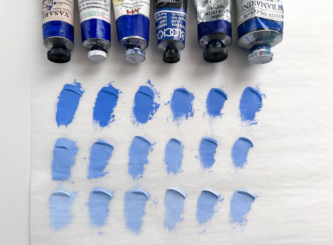
A cursory tinting strength test with the paints used on the test panel. The tinting strength was comparable across these brands. Each Ultramarine was mixed approximately 1:1 with Titanium White (top row), then 1:1 again, etc. From left to right, Vasari, Old Holland, Michael Harding, Blockx, Rublev, and M. Graham.
Legend to the Paint Comparison Panel
A few more notes
Here's a quick overview of the paint comparison panel. The columns compare different tubes of oil paint, which are labeled at the bottom.
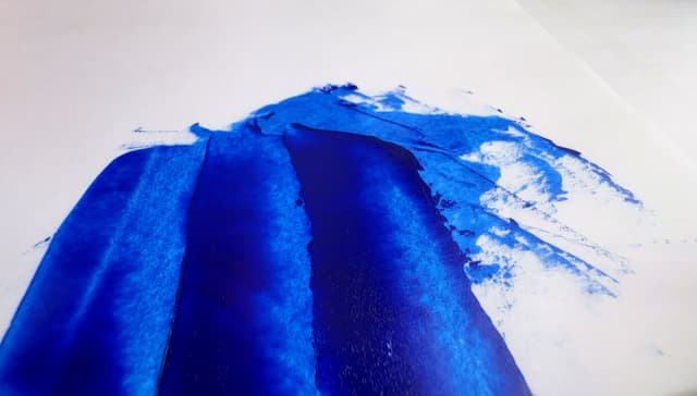
Row 1: Thinned. Row 1 is the paint color thinned with a bit of Rublev Oleogel. This of course could have been done with a drop of linseed oil to achieve a similar result.
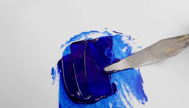
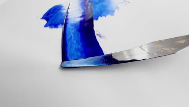
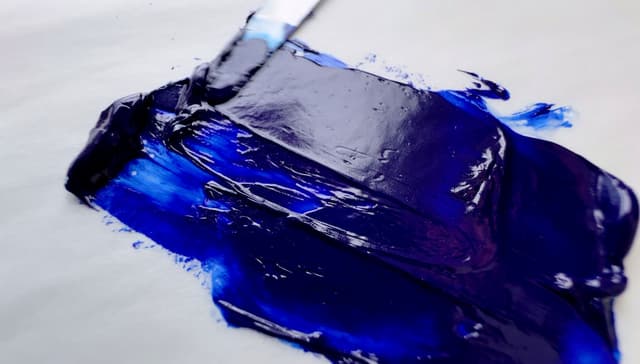
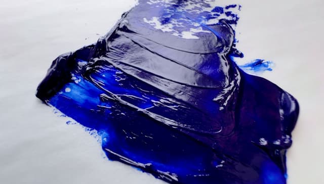
Row 2: Masstone. This is what the color looks like in masstone when spread with a palette knife. It's fairly imprecise and can allow for some variation in pressure, however, it shows what the color might look like in practice right out of the tube.
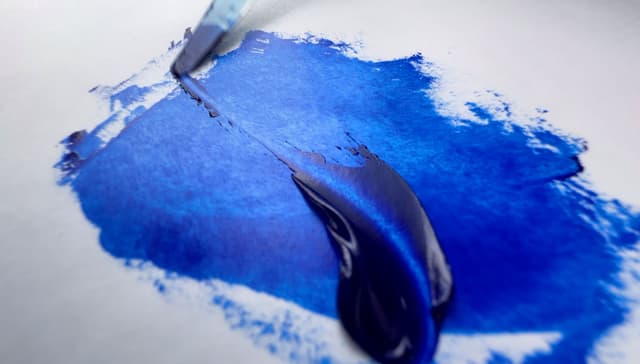
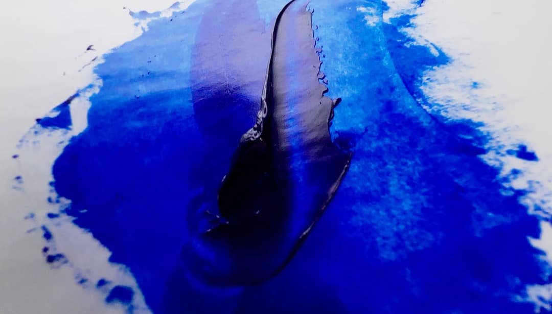
Row 3, The "C" Shape - Approximate Tinting Test The daub here shows the color mixed approximately 50-50 with Williamsburg Titanium White. This is the only part of the panel that gestures at a true tinting test, though any visual approximation as a method is fairly imprecise. For context, when comparing expensive pigments, the tinting test becomes more important. Painters tend to put a lot of focus on the tinting test as it can be an indicator of value for money (pigments are expensive, fillers are cheap). The semi-circle daub is the only place on the panel that gestures at the tinting strength.
Row 3-5 Undertone comparison. These rows primarily explore the hue capabilities of a paint. To do this, we mixed varying amounts of the color with white in a way that is aimed at showing which direction the hue veers through the color space at roughly similar lightness levels. Please bear in mind these rows aren't a tinting strength comparison, as different ratios of pigment and white were mixed to achieve somewhat similar values. We didn't belabor the values matching exactly. These rows explore a paint color's undertone is capable of doing when mixed with the same color of white.

Oil paint panel comparison legend. The top row shows the paint thinned with a bit of Oleogel to emulate its look in a glaze, the second row shows the paint at full strength applied with a palette knife, the third row explores undertone as well as tinting. The semi-circle shows a tint 50-50 with Williamsburg Titanium white. Rows three through five explore the undertone and how the paint color travels through the color space.
How to Pick a Good Ultramarine Blue
Categories for Comparison
There are multiple factors to consider when choosing an ultramarine blue. Nearly every brand makes at least one, and some brands offer several versions of the pigment, PB29. Here are some things to consider:
Color: Do you wish for an ultramarine that leans more middle blue or one that is closer to purple? The ultramarines featured here were quite similar in color. More purple versions are often labeled Ultramarine Deep.
Tinting Strength: Do you want a stronger mixing color? Every pigment has different natural tinting capacities, but once you get a feeling for what a good tinter feels like, comparisons can then be made. All the paints sampled here had good tinting strengths for an ultramarine. (More details below).
All of these are ultramarine blues. The paints highlighted in the article are on the panel toward the back, while the front panel shows a few more brands for comparison.
Consistency: Do you prefer a short and stiff ultramarine that you can cut into with a palette knife or a more flowing one that lends itself to transparent glazes out of the tube? The paints ranged widely in consistency with Old Holland and Michael Harding being on the stiffer side.
Choice of Oils: The natural strength of linseed oil, which forms stronger paint films, may be more useful for the lower layers of a painting. Linseed oil has a natural yellowing effect though. For the top-most layer safflower, walnut or poppy would possibly be acceptable (though be sure to understand the risks).
Depth of color: One of the things that a person might want to look for in an Ultramarine is its depth in terms of the value scale. Finally, some limited palettes require a fairly deep ultramarine to make dark mixtures, so a higher quality version may be desirable. Sometimes student brands or budget brands will dilute their paint with fillers, which makes it hard to really get the depth that is possible with this pigment.
Even though they are made with the same pigment, PB29, each paint company has a different interpretation of the color right out of the tube. Vasari's version is readily movable while Old Holland's version keeps to itself
Consistency Differences
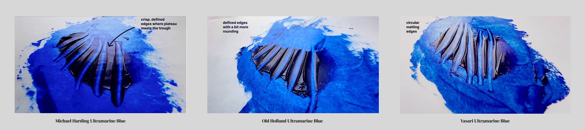
From short, crisp peaks to long strings, each brand interprets Ultramarine in its own way
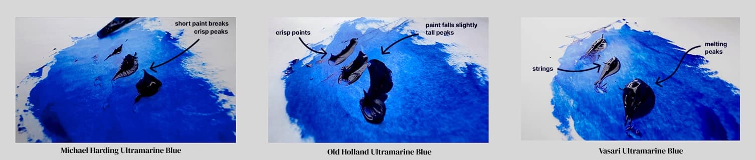
Variety in Consistency Between Brands
Consistency is notoriously difficult to describe without trying a paint. However we've grouped the paints we tested according to some generalizations.
Thicker consistency
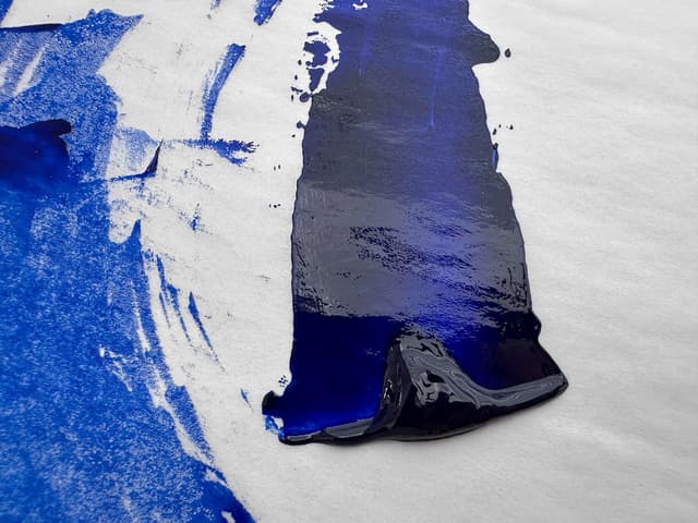
Old Holland and Michael Harding had stiffer consistencies and formed peaks
In-between consistency
Blockx and M Graham had a different feel, due to the different binding oils. Both had a bit of a bounce to them.
Flowing consistency
Vasari had a more melting consistency, while Rublev had a lot of flow and extra oil separation.
M Graham Ultramarine is bound with walnut oil, and had a different feel to it than some of the other paints
Featured Ultramarines
We focused on these six ultramarines. All of them were rich middle blues (not the Deep variety). They did differ in handling though
Differences in Paint Behavior
Some of the ultramarines have a bit stiffer handling. The degree of medium that each paint would require to become flowing or brushable is one of the many variables in making a paint selection.
The stiffness out of the tube comes down to personal preference as paints can be modified to be more brushable or more impasto depending on the needs of a particular painting session. Any modification may have tradeoffs though.
Instead of having to modify the paint heavily with medium, it may be convenient to choose a consistency that one prefers straight from the tube.
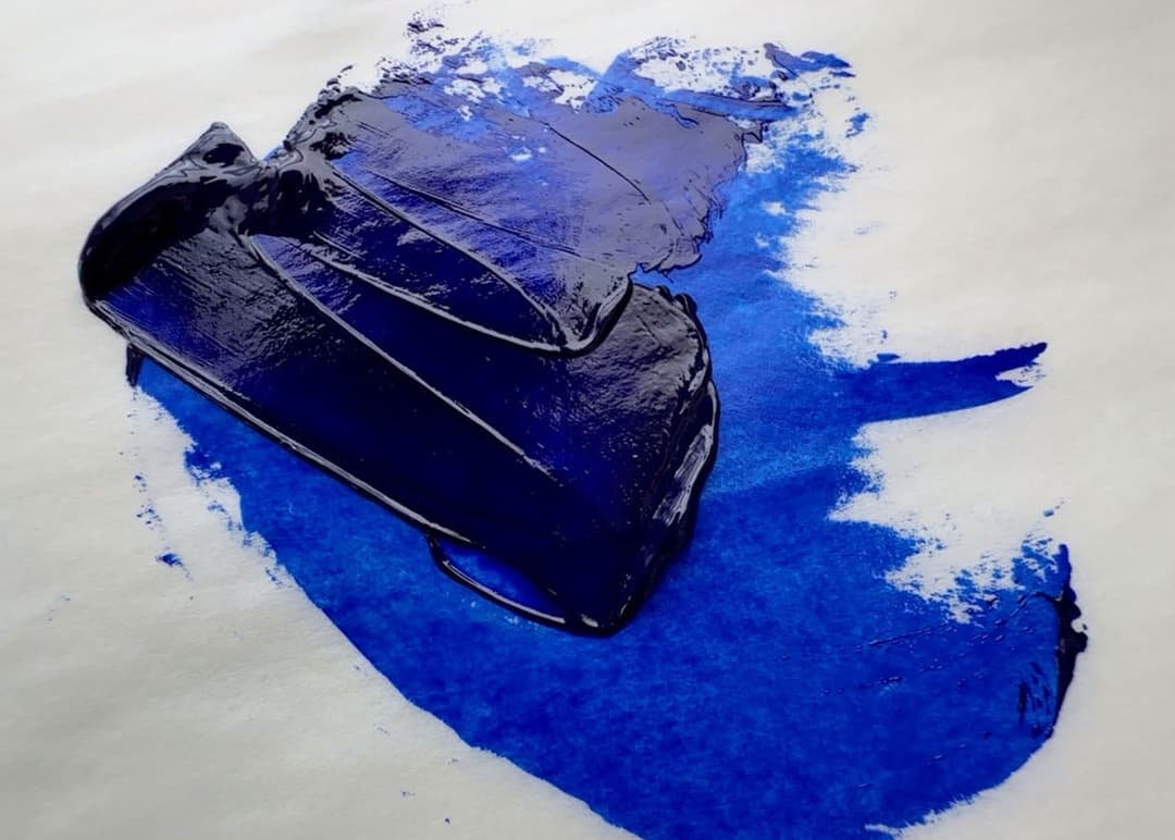
A daub of paint right out of the tube. From front to back, in the foreground, Vasari is a bit more melting, while Old Holland is more stiff. Michael Harding and Blockx also form a peak, while Rublev and M Graham do not so much.
Featured Ultramarines with Stiffer Handling
These colors came out of the tube a bit stiffer than the others on the panel and had more of a propensity to form peaks when pulled up by the palette knife. Old Holland is characteristically stiff, with the Michael Harding being more workable.
Old Holland Ultramarine Blue
Old Holland Ultramarine Blue is a luxurious ultramarine. A color with a bit of heft to it, this ultramarine has decent to strong tinting strength. As an aside, when dried in masstone, the difference between Old Holland Ultramarine and Old Holland Ultramarine Blue Deep (not shown here) is difficult to see, however in tints their two Ultramarines change significantly. This is the version that is the regular ultramarine (that is, Ultramarine Blue is more blue hued as opposed to indigo). Their Ultramarine Deep is more indigo.
This paint, the regular Ultramarine, felt much thicker and chromatic than some of the other brands, however these differences were evened out when the paints dried. This paint was as transparent as the others when thinned. Old Holland's Ultramarine Blue seemed slightly more chromatic than Vasari in tints and a bit more matte out of the tube than Vasari or Blockx French Ultramarine Blue Light.

Old Holland Ultramarine Blue


Michael Harding Ultramarine Blue
Michael Harding Ultramarine Blue is a useful version which has a tendency to glaze thinly without the use of extra medium. This quality is one that it shares with Vasari Ultramarine Blue. Michael Harding Ultramarine Blue creates pleasing transitions with titanium white. This paint has some almost springiness under the palette knife. Michael Harding’s version is a good tinter and shares the working characteristics of many other Michael Harding paints. If you are a fan of the handling, this is a great ultramarine blue.
Michael Harding Ultramarine Blue
Michael Harding Ultramarine Blue


Featured Ultramarines with in-between Consistency
These paints where somewhere between melting and impasto with a slight ribbon when pulled up with the palette knife. Both of these paints are made with different binding oils, which will have other effects on the painting
Paints with an In-Between Consistency

Featured Ultramarines with Loose Consistency
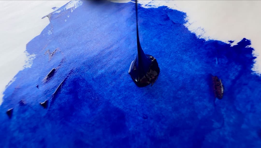
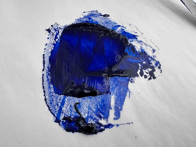
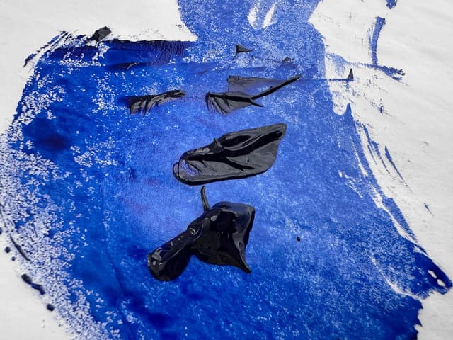
Compared among the six paints featured here, these had much looser consistency right out of the tube. The Rublev was ropey/stringy and oil-rich with some extra oil that came out of the tube. The Vasari was loose as well but it was also buttery. Both of these formed melting peaks when pulled up with a palette knife
Vasari Ultramarine Blue
Vasari Ultramarine Blue has a texture that is almost slippery. We’d expect flowing paint (i.e. it doesn't really need any medium out of the tube) from Vasari, but this ultramarine was very smooth, even compared with other ultramarines. This color also has decent tinting strength despite its degree of flow. One thing to note is that this paint is very transparent and almost impossible to apply in uniformity with any degree of thickness. Vasari Ultramarine Blue tends toward thin gemlike applications, much like the Michael Harding Ultramarine Blue. When dried, this color initially had a bit higher overall reflectance than some of the others— it was similar in quality to M Graham Ultramarine Blue. However after a few years, the M Graham and the Blockx looked more similar.
Vasari Ultramarine Blue
Vasari Ultramarine Blue


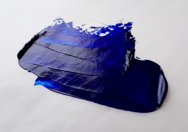
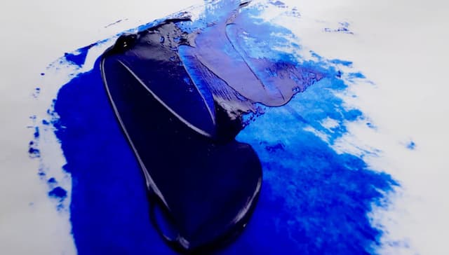
Rublev Ultramarine Blue (Green Shade)
We first learned about Rublev Ultramarine Blue (Green Shade) from the Natural Pigments Painting Best Practices Class. There, George and Tatiana talked about how they make this paint differently from other brands because they allow the pigment to rest in between millings which is a more time-consuming process. Perhaps it is due to ultramarine being hydrophilic, so it doesn't really want to mesh with the oil. Most brands denote Green Shade to mean what we call regular ultramarine (the least purplish kind of deep middle blue) and separate it from the Ultramarine French naming structure, however within the Rublev line specifically, they make the Green Shade with linseed and the Red Shade with walnut oil.
This ultramarine blue has some remarkable qualities. Out of the tube the color feels more notable, but when dried it was similar to the other ultramarines on the panel. Out of the tube it felt so deep that it actually seemed capable of opacity, which also lent a gem-like quality to areas with a thinner application.
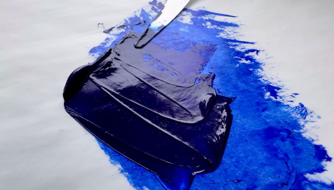
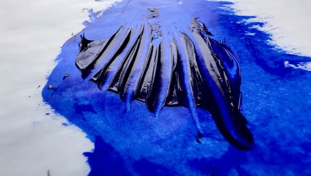
This paint consistency could be described as smooth or it could be described as a bit gooey. Even though the paint has a lot of slip in its consistency, the color still has some pull under a palette knife. This color does have an incredible stringy (some could say ropey) behavior, but it kind of plops or drips off of the palette knife. We have never seen this exact same quality before in an ultramarine. It takes a bit of work to get it to incorporate with Williamsburg Titanium White. Even though it is not the strongest tinter, when applied thickly it has a lovely deep value. It is nice to feel that perhaps it does not contain additives.
Rublev (Natural Pigments) Ultramarine Blue Green Shade sort of drips off of the palette knife
Differences in Paint Behavior and Viscosity
A few more notes on Rublev Ultramarine Blue (Green Shade)
There are also differences among these brands of texture and viscosity. Old Holland Ultramarine Blue tends to be stiffer while Rublev Ultramarine Green Shade is ropey, and Vasari makes paint that is very loose.
While very deep, the Rublev can sometimes have some excess oil that comes out. On the webpage, they say that "Some separation of pigment and oil may occur in Rublev Colours Artist Oils and is a natural process when no wax or stabilizers are added to paint to prevent this from occurring," and we have found this to be true of this color.
Rublev makes this particular ultramarine in a special way that takes longer than usual out of linseed oil. They have formulated it to be ropey and stringy, aka "long". Many ultramarines are "short" but this one has a slightly different behavior.
Rublev also demonstrates that ultramarine blue has a hard time "wetting" in oil, and they show the differences between making paint from ultramarine in linseed oil and walnut oil. This video from Rublev, shows the differences between their ultramarine green shade and ultramarine red shade. In Rublev only, they make their green shade in linseed oil and red shade in walnut oil. They mention that the behavior of the red shade will remind painters of ultramarines in other brands since walnut oil makes a more buttery paint.
Rublev (Natural Pigments) Ultramarine Blue Green Shade
Rublev Ultramarine Blue (Green Shade)
New Information on Lightfastness
There is also new information on lightfastness. While this is fascinating for Ultramarine in general and focuses on the mixing white one chooses to use with it, this information is also possibly relevant for choice of binding oil. Golden researched their Williamsburg colors with white paints in a variety of binding oils, which gives an insight into how ultramarine reacts in blends with white but also may hint at its lightfastness reactions with different binders. While this was not expressly the topic of the study it opens up new lines of inquiry.
Good Lightfastness in an Area the Needs It- But Some Surprises
In the current (read here old and under revision) lightfastness designations, Ultramarine is ASTM I, which is the category for excellent lightfastness. However, some research that Golden just performed on Ultramarine in various mixing whites contained a few curve-ball scenarios where Ultramarine didn't perform as well as was thought. Particularly lithopone in safflower oil did not do well.
Part of the issues open up a wider discussion about why many of the blue-purple pigments that were tested didn't do as well as expected under artificial exposure scenarios, such as QUV and Xenon exposures, even though the same paints performed closer to expected under natural sunlight. It appears that in natural sunlight Ultramarine did very well, but we we bummed to see that it had any anomalies.
For more information on emerging research on Ultramarine's lightfastness please see Golden's research on pigments in various white paints. More detail may also be found in the article on ultramarine as a pigment, available here
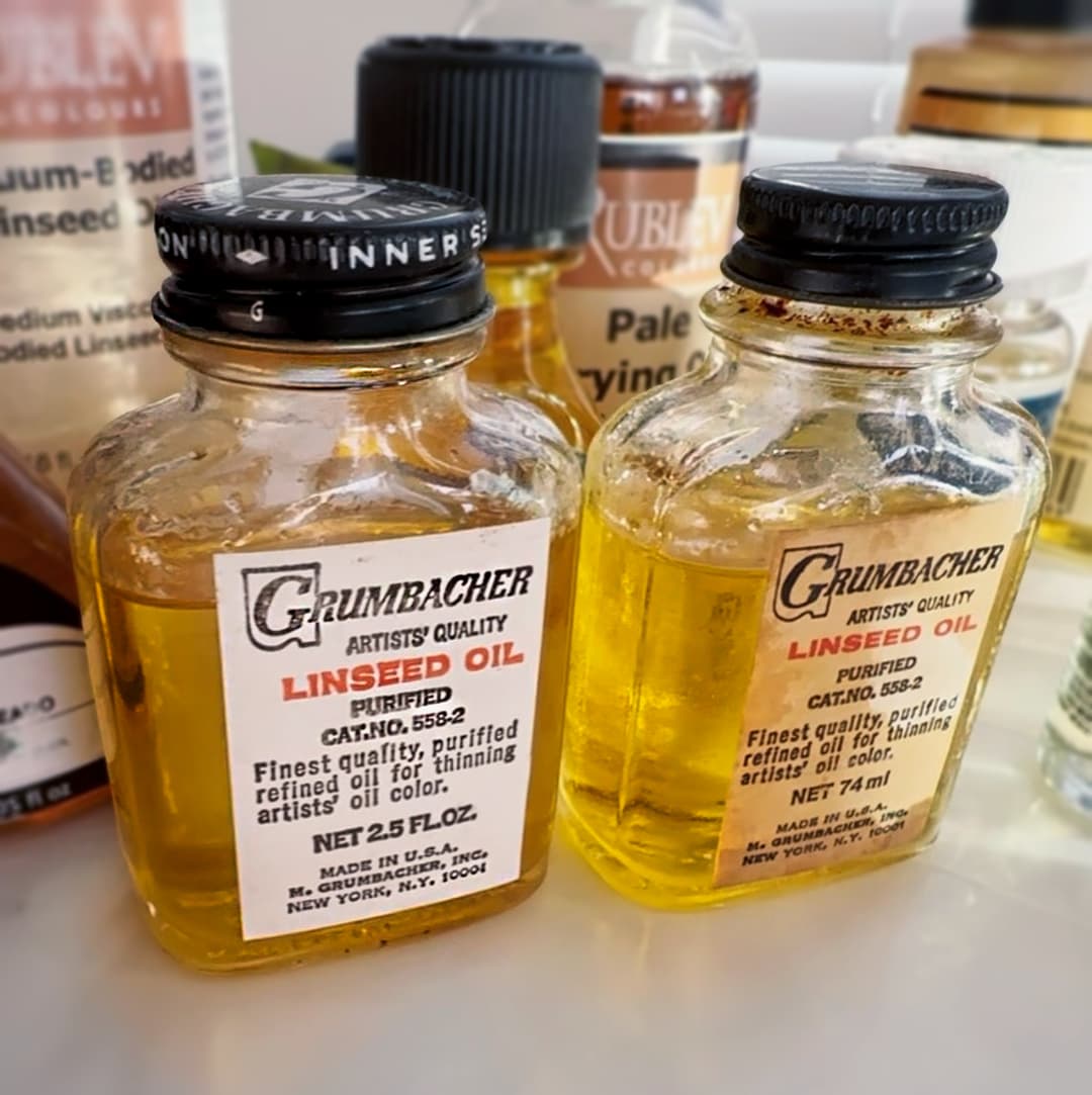
Ultramarine In Linseed Oil
Old Holland uses Cold Pressed Linseed Oil, Vasari uses Alkali Refined Linseed Oil, Rublev and Michael Harding also use Linseed Oil. Linseed Oil is associated with forming stronger paint films but may also have more yellowing over time.
A Wide Array of Binding Oils One of the most important choices is the binder- which oil is best for you?
Ok, this is a bigger discussion than this article intends to tackle, but in general an artist would be well-advised to research the pros and cons of any binding oil.
Linseed oil tends to form the strongest paint films, however it does yellow. We also must consider Walnut Oil, which may be used for a variety of reasons.
Safflower oil and poppyseed oil have less initial yellowing, however they form a less strong film and can also cause problems in paint layers. There are rumors of both oils (safflower and poppy) reversing their dried state under certain conditions which are not entirely understood. When used (if at all) they are best reserved for rigid supports and only used in the top-most layer of the paint film-- at least that is the current idea of a best practice. Williamsburg/Golden's Just Paint archives contain further information on Safflower oil and its use in painting.
Ultramarine In Other Binding Oils
There are a lot of other Ultramarines in alternative binding oils (these have tradeoffs) but here are the two on the featured panel. M Graham uses Walnut Oil and Blockx uses Poppy Oil
Blockx French Ultramarine Blue Light
Thick, chromatic and a high tinter, we quickly fell in love with Blockx French Ultramarine Blue Light. This paint truly excellent in handling. This color created enchanting transitions when being mixed with Titanium White. We’ll keep an eye on whether this one resists yellowing over time more than the rest. Bear in mind Blockx Ultramarine Blue contains poppyseed oil. Since blue is a color which can show the natural yellowing of linseed oil, this version in poppyseed oil that yellows less could be a good candidate for careful use in uppermost layers only. A true gem of a paint.
Blockx French Ultramarine Blue Light
Blockx French Ultramarine Blue Light


M Graham Ultramarine Blue
When fresh out of the tube, M Graham Ultramarine Blue was actually similar in some ways to Old Holland Ultramarine Blue. The M Graham had higher tinting strength perhaps than all of the samples we tested. Bound in walnut oil, this paint is one of our favorites for ultramarine blue for high chroma— gorgeous in mass tone and tints. This color is almost impossible to apply opaquely. The color seemed very deep when applied in masstone, however the surface dried to a high chroma deep blue with an even matte finish. M Graham's version was very similar to Vasari Ultramarine Blue when they initially dried, but after several years the M Graham in Walnut and the Blockx in Poppyseed appeared more similar to one another. Walnut oil may offer less yellowing than linseed oil and may be best used in the top-most layer of a paint. We recommend looking into how to paint with walnut oil if you use it, as it can be a slow drier which also forms weaker paint films. This is a high-powered ultramarine.
M Graham Ultramarine Blue in Walnut Oil
M Graham Ultramarine Blue


Consistency Summary
There are a lot of different choices within the ultramarines but in terms of hue it's hard to go wrong with any of these colors. The main differences we found have to do with consistency, and unfortunately brands don't disclose their additives.
How Impasto do you Wish to Paint?
Our main tip beyond the binding oils, which is an important choice, has to do with the relative impasto quality of the paint right out of the tube. Here's where it is helpful to have an idea of your preferences as well as the application for which you're going to be using the paint. When it comes to some other colors, we'd also caution against using safflower or poppyseed oil in impasto-- impasto has its issues anyway.
Will You Be Plein Air or Working in a Studio?
For example, if one is using this color for plein air, some of the more loose consistencies may be less satisfying -- for example managing a paint with loose oil during a plein air session is sometimes not too much fun. Paints that have a lot of excess oil can cause minor disasters if a palette is held at an angle, unless the paint is mitigated before it's applied to the palette.
However the consistency is a very personal choice and the same paints which might be more challenging in a plein air setting may be the more stunning, gliding paints for glazing or studio painting.
These middle-blue ultramarines were all gorgeous.
What's the Difference Between Ultramarine Blue and Ultramarine Blue French?
Sometimes the difference is not huge, but other times it is more noticable
In some ways the differences are minuscule but unfortunately even that generalization does not hold from brand to brand. Ultramarine Blue French may refer to the fact that it is synthetic PB29, and the word French may gesture to the pigment's famous manufacture in France in the 1800s. More about that can be found in our article on the pigment, PB29.
Sometimes, if a brand has two versions of Ultramarine-- regular and French, the one labeled French may be more indigo-leaning, but this is by no means a guarantee.
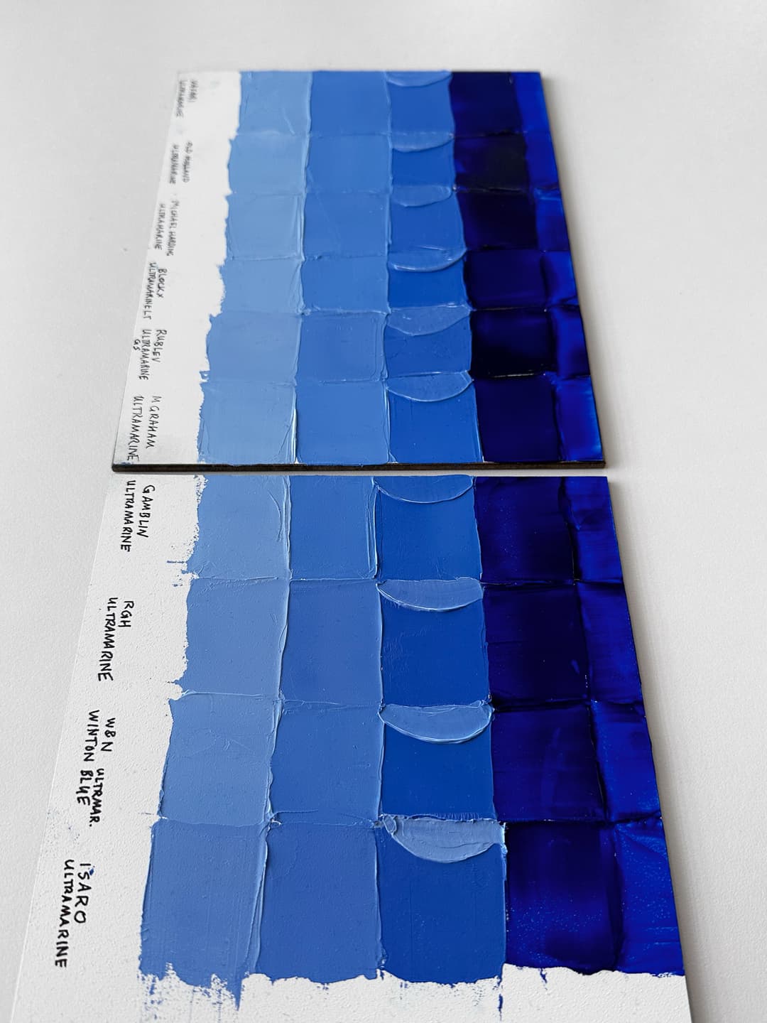
These are all what we'd call regular Ultramarines (not Deep). However, some of the are labeled "French," such as Blockx and Winsor and Newton's Winton
What's the Difference Between Ultramarine Blue and Ultramarine Blue Deep?
This might be a bigger difference
In practice most artists do not make a big difference between Ultramarine Blue and Ultramarine Blue Deep. However when we started swatching paints, we saw that there was often a noticeable difference in undertone. This naming convention of adding the words “Deep” or “French” to the title held pretty steady with the colors we sampled— the Ultramarine Deeps were closer to violet — that is, they were a little more indigo colored or denim colored. When we examined these naming conventions across brands, the differences between these two shades were noticeable enough that we separated them out and decided to do another separate panel of tests on the Ultramarine Blue Deeps or sometimes called Ultramarine Blue French hues.
Sometimes the hue differences are not so slight, and we found this to be especially true when a brand pushes the difference with a paint blend that includes ultramarine violet, PV15.
We were very surprised to a see a wide variety of differences between these ultramarine colors. The “Deep” or “French” colors quickly distinguished themselves different in hue and tinting strength, so we were inspired to do a whole extra panel on Ultramarine Deep and Ultramarine French colors (article on Ultramarine Blue Deep to follow in the future-- a preview of that panel is displayed here). The French or deep Ultramarine shades are blues that lean more indigo, and in some cases halfway to ultramarine violet. Sometimes blends actually listed the pigment Ultramarine Violet PV15.
Ultramarine Blues in the foreground, with warmer ultramarines (sometimes called Deep or French) on the far panel.
What About Historical Lapis Lazuli?
Genuine Lapis, Hard to Find
Genuine Lapis. We must mention that in regards to genuine lapis especially, look into the practices of the manufacturer to be sure you're actually getting lapis and also try to figure out what quality it is if you can. You can also check our Dry Pigments search for Genuine Lapis Dry Pigment for more options if you're into paintmaking. Once again, do your research with the pigments company to help ascertain the quality.
We have yet to see a lapis that is anywhere as bright as synthetic ultramarine, so we try to remember to thank Jean-Baptiste Guimet (inventor of the synthetic version we all know and love) for figuring out how to add this rich heavenly blue to our palettes. However the genuine article has its charms (some sell the natural version's impurities as qualities that number among its charms). We have only tried one paint that was made with genuine lapis and it yellowed fairly significantly. Someday perhaps we'll do a deeper dive on Genuine Lapis Lazuli, but today we're talking about modern Ultramarine.
Naming Ultramarine Blues in General
Ultramarine Green Shade?
Paintmakers vary a lot in how they apply the term "green shade" to ultramarines. We could take it to mean "not the red shade" or the slightly-less-indigo-one.
However manufacturers get creative and as an example of this, Rublev uses the term Green Shade to denote both the hue of the pigment and the binding oil for their ultramarine. More on the naming of their version specifically below. The pigment for the green shade should be less indigo than the red shade.
More notes on Ultramarine Blue vs. Ultramarine Blue French
In short, Ultramarine French is usually- but not always!- more toward Indigo than a true blue. Sometimes people describe the more indigo shade as being "redder." Unfortunately there is no way to tell by looking at just the pigment code as they share the designation PB29.
The differences in a paint's undertone are not always clear when a person is standing in an art materials store or looking at swatches online. Furthermore the name space is a bit confusing because sometimes a brand will name Ultramarine regular as Ultramarine Light.
What About Ultramarine Blue Light and Ultramarine Blue Deep?
Sometimes Ultramarine Deep is the same as Ultramarine French. Unfortunately there is no tried-and-true way to determine the leaning of the pigment without trying it, since each brand varies.
We noticed that a number of European brands went with the naming scheme of Ultramarine Blue Light to denote the regular, less-purple middle blue shade, and used Ultramarine Deep to denote the more indigo (red shade) of the pigment. Here are a few Ultramarine Blue Deeps on Paint List.
A couple of European brands combined the terms Ultramarine Blue Light with the name French. Blockx has a French Ultramarine Blue Light, which is PB29. And then there is Old Holland, which does something totally different. Their French Ultramarine Light Extra (combines the terms ultramarine light and the word French)-- names a color blend that contains both ultramarine PB29 and cobalt blue PB28.
And then there is Schaal, who actually is French, who has Bleu outremer foncé. Foncé means deep.

Ultramarine Blue Deep or French
There is another shade of ultramarine which has paints which lean more indigo, also pigment PB29.
Opinions on Naming Variations and Ultramarine French Blends
Light, Deep, French, Blue Shade, Green Shade-- and Blends
We felt it made more sense for a paint labeled "Ultramarine Blue" to have just one pigment (PB29). This is a readily-available, inexpensive pigment, and there does not seem to be much justification for labeling a paint ultramarine blue and filling it full of any other colors. There may be some great blends out there, just name them accordingly (that's when the flowery names for convenience blends becomes appropriate). Ultramarine Blue should clearly denote single pigment PB29. In European brands we saw more Cobalt-Ultramarine blends.
When it comes to Ultramarine Blue French, we lean toward the idea that it should be one pigment as well. There may be a bit of justification for a blend, though honestly we felt surprised each time we discovered one that wasn't a single pigment. We did see a few more Ultramarine French or Ultramarine Blue Deep colors that had more than one pigment. Williamsburg includes PV15, Ultramarine Violet in their Ultramarine Blue French, which is interesting because of the way the two pigments are manufactured, and there is a need for an interstitial blend between the two (this is a topic for another day but we have spent some time in the territory between red shade ultramarine blues and ultramarine violets, and it's nice to handle on which paints occupy the range between these two). We felt there was a bit more justification for including blends in the French category since there are some adjacent colors that would make PB29 even more indigo.
French doesn't always mean redder. As discussed, Ultramarine Blue Deep seems to indicate the more indigo shade of PB29, similar to Ultramarine Blue French (but again, not all 'French' varieties lean indigo). Here in the Ultramarine Blue Deep category we also found some blends where we would have expected single pigments. Again this may make some sense as a painter may wish to push PB29 even further towards violet. Sennelier even added PV23, Dioxazine Violet. However Grumbacher appears to be a bit creative with their Ultramarine Blue Deep which includes PR259, PB29 and PV19- more like an indigo convenience mix. It goes to show you should always check the back of a tube.
In sum, the more melting paints were Rublev and Vasari, the ones that made ribbons that crested and fell when pulled with palette knife were the Blockx (poppyseed oil) and the M Graham (in walnut). And the paints which were able to hold a peak were the Old Holland and the slightly softer Michael Harding. All of the paints featured here were good tinters with deep masstones The variety in binding oils may be an important factors in choosing an ultramarine blue.
Featured Ultramarines
The featured ultramarines, which vary in consistency and binding oils.
Ultramarine Blue Across Brands
Discover more single-pigment versions of PB29, both regular and Deep
More about Ultramarine Blue pigment.
Article written by Melissa Carmon
About the author: When a sudden urban firestorm threatened their studio, Melissa and her husband Jonathan rescued The Great Book of Color, about 800 pages of her handwritten notes gleaned from her years of painting. They co-founded the Paint List to empower fellow painters around the world. More can be found here. Read More.
Subscribe for More Articles From the Great Book of Color
If you'd like to receive the latest illuminations from the Great Book of Color and Paint List news in your inbox, subscribe to the newsletter here Thanks for reading and Happy Painting!