Top Pigment
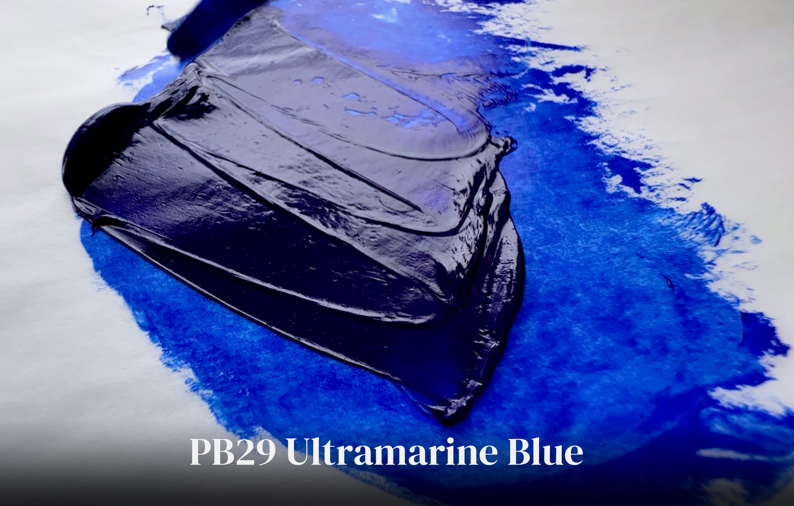
Ultramarine Blue
PB29
Alternate Names
Ultramarine Blue Light
Ultramarine Blue Dark
French Ultramarine
Pigment Description
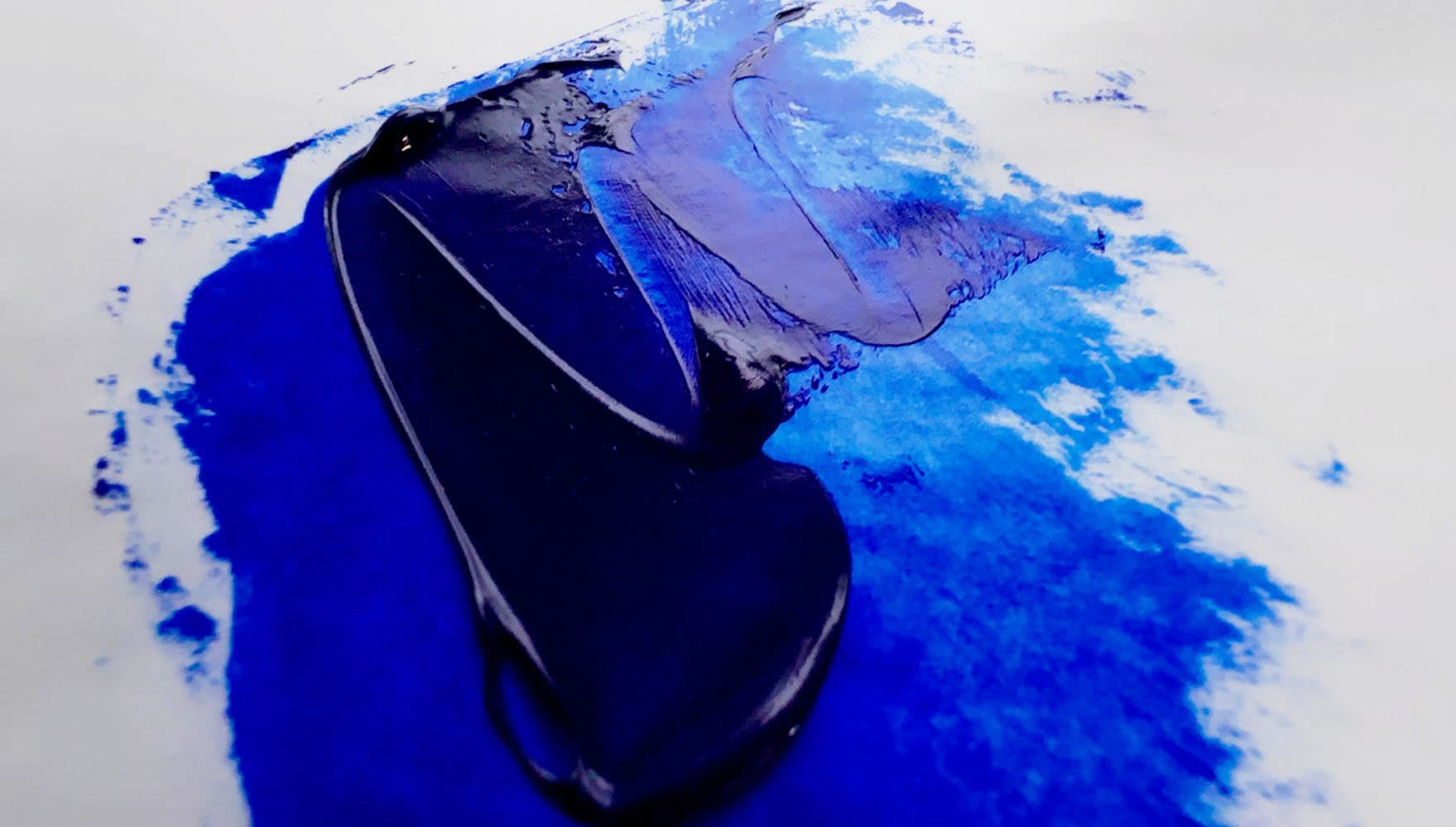
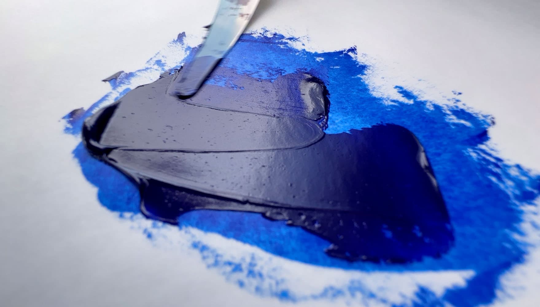
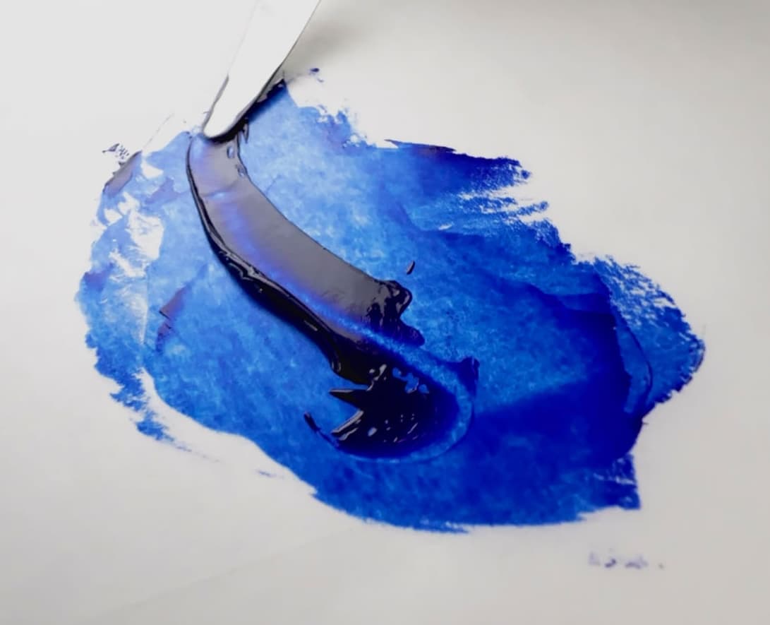
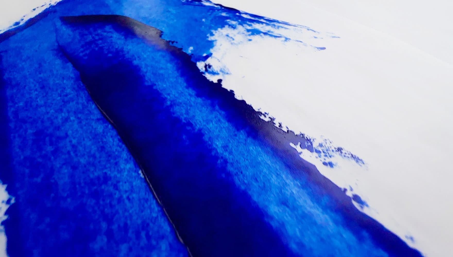
There is no other pigment quite like synthetic ultramarine blue—a transparent royal blue that leans violet. Where cobalt blue has a feeling of solidity, ultramarine glistens like tanzanite.
Michael Harding Ultramarine Blue
So we're suckers for natural pigments too, but when it comes to this pigment, we’re especially grateful for the discovery of synthetic ultramarine. We can hardly keep from saying prayers of thanksgiving for this Godsend to the palette. Just imagine having to trade your car for a tubes of the highest quality natural lapis lazuli, or going without groceries for week (we hate to say it but most of the natural ultramarine on the market can't hold a candle to the synthetic version... and even the mediocre natural versions are not exactly affordable). As a painter, it's hard to imagine what we'd do without a deep, rich blue at the ready. Of all the most essential colors of the palette, this one makes our short list. The natural one is loads of fun too, so be sure to check out the entry we've dedicated to it over at Lapis Lazuli.
Old Holland Ultramarine Blue
Ultramarine Blue is the synthetic version of a natural ground stone which can be made into pigment. While the natural version has its charms, the invention of synthetic ultramarine was an incomparable boon to painters. In depth and vibrancy it rivals the most expensive grades of Lapis Lazuli. Since Lapis Lazuli shares the same pigment code but looks so different when made into paint, we’ve given Natural Lapis a separate entry in the pigment notebook.
Vasari Ultramarine Blue
Synthetic Ultramarine is a phenomenal deep blue. It's transparent, dark in masstone, chromatic in tints, and varies a bit from a middle blue to an indigo-violet. We compared a handful of varieties in oils here.
Michael Harding Ultramarine Blue
There are many shades within this pigment code but there tend to be two main forms. Of the two, one is slightly more reddish than the other— the "redder" shade is more violet, and is often labeled Ultramarine Blue Deep. Alternatively, in the English world, paintmakers may name the redder version “French”.
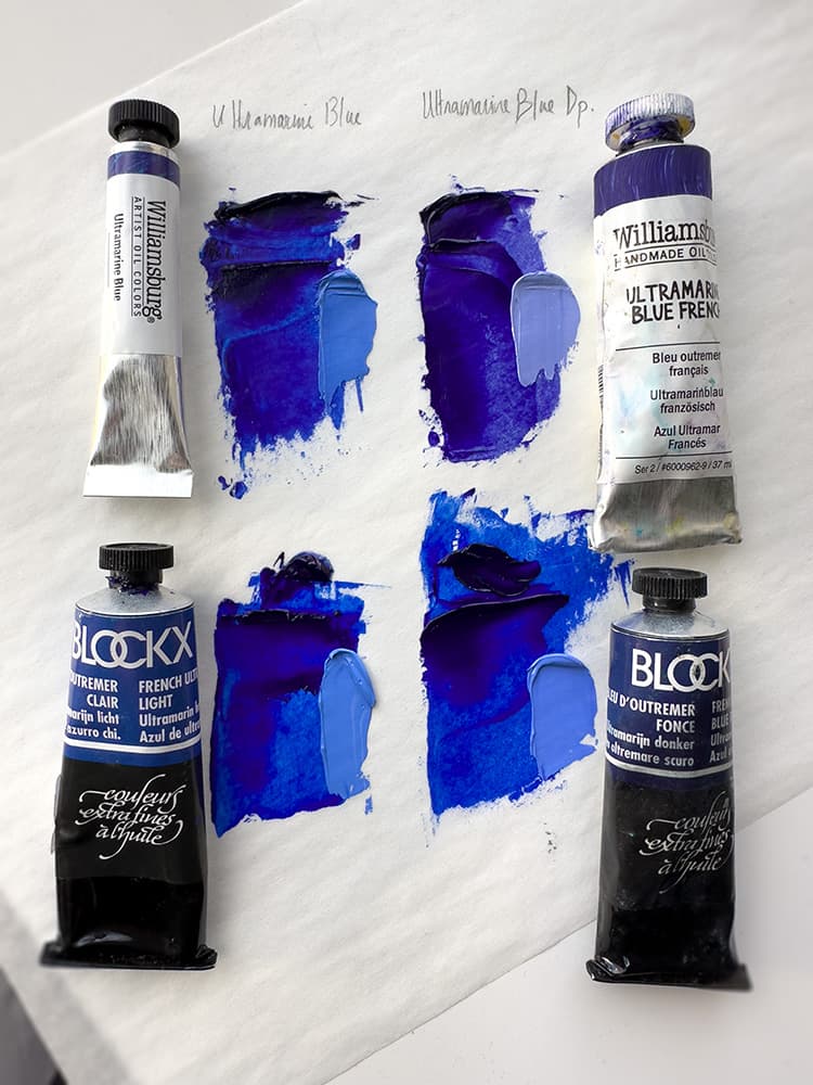
Ultramarine Blue has a handful of varying naming conventions. Sometimes French Ultramarine Blue is more violet, but not always. Top left: Williamsburg Ultramarine Blue, top right: Williamsburg Ultramarine Blue French. Bottom Left Blockx French Ultramarine Blue Light, bottom right, French Ultramarine Blue Deep
It has excellent lightfastness, however it does have a few tricks up its sleeve in oils. For details on the wildcards regarding ultramarine, see Golden's recent lightfastness testing. There is also something called ultramarine sickness which describes some changes that can occur to the paint, however that is fairly rare. As there don't seem to be any viable alternatives in the color space, and for most intents and purposes ultramarine behaves itself.
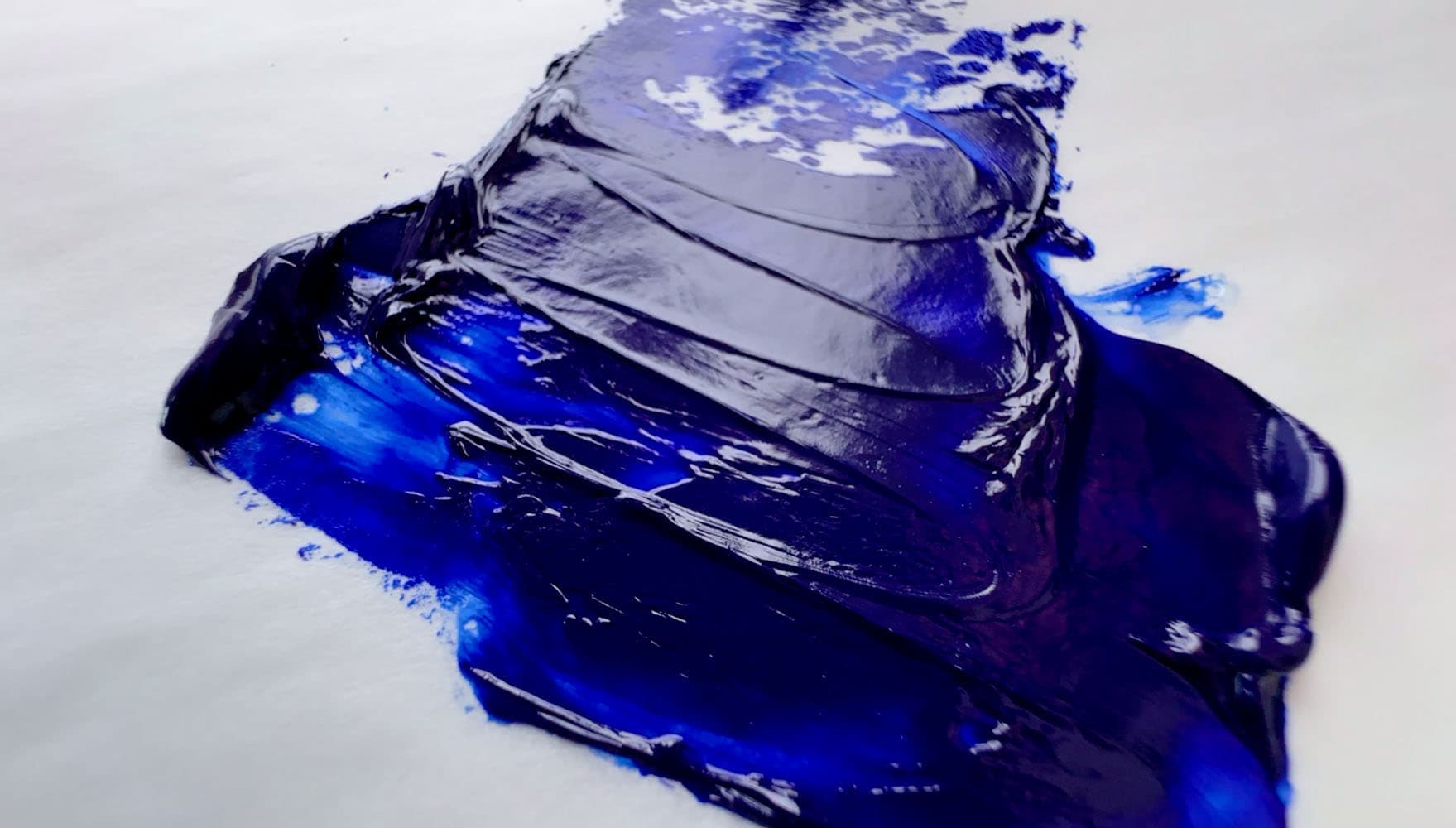
M Graham Ultramarine Blue, bound in walnut oil. Ultramarine typically has somewhat of a "long" paint behavior in oils
Blockx French Ultramarine Blue Light bound in Poppyseed oil
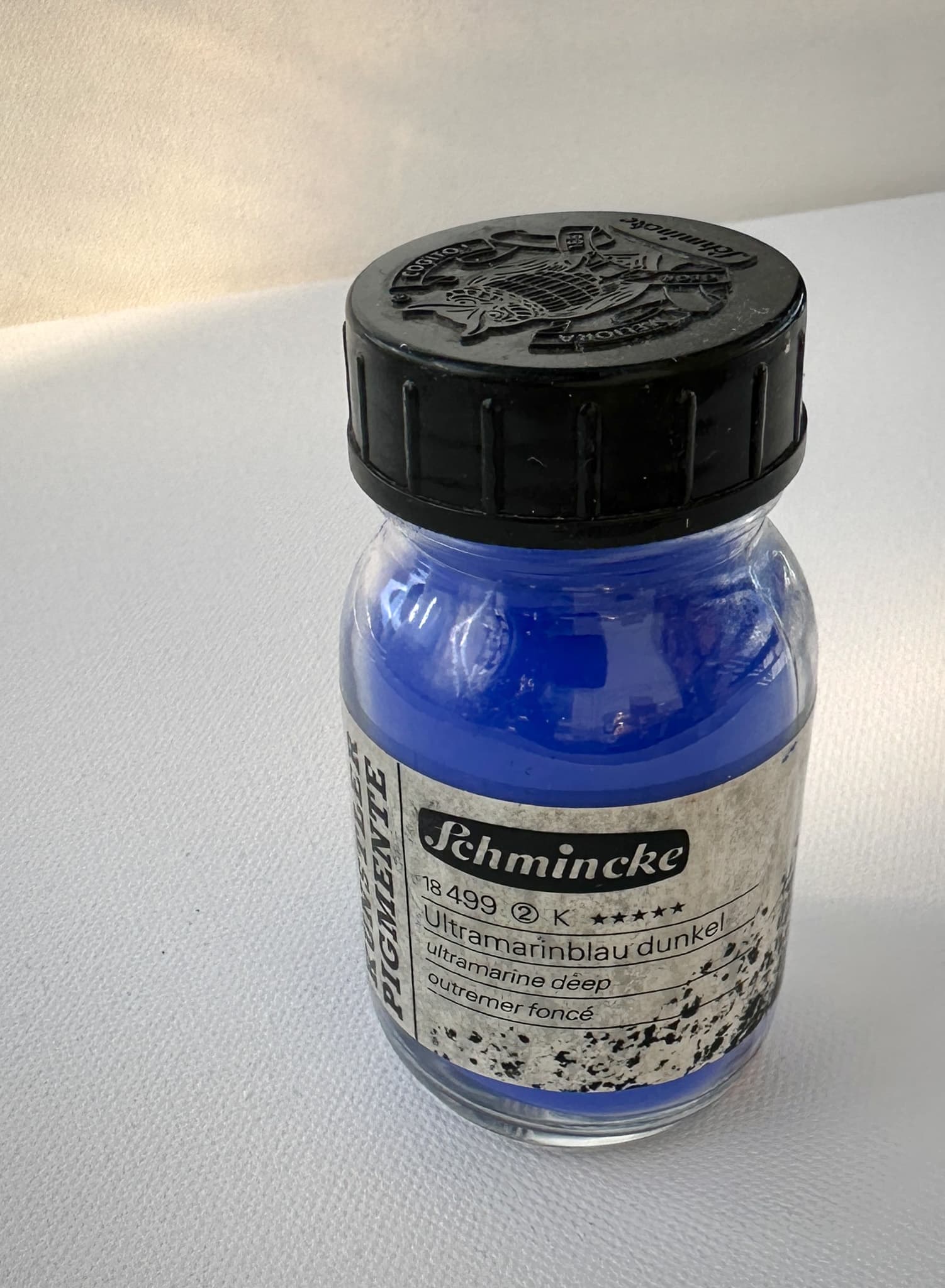
Ultramarine Blue, PB29, from Schmincke
Resources
PB29 pigment data from David G. Myers, The Color of Art Pigment Database, Artiscreation.com
Information about PB29 from Bruce MacEvoy, Handprint Guide to Watercolors, General information about this class of pigments from Handprint
CAMEO Materials Database: Conservation & Art Materials Encyclopedia Online, Museum of Fine Arts Boston. (Accessed June, 2025). Ultramarine Blue, Synthetic https://cameo.mfa.org/wiki/Ultramarine_blue,_synthetic. Museum of Fine Arts Boston.
Alfa Chemistry (n.d. Accessed June 2025). Ultramarine Blue (PB29) https://materials.alfachemic.com/major-products/ultramarine-blue-pb29.html,. Alfa Chemistry.
Ambrose, Trevor (2023, September 24). ASTM Lightfastness Testing for Oil Paints https://justpaint.org/astm-lightfastness-testing-for-oil-paints/. Just Paint, Golden Artist Colors.
Read an in-depth article
Stats
Lightfastness
Excellent with slight caveats
Overall ultramarine tends to be excellent and gets solid highest marks (all 8’s on the BWS). In Golden’s Lightfastness Testing on mixing whites in oils, Ultramarine Blue showed some unexpected behaviors in some Flake white formulations as well as failure in a Lithopone made with safflower oil. There was also a slide to LFII when it was combined with pure Zinc Oxide. These results suggest that choice of mixing white may matter for Ultramarine Blue. There were also a few surprises as to its reactivity in artificial simulations such as QUV and Xenon testing. While unrelated to lightfastness, this color is known to discolor in the presence of acids. It is also worth noting that the lightfastness may vary depending on the manufacturer, with some industrial suppliers listing 7-8, while artist suppliers may list all BWS 8's (highest marks).
Transparency
Transparent, Semi-Transparent
Some list as Semi-Transparent. NPIRI notes Opaque in water.
Toxicity
Low Concern, however see note and referenced article mentioning health hazards
We were surprised to see a toxicity note on CAMEO on natural lapis lazuli which is chemically similar. See also SDS. Treat all pigments and paints with studio safety protocols.
Tinting
Medium
Dry Time
Many varieties take 2-7 days, may contain driers.
Since it is slow drier, it may contain driers.
Oil Content
Sources vary, Low to Medium, perhaps on the lower end of Medium.
Oddly enough oil content by volume can be moderately low. Source here. Mayer assigns it to the medium category for volume, with a score of 85. By weight it is 38-40g/100g of oil.
Particle Size
Very Fine
Chemical Name
complex sulfur-containing sodium aluminum silicate, or complex silicate of sodium and aluminum with sulfur or sodium alumino-sulphosilate
₃Na₂O.₃Al₂O₃.₆SiO₂.₂Na₂S, or Na₈-x[(Al,Si)₁₂]O₂₄(Sy)₂
DISCLAIMER: Please note that we are not experts in health and safety and we are not toxicologists, please consult the proper experts. We are not liable for any issues that may arise from the use of our website or its contents. The information contained in this site is provided without warranty or guarantee of any kind. We do not necessarily endorse any other website that are linked from our site. For any important pigment specs, please reference the manufacturer details. If you discover errors or omissions, please reach out through our contact form. Thank you.