PB29 Ultramarine Blue
A Blue Forged in the Furnace, an Enchanting Blue Beyond Compare
Featured Paints
From the Crucible
A Heavenly Blue Forged in Fire
Bright, harsh, high-altitude winter-sun shone through the windows of our new home from three sides, and in the echoing emptiness of our new apartment I asked,
"What color would you like to make your painting?"
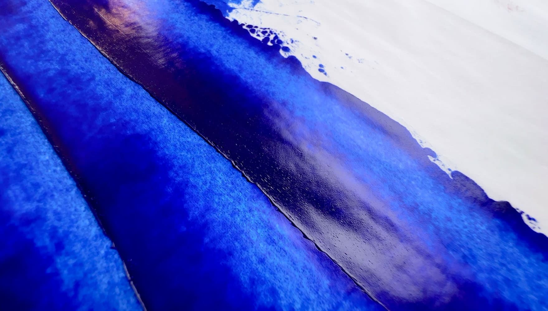
We had moved to this sunny third-floor apartment with only the belongings we could carry after a destructive wildfire-turned-urban-fire had destroyed part of our town and ruined nearly all of our belongings. Starting from almost scratch, we were building again. We hadn't been in our new place very long before Jonathan said he had wanted to make a painting-- a big painting-- a solid-color monochrome painting filled with impasto swirls of color. Before the fire, he had made some impasto work in Cobalt, and this was both a continuation of those studies and a departure-- a new beginning.
Jonathan replied to my question with, "Ultramarine."
Ultramarine Blue is a blue that comes from a crucible, where very specific substances are heated together. We've read that applying heat to this pigment doesn't change its appearance-- it's a blue that is forged in the furnace. It is a blue of innovation— it was a prize of 6,000 francs that led to its discovery and modern production. And it is a blue of history, as its predecessor, natural lapis lazuli, is one of the most beautiful natural stones on earth.

A symphony of blues featuring Ultramarine. Painting by Jonathan Myers, Oil on Canvas, 36"x36"


A Royal Blue Beyond Compare
It's hard to imagine what painters of the past would have given for our modern ultramarine
As a color that makes the list for even the most limited palettes, where would we be without synthetic ultramarine? Paying stacks of silver bullion for an ounce of genuine Lapis Lazuli pigment? Or having to make do with green-leaning Prussian Blue? Or maybe trying to eek by with Phthalo Blue Red Shade? Ultramarine Blue is gorgeous royal blue with depth, transparency, and lightfastness. Whatever Ultramarine's consistency defects in oil might be, painters are willing to overlook them. There is currently no viable alternative for a transparent, rich, lightfast, clear royal blue. Just known these days as just "Ultramarine Blue" the invention of this pigment was nothing short of a modern miracle for painters.
Lightfastness: Excellent. Refer to lightfastness section below.
Transparency: Transparent
Relative Dry Time: Slow
Strength in Tints: Medium
Oil content: Moderately low
Toxicity: Least concern
General notes on categories: Lightfastness in tints may have quirks in different mixing whites, however Ultramarine is an important pigment in this area of the colorspace, so even with minor quirks it is worth using. Transparency may vary due to paint formulation. Strength in tints will vary across brands due to varying amounts of pigment per brand and depends on how much filler a brand uses. Differences in dry time will also be noticed as some brands use driers which speed things up, or different binding oils which may slow it down.
Compared with other blues, apart from being unique in masstone and glazes, Ultramarine is super useful in mixes toward violet.

Michael Harding Ultramarine Blue in linseed oil. Ultramarine Blue has a natural transparency
Ultramarine Among the Blues
Deep as the Sea
Ultramarine Blue is on my ultra-short list of essential pigments, and through my whole painting career, it is one of the colors which has always been included in the list of the most-prized colors on the palette.
In comparison to other blue pigments, Ultramarine Blue is:
- Closer to indigo-violet-blue than Phthalo Blue, PB15
- Clearer and more transparent than Cobalt Blue Deep, PB74
- Closer to violet-blue than Prussian Blue, PB27
PB29 or Ultramarine Blue is sometimes also named Ultramarine Blue Light, Ultramarine Blue Dark, or French Ultramarine. It is a blue pigment that is described as a deep gem-toned royal blue, and some varieties lean more or less toward a purple-blue (both varieties- the royal blue and the more indigo blue share the same pigment code). Ultramarine Blue is usually transparent or semi-transparent depending how the paint is formulated.

Ultramarine Blue fills a unique area of the spectrum compared to other blue pigments
How to Choose a Good Ultramarine Blue
Questions to Consider
We made a comparison of several Ultramarine Blue paints so in-depth comments on a handful of specific paints may be found there. Here are some general questions.
What consistency do you prefer?
Each brand has their own interpretation of how to make ultramarine into a paint. Some let the naturally longer nature of the pigment in oil shine through while others make attempts to modify the paint feel to fit the rest of the brand's paint line. Long and soupy versions are going to be easier to use in a glaze without further dilution, while short or stiff versions are more sculptable.
Should You Avoid Student Brands? The answer could be yes. Something to look out for is how many extenders one's ultramarine contains. When used in a limited palette we've sometimes heard comments that it's important to have a high-quality version of ultramarine as some of the student versions overly extend the pigment so thatit doesn't have the depth and tinting strength that one requires. Some limited palettes rely on the near-black depth of a highly tinting ultramarine paint to achieve satisfying results.
How important is drying time? Ultramarine tends to be an average to slow drier. Many varieties take 2-7 days, and may contain driers. It forms a good but fairly brittle paint film in oils. Some painters wish to avoid driers as much as possible.
Do you prefer more of a middle blue or one that leans more violet? More on this below. Also, which binding oil is best suited for your purposes? More on this below as well.
As a side note, the versions of ultramarine we show in pictures or discuss here are not necessarily the paints we recommend the most highly. Each painter has totally different needs and preferences. For the article we selected a few tubes we have around the studio to show a range of typical colors in oil paint as well as a variety of consistencies. Ultramarine is one of the colors where we might be more interested in both a linseed version as well as another binding oil (used selectively in the topmost layer of the painting only-- more on this below).

Old Holland Ultramarine Blue has a stiffer consistency than some other brands. Old Holland offers both Ultramarine Blue (regular) as well as Ultramarine Blue Deep, both PB29
Old Holland Ultramarine Blue (Linseed Oil)


A Prize-Worthy Pigment
Solving a Mystery
Modern ultramarine was borne from the dire need for a gorgeous, high saturation, deep royal blue pigment. The need was so great a prize was offered for its development.
Modern ultramarine blue is quite a complex innovation. Its chemical formulas are intricate and significant effort was put into its discovery. Lapis Lazuli had always been expensive and the method for extracting the lazurite was difficult.
In the older edition of his book (1970), Mayer wrote, "...Ultramarine was the most precious of artists' materials from the Middle Ages up to the early nineteenth century. Although azurite, blue verditer, and the other unsatisfactory blues were augmented by smalt in the seventeenth century and Prussian blue in the eighteenth, the invention of artificial ultramarine was one of the major events in the history of artists' materials."
According to Mayer, "accidental observation of a mysterious blue color encrusted as an impurity in the furnaces where soda ash was made," led to "intensive chemical research." Goethe made mention of the blue deposits around lime kilns in Italy in the late 18th century. A prize was offered in France to incentivize innovation. The winner was B. Guimet. More about its history and the twists and turns of its discovery can be found here.
A hundred years ago Uebele wrote, "Artificial ultramarine blue, while not as permanent as the natural, is on the lists of artists' tube colors, as it is when properly selected, deeper and more brilliant and very much lower in price."

Ultramarine Blue Pigment by Kremer Pigments (left) alongside two versions Genuine Lapis Lazuli Pigments by Rublev and L. Cornelissen & Son London
A Significant Blue on the Palette
One of the best blue-purple pigments
For the purposes of color mixing, Ultramarine Blue is a sine qua non. Where the land of blue and purple meet, you'll meet Ultramarine, rich and deep.
With its glorious transparency, this rich deep blue is unlike any other pigment on the palette. Where phthalo tends to be harsh and overpowering, Ultramarine is a moderately high tinter and easier to use. PB29 is a wonderful blue for mixing purples. We also mix it with yellows to make dull camouflage and olive greens. One of the more common mixtures involving Ultramarine is a tint with white which is often pre-mixed and sold as King's Blue.
Though not everyone is in love with a split-primary palette, as a framework for color mixing, it has its merits. Ultramarine is admirable in the role of a blue that leans red instead of green.
Some of the other colors in a similar color space as ultramarine are Cobalt Blue Deep or even YInMn Blue. Both of these alternatives are quite costly as well as opaque.

Blockx French Ultramarine Blue Light in Poppyseed Oil
Gorgeous Ultramarine Blue
Paints made with PB29
Lapis Lazuli
While lapis pigment has an almost medieval charm (and conjures up visions of the woods, and thatched-roof hovels housing wizards making blue powder out of stones) we've never seen a modern lapis lazuli paint sample that could compare with today's ultramarine. In terms of color, there is currently no other pigment in this color space which can compare with present-day ultramarine. Yes, we've heard about particle sizes and shapes. Yes, we love the idea of using it to glaze with resins.
However, if you've ever held a piece of display-quality lapis lazuli in your hands, it seems like a crime to crush that gorgeous stone up into pigment. We're guessing (hoping) only stone scraps and powder get turned to pigment.
On the opposite end of the spectrum, if you've ever bought modern genuine lapis lazuli oil paint, it can be a bit of a letdown. Some painters may love it, and we don't blame them, if it works for you, it works, and besides it is a lot of fun to try. There are tales of finer and finer grades of Lapis, however it's hard to beat modern ultramarine. Sure, there is a charm to lapis, and everyone needs to try genuine Lapis at least once.
Genuine lapis lazuli pigment is very expensive, so paintmakers will go out of their way to tell you if they're selling genuine lapis (bear in mind it currently shares the same pigment code as artificial ultramarine). We recommend looking at samples of what is on offer and doing your research before paying a mint for anything labeled genuine lapis lazuli paint. For the purposes of this article we'll focus on modern ultramarine.

Lapis Lazuli Rock. Modern ultramarine (moreso than the genuine Lapis Paints we've tried) gets closer to the look and feel of Lapis Lazuli. The blue component in Lapis Lazuli is Lazurite, but it contains other minerals as well such as pyrite, calcite (the white) and more.
Ultramarine Blue vs Ultramarine Blue Deep
Primary Blue to Indigo
Ultramarines come in a range of shades from greenish to reddish shades. Ultramarine Green is exceedingly rare as not to be really mentioned anymore, and it is most typical to find Ultramarine Blue. However, paints labeled Ultramarine Blue Green Shade are a rich deep blue. Within PB29 there are also deep blues that lean indigo which are sometimes labeled Ultramarine Blue French or Ultramarine Blue Deep. There is also a related pigment called Ultramarine Violet (PV15) which can range from indigo to middle purple to a reddish pink. Another related pigment which picks up in the reddish purples is Ultramarine Red or Ultramarine Pink made of pigment PR259. Here we focus on the range of subtleties within Ultramarine Blue, PB29.
Range of Colors for Ultramarine Blue, PB29 Setting aside Genuine Lapis, discussed above, there are two main subcategories of Ultramarine Blue. We'd call these regular Ultramarine or Ultramarine Blue Deep.
As in other areas of the blues, the red-green naming structure strikes again (e.g. Ultramarine Blue Green Shade is a deep clear royal blue while Ultramarine Blue Red Shade is a purpler blue that's usually a bit closer to Indigo). It's easier to imagine a color wheel with a handful of deep blues. Some versions of deep blue lean a tiny bit toward green, while others are a bit closer to violet. With ultramarine, the violet range stretches all the way to fully violet, and the pigment becomes ultramarine violet, PV15.

Two test panels which compare Ultramarine Blue and Ultramarine Blue Deep in the background. In masstone the colors do not look much different, but the undertone in Ultramarine Blue Deep is more indigo-purple.
Other Ways Ultramarine Blue May Be Named
Light, Dark, Red, Green, French
Sometimes the differences between the types of Ultramarine that are offered will be fairly subtle, and the names are unfortunately not a lot of help. Some brands name everything "French" while others reserve French for the purpler shade (red shade). The difference between Ultramarine Blue Green Shade and Ultramarine Blue Red Shade (both pigment PB29) are sometimes somewhat subtle differences in undertone. However, if mixing purples we'd go for a red shade, as that little bit of extra indigo potential could be helpful.
These guidelines are just that-- unfortunately there is no official standard for how paints are named according to their colors, so this is not a guarantee.
What is Ultramarine Blue Light? - A Regular Deep Blue. We usually notice the name Ultramarine Blue Light in European brands. Often it is a deep rich royal blue that leans a touch less toward indigo.
What is Ultramarine Blue Deep? - A Purpler Deep Blue. Ultramarine Blue Deep may refer to a similar color as Ultramarine Blue Light (a rich deep blue) which may lean very slightly toward indigo, or it may have a distinct Indigo note.
What is Ultramarine Blue French? - Often a Purpler Deep Blue. The name Ultramarine Blue French is more often seen in English or American brands, and there it may connote the more red-shade version of the pigment. In some contexts it means Ultramarine Blue Synthetic (which is most of th market). The name French is used rather inconsistently but more often it refers to the more indigo or deep version of the pigment. In European brands the naming structure may be applied differently, but it is hard to draw consistent patterns.
More on names may be found in our article that compares several Ultramarine Blue oil paints.

A few paints from around the studio with different Ultramarine names. On the left are two versions of the more regular Ultramarine Blue, Williamsburg Ultramarine Blue (PB29) on the top left, and Blockx French Ultramarine Blue Light (PB29), bottom left. On the right are two versions of the paints labeled deep. Williamsburg's Ultramarine Blue French (PB29 and PV15), which has a touch of Ultramarine Violet to increase the indigo note even more on the top right, and Blockx's French Ultramarine Violet Dark on the bottom right, which is one of the subtly more indigo versions of PB29.
Many Versions of the Pigment
We've heard there are quite a few pigment options for paintmakers who wish to procure PB29 for their paints.
An antique book on paintmaking shows that even a hundred years ago or more there were many varieties of Ultramarine Blue for paintmakers to explore. Uebele wrote, "There being a dozen or so of grades listed, of which at least one-third will interest the color grinder for his various purposes, it is up to him to test samples offered him by the manufacturer for brilliancy of tone, shade, fineness, softness of texture, tinting power and clearness of tint produced with white. One part of the dry blue mixed with 25 parts French zinc white, rubbed out to the utmost is the best guide for this."
These days we don't tend to use zinc white for oil painting (or at least use it with caution) but it was one of the standard measures for doing a tinting test. Unfortunately we as painters don't have an easy way to determine the quality of the Ultramarine Blue which was selected by the paintmaker.

A sampling of blue pigments available through L. Cornelissen and Son, London. The Ultramarine Blue Light and Ultramarine Blue Dark show only subtle difference in masstone here when bound in casein.
A Blue Like None Other
This staple violet-leaning blue is one of the colors we'd call absolutely essential. From cobalt-colored glazes that shine like a sapphire to airy King's Blues fit for the heavens, Ultramarine fills a special niche in the spectrum of pigments on the palette.
Ultramarine blue is a special blue that is actually a bit difficult to reproduce. The depth it can achieve in oil is remarkable. However artists, such as Yves Klein, have also fallen in love with powder blue of its pigment forms. No matter which binding medium is used, this pigment definitely makes our short list of the most essential artist colors.

Blockx French Ultramarine Blue Light
Ultramarine Blue
More PB29 in oils
One of the Most Difficult Pigments to Make into Oil
One Cases where Stabilizers Help
Ultramarine is legendary for being difficult to make into an oil paint. For oil painters, we enjoy the end results of all of the decades of R&D that paintmakers have put into homogenizing ultramarine into their paint lines. That said, many ultramarine paints with a nice consistency probably have an additive or stabilizer or two (such as a bit of beeswax). However we do not like to see aluminum stearate as it can cause other problems. Ultramarine in oil is naturally stringy, so some brands will modify it in various ways to give it more body.
For paintmakers, Wehlte notes that ultramarine is very hard to work with in oil. He writes, "When oil is added too sparingly, ultramarine will form a puttylike mass and may even start to burn in the roller mill. The color tends to become dull and lose its brilliance." He mentions that a particular resin may help but that it comes with its own sudden dangers. When adding the resin, "...the consistency may rapidly be reduced to a point where the paint runs. This break in consistency is reached quite suddenly. For this reason, a little beeswax dissolved 1:2 in turpentine is usually added." He concludes his remarks by saying, "Ultramarine is the most difficult pigment to grind by hand."
Elsewhere he wrote, "When grinding Ultramarine in oil or in some emulsions, one will find that the paint will long remain a dragging, puttylike mass. If more medium is added to remedy this, the material will suddenly start to flow off the slab. Different types of ultramarine vary in this respect."
Doerner wrote that, "About 2% wax is added to the color to make it "short" and also to prevent its hardening too quickly in the tube. One should allow the ground color to stand a day before putting it into the tube; the color then becomes thin again and is able to absorb more of the powder."
It seems that this may have been part of the inspiration for Rublev's particular take on Ultramarine which allows the pigment to rest between milling. Rublev's particular version (called Ultramarine Green Shade) is made with linseed oil. We've found it to be a fine paint, though be prepared for separation in the tube and for the occasional large amount of oil to come out when the tube is opened.
Odd or notable behaviors: There is something called Ultramarine Sickness which can happen to the paint film, but it is rare and may apply more to certain binding mediums. From a paintmaking perspective, Ultramarine is a notoriously difficult pigment to form into an oil paint and wax is often added in small amounts.

Ultramarine Blue pigment is known to be difficult to make into oil paint, however it is such a beautiful and essential pigment that it is a standard color on many palettes
Specific paint comparison
A comparison of several quality Ultramarine Blue paints.
We took a look at four linseed oil paints, Old Holland and Michael Harding comprise one half of the quartet as the paints that have a bit more body. Of those two, Old Holland has a stiffer consistency. The other half of the group is formed by Rublev and Vasari, both of which are very flowing. Between those two, Rublev had much more separation. In our tinting tests, Vasari performed on par with the others, but in practice we've felt like it has a bit less tinting strength or heft than some of the other linseed options. However it is a lovely gemtone ultramarine.
We also took a look at two non-linseed oil options, Blockx for poppy oil and M Graham for walnut oil.

A handful of Ultramarine Blues are compared in separate Paint List article
Ultramarine Deep or French
Gorgeous Glazes
A crystalline paint
Wehlte remarks, "Unadulterated artificial ultramarine is one of the best glazing pigments available." Elsewhere he wrote, "Certain pigments like madder, ultramarine or viridian are very transparent by virtue of their crystalline structure. They are therefore called glazing colors. They should, more precisely, be called glazing pigments." He goes on to explain that naturally an opaque color can be used as a glaze if it is diluted enough. However transparent pigments like Ultramarine almost can't help but glaze.

M Graham French Ultramarine in Walnut Oil


More PB29 paints labeled Deep or French
Ultramarine Blue in Linseed Oil
In general, linseed oil forms the strongest paint films, however its drawback is a natural yellowing over time. The yellowing of linseed oil is more strongly felt in colors such as blue, purple, or white. For this reason, some painters may opt to have a version of ultramarine blue in a different binding oil.
However, other oils such as poppy and safflower have been known to experience drying problems of various kinds, and the circumstances under which the problems arise are not currently well-enough understood.
For general mixing throughout the layers of the painting, we opt for Ultramarine Blue in linseed oil.

Michael Harding Ultramarine Blue in Linseed Oil
Michael Harding Ultramarine Blue in Linseed Oil


Linseed Oil - Ultramarine Blue
The regular Ultramarine PB29 paints in Linseed Oil (i.e. not Dark nor Deep)
Ultramarine in Linseed Oil
Old Holland Ultramarine Blue Deep


Linseed Oil- Ultramarine Deep
Ultramarine Blue in Poppyseed Oil
Ultramarine blue is one of the colors where Poppy oil might be considered if it's used judiciously, thinly, and only in the topmost layer of a painting where the non-yellowing nature of the oil would be best appreciated by the viewer. However Mayer tends to think its non-yellowing reputation may be a bit overstated.
The theory goes that since linseed oil yellows naturally, colors like blue, purple, and white are prone to be affected by the effects of the yellowing, but authorities have mixed enthuisasm on whether poppyseed oil resists yellowing enough to outweigh its defects.
In general, Wehlte had rather neutral comments overall. He wrote, "Poppy oil yellows less than linseed oil, provided it has been obtained from white flowering plants by cold-pressing. Some commercial products look darker than linseed oil and yellow just as strongly." However we've heard from other sources (including Mayer) that poppy oil sometimes becomes tacky after it was thought to be dried, and may also be associated with other problems such as cracking. It also forms a weaker paint film.
Mayer wrote, "The serious defects of poppy oil are the frequency with which its paint films will crack upon aging, and its slow drying rate...." and he mentions the dangers of using it in multiple layers. It is sometimes mixed into linseed oil to extend the drying time of paints.
All that said, if a person wants the least yellowing oil, a high quality poppy oil paint may be worth the risk if used sparingly in the top-most layer of the painting.

Blockx French Ultramarine Blue Light in Poppyseed oil
Blockx Ultramarine Blue


Ultramarine Blue in Walnut Oil
Walnut oil enjoys a long history in oil painting, perhaps made most famous by Leonardo DaVinci. According to Mayer it is often considered to be "inferior to linseed oil" but at the time of his book, he mentions that was actually its cost which has prohibited it from being more widely used in paints. Other authors also mention the high cost as well.
Walnut oil may form a slightly weaker paint film than linseed. We've heard mixed reports, but in general it may yellow less than linseed, which is one of its main attractions. We have wondered if it might be related to some chalking/bloom that we've noticed on certain samples, but it is too hard to say whether that was the walnut oil or some other ingredient that the paintmaker added. It may be advisable to avoid it in impasto.

M Graham French Ultramarine Blue in Walnut Oil
Ultramarine In Walnut Oil


Other Binders (Non-Linseed) Regular Ultramarines
Ultramarine Blue Deep in a Non-Linseed Binder
Maimeri Puro makes both an Ultramarine Light and an Ultramarine Deep. In masstone, some paints labeled Deep are difficult to distinguish from regular Ultramarines, but the undertone is much more purple- leaning in tints.

Maimeri Puro Ultramarine Blue Deep
Deeps - Other Binders (Non Linseed)
Sensitivity to Acids
One of the few things to note about Ultramarine
Ultramarine is harmed by acids, so that is one thing to consider.
Older texts mention grades of ultramarine pigment, and that not all grades are suitable for artists' colors. They also mention that there should be no free sulfur in the ultramarine pigment. Sulfur can also react with other pigments.
Doerner cautions, "Unfortunately this beautiful and valuable color becomes quickly discolored by the action of weak acids, which attack it, forming hydrogen sulphide. Vinegar, which is often used with tempera, and also carbolic acid used as a disinfectant, can by their continued action, even in very small quantities, completely ruin this beautiful blue color in a picture. Alum will likewise discolor ultramarine." This is getting technical, but Doerner even mentions that "Free acids in the very fat oils may do the same."

Michael Harding Ultramarine Blue in Linseed Oil
Excellent Lightfastness with a few Quirks
Mixing white may matter in tints
Ultramarine Blue, PB29 is known for having excellent lightfastness, with a few slight caveats.
Overall ultramarine tends to be excellent and gets solid highest marks (all 8’s on the BWS).
In terms of mixing whites in oils, in Golden’s Lightfastness Testing, Ultramarine Blue showed some unexpected behaviors in some Flake white formulations as well as lightfastness failure in a Lithopone made with safflower oil. There was also a slide to LFII when it was combined with pure Zinc Oxide.
These results suggest that choice of mixing white may matter for Ultramarine Blue. There were also a few surprises as to its reactivity in artificial simulations such as QUV and Xenon testing.
It is also worth noting that the lightfastness may vary depending on the manufacturer, with some industrial suppliers listing 7-8, while artist suppliers may list all BWS 8's (highest marks). It has an ASTM I - Excellent rating.
While unrelated to lightfastness, this color is known to discolor in the presence of acids.

Blockx French Ultramarine Blue and its tint with Titanium White
Toxicity Notes
Low Concern
Ultramarine is generally regarded as the category of Low Concern. There are usually no listed hazards, however reference the note from CAMEO. As with all pigments, do not breathe the dust.
We were surprised to refer to a toxicity note on CAMEO on natural lapis lazuli, which is chemically similar.
For toxicity information, refer to manufacturer SDS. Treat all pigments and paints with studio safety protocols.

A swatch of Old Holland Ultramarine Blue showing its deep masstone and chromatic glazes
Oil Absorbtion
Low to Medium by Volume
Every pigment, when made into oils, has a different oil requirement. So when a paintmaker says they have highly pigmented paints, that percentage of pigment will be relative to what that pigment can bear and the percentage of oil needed will be different for every pigment.
The oil requirement by volume for a given pigment may be helpful information if a person is painting in layers. For example, there are a few pigments to avoid in an underpainting. In oils, different Ultramarine Blue pigment samples within a pigment code may have slightly different oil absorption amounts, but in general, PB29's oil content by volume ranges from low to medium, perhaps on the lower end of medium relative to other pigments.
For Ultramarine Blue, oil content by volume can be moderately low. An article from Golden has more information. Doerner wrote that ultramarine requires about 40% oil, while Wehlte says 30-50% oil with 2% wax paste.
Mayer assigns Ultramarine Blue to the medium category for volume relative to other pigments, with a score of 85. For information by weight, refer to the entry for PB29 in the Pigment Notebook for details.

M Graham French Ultramarine Blue
References
PB29 pigment data from David G. Myers, The Color of Art Pigment Database, Artiscreation.com
Information about PB29 from Bruce MacEvoy, Handprint Guide to Watercolors, General information about this class of pigments from Handprint
CAMEO Materials Database: Conservation & Art Materials Encyclopedia Online, Museum of Fine Arts Boston. (Accessed June 2043). Ultramarine Blue, Synthetic https://cameo.mfa.org/wiki/Ultramarine_blue,_synthetic. Museum of Fine Arts Boston.
Alfa Chemistry (n.d. Accessed June 2025). Ultramarine Blue (PB29) https://materials.alfachemic.com/major-products/ultramarine-blue-pb29.html,. Alfa Chemistry.
Ambrose, Trevor (2023, September 24). ASTM Lightfastness Testing for Oil Paints https://justpaint.org/astm-lightfastness-testing-for-oil-paints/. Just Paint, Golden Artist Colors.
Douma, Michael, curator, Pigments through the Ages. 2008. Institute for Dynamic Educational Advancement. (Accessed December 2025). Ultramarine Blue https://www.webexhibits.org/pigments/indiv/history/ultramarine.html.
Doerner, Max. The Materials of the Artist and Their Use in Painting with Notes on the Techniques of the Old Masters. Harcourt Brace and Company New York, 1949. https://archive.org/details/materialsofartis0000maxd
Mayer, Ralph. The Artist's Handbook of Materials and Techniques. New York, Viking Press, 1970. Internet Archive, Web. Accessed August, 2025. https://archive.org/details/artistshandbooko00maye
Mayer, Ralph. The Artist's Handbook of Materials and Techniques, 5th ed. New York, NY, Penguin Group, 1991. https://amzn.to/44OzBN9
Wehlte, Kurt. The Materials and Techniques of Painting, With a Supplement on Color Theory. Van Nostrand Reinhold 1975. https://amzn.to/3Gutt3l
Article written by Melissa Carmon
About the author: When a sudden urban firestorm threatened their studio, Melissa and her husband Jonathan rescued The Great Book of Color, about 800 pages of her handwritten notes gleaned from her years of painting. They co-founded the Paint List to empower fellow painters around the world. More can be found here. Read More.

Blockx French Ultramarine Blue Light, in Poppyseed oil
Subscribe for More Articles From the Great Book of Color
If you'd like to receive the latest illuminations from the Great Book of Color and Paint List news in your inbox, subscribe to the newsletter here
Thanks for reading and Happy Painting!