PR255 - Pyrrole Scarlet
Vivid and Versatile, this Feisty Red is Unparalleled in Tints
A Fiery, Underrated Pigment
An Oranger Version of Pyrrole Red
The summer sun poured through the eastern windows onto the old brass tray that I used for a paintbox and illuminated all the red tubes of paint like a string of rubies. Deep cherry red, cheerful middle red, warm reds leaning into the oranges. Large portraits in progress filled the studio, and on one of the faces, I needed to add a bit of warmth to the peaches-and-cream pinks of the cheek where it met the light. The only challenge was, my go-to cadmium reds and oranges were naturally more muted than I would have liked.
With the daubs of red paint arranged on a palette from cool to warm, I began to tint each one with bits of icy titanium white. Some reds cascaded unexpectedly cooler like the pastel mints that grandmothers in the 1980s once kept in crystal dishes, others turned pink like the bubblegum from my childhood which came in wax-paper wrappers, while others turned unexpectedly duller like the baked terra cotta bricks of the desert southwest. That morning in the studio I determined to tint out every red-orange in my paintbox. Cool pinks? Yes. But what about the region where red turns toward orange? That's when I discovered the value of Pyrrole Scarlet-- a racing red-orange which has much more to it than first meets the eye.
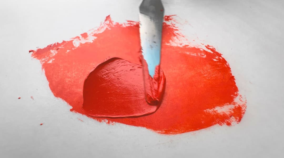
Gorgeous Pyrrole Scarlet
Pyrrole Scarlet, Hard to Find and High Powered
A Red Orange From the Fast Lane
This strangely hard-to-find color may rank as one of the well-kept secrets of the palette. Pyrroles came roaring out of the automotive world at 211 mph, and their specs have been well vetted. Pyrrole Scarlet, the oranger sibling to Pyrrole Red / Ferrari Red PR254, but Pyrrole Scarlet is also used in automotive coatings. For all its charms, Pyrrole Scarlet is oddly underrated. For example, it's hard to find PR255 in large quantities. We've been known to buy quite a few small tubes since few paintmakers offer it in larger quanitites. PR255's tints are just one of several reasons that make Pyrrole Scarlet a wonderful palette asset. What could look like an "extra" color actually has a few secrets (more on this below). Overall this is an incredibly versatile color.
Basic Specs: Lightfastness: Excellent Transparency: Semi Transparent to Semi Opaque Relative Dry Time: Slow Strength in Tints: Good Toxicity: Lower Concern
General caveats on categories: The transparency of any given paint may vary due to paint formulation as well as the pigment's qualities. The strength of a color in tints will be a factor of the pigment's natural qualities as well as how much filler a brand uses. Differences in dry time will also be noticed as some brands use driers which speed things up, or use different binding oils which may slow down the drying time.
Compared with other reds, PR255 is:
-Slightly warmer/oranger than most versions of the more cherry red, Pyrrole Red PR254. -More transparent and higher chroma in tints than Cadmium Scarlets, PR108. -Much more lightfast than many similar pigments in the color space, such as Napthols (e.g. PR112).
PR255 or Pyrrole Scarlet is sometimes also named Diketo-pyrrolo Pyrrole Scarlet (DPP). It is a semi-transparent or semi-opaque pigment. In oils, its dry time is slow.
PR255
Make Way for These Racing-Hot Pyrroles
One of the Hottest Orangish Reds
A Pyrrole that Doesn't Get a Lot of Press
It can be hard to find lightfast reds in general, so reds with good stats in that department are noteworthy.
High Chroma in Tints
Accomplished painters know that it's a bit tricky to find chromatic red-orange tinting colors which are also lightfast. For context, in terms of the alternatives in the colorspace, Cadmium Reds are a bit more muted in tints, and some of the other scarlet stunners (like PR112 or PO73) which also land in this tinting space can throw dismal curveballs in lightfastness for one reason or another. In short, some of the alternative high-chroma pigments turn out to be quite reactive (more on this below).
Comparison with Pyrrole Red
Generally speaking, in comparison with Pyrrole Red (PR254), Pyrrole Scarlet (PR255) is oranger. (Interestingly there is one exception to that rule, which is discussed below). In general terms, a PR254 will be a deep cool red while PR255 will be a warmer red-orange. In terms of technical chemical issues for the coatings industry, PR255 may be slightly inferior to PR254 on a few counts, but both are high-performing pigments with an excellent track record.
It's a bit difficult to find advanced information about PR255. Perhaps as a newer pigment it does not have the long literary legacy like some of the older pigments do.
So, we must turn to the Chemistry section instead of Art History, and there we find a tome called Industrial Organic Pigments. The chemists wrote of PR255, "The pigment affords reddish shades of orange, actually scarlet shades, which are distinctly more yellowish than those of P.R.254. The commercially available grade of P.R.255 shows excellent hiding power."
This slight orangeness or yellow-red quality is precisely why we love PR255. We'd place Pyrrole Scarlet PR255 between PR254 as a middle red and the related orange pigment, PO73, Pyrrole Orange. All three make wonderful tints. Pyrrole Scarlet PR255 and Pyrrole Orange PO73 stand out as reaching chromas in tints that are hard to reach with other pigments. PO73 may be fairly reactive to safflower oil though, so we would love to have testing done on PR255 to be sure it does not suffer from similar problems (more discussion of this can be found in the section below on lightfastness).
However since few things in life are actually simple, a caveat to our basic comparison will also be found below in the notes on Pyrrole Scarlet's little-known secrets.
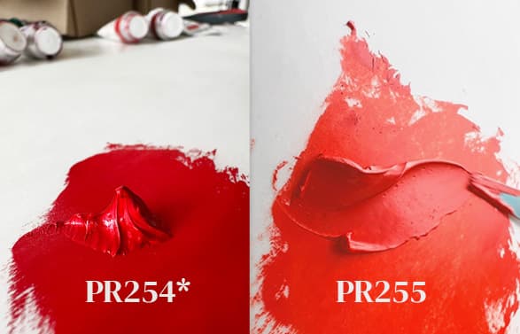
Pyrrole Red, PR254 vs. Pyrrole Scarlet, PR255. With few exceptions, Pyrrole Red tends to be cooler and Pyrrole Scarlet is an oranger red. We added as asterisk as there is one little known exception which is discussed below. Shown here are fairly typical representatives of the two colors, namely Williamsburg's Pyrrole Red and Winsor and Newton's Pyrrole Scarlet.
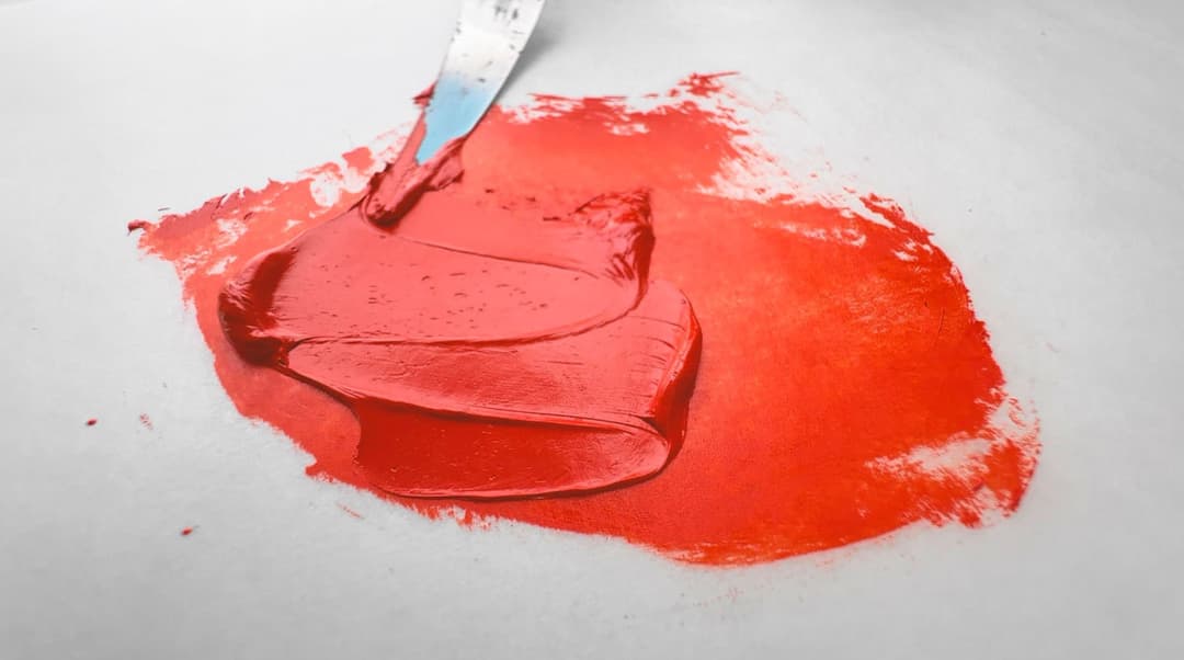
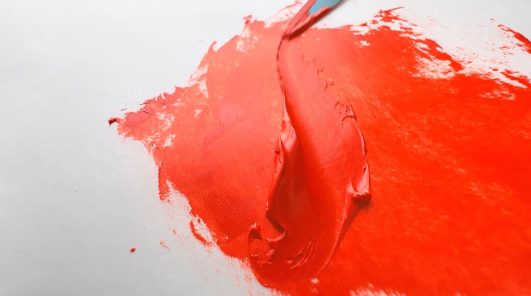
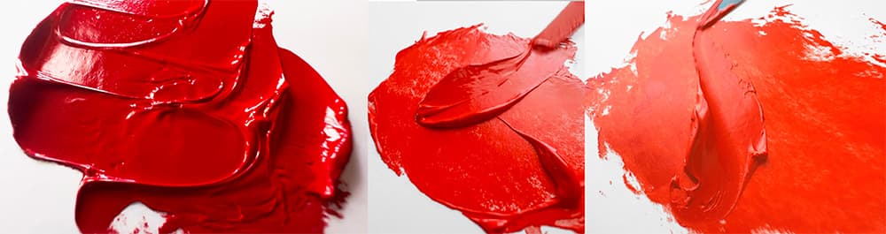
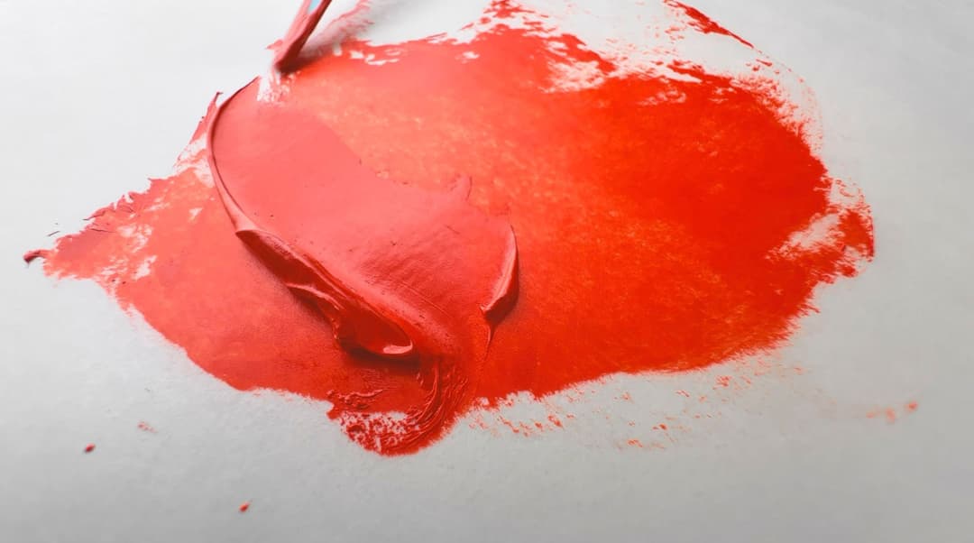
Pyrrole Scarlet in Masstone
High-Level Comparison with other Reds
Pyrrole Scarlet may be an attractive choice depending on what a person desires from a paint. Setting aside its unique hue and tints, here are some notes on other pigments shown here. This is a selection from L. Cornelissen & Son's pigment offerings which have been bound in casein.
-It has higher chroma tints than many Cadmium Reds, PR108. -It's far less toxic than Red Lead, PR105. -It's an Oranger-leaning red than PR209. -It's more lightfast than the pigments used in their Vermilion Imitation, namely PR4 and PY1.
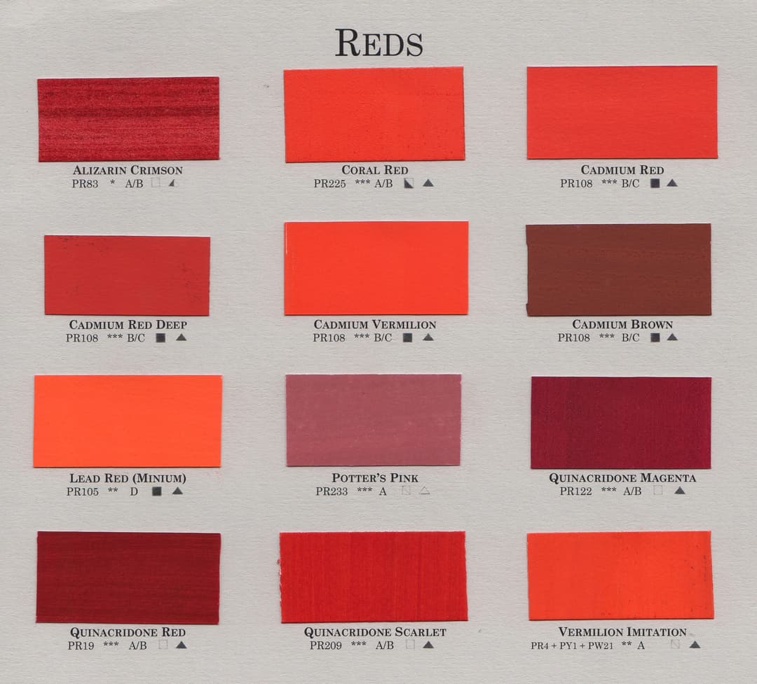
Some pigments from L. Cornelissen & Son, London. Pyrrole Scarlet, named here Coral Red, offers some benefits over pigments in a similar colorspace
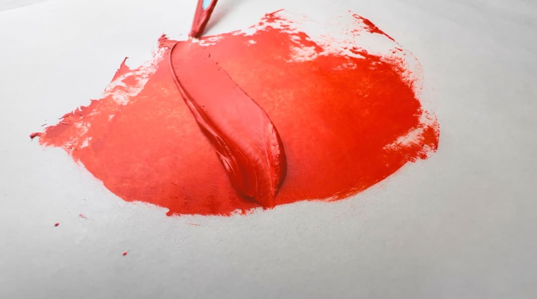
Vivid in Masstone with Lively Pink Tints
Few colors approach Pyrrole Scarlet's Tints
What's so Special About Pyrrole Scarlet?
With so many red pigments to choose from, to suggest one in particular -- or even an addition to the palette-- requires a few words.
In terms of a limited palette in oils, we'd first favor Cadmium Red Light for this part of the spectrum as it is a super versatile lightfast red which is also opaque. So why introduce another color at this similar area of the rainbow?
Chances are good that you may not need Pyrrole Scarlet. However, we've noticed that few colors really hit the high notes when it comes to red-orange tints.
Some Notes on Pyrrole Orange (Not Shown)
In terms of warm pink tints, once upon a time, we would have turned to Pyrrole Orange (PO73) for this task, but it seems that at least the one Golden tested has some unexpected behavior in safflower oil. Since many brands use safflower oil rather freely, we can't recommend Pyrrole Orange with the same gusto. Until we find out more about PR255, it may be an interesting alternative. Pyrrole Scarlet wasn't mentioned in Golden's recent lightfastness results, so until further test results come in we'll be cherishing our PR255 as well as steering clear of safflower oil just in case it demonstrates similar behaviors.
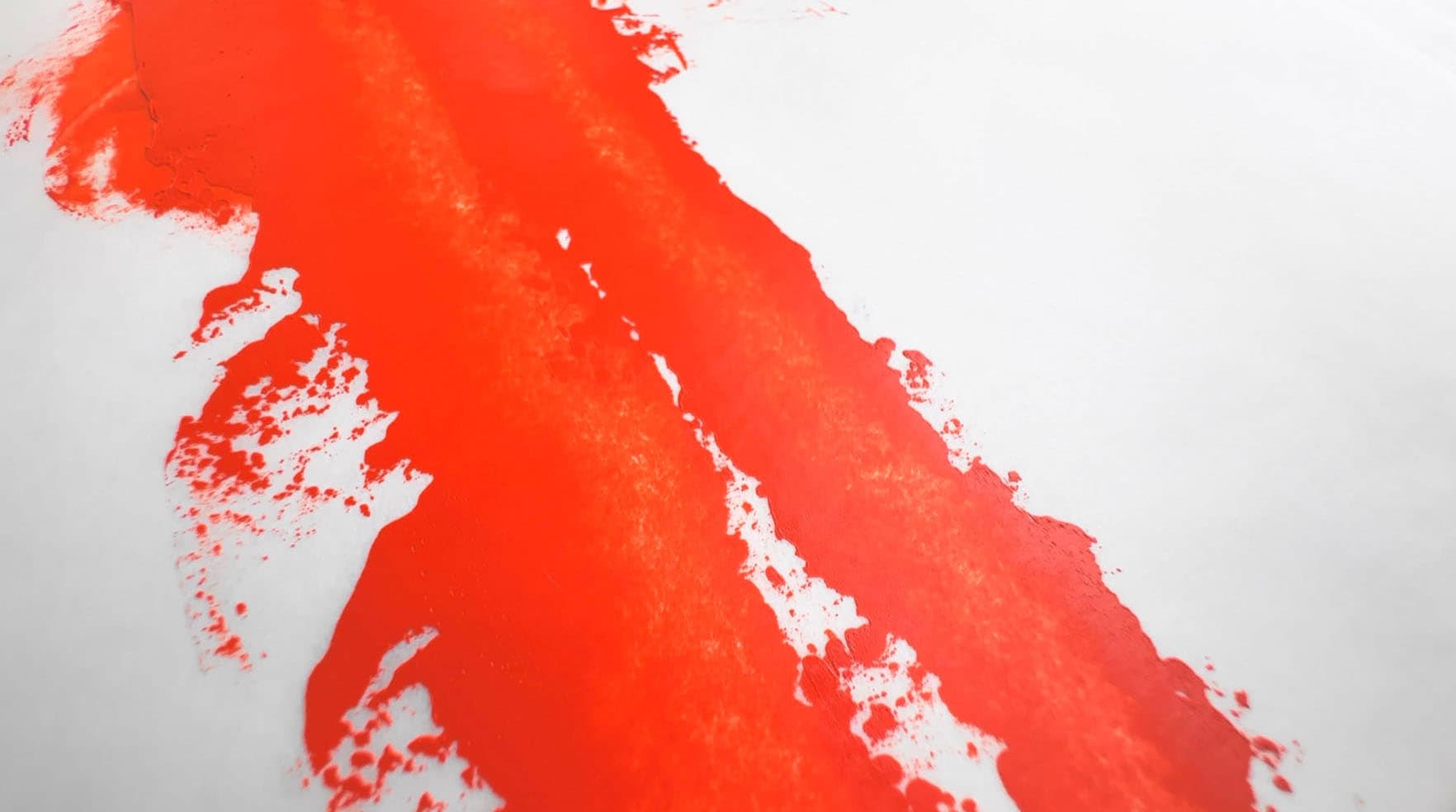
Chroma boost in the saturated-pinky-peach end of the gamut
Pyrrole Scarlet is absolutely smashing in warm pinks, and PR255 is much higher chroma when mixed with white than Cadmium Red.
The tints of PR255 have an incredible warm quality-- that kiss of orange in the midst of the pink. Some might call it coral, as it's a bit pinker than what we'd consider to be called salmon. Certain orangy-pink ranunculus flowers get close to this enchanting color.
In masstone, Pyrrole Scarlet also blows away the competition. Pyrrole Scarlet is a super versatile mixer, and may have been the red in the famed Scott Christensen palette- more on that below.
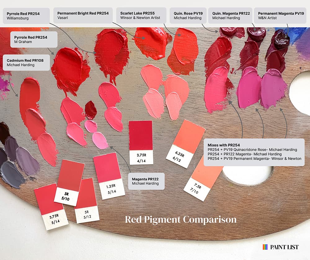
Tints of various red pigments. Only a little-known spin-off of PR254 which is almost as warm as PR255 approaches the orange pink achieved by Pyrrole Scarlet
Pyrrole Scarlet, A Palette Secret
Congratulations! You've Found One of the Secrets of the Paint List
Is Pyrrole Scarlet a superfluous pigment? What if you found out it was secretly the star of the show?
There isn't just one power pigment that will transform your palette... but if you could only choose one, this might actually be it. In a super-limited palette, PR255 might actually be a top choice-- at least it could possibly have played a leading role for one of the most accomplished modern landscape painters out there, none other than Scott Christensen. Now we must mention that we have no idea what he really uses and would love to take one of his workshops sometime. But we can speak to our own experiences in the studio, and this pigment has star power.
Astounding Lead Role in a Limited Palette This gets into painters legends, since we have not verified it ourselves, but we've heard it rumored that Scott Christensen himself once chose a PR255 for his limited landscape palette. Now of course all of this is just hearsay, but as fans of PR255 we could believe it.
Armed with just a PR255 for the warm red, a high quality Ultramarine, and a very lemony Cadmium yellow, Scott Christensen has worked something that looks at times like a miracle, and you can check out his paintings to see how successfully he puts it to use. The old painters' rumor was that there were also a couple of grey blends thrown in, too, and an occasional bit of something else, but even so-- that is what we'd call an extremely abbreviated palette.
Secretly Steel on Wheels for Landscape Grays
If you haven't heard about the Scott Christensen grays, you can check out our Vasari video, where we take a look at the set. We're guessing that just a handful of colors (PR255 or their PR254 for red, PB29 for blue, and PY35 Cadmium Lemon, a white, and a cobalt PB28 or other blue of choice) make up the core Scott Christensen grays. When we set out to recreate them in the studio we couldn't quite hit the blue not in the one called Bice without the help of an additional blue pigment, so we chose PB28 as it's a friendly mixer with other landscape colors. We like to add a bit of PV14 in too, but it's not clear how much that's truly necessary. All in all, that's a very limited palette, and PR255 can adequately carry the starring role as the red.
A Clandestine Hidden Twin
And while we're on the topic of Vasari, we happened to come across an interesting insight. PR255 seems to have a hidden twin. Vasari's Permanent Bright Red, which is labeled PR254, looks an awful lot like PR255. After using it, we were so curious that we had to ask if it was PR255, but no, Permanent Bright Red is indeed PR254-- just an oranger version than we've ever seen before. Normally PR254 is a cherry red, but this one is a lot more like Pyrrole Scarlet.
We don't know for sure, but in the hallowed pages of Industrial Organic Chemistry, we found that PR254 has a beta version which is warmer in color. Is Vasari's Permanent Bright Red PR254 possibly the warmer beta version? Only Vasari knows for sure.
So in addition to creating stellar coral tints, PR255 is also a palette champion in its own right. From ultra-high chroma to an integral role in landscape grays, this color is worth checking out.
From the Great Book of Color, PR255's role in mixing, in famous landscape grays, and a little-known doppelganger. From left to right, Williamsburg Pyrrole Red (a standard PR254), Vasari's Permanent Bright Red (a less-common version PR254), and Winsor and Newton's Scarlet Lake (PR255)
Taking the Lead in a Limited Palette
PR255 or the oranger version of PR254 in a Limited Palette
Excellent Lightfastness
Outstanding Lightfastness with Potential for Further Research
Pyrrole Scarlet, PR255 has noteworthy lightfastness in general, and (so far) it is also considered lightfast even in tints, which is an excelsior trait in a red-orange paint. With its pedigree from the automotive world, Pyrrole Scarlet is considered great for high lightfastness, however there may be some areas of future research for oil painters specifically. For context, it has tested ASTM I- Excellent, but cadmiums and PR254 may be more lightfast in long-term lightfastness tests.
Possibly Better than Alternatives?
With the caveat that more testing is needed on PR255 specifically, emerging research suggests that some of the high chroma alternatives (Namely Pyrrole Orange, PO73 and Napthol Red, PR112) may have some reactivity issues. Emerging research suggest that PO73 can display poor results in tints when safflower oil is used, and PR112 can display some shocking reactivity in Lead White. PR255 may be an interesting alternative, and we hope there will be further research on this pigment.
Need for Future Testing on Binding Oils
A question mark arose in our minds as Industrial Organic Pigments also highlighted PR255's similarity to Pyrrole Orange (PO73). We love Pyrrole Orange, but it was tested in Golden's lightfastness rounds, and it seems to be less lightfast in tints when safflower oil is used. Golden's recent study of oil paints when mixed with white has the details. Since PR255 does not seem to have been mentioned, we can only wonder if PR255 would perform more similarly to PR254 Pyrrole Red, which has great results, or PO73, Pyrrole Orange, which is questionable. Until then, we'll be searching out versions that aren't bound in safflower oil just to be on the safer side.
Slightly Less Lightfast than PR254
It's not a surprise that the Pyrroles are related, and that small differences in the molecules help account for the color variations, and they also have differences in lightfastness. The authors of Industrial Organic Pigments mention that PR255 is not quite as lightfast as PR254, Pyrrole Red.
Encouraging Results in Long-Term Testing
In terms of longer-term more intense lightfastness testing that goes beyond the ASTM, PR255 may hold up surprisingly well. In Virgil Elliott’s extra intense lightfastness testing, after about six years in the sun, the version he tested showed some fading but at least it was still intact. While the results are bracketed by some color loss, extended battery by the sun over multiple years is a demanding test. While not the highest lightfastness, PR255 still showed high performance for a saturated red pigment.
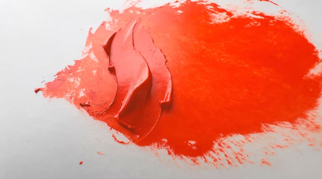
Powerful Pyrrole Scarlet
Toxicity
Lower Concern
Thought to be in the category of Lower Concern. However, we are not experts, so as with all pigments, please always consult the relevant Health and Safety professionals.
Avoid the dust and treat all pigments and paints with studio safety protocols.
Pyrrole Scarlet makes gorgeous high chroma tints in addition to having a bright masstone
How to Choose a Good PR255 for Your Palette
A Summary of PR255
There aren't very many offerings of PR255 in oils, and only about nine paintmakers offer this color. For that reason the choice of binding oils, as well as preferences in consistency will probably play a bigger role.
-In general, if you'd like higher chroma warm red tints than cadmiums can give you, you may want to try PR255. Most of the versions on the market are likely to yield high chroma tints.
-If you're concerned about lightfastness of PR255 in regards to the safflower oil sensitivity in related pigments such as PO73, you could try a version of PR255 bound in linseed oil until testing is done. It may be a good idea to double check with the manufacturer whether only linseed oil is used, since some companies can be a bit vague when it comes to the types of binding oil in a given tube of paint.
If you'd like to use a PR254 instead -- one which is almost as warm as PR255, check out Vasari's Permanent Bright Red. However, we have not seen their variety formally tested, so we're not sure if it shares all of the same specs as the cooler versions of PR254.
Resources
PR255 pigment data from David G. Myers, The Color of Art Pigment Database, Artiscreation.com
Elliott, Virgil, Exposure Tests, Online Forum post.
Spurgeon, Tad. Living Craft: A Painter's Process. Mt. Airy, Philadelphia, PA: Zoetrope, 2018. Newer version available here.
Information about PR255 from Bruce MacEvoy, Handprint Guide to Watercolors, General information about this class of pigments from Handprint
Hunger, Klaus, and Martin U. Schmidt.. Industrial Organic Pigments: Production, Crystal Structures, Properties, Applications, With contributions by Thomas Heber, Friedrich Reisinger, and Stefan Wannemacher, 4th ed. Wiley-VCH 2019. https://amzn.to/3ISJTE8 (this volume may also available through library apps like Hoopla).
__
Article written by Melissa Carmon
About the author: When a sudden urban firestorm threatened their studio, Melissa and her husband Jonathan rescued The Great Book of Color, about 800 pages of her handwritten notes gleaned from her years of painting. They co-founded the Paint List to empower fellow painters around the world. More can be found here.
Fiery Pyrrole Scarlet
Subscribe for More From the Great Book of Color
If you'd like to receive articles, news, and the latest illuminations from the Great Book of Color in your inbox, subscribe to the newsletter below.
Thanks for reading and Happy Painting!