
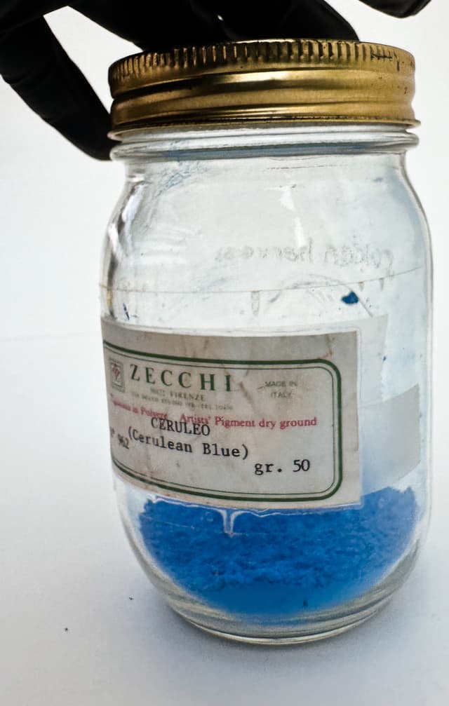
PB35 Cerulean Blue Genuine
Stable, Reliable, and Expensive, This Sociable Sky Blue is a Stellar Mixer
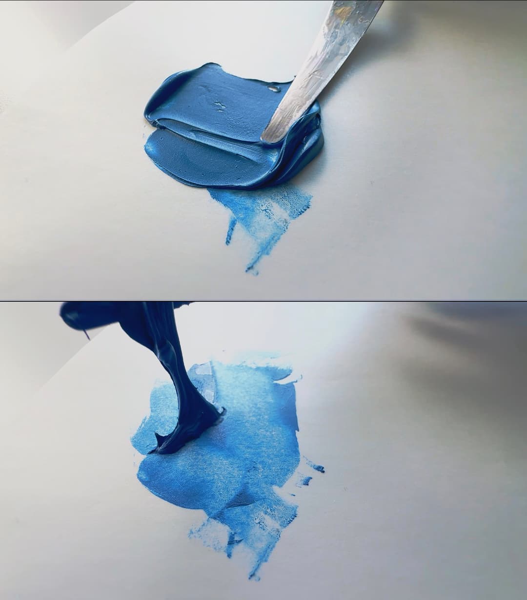
Featured Paints
For the Love of Painting
In the Blue Distance, Cerulean Beckons
Beneath what felt like stage lights, which cast yellow pools of light onto the model stand and threw the shadowy recesses beyond into the cool, slate blue darkness of the background, I sat perched at an easel near the golden glow surrounding the still-life. Alone with a room of large metal easels, painters' taborets, and abandoned still-life props, the only company was the palette on the rolling painter's taboret, a tabletop encrusted with years of jewel-toned daubs of paint left by students before me. The palette held gleaming daubs of fiery reds, daffodil yellows, and blues so deep they looked black. With paintbrush in hand, I applied a calculated ribbon of paint to the smooth gessoed surface of a masonite panel. The year was 2001, and I was too young to know what good fortune this class truly had been. The professor of my first college art class was an expert in realistic painting, which was a rarity in university art departments in those days.
Back in the early 2000s, the vestiges of the late-mid-century non-representational art scene were still quite strongly felt within university art departments. In general, there didn't seem to be much interest in trying to catch the way the sun rakes across distant blue hills in a landscape painting or catching the glint of a vase in a still life. In fact, later as a student at RISD, there was a sometimes-stated assumption that realistic technique could be relegated to what is found in craft store how-to books, which it turned out was a bit of an oversimplification. In what could only be termed luck, or undeserved providence, my first professor introduced the class to the Munsell Book of color and to a powerful split-primary palette that still forms the core of the color mixing philosophy that has held me in good stead since.
Any limited palette can do a lot, but may have a couple of slight drawbacks, and one of these is that it can take longer to mix certain colors. However, that is how one learns how pigments behave. For example, for an area of the still-life, I took a daub of phthalo blue and added it to the target mix, and the phthalo instantly overshot the target color, and turned the whole color cast a bit chemical looking. The method for counterbalancing the phthalo seemed to be proportions of cadmium yellow and cadmium red light- a sort of mock Cadmium Orange. Now the mix was too dark and the chromatic grey needed a bit of titanium white, which cooled it off a bit too much, and so needed a bit more yellow...and so on. It took a bit of balancing to arrive at just the right mixture.
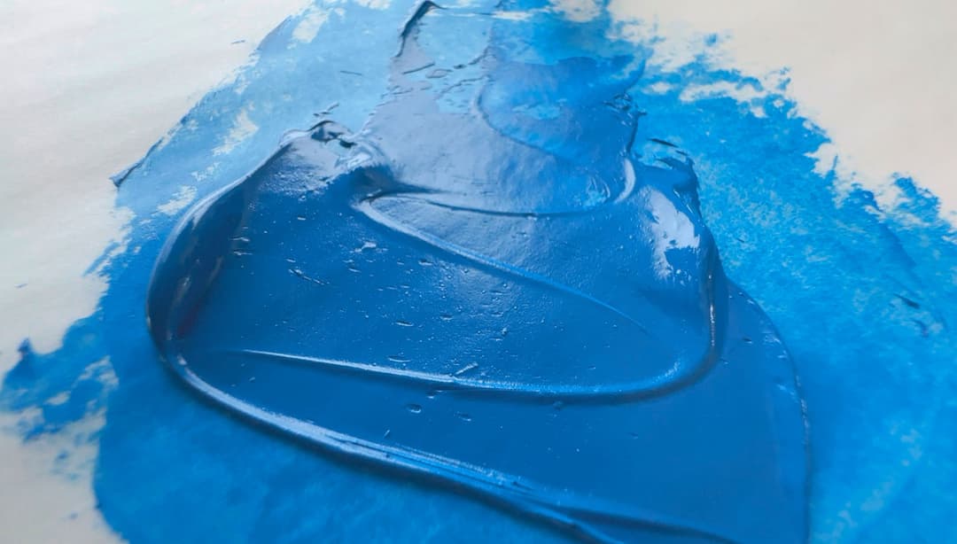
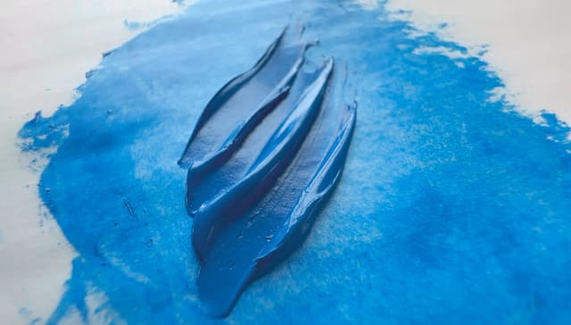
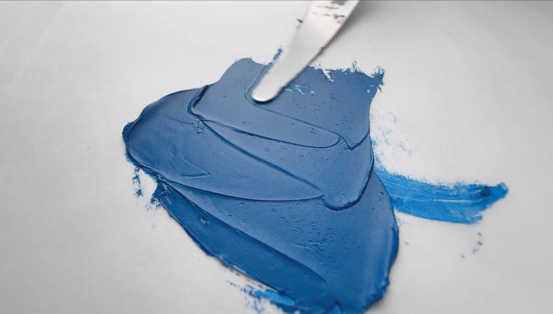
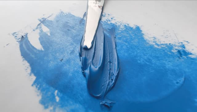
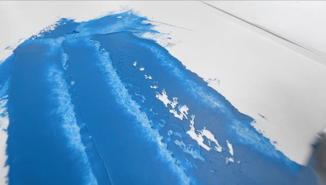
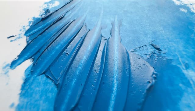
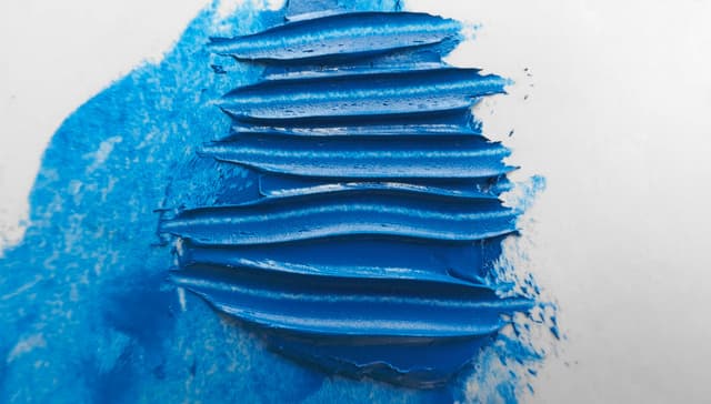
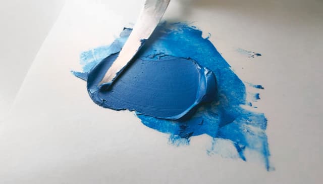
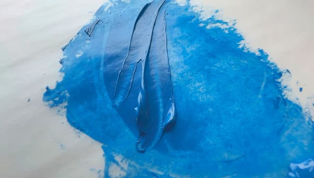
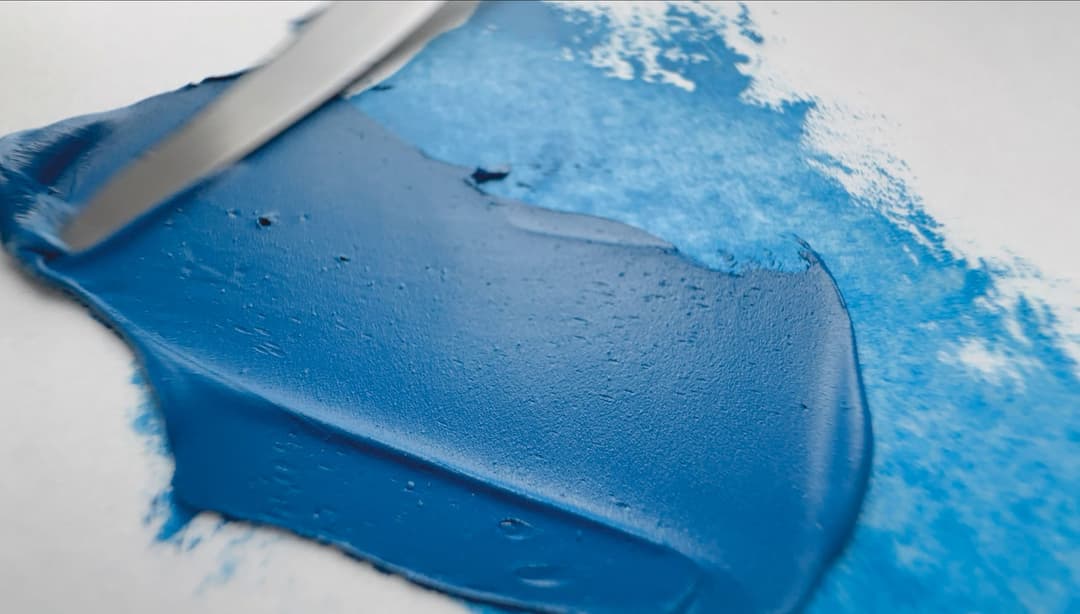
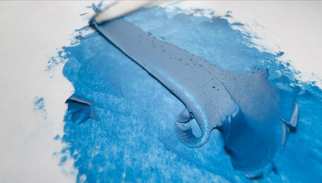
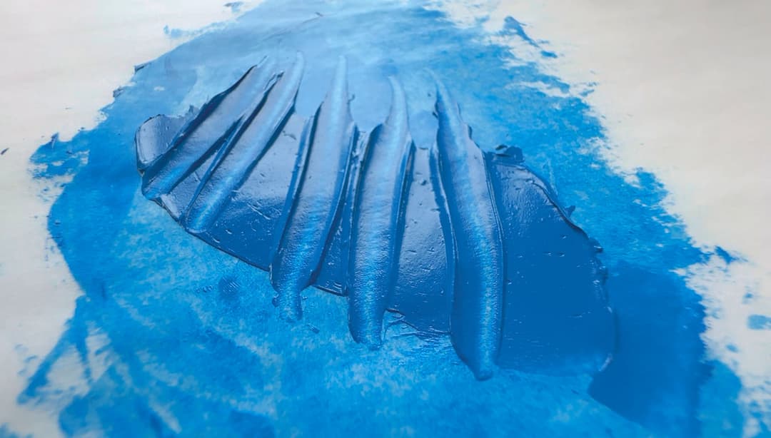
Maimeri Puro genuine Cerulean Sky Blue, PB35, in a blend of Safflower and possibly Poppyseed Oil
I loved the split primary palette with its mixes and cross-mixes, along with its pairings, permutations and combinations. The airy, empty studio sat deserted on weekends, but I often came in with my square black army-issue map bag slung over one shoulder, removed the bamboo roll of Isabey paintbrushes sticking out of it, and would set up at an easel and put in extra day-long painting stints to paint from the still life. Sometimes the afternoon stretched late into the night, and still I worked. It is in such solitary spaces that one learns how to paint form, begins to learn how color behaves in light, and wrestles with just what a given limited palette could and couldn't do. It was also there where I began to miss the colors outside of its gamut. There wasn't any food in the art building, just a large coffee machine in a hallway that churned out convenience-store-style cups of coffee in paper cups, so with a cold cup of coffee for company at my taboret, I studied and re-approached the still-life again and again. During the still afternoons, a door to the left which led outside was propped open, and the cold concrete of the studio floor caught the glint of reflected sky blue.
Why do I think of this scene when I think of cerulean? Maybe it's the way cerulean catches distant skylight. The limited palette does not contain cerulean, and as a student especially, the much more powerful phthalo blue is the better choice on a limited budget, but it turns out that phthalo blue can be a lot of work to reign in. Nor is cerulean on the list of the paints required for the widest-gamut-in-oil colors. The introduction to the Munsell color system, for which I'll forever be grateful to my professor, also doesn't require cerulean to reach the outermost areas of its gamut. In teaching us the basics of color mixing with a limited palette, my professor had set me onto a good thing, and I kept going.
The love of painting sustained me during those long hours of learning to paint from still lifes, and it was the same love of painting led me to appreciate the subtleties of this pigment in my own studio many years later. It isn't for everyone, and something like the surface color of cerulean can be mixed from other colors on the palette, but it is excellent for lower-chroma mixes. Twenty-plus years later, I am still painting, still mixing, and it's after many more long days of solitary painting in the studio that I have come to love cerulean. Cerulean isn't the cheapest pigment, nor is it the most powerful. But in its more modulated nature lie its secrets- its invitations, and its charms.
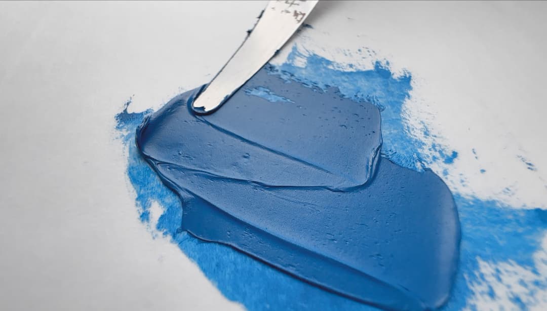
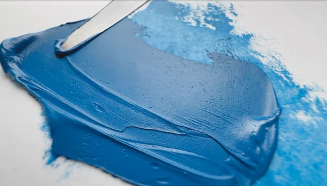
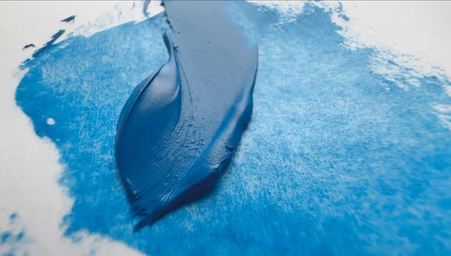
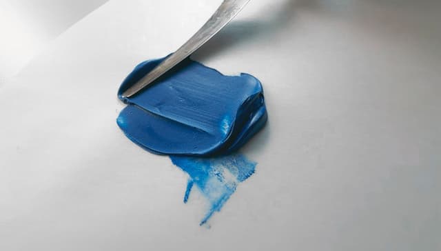
A color that is not usually included in the limited palette. Genuine Cerulean Blue can be quite valuable in mixes. This particular one is Cerulean Blue Light, PB35, in Linseed Oil, by Old Holland.
A Lightfast Azure
Genuine Cerulean, A Satisfying Blue in Mixes
Genuine cerulean is a gorgeous, durable, lightfast sky blue that mixes well in realistic painting. PB35 is one of the areas where it may help to know the chemical name, Cobaltous Stannate, in order to differentiate it from an occasional doppelganger, PB36. Genuine cerulean PB35 is sometimes called light cerulean blue, whereas PB36 is sometimes found in much deeper and greener shades. Genuine cerulean is a lovable blue when making lower-chroma mixes.
Lightfastness: Excellent with a few minor caveats.
Transparency: Semi-Opaque,
Relative Dry Time: Medium,
Strength in Tints: Mild (tinting strength tests help to gauge pigment load),
Oil content: Can be high depending on formulation,
Toxicity: Hazardous, handle with proper cautions.
General notes on categories: The transparency of a given paint may vary due to paint formulation. Cerulean is one of the colors where tinting tests are very helpful for judging relative pigment load. Its strength in tints will vary across brands due to how much filler a brand may use. Since cerulean is naturally a rather gentle tinter, it helps to use a high quality sample as a baseline for comparisons.
In comparison to other blues, Cerulean Blue is: -Less strongly tinting and easier mixing pigment than Phthalo Blue, PB15,
-A greener blue than Ultramarine, PB29,
-More of a light sky blue than most Cobalt Blues, PB28
PB35 is commonly called Cerulean Blue, and has a range of names including Caeruleum, Bleu céleste, and the wild spelling, Coeruleum. Sometimes it's described as a middle chroma blue that leans toward the greens, and it creates lovely mixtures with other pigments. Cerulean Blue is usually described as opaque or semi-opaque, depending how the paint was formulated. Oil paints are found ranging from semi-transparent to opaque depending on factors such as extenders and pigment load. This is one of the pigments where tinting tests are very useful, as quality may be shown rather quickly.
The drying time can vary, but it is usually listed as medium (some say fast or average, but some sources may even say slow). In addition to the usual variances caused by driers, the differences in dry time also derive from the binding oil, as Cerulean may be bound more often in alternative oils to reduce yellowing, and those oils often come with longer dry times. According to Mayer, the pigment itself is a good drier. Many paints list 2-7 days as a drying time.
Mayer doesn't seem too concerned about the paint film, and says cerulean tends to form a somewhat flexible oil paint film in linseed oil, however we've heard elsewhere that it is slightly soft, and in his book on paints, Reed Kay gives it a B for film formation. Its lightfastness and toxicity are further discussed below.
PB35 Paints in Oils
Cerulean among the Blues
Bleu Celeste, An Atmospheric Blue
The Secret of Skies
A Blue for Skies Cerulean blue was sometimes called bleu céleste, for good reason. Stunning on its own, it's also a gorgeous mixer that plays well with other colors. The remarks of a very accomplished painter of skies caught my attention when he said that for his brilliant, chromatic sunset skies he did not use phthalo in his palette-- he used cobalt and cerulean. Cerulean behaves differently than phthalo in mixes with other colors. Our experience is that there's something more visually comfortable about mixing with cerulean.
** A Highly-Praised Pigment** Older texts praise it for its remarkable stability. In his work on pigments, Doerner said, "...A greenish, light, very pure and dense compound of cobaltous and tin oxides which, as a color, is very valuable to the landscape artist, for example, in atmospheric tones. This color is absolutely durable."
Cerulean was discovered in the early 1800s (it's related to Cobalt Blue or Thenard's blue), but it took a half century for its use to become popular with artists. It was expensive, but it so marvelously replaced azurite that artists sought out this incredible color. It's similar in some ways to cobalt, but it's more of a daytime summer sky color.
Do You Really Need Genuine Cerulean? In the modern era, the big question arises, do you really need cerulean in a world that contains phthalo? For some the answer will be no, but we happen to prefer the way cerulean mixes with other colors. We've heard similar sentiments from a couple of other artists. Those who have been painting a while are familiar with phthalo's intensity, which takes some reigning in. Cerulean blue is the opposite, and its visual presence at full strength and sociable aspect are part of why it's still prized. In other words, the low tinting strength of cerulean is part of what makes it blend well with others, and due to its durability that makes it valuable on the palette. When choosing a blue that will meld well with other pigments in different areas of the spectrum- especially for naturalistic work, or painting wet-on-wet, Cerulean is excellent.
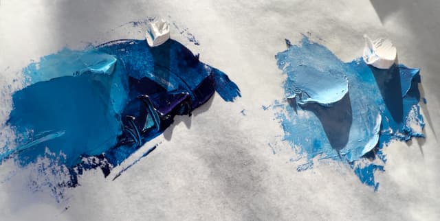
Phthalo Blue vs Genuine Cerulean
PB15 on the left with PB35 on the right
Gorgeous Cool Blue
...But What Does That Even Mean?
Cerulean Blue is a gorgeous blue that radiates stability. It's socially charming in mixes and doesn't make its presence known the way that Phthalo does.
Cooler than Cobalt Blue Wehtle describes this beauty as, "Slightly cooler than cobalt blue, with a greenish tinge," though we would reiterate that PB35 is definitely blue. When reading Wehlte, it seems that in his terms, a cooler blue means a blue closer to green than to violet. When he compares Cerulean to Cobalt, we're guessing Wehlte is referring to one of the more common forms of Cobalt Blue, a PB28 with a rich, deep middle-blue color. In that case, Cerulean could be said to be a blue that's closer to green. ColourLex comments on the color of PB35, "Cerulean blue has a fairly true blue (not greenish or purplish)." We'd tend to agree.
Watch out for Cerulean's Double Cerulean Blue is capable of enchanting sky blue tones. However, there's a less expensive pigment which might be sold for cerulean's prices. The doppelganger is a variety of Cobalt Chromite called PB36, is often sold under the name of Cerulean. We've heard that Cerulean, Cobalt Stannate or PB35, is more expensive and tends to be bluer than PB36. So to clarify, Cerulean PB35 is more of a true blue color than the more turquoise forms of PB36. Some versions of PB36 can be awfully convincing though. We've noticed one or two PB36 varieties that push as far blue as some PB35's, so it's helpful to read the label. Cobalt Chromite, the double, is an interesting pigment in its own right, so we like to see it-- just preferably not named Cerulean.
Beware of Hues It's one thing to look out for paints (correctly) labeled as Hues. A hue is a color made of less expensive pigments which approximates a genuine pigment. The blend will often fail to completely emulate a color, but these paints are genuinely fine as convenience blends. These will be labeled as Cerulean Blue Hue, and are most often a blend of phthalo blue and titanium white in a ratio that gestures to cerulean's look when it comes out of the tube. It will not mix nor behave like cerulean, but that's expected. What we do not like to see is paints named Cerulean Blue which are actually imitation blends. It's a good idea to always check the label for the pigments.
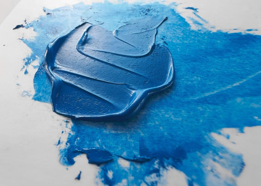
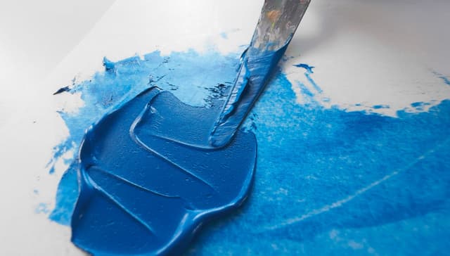
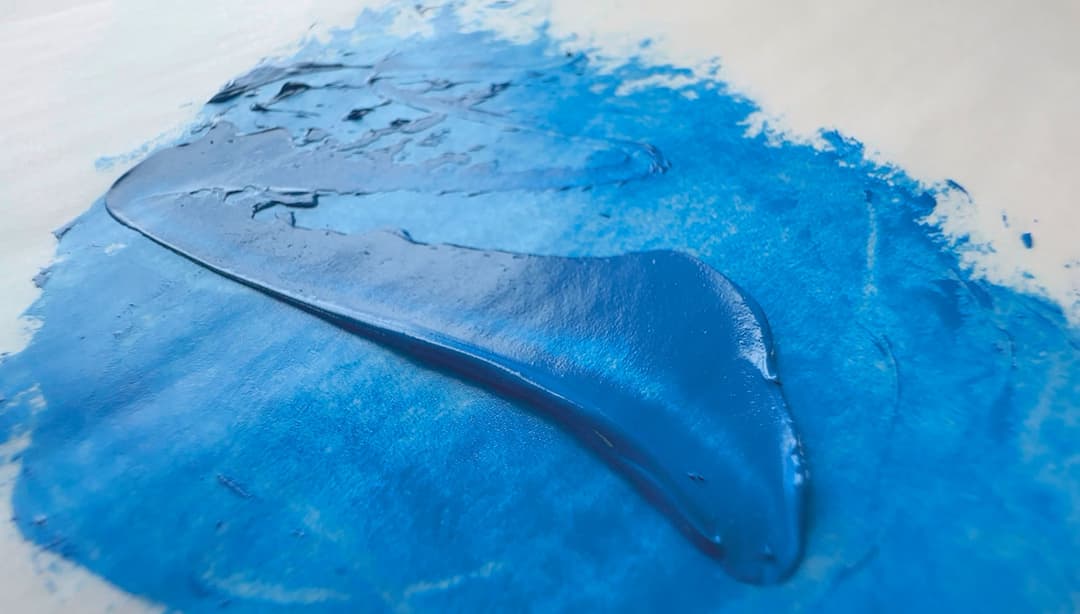
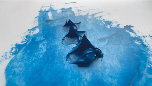
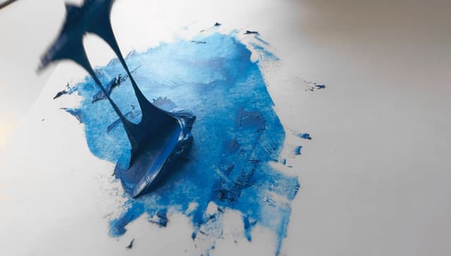
Old Holland Cerulean Blue, PB35, in Linseed Oil
Cerulean's surprising role in skintones
Every now and then, this pigment comes in handy
There are a million roads to Rome when it comes to mixing skintones. However, there have been a few times when Cerulean was the right color for a mix.
I love to work from life, and when a model is waiting, there is an unspoken pressure on the mixing, even if the model is the most patient person in the world. The model for this painting was a very patient person, and as I mixed the colors at one of the portrait sessions, I noticed that none of my mixes captured a certain note that I wanted in the undertone. In a moment of inspiration, I thought, it's crazy, but I want to add Cerulean blue.
It just so happens that I had Old Holland Cerulean Blue on the palette. It was the perfect note. I'm sure the same spot color could have been mixed and balanced with toothpick-sized dots of phthalocyanine or viridian or some other combination of forces, but when four or more colors come together in a mix, it is easy to overshoot a mix in a live painting session. Sometimes a person can find themselves spending more time adjusting and mixing than they do painting. Phthalos have a phthalo look to them sometimes, so I wouldn't usually add them to portrait tones.
Since then, there have been a handful of sitters for whom, after a few initial mixes, I find myself reaching for genuine Cerulean Blue.

One of several portraits where the skin tone incorporated Cerulean Blue, PB35. The version of cerulean used was Old Holland Cerulean Blue. Detail of The Philosopher, by Melissa Carmon
Cerulean Blue and Choice of Oil
Linseed Oil vs Other Binding Oils
The lovely cool tone of Cerulean can be influenced quite a bit by the natural yellowing of linseed oil. Nevertheless, the strength of linseed oil and its reliability are attractive qualities, and several major paintmakers have a dedicated linseed oil version (and in the case of Old Holland, they make two).
Like a Blue Earth, the Color of Sky
Vivianite, Blue Ochre, and Azurite aside, there is something about cerulean that reminds us of what we would imagine a blue earth tone could or would or should have felt like, had one existed. This quality especially shines through when PB35 is bound in linseed oil. When it comes to cerulean, the feel of the paint is a bit different in linseed, whereas poppyseed and safflower can feel a little rounder somehow.
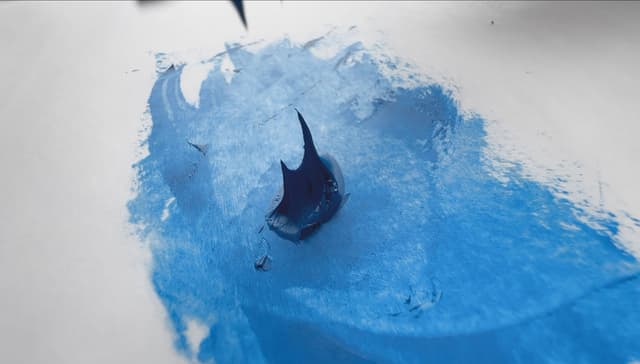
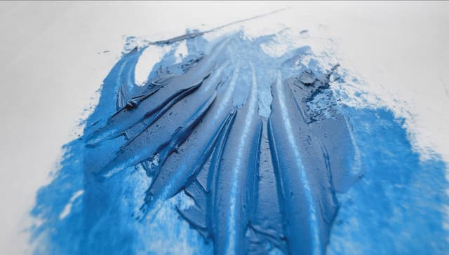
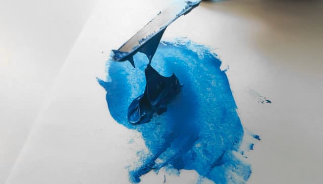
For those who like to have every pigment in a paint line behave the same way, the feel of genuine Cerulean may occasion a bit of consternation, but over the years we have learned to love how high quality cerulean feels in linseed oil. Some of the PB35 paints have a visceral feel, and almost tear when the palette knife is pulled away. Unlike earth tones, we wouldn't necessarily recommend cerulean for beginners but some ceruleans feel similar to certain specialty earth tones in handling.
Versions in Linseed Oil
Three versions of this color stand out among the ones we've tried so far.
For a pigment code that doesn't even show up in every paint line, it's of interest that Old Holland offers not one but two versions of PB35, which are quite similar colors. Both are expensive at least in the States, and so if you're newer to cerulean, perhaps try PB35 in a brand you know you like which has high quality, or get one that suits your needs. We've grown rather fond of the Old Holland versions, which have their characteristic stiff handling. Their Cerulean Blue has a tiny grey cast, which we don't mind for portraiture.
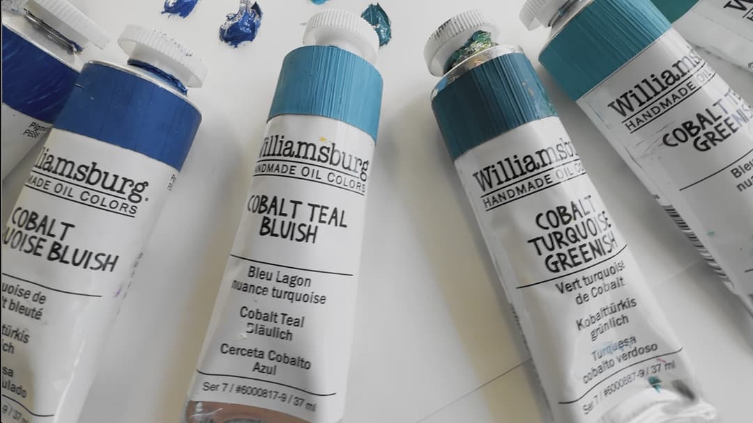
We also fell in love with the Williamsburg version. Williamsburg offers numerous high quality cerulean colors, but only one PB35. Unfortunately we didn't see their PB35 in safflower oil (it seems they offer a PB36 in both linseed and safflower), but we like their linseed oil version a lot.
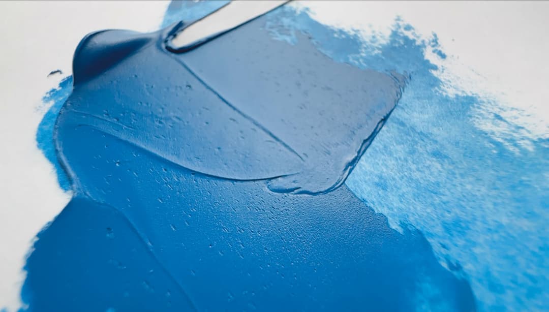
Old Holland Cerulean Blue in Linseed Oil
Cerulean Blue in Linseed Oil
Linseed oil may contribute to more yellowing, but it forms the strongest paint film
Old Holland Cerulean Blue Light
One of two cerulean blues, PB35 in linseed oil
Old Holland Cerulean Blue
The second of two genuine Cerulean blue paints by Old Holland, made with PB35
Old Holland Cerulean Blues, PB35
Cerulean Blue and Cerulean Blue Light in linseed oil
Williamsburg PB35 in Linseed Oil
Williamsburg Cerulean Blue
A lovely version of PB35 in linseed oil
Often Bound in Alternative Oils
Poppyseed or Safflower are Popular Choices
Cerulean is a candidate for being bound in oils that yellow less, namely safflower and poppy. Writing from the mid-20th century, Wehlte mentioned that it is "only used in poppy oil."
Cerulean blue is often bound in poppyseed oil to preserve its cool blue tones, but poppyseed oil has some potential drawbacks, such as possible issues with drying time as well as cracking. Best practices dictate that if one was to use an alternative binding oil, it's best reserved for the topmost layer of a painting where the color will be best appreciated.
A Note on Walnut Oil We used to think M Graham made a true Cerulean in walnut oil, but it turns out the pigment is actually PB36. We have also experienced a bit of chalking a while after the paint dried. This happened when the paint was applied thinly at full strength with a palette knife on panel.
For general mixing, we tend to opt for PB35 in linseed, however, for areas where the blue masstone is most important, we might entertain the idea of other binding oils used sparingly in the top layer of the painting.
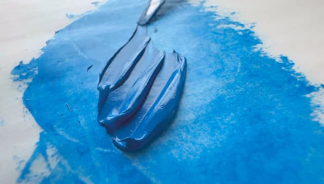
Maimeri Puro Cerulean Sky Blue, bound in a blend of safflower and poppyseed
Maimeri Puro Cerulean Sky Blue
Bound in a blend of Safflower Oil and possibly Poppyseed Oil
Genuine Cerulean Blue, PB35, Bound in Alternative Oils
Poppyseed, Safflower, or a blend of both. While there is less yellowing, these should be used judiciously due to the binding oil
Comparison with Other Ceruleans and Cobalts
A Quick Guide to Cobalt-Cerulean Blues
The name "Cerulean" covers a huge amount of territory. In this case,
PB35 Cobaltous Stannate, a gorgeous, rich sky blue that is incredibly stable as a pigment. Tends to be expensive, mixes well with other colors.
PB36 Cobalt Chromite, Often a Greener or Deeper Turquoise. Some companies will make a PB36, which is a related but less expensive pigment, and name it cerulean. Some PB36 versions are deeper or greener than PB35, but some versions come very close to the color space for PB35. In general, PB35 is bluer than PB36.
PB28 Cobalt Blue, Usually a Deeper Middle Blue or even Indigo. Cobalt blue, PB28 contains a range of colors, but tends to be a middle primary blue. It can also go more turquoise, but the more common variant is more indigo. PB35 is generally greener than PB28.
PG50 Cobalt Titanate Green, a Lighter Greener Pastel-ish Teal. Cobalt Teal PG50 can be bluish or greenish, and tends to be lighter than PB35. PB35 is generally a little deeper blue than PG50.
A Range of Related Cobalts and Greenish Ceruleans, such as PB36 and PG50
The Cerulean Test
An interesting barometer by which to assess a paint line
Cerulean is expensive. We're not talking Lapis Lazuli expensive... but for a regular palette color, the price is high. Even in historical texts we've read, "Because of its high price, cerulean is used only for artists' colors," from authors in the 20th century such as Kurt Wehlte.
The Tint Test Unfortunately paintmakers may try a lot of things to reduce their costs (and possibly sell it to the artist for a high price anyway). Genuine PB35 is one area where a basic tinting strength test becomes relevant to help gauge quality. Tinting cerulean samples with equal parts of white, and then ratios of 1:4 with white can be helpful. Tinting tests are usually done by volume, and need not be elaborate.
Paintmakers also saw artists coming with the tint test. We've noticed a few brands who have raced on trying to make what feels like a cheaper product which still somewhat makes it through the tint test (more-or-less). Things to watch out for are a chalky feel to the paint, a whitish film that develops after a while (especially when painting on panel) or paints that have a bit of an oddly flat appearance- a flat note in the chroma.
An Unexpected Twist with Tinting Tests
This issue is like the UNO reverse card- too high of a tinting strength can also be suspicious. While it's well-known that paintmakers have been known to adulterate their expensive colors by adding white or transparent fillers and extenders like calcium carbonate. Other colorless pigments in oils can sometimes add heft at a low price, but that's only half of the problem. Another, stranger problem is that some paintmakers may also add less-expensive high-chroma pigments to boost the appearance and enhance a given color unnaturally without listing them on the label, which is deceptive. A paint which has too high of a chroma for its listed pigment-- and it takes some practice to identify this problem-- is actually worth deeper analysis to see if an adulterating pigment has been added.
Does a Paintmaker use PB36 instead? This is a subjective test, as some painters don't care about which pigment is on the label. However, something we do like to see is the use of genuine cerulean PB35 as well as a PB36 as a separate, visually distinct color. We've noticed a few Artist/professional lines lately that use PB36 instead of a PB35, and we've heard PB36 tends to be less expensive. The absence of PB35 in a paint line may indicate a lot about the market towards which the paintmaker has tailored themselves. A sign of a higher end paint brand may be that they offer several differentiated offerings in the cobalts, ceruleans, and cobalt chromites.
However, we will add that if a brand offers a PB35, it should be of good quality.
The interesting behavior of genuine Cerulean in oil paint
Cerulean Blues in oil
Getting to know a High-Quality Cerulean
An accurate baseline for comparisons is needed
Cerulean is a moderate tinter-- not the faintest, and certainly not the strongest. So, when performing tinting tests, it's helpful to have some high-quality samples by which to judge a prospective brand.
Getting to Know Cerulean Since Cerulean is a naturally gentle tinter, be sure to try a high quality cerulean so you have something with which to compare your samples as a reliable baseline for quality. Once you get to know a high-end cerulean, you'll also understand it's peculiar behaviors.
Cerulean isn't always the loveliest texture in oils-- sometimes cerulean seizes a bit when being worked with a palette knife, and it's naturally a little gritty. This beautiful, stable blue is not the butteriest, and that's how it should be.
In Search of Genuine Cerulean Samples
We only know of one company right now that sells a sample set that includes a high quality genuine cerulean (if you know of another, let us know). Since it's an expensive pigment, it is almost never seen in sets.
However, we just learned this week that the 11ml sample sets by Williamsburg will no longer be offered. We were devastated to hear that these mini-sets were no longer being made available, as painters need accessible entry points to try the more expensive colors without having to invest a large sum.
So if you are reading this while they are still available, this set, which contains several cadmiums as well, is currently around $47 when ordering from the States. It's called the Williamsburg 11ml Traditional Sampler Set. So while11ml is super small, it contains several mini-tubes of cadmiums, a full-sized 37ml Titanium white, and is a great way to try some of the more expensive colors.
Williamsburg Cerulean Blue, PB35, tinted 1:1 with Titanium White
Tinting strength 1:1 of Genuine Cerulean by Maimeri Puro
More genuine Cerulean Blues
PB35, genuine Cerulean Blue
Excellent Lightfastness with a Few Caveats
Historically excellent, some unexpected sensitivities in specialized testing environments
Cerulean Blue, PB35, has excellent lightfastness, with slight caveats.
Historically, PB35 has a reputation for excellent lightfastness with highest marks (solid 8s on the BWS). In Golden’s Lightfastness Testing in oils, in tints Cerulean performed at ASTM I (excellent) in several whites which were tested.
Slightly More Change in Lead White and Zinc Oxide In Golden's tests, Cerulean performed at an ASTM II (Very Good) in Lead White in Linseed as well as pure Zinc Oxide. While Cerulean did well in outdoor sunlight it showed a dramatic and surprising sensitivity to artificial simulations such as QUV and Xenon.
In the past it has been rated at ASTM I in watercolor, though Bruce MacEvoy mentions some quirks that occurred in watercolor. Refer to his research for more.
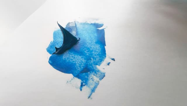
Old Holland Cerulean Blue Light, PB35, in Linseed Oil
Toxicity of Cerulean Blue
Hazard, Treat as Toxic
Cerulean Blue pigment qualifies as a hazard, treat as toxic, and so use the proper caution and studio safety measures set by safety experts. Artiscreation says, "Hazard if carelessly handled, ingested in large amounts or over long periods of time; Do not ingest; Avoid dust & spray."
We've read several other sources that say "Do not breathe dust." It also contains cobalt, so please refer to the Artist's Guide to Health and Safety for information about the hazards associated with cobalt pigments. The author's most recently updated writing can be found through her site. As always, we are not toxicologists, we're artists, so consult the manufacturer SDS and third party health and safety experts. Treat all pigments and paints with studio safety protocols.
Old Holland Cerulean Blue, PB35
Oil Absorption Possibly Very High, But it Varies
Consider reserving for top layer of an oil painting
Each pigment, when made into oils, has different oil requirements. This is an interesting note when companies mention a high pigment load-- each pigment has a different relationship to the oil, and dictates how much oil is required. Some pigments need more oil than others to be made into a paint. Another element, which becomes relevant with cerulean blue in particular, is that those fillers and extenders that paintmakers might be tempted to add also have their own oil requirements. Some extenders and fillers require a lot of extra oil, and some also yellow more severely.
Oil requirement patterns for pigments may be helpful to know if painting in layers, for example one can choose a less oily pigment for underpainting. In oils, different Cerulean Blue pigments may have slightly different oil absorption amounts, and PB35's oil content by volume when made into a paint may be quite high compared with other pigments. Wehtle merely says, "As high as cobalt blue," which is one of the pigments with high oil requirements. Mayer, in his 1970 work, categorizes Cerulean Blue as requiring a high oil volume with a score of 112. However, Williamsburg lists their version on this chart. They list their Cerulean as having a moderately low amount of oil when linseed is the binder. We would love to see every brand list oil content by volume for their paints, as there can be a lot of variation at times.
Poppyseed Oil Cerulean Blue may also be bound in alternative oils such as poppy or safflower in order to help preserve the look of the blue and avoid yellowing. It may be helpful to note that poppy and safflower are often reserved for the uppermost layer of a painting for their own reasons.
Further Notes For Cerulean Blue, some sources suggest high to very high oil requirements by volume depending on the binding oil, so clearly opinions vary.
A side note on weight vs volume: it gets confusing, but oil content by volume is totally different than oil requirements by weight. The figure by weight may be more helpful for paintmakers, while painters may find volume ratios more helpful in planning out their painting layers. For oil absorption by weight, refer to the main entry for PB35 in the Pigment Notebook for more details.
Old Holland Cerulean Blue, PB35
Resources
PB35 pigment data from David G. Myers, The Color of Art Pigment Database, Artiscreation.com
Spurgeon, Tad. Living Craft: A Painter's Process. Mt. Airy, Philadelphia, PA: Zoetrope, 2018. Newer version available here: https://www.thomaskitts.com/page/36804/tad-spurgeons-living-craft
Information about PB35 from Bruce MacEvoy, Handprint Guide to Watercolors, General information about this class of pigments from Handprint
Ambrose, Trevor (2023, September 24). ASTM Lightfastness Testing for Oil Paints https://justpaint.org/astm-lightfastness-testing-for-oil-paints/. Just Paint, Golden Artist Colors.
Doerner, Max. The Materials of the Artist and Their Use in Painting With Notes on the Techniques of the Old Masters. New York, Harcourt Brace and Company, 1949. Internet Archive, Web. Accessed July, 2025. Book form available here: https://amzn.to/4lGhn5V
Douma, Michael, curator, Pigments through the Ages. 2008. Institute for Dynamic Educational Advancement. (Accessed August 2025). Cerulean Blue https://www.webexhibits.org/pigments/indiv/overview/ceruleanblue.html.
Kay, Reed. The painter's guide to studio methods and materials. Garden City, N.Y., Doubleday, 1972. Internet Archive, Web. Accessed June, 2025. https://archive.org/details/paintersguidetos00kayr
__
Article written by Melissa Carmon About the author: When a sudden urban firestorm threatened their studio, Melissa and her husband Jonathan rescued The Great Book of Color, about 800 pages of her handwritten notes gleaned from her years of painting. They co-founded the Paint List to empower fellow painters around the world. Read More.
Maimeri Puro Cerulean Sky Blue, PB35
Subscribe for More Articles From the Great Book of Color
If you'd like to receive the latest illuminations from the Great Book of Color and Paint List news in your inbox, subscribe to the newsletter here.
Thanks for reading and Happy Painting!