Perylene Maroon
PR179
Alternate Name
Paliogen Maroon
Pigment Description
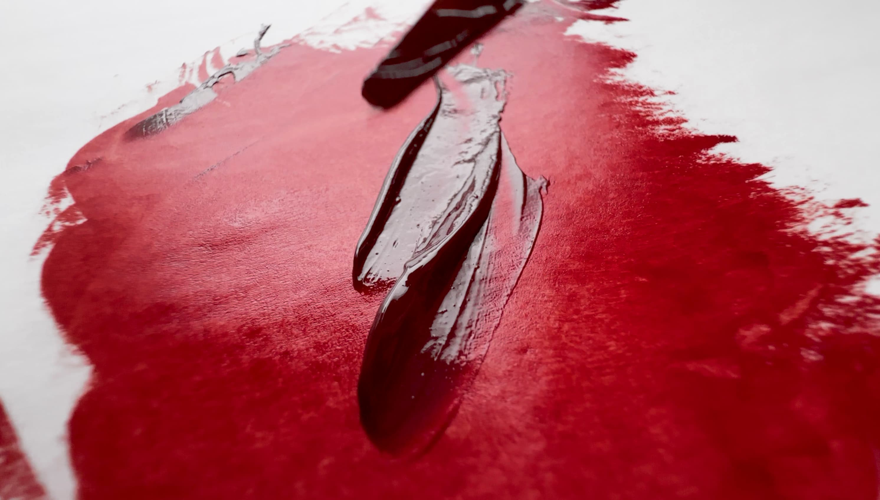
An excellent burnt red crimson, useful for botanicals as well as the highest chroma deep reds in oil paint. We fell in love with this pigment years ago when working on a commission that involved a lot of realistic work as well as botanicals. Valuable as a transparent red, in thicker glazes it can appear similar to Anthraquinone (PR177), but in thinner glazes a different nature is revealed. An excellent pigment to try for the substitution of Alizarin Crimson, but this depends on the brand.
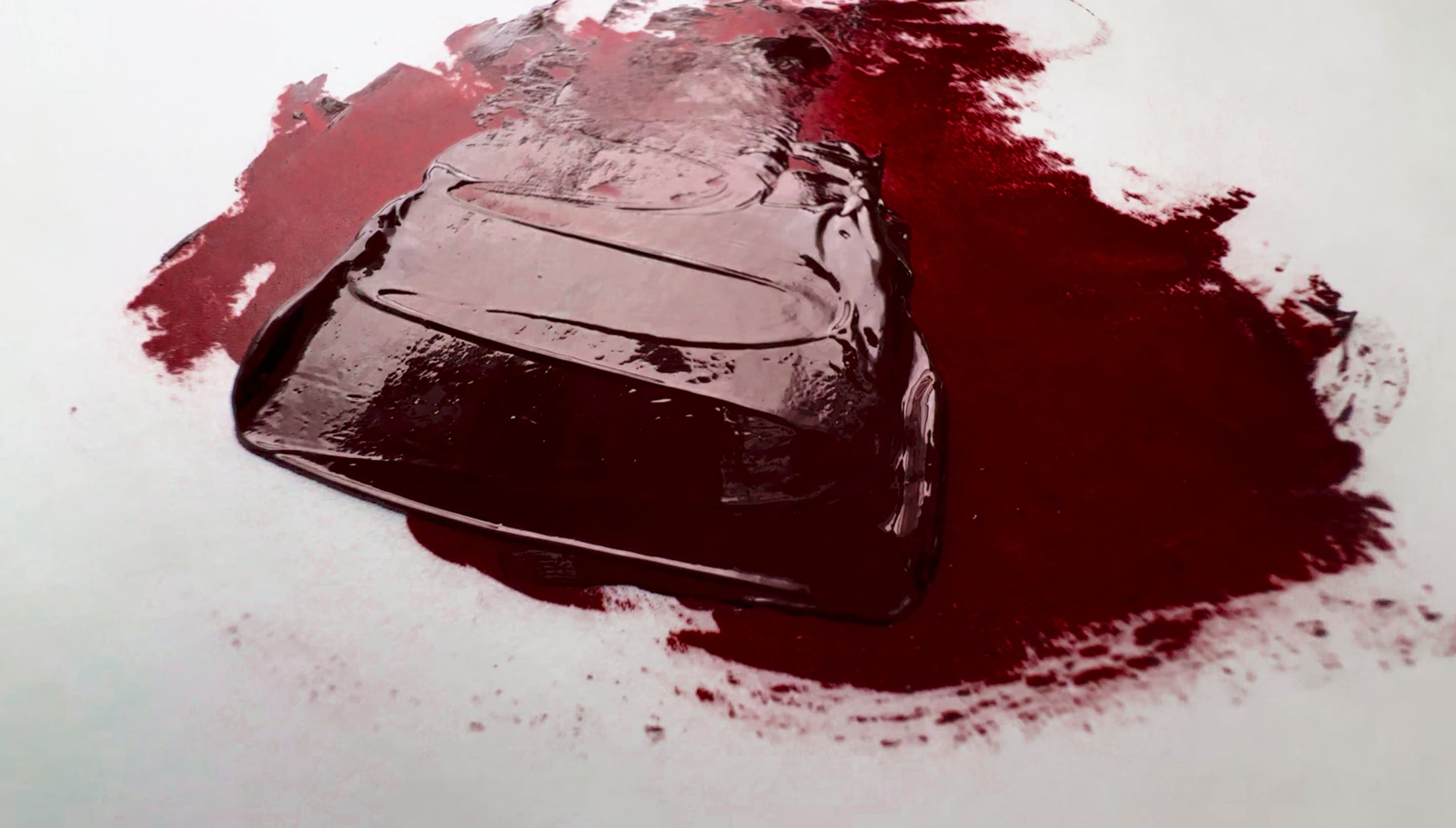
In masstone it can be very deep. Grumbacher Perylene Maroon, PR179
Some versions feel like a cross between Alizarin Crimson and Quinacridone Violet (truly maroon) with a tiny bit of desaturation to it, while others can look like more of a deep red. Some versions look like a slightly deeper kind of cadmium red deep, but with semi-opacity. Perylene Maroon is helpful color where deep, chromatic reds and violets are needed.
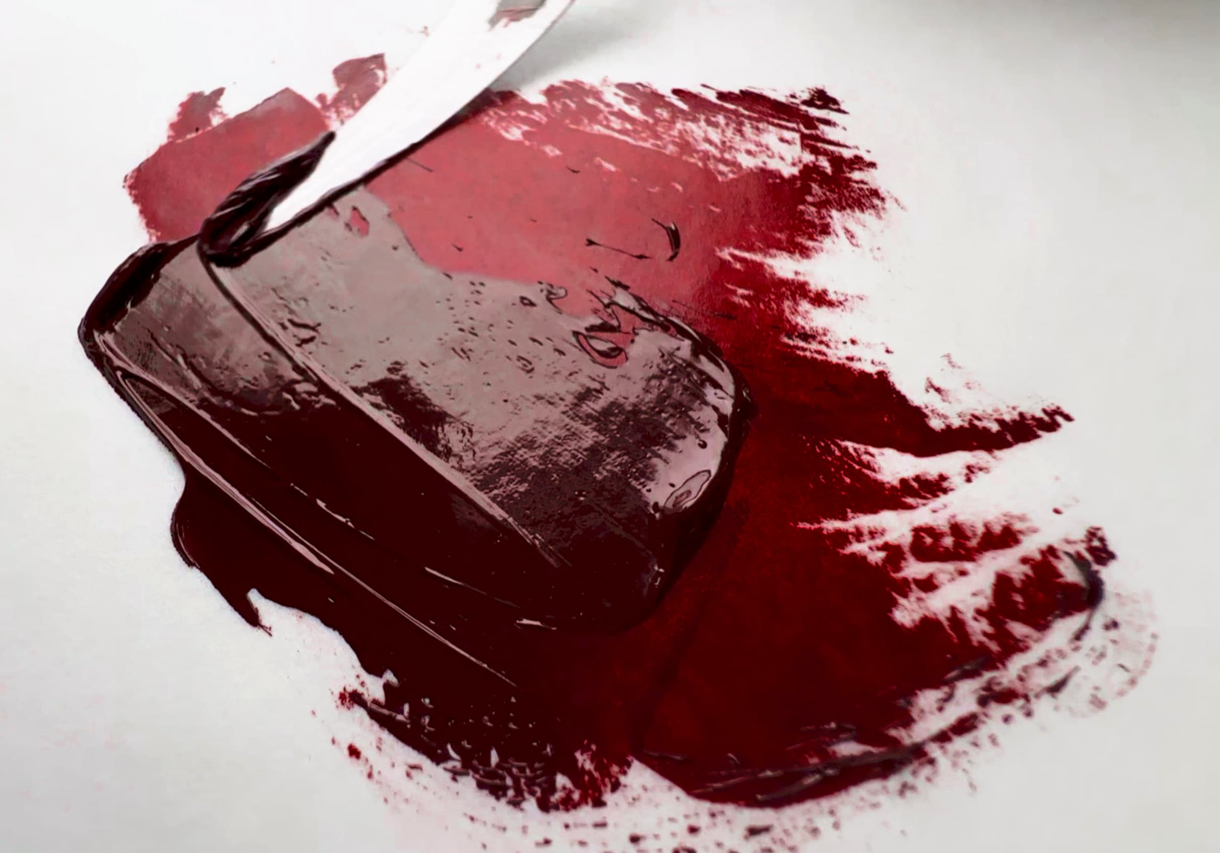
Perylene Maroon by Grumbacher
PR179 is reported to have excellent lightfastness, but Perylenes in general may struggle a little in tints. This one seems to come through better than most. Refer to the Blue Wool Scales on Artiscreation for specifics. Schmincke lists their version in watercolor as four out of five stars for lightfastness, meaning it has very high lightfastness (five stars is for the incredibly high lightfastness associated with earth tones). In oil, some versions of PR179 are very slow drying, but for a color in this shade range it feels worth it. In oils, Perylene Maroon tends to be transparent, but Schmincke's version in watercolor is semi-opaque.
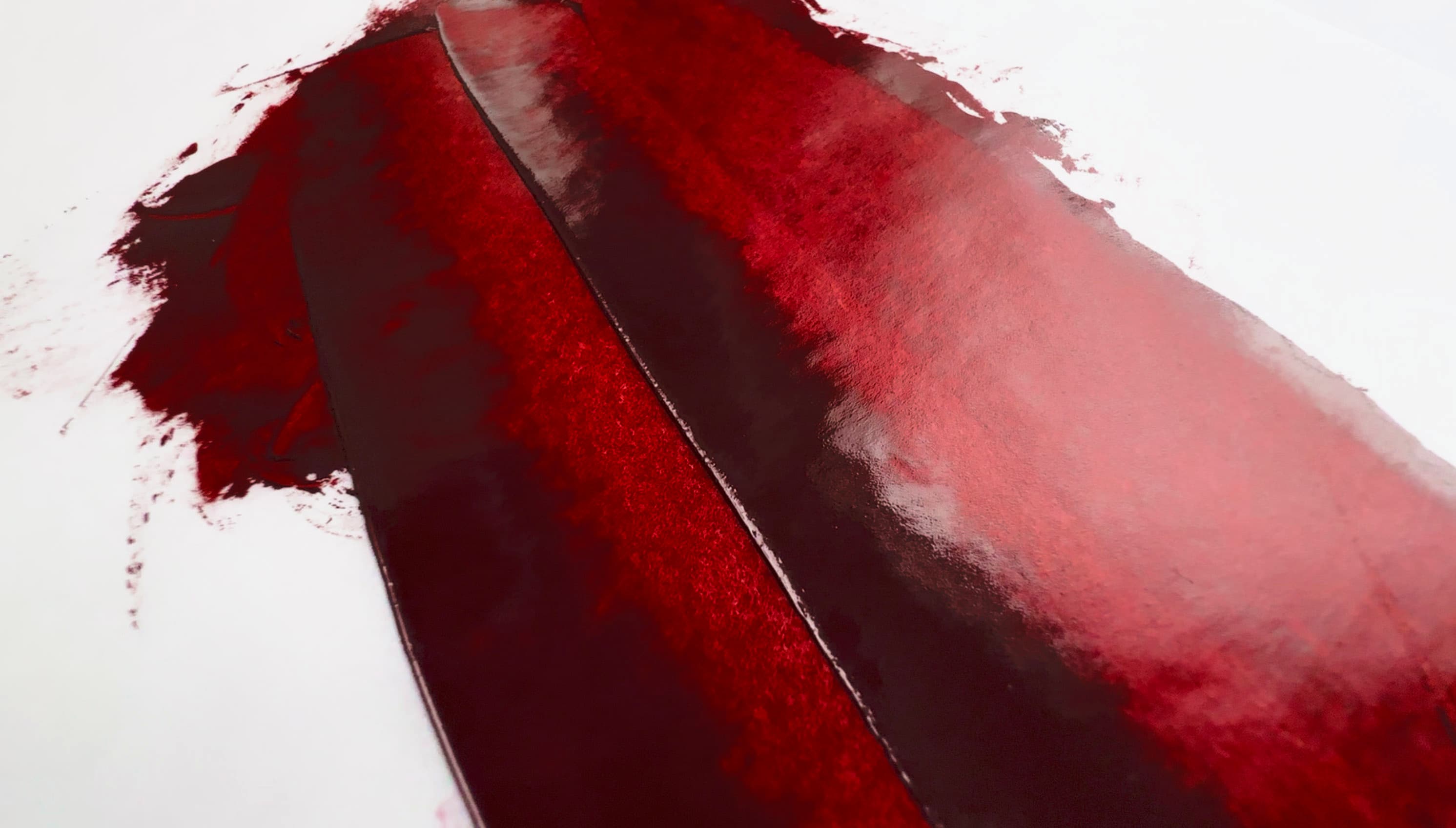
PR179 by Grumbacher- Perylene Maroon
This color has a structure that is similar to the anthraquinones (possible carcinogens) so please consult Monona Rossol's work for more information.
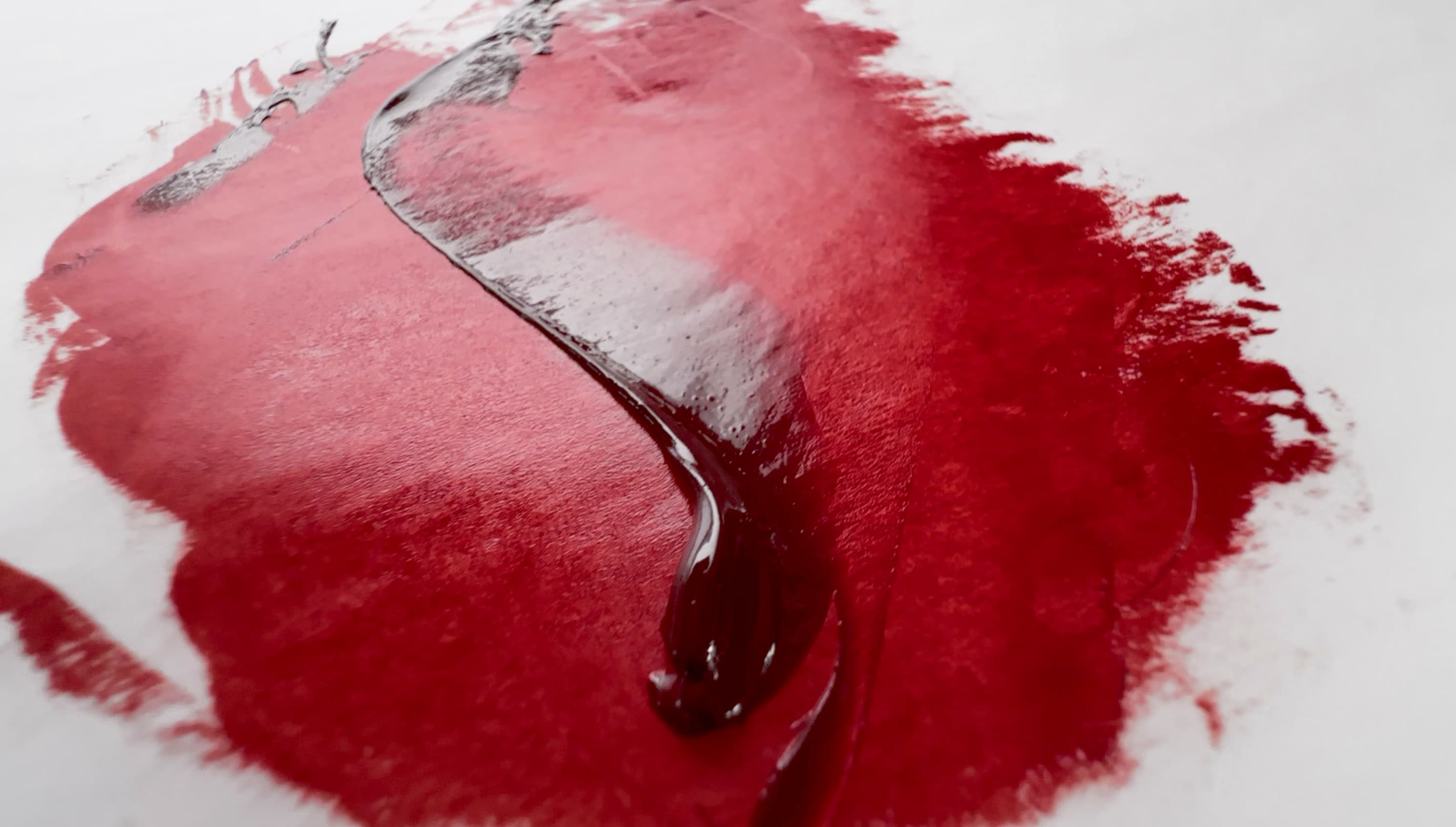
Mussini Florentine Red, PR179
Perylene Maroon gestures to the depth of Alizarin Crimson but has a slightly different color. Of course, nothing perfectly emulates Alizarin. However, Perylene Maroon is one of our preferred recommendations for pigments to try.
Florentine Red, PR179 by Schmincke Mussini
Resources
PR179 pigment data from David G. Myers, The Color of Art Pigment Database, Artiscreation.com
Information about PR179 from Bruce MacEvoy, Handprint Guide to Watercolors, General information about this class of pigments from Handprint,
Rossol, Monona. The Artist's Complete Health and Safety Guide. New York, NY : Allworth Press, 2001. The book is rather dated, updated information is available from her website.
Stats
Lightfastness
Excellent, may depend on pigment supplier
Golden’s Lightfastness Testing in oils showed mostly ASTM I behavior, which is quite encouraging. In one Flake White by another brand it was ASTM II. Some results were not listed for a few of the mixing whites. See artiscreation for blue wool scales as this did receive some 7-out-of-8 rankings. However this is an area where there are few really good choices for a robust deep crimson, so it may be a good choice given the alternatives. The NPIRI tests from the 1980s showed excellent results in outdoor Florida exposures for both masstone and tints.
Transparency
Transparent, Semi-Transparent, Semi-Opaque
Toxicity
Previously thought to be in the category of Low Concern, new research suggests this may be carcinogenic.
Monona Rossol’s writing about pigments and artist safety available on request here notes that this pigment has a similarity to other Anthraquinones which are carcinogenic. While this specific pigment has not been tested, other similar pigments have been listed as "reasonably believed to be carcinogenic." Treat all pigments and paints with studio safety protocols.
Dry Time
Slow, Very Slow
Some varieties are in the 6-18 days category while others are in the 2-7 day category. It’s likely driers are used by many brands.
Particle Size
Fine
Chemical Name
anthraquinone perylene
DISCLAIMER: Please note that we are not experts in health and safety and we are not toxicologists, please consult the proper experts. We are not liable for any issues that may arise from the use of our website or its contents. The information contained in this site is provided without warranty or guarantee of any kind. We do not necessarily endorse any other website that are linked from our site. For any important pigment specs, please reference the manufacturer details. If you discover errors or omissions, please reach out through our contact form. Thank you.